THIRD ALIGN
Third Align is a global B2B growth partner that engineers high-value conversations between enterprise-facing companies and the right buyers. Izart Studio delivered full brand identity, visual system, immersive website design, and Webflow development across a six-week engagement.
CLIENT
THIRD ALIGN
SERVICES
Branding
Website
YEAR
2025
THE OBJECTIVE
We created a creative and experiential e-commerce for Manjn that tells the story of its products' naturalness through a pure and complete visual language. Fluid animations guide users seamlessly, while our clean, minimal design keeps the products as the true protagonists of the experience.
THE APPROACH
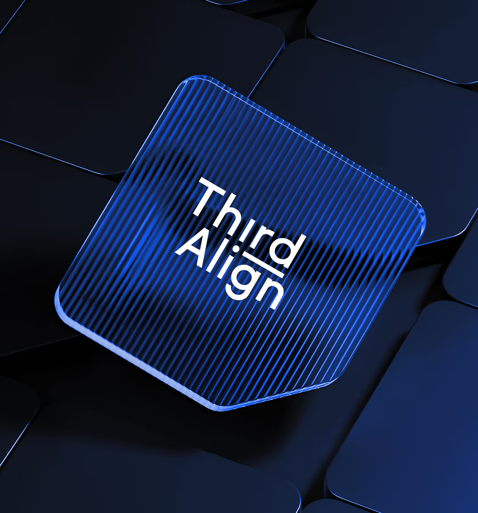
The central design brief was specificity. Third Align operates with a proprietary 3C framework, three strategic pillars that define how they engineer buyer conversations. The identity had to make that framework visible without making it decorative.
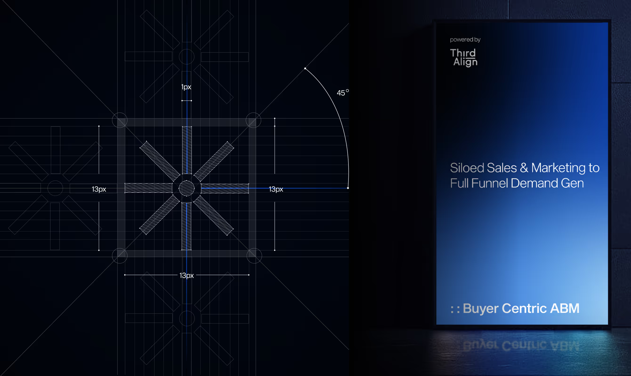
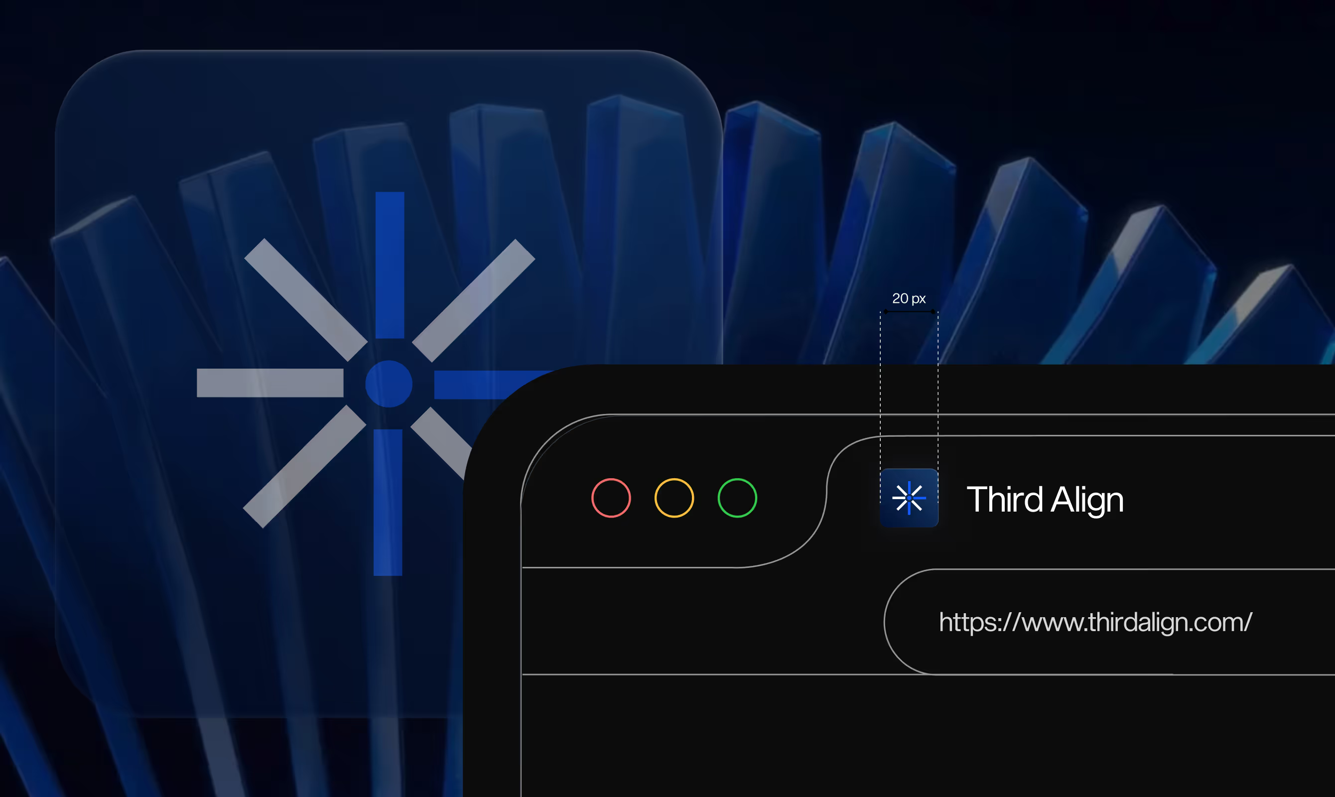
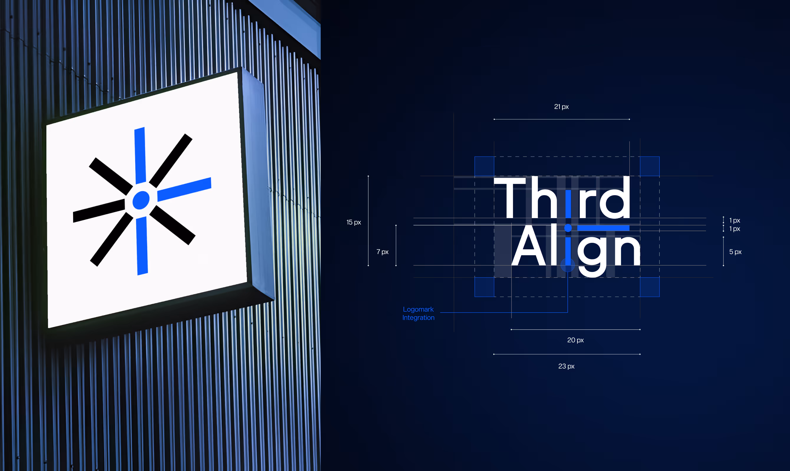
The wordmark was the primary vehicle. The three pillars of the 3C framework are introduced directly within the letterforms of the name, structural rather than supplementary. The logomark then abstracts those same three elements to represent a full funnel approach, moving from top-of-funnel awareness through to closed pipeline in a single geometric form.
The visual system references clean architectural geometry as its primary aesthetic language. Precision grid construction governs both the logomark and logotype layouts. The color direction is anchored in a deep blue gradient system, communicating intelligence, trust, and technical depth without coldness.
VISUAL IDENTITY
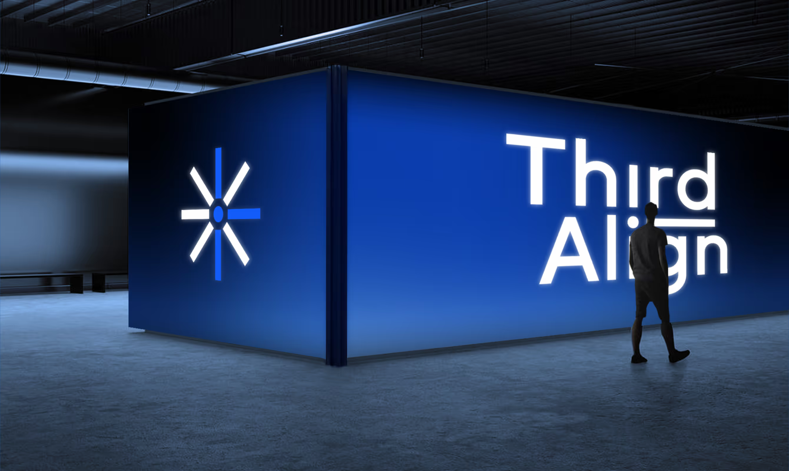
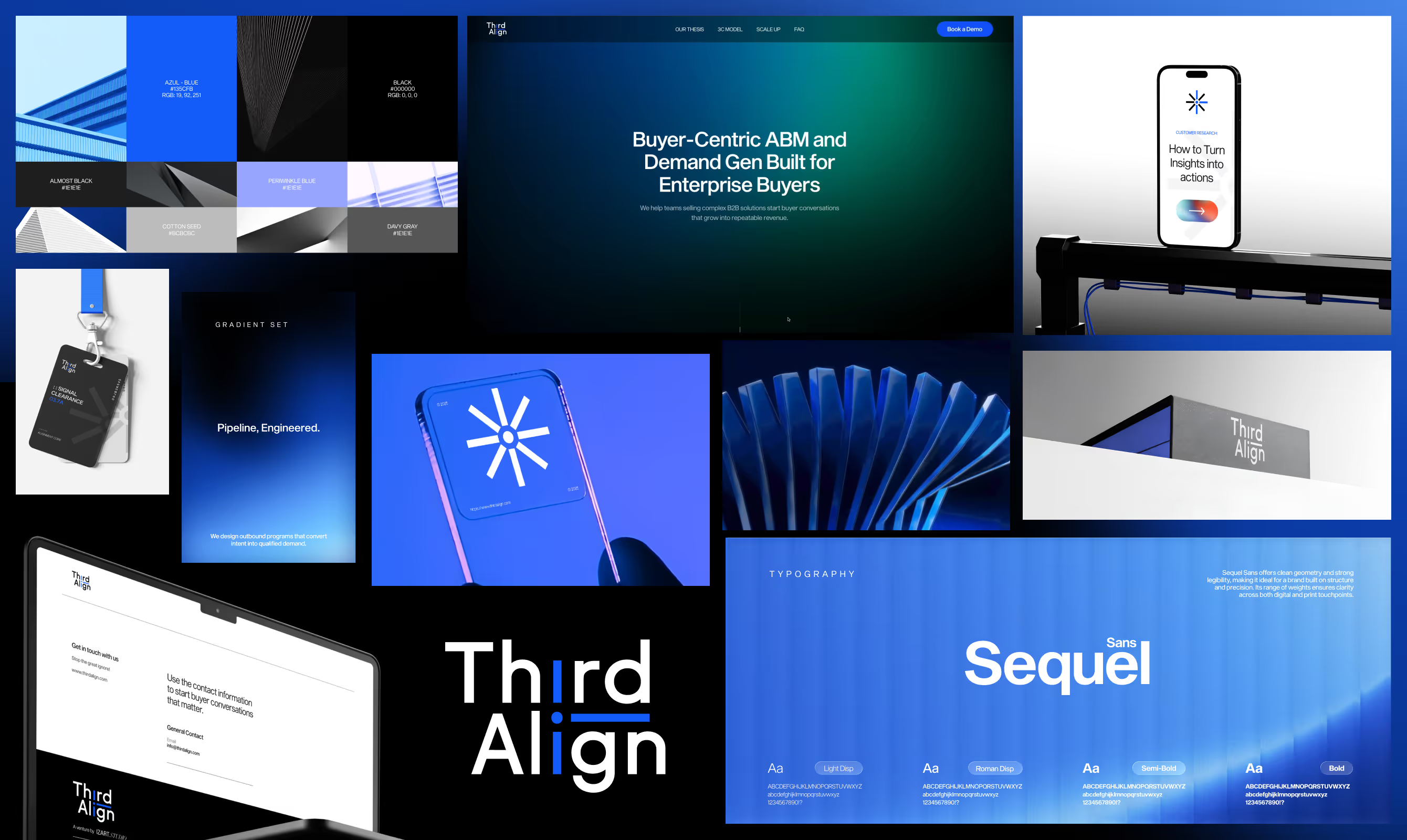
Third Align's visual identity looks exactly like what the brand builds: focused, frictionless systems. The logomark is a geometric abstraction of the full funnel, three elements converging into a single directional form, constructed on a precise technical grid with no arbitrary curves or decorative detail. The wordmark carries the same structural logic, with the 3C framework pillars embedded in the letterform construction itself.
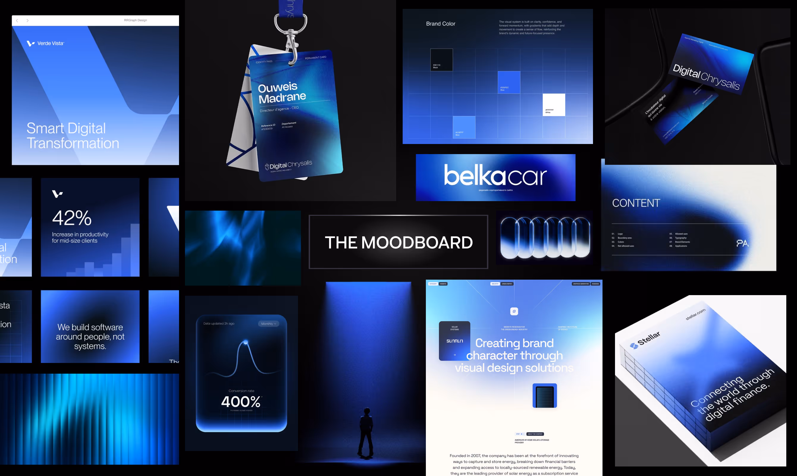
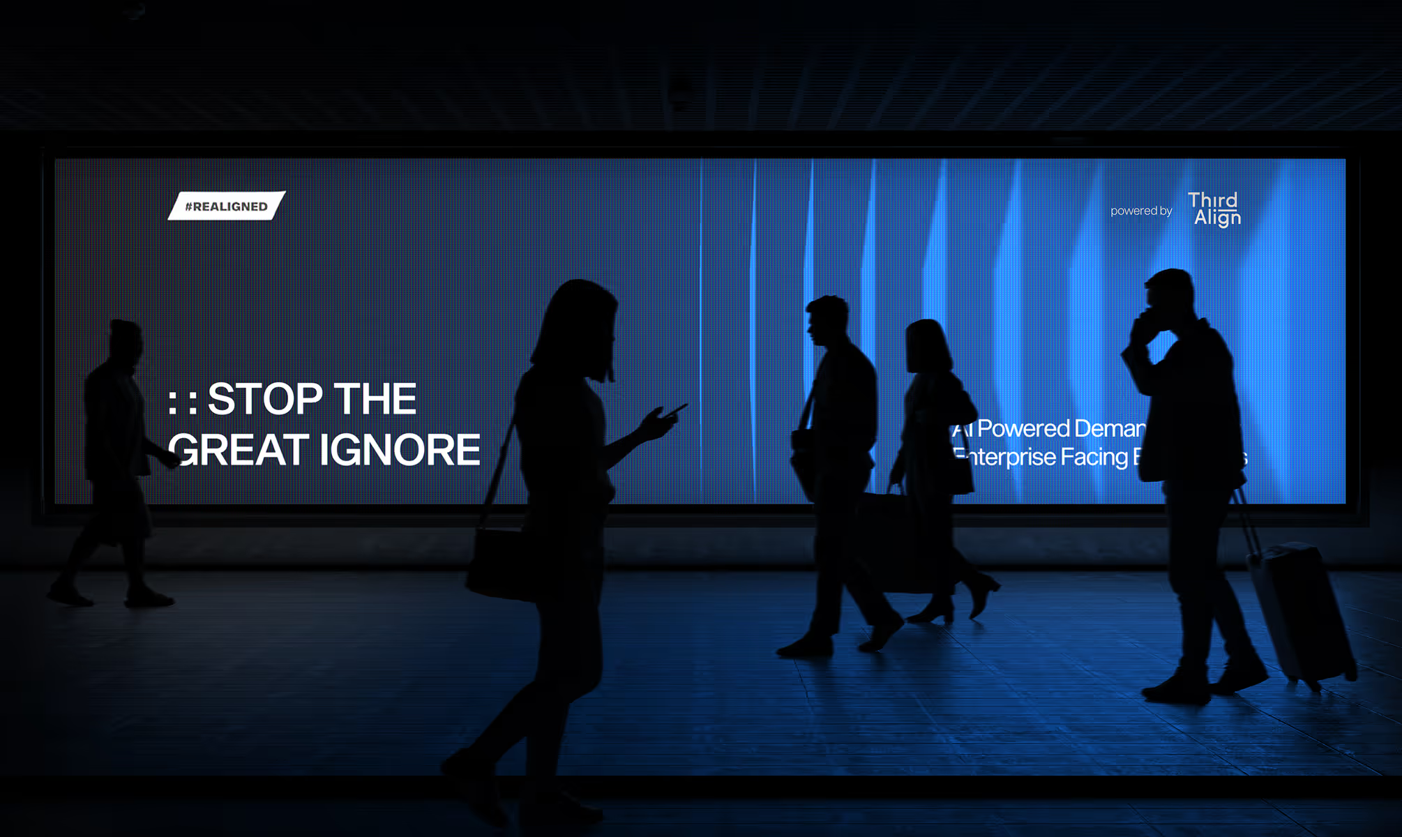
The primary typeface is Sequel Sans, a typeface with Swiss geometric precision and contemporary warmth, deployed across all brand communications. The color system operates in a deep blue gradient range, referencing architectural depth and strategic clarity simultaneously. Applied across billboards, event badges, mobile interfaces, and a 3D logo rendering, the identity holds authority at every scale.
The website, built on Webflow with immersive design and conversion-focused content architecture, extends the visual system into a fully functional growth asset.
OUTCOME
Third Align's visual identity looks exactly like what the brand builds: focused, frictionless systems. The logomark is a geometric abstraction of the full funnel, three elements converging into a single directional form, constructed on a precise technical grid with no arbitrary curves or decorative detail. The wordmark carries the same structural logic, with the 3C framework pillars embedded in the letterform construction itself.
The primary typeface is Sequel Sans, a typeface with Swiss geometric precision and contemporary warmth, deployed across all brand communications. The color system operates in a deep blue gradient range, referencing architectural depth and strategic clarity simultaneously. Applied across billboards, event badges, mobile interfaces, and a 3D logo rendering, the identity holds authority at every scale.
The website, built on Webflow with immersive design and conversion-focused content architecture, extends the visual system into a fully functional growth asset.
Latest Work
Every project is a chance to try something new. Look at something with a fresh perspective. Do something for the first time.
SOAK STUDIO
Soak Studio is an Indian body care brand with face-grade formulation intelligence.
Branding
Packaging
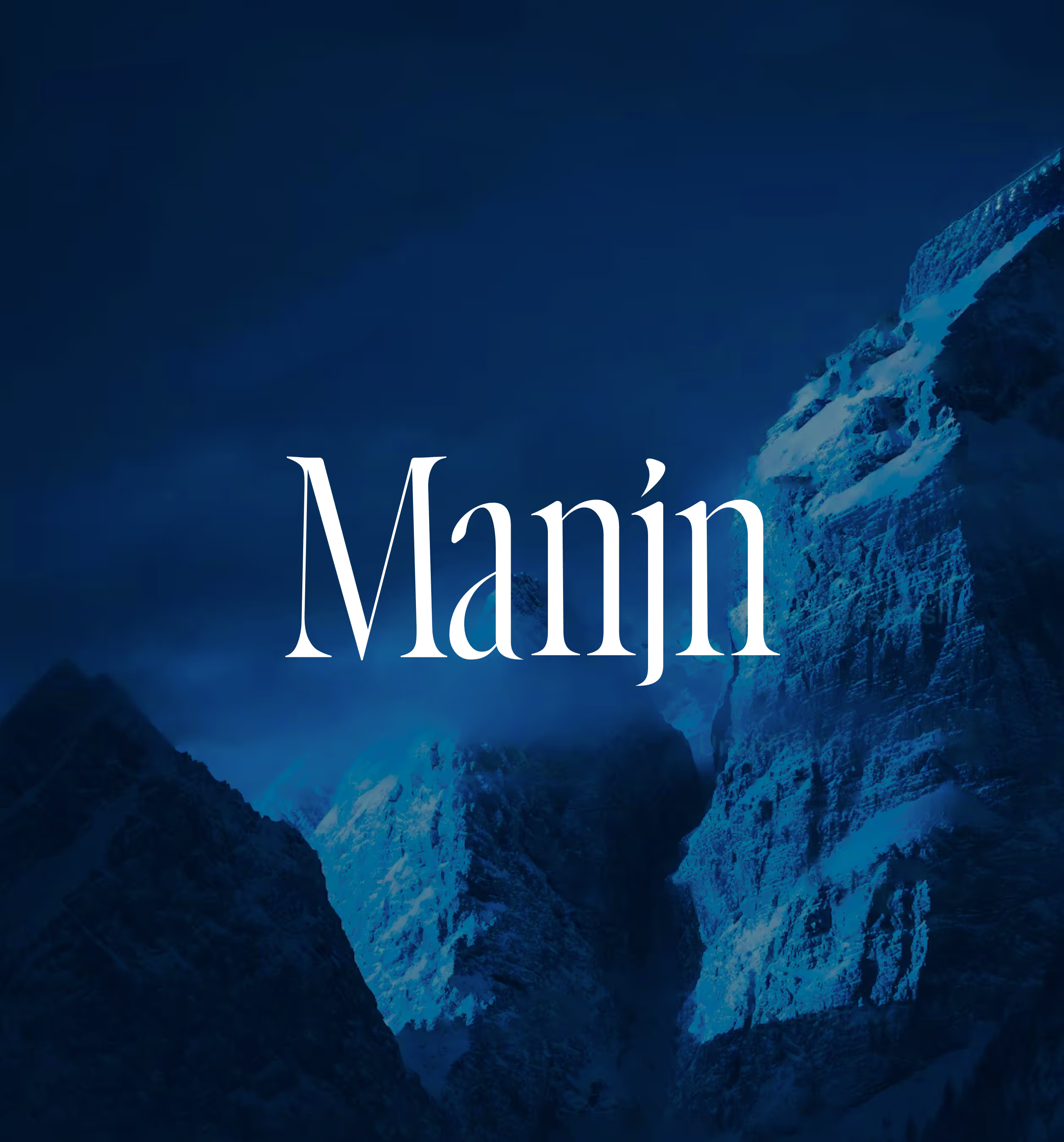
MANJN
Manjn is an upcoming oral care brand from India for global audience.
Branding
Packaging
Website