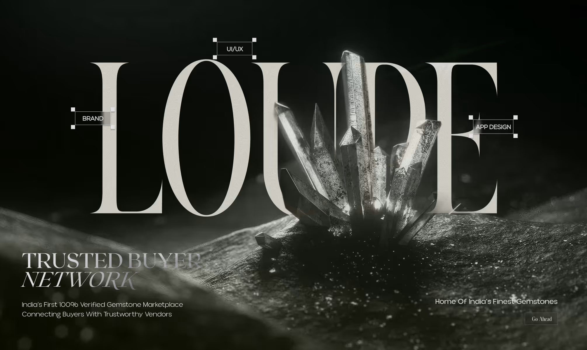
LOUPE
Loupe is a trusted gemstone marketplace platform built for verified buyers and sellers of genuine gemstones. The brand eliminates fraud from the trade by creating a secure, elegant environment where authenticity is the foundation of every transaction.
CLIENT
LOUPE
SERVICES
Branding
UI/UX
YEAR
2025
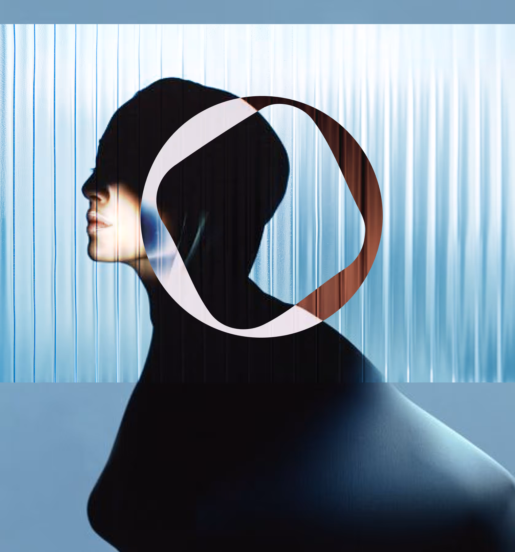
THE OBJECTIVE
We created a creative and experiential e-commerce for Manjn that tells the story of its products' naturalness through a pure and complete visual language. Fluid animations guide users seamlessly, while our clean, minimal design keeps the products as the true protagonists of the experience.
THE APPROACH
The core design challenge was holding two qualities simultaneously: the gravitas of a luxury jewellery brand and the functional clarity of a trusted marketplace platform. Neither could dominate. Both had to be present in every element.
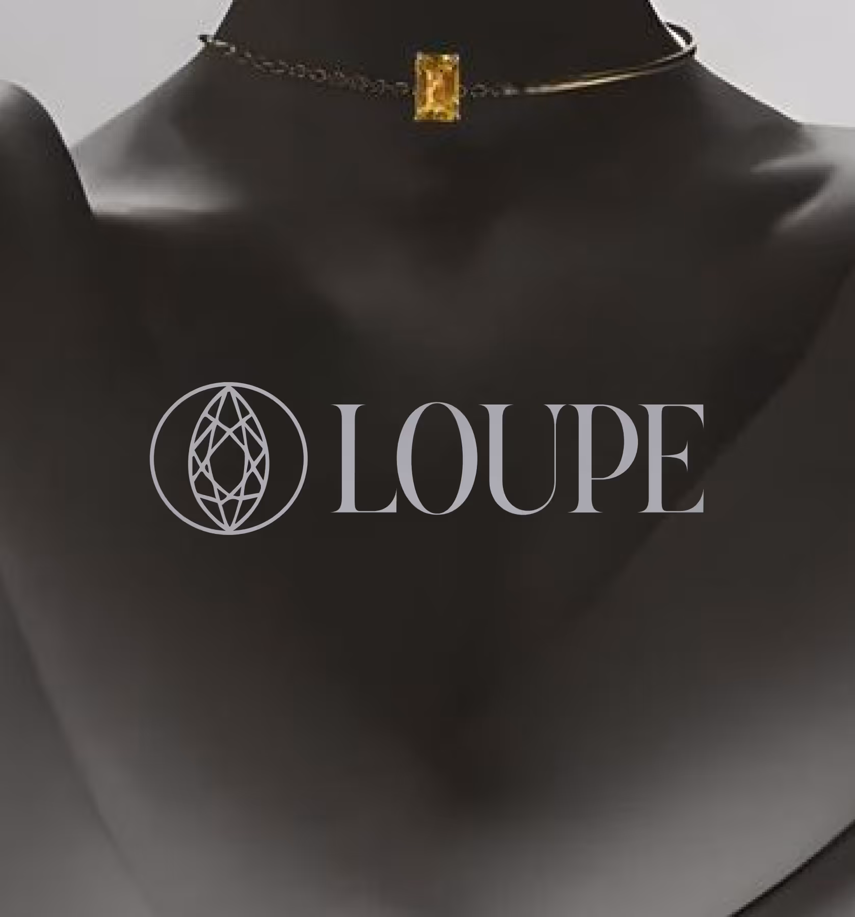
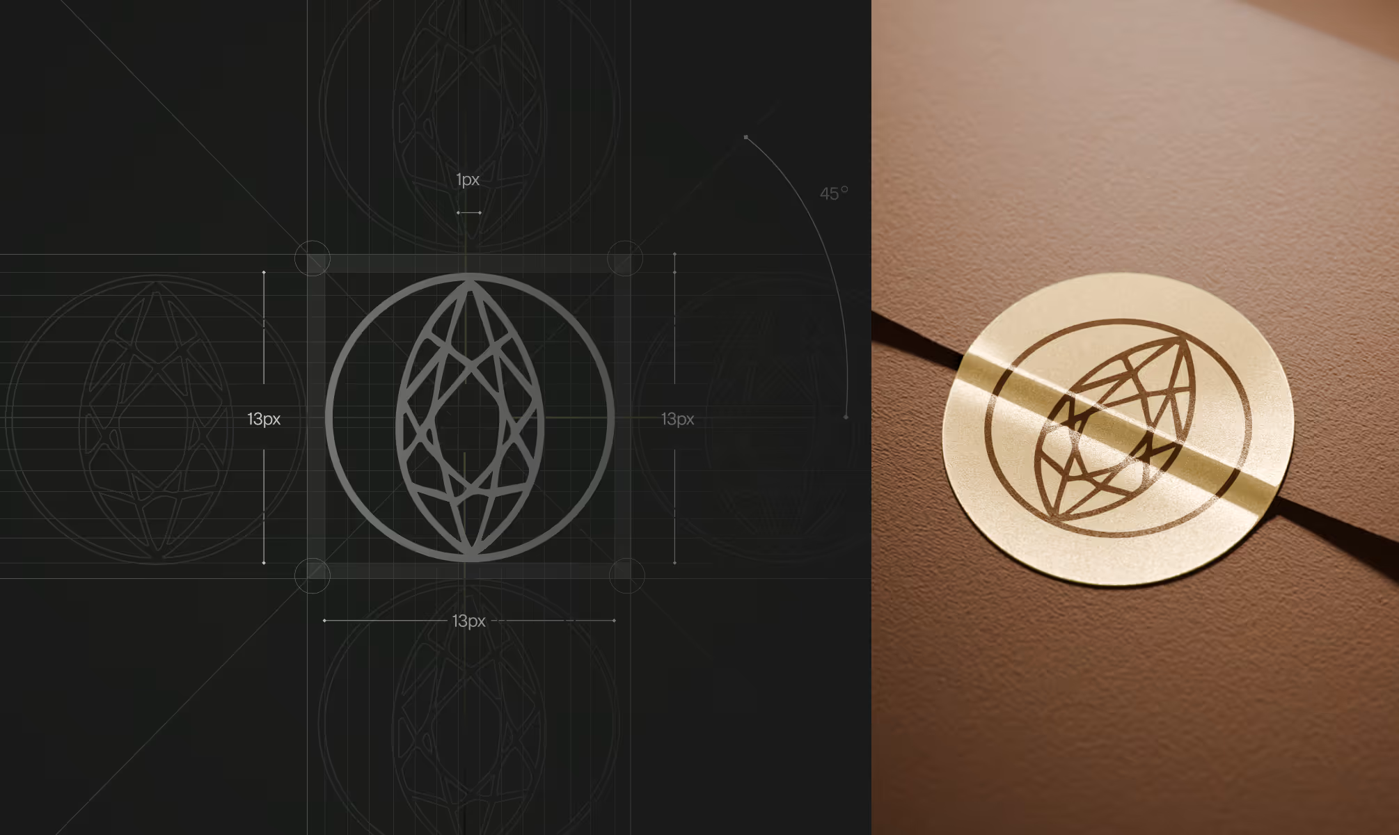
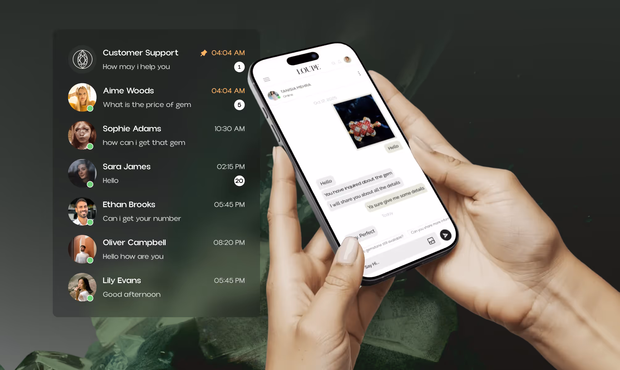
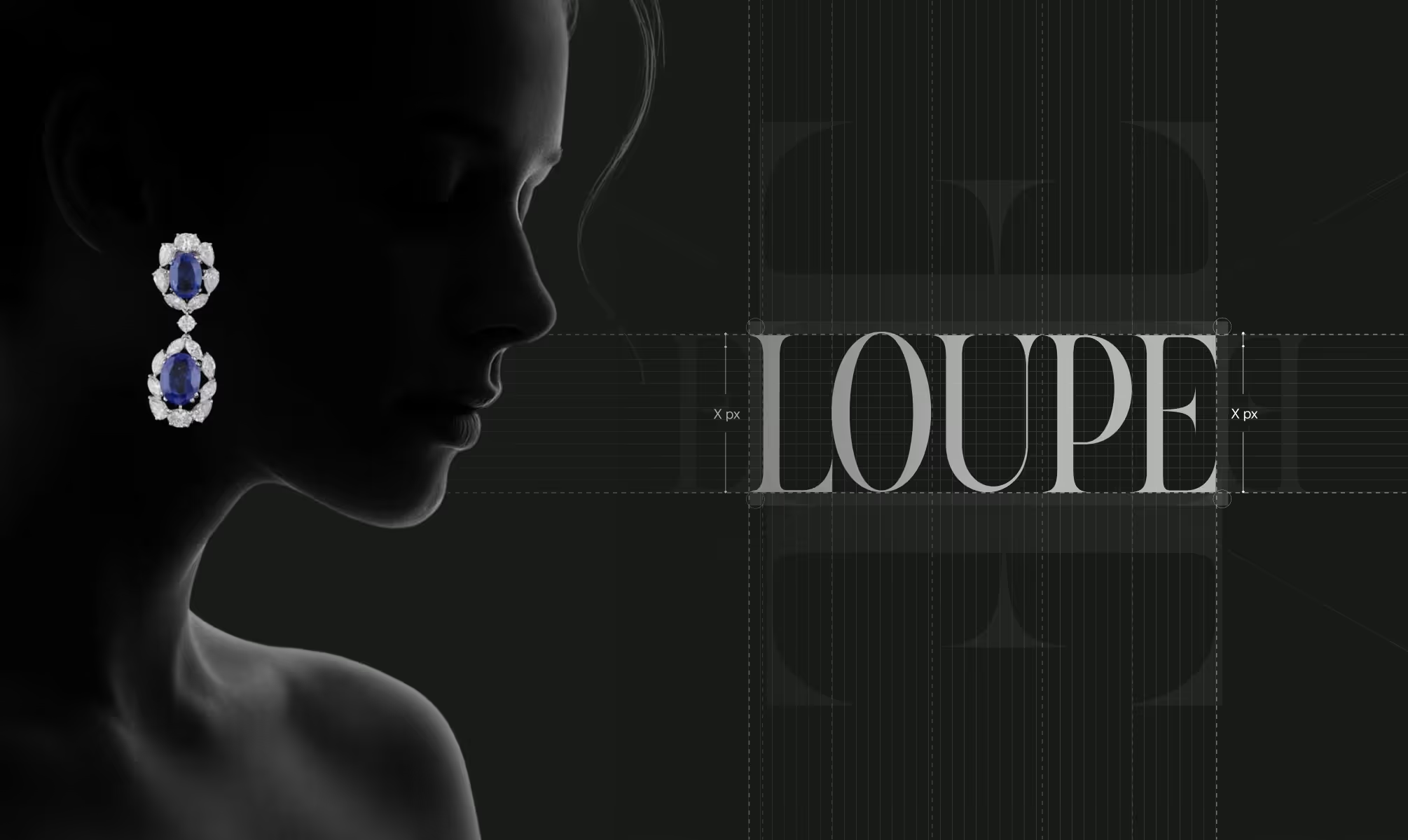
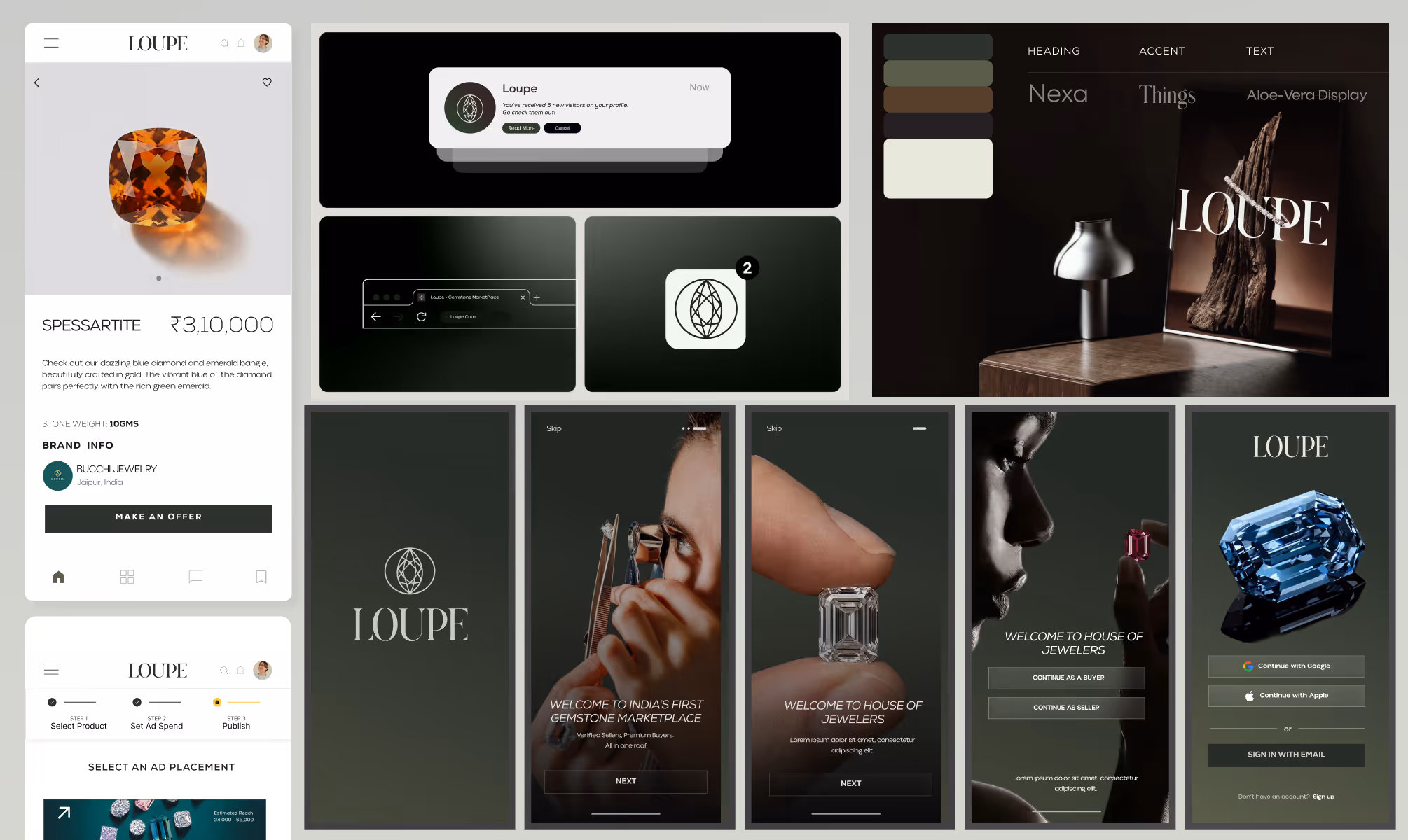
The logomark was built around a faceted gemstone form rendered in clean geometric line work, referencing the loupe, the jeweller's precision magnification tool, as both a naming device and a visual metaphor for verified scrutiny. The mark communicates that every gemstone on the platform has been examined, authenticated, and cleared.
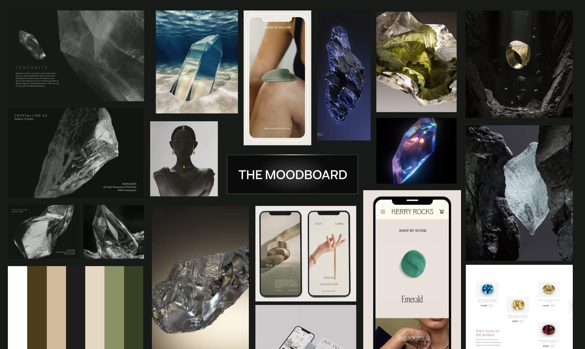
The color palette grounds the identity in earth and stone. Warm Walnut (#543F2A), Deep Forest (#2C332C), Sage Slate (#5A5F49), Parchment (#E7E9DB), and Charcoal (#242021) together produce a palette that reads as naturally luxurious without referencing conventional jewellery industry gold or gloss.
VISUAL IDENTITY
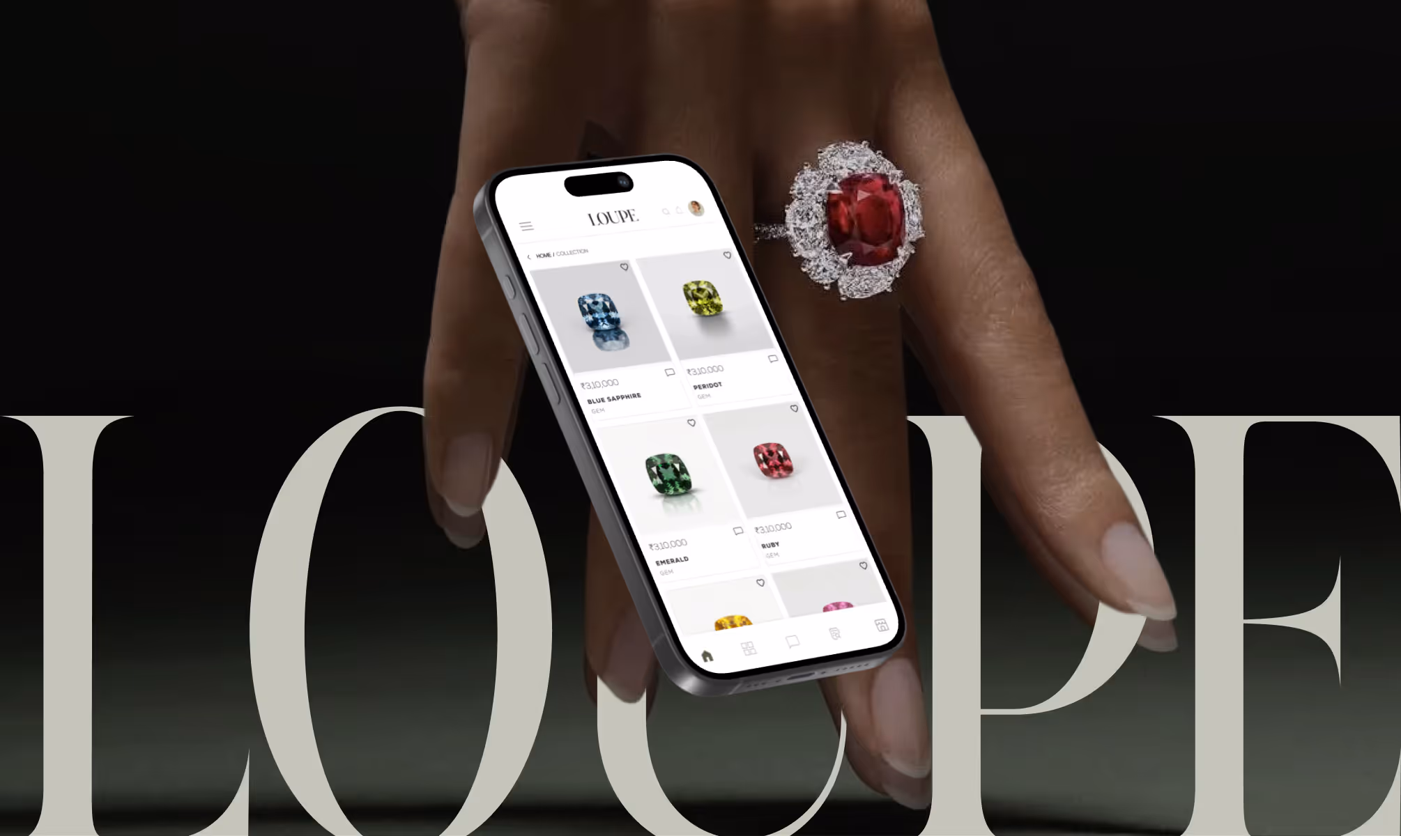
Loupe's visual identity operates with the quiet authority of a trusted institution. The logomark, a geometric gemstone outline constructed within a circular frame, functions as both a precision instrument reference and a seal of verification. Its clean faceted line work communicates craftsmanship and exactitude across all applications, from app icon to packaging.
The typography system uses three complementary faces. Things, a modern serif with refined high-contrast details, anchors the primary brand voice with editorial elegance. Aloevera Display brings expressive personality to headlines and campaign moments. Nexa provides clean geometric structure for interface copy, product listings, and functional communications. Together the three typefaces create a system that moves between luxury editorial and digital utility without friction.
The earth-toned palette ensures the brand reads as grounded and trustworthy, a deliberate departure from the cold metallics and aggressive luxury signifiers that dominate the gemstone and jewellery category.
OUTCOME
Loupe's visual identity operates with the quiet authority of a trusted institution. The logomark, a geometric gemstone outline constructed within a circular frame, functions as both a precision instrument reference and a seal of verification. Its clean faceted line work communicates craftsmanship and exactitude across all applications, from app icon to packaging.
The typography system uses three complementary faces. Things, a modern serif with refined high-contrast details, anchors the primary brand voice with editorial elegance. Aloevera Display brings expressive personality to headlines and campaign moments. Nexa provides clean geometric structure for interface copy, product listings, and functional communications. Together the three typefaces create a system that moves between luxury editorial and digital utility without friction.
The earth-toned palette ensures the brand reads as grounded and trustworthy, a deliberate departure from the cold metallics and aggressive luxury signifiers that dominate the gemstone and jewellery category.
Latest Work
Every project is a chance to try something new. Look at something with a fresh perspective. Do something for the first time.
MYSTIQARE
A global yet rooted brand unifying three global distinct ritual-led lines for Indian skin.
Branding
Packaging
EVOVE
India’s first biohacker-grade skincare brand redefining anti-aging through cellular health maintenance.
Branding
Packaging