SOAK STUDIO
Soak Studio is an Indian body care brand built on the conviction that the body deserves face-grade formulation intelligence. A science-led, sensory-grounded brand serving urban consumers who demand ingredient transparency and ritual that fits real life.
CLIENT
Soak Studio
SERVICES
Branding
Packaging
YEAR
2025
THE OBJECTIVE
We created a creative and experiential e-commerce for Manjn that tells the story of its products' naturalness through a pure and complete visual language. Fluid animations guide users seamlessly, while our clean, minimal design keeps the products as the true protagonists of the experience.
THE APPROACH
The core design challenge with Soak Studio was scale. Body care, by nature, covers a large product surface area spanning multiple categories, variants, and eventual category extensions. The identity had to be malleable enough to stretch across all of them without fracturing.
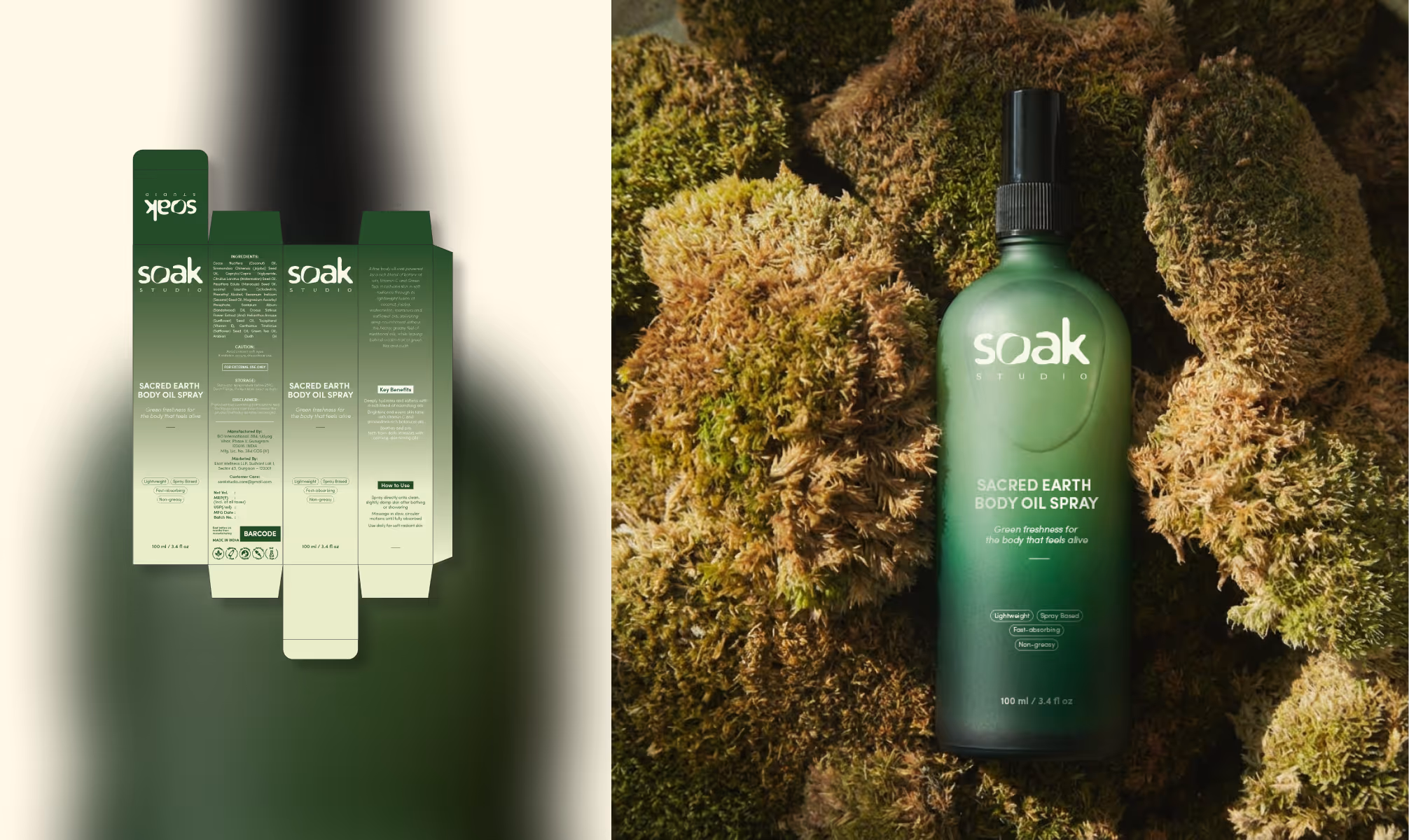
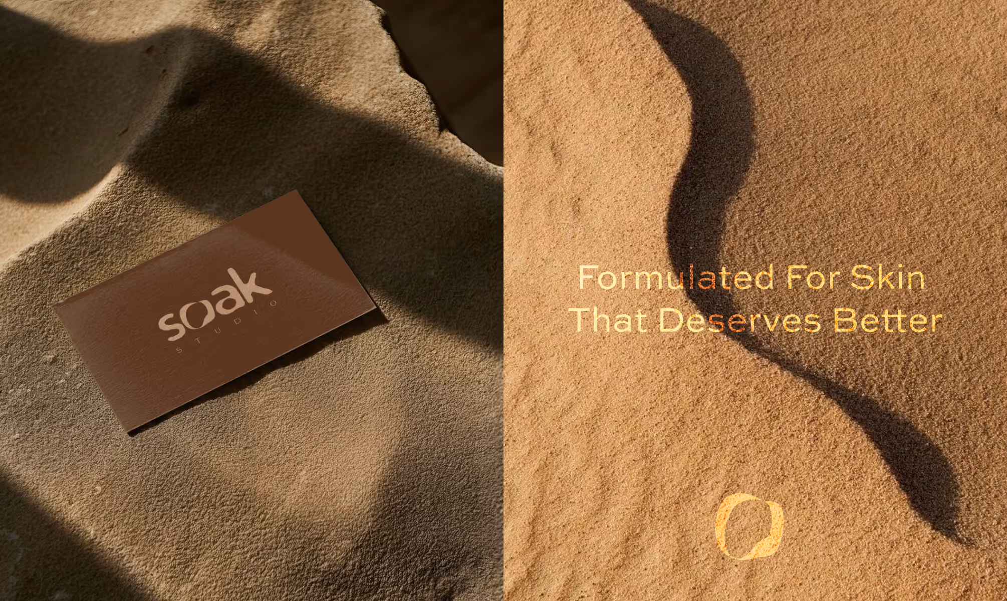
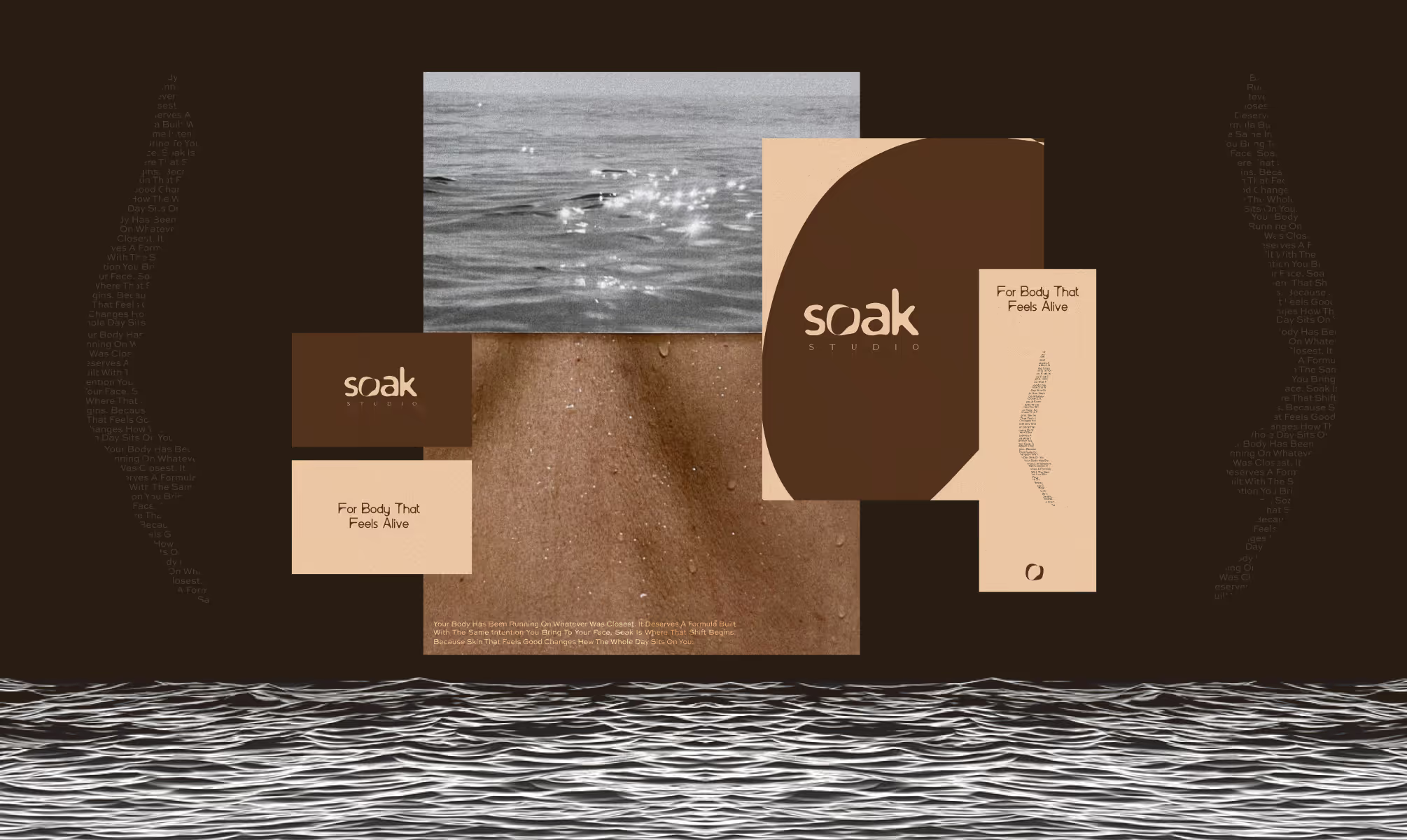
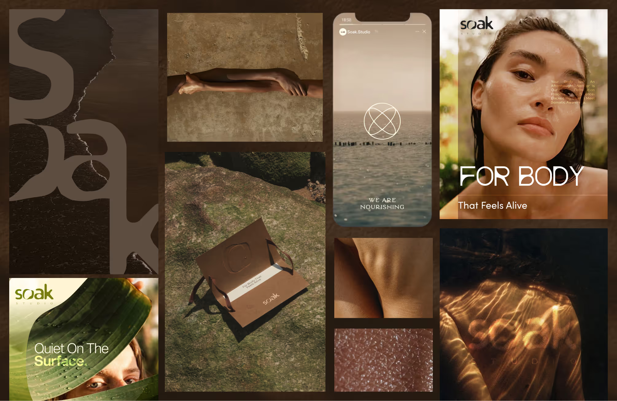
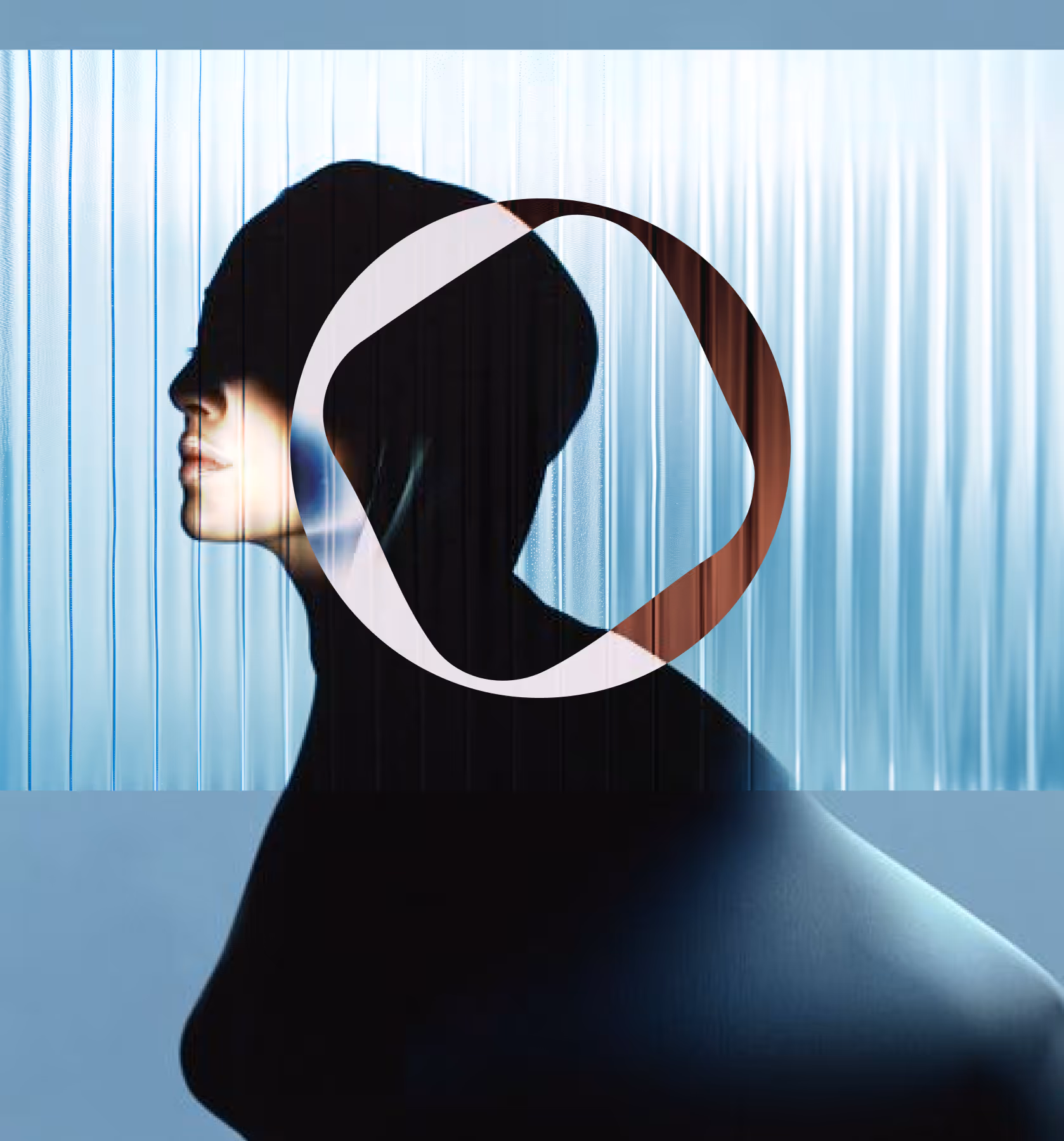
We began with the wordmark, drawing from the brand's inherent fluidity. A conventional letterform base was treated with rounded, fluid terminals, producing a wordmark that visually communicates the act of soaking. The circular element embedded within the "O" operates as a dual symbol, referencing both a ritual vessel and body-centricity without literal illustration.
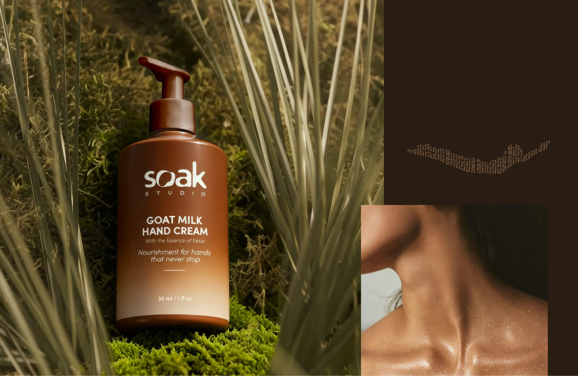
For color, we developed an earthy primary palette anchored in Cafe Noir (#56341D), Ebony (#404D2D), and Light Orange (#F3CDA9), complemented by off-white (#FFFAE7) and Jet (#1D1A1A). Each primary color represents a product category. Within each primary, a dedicated hue spectrum allows variant differentiation through gradient application on packaging, creating shelf distinction while sustaining visual family cohesion. The system scales organically.
Typography pairs Sweet Sans Pro (18 styles, primary) with Pelara as a decorative accent, balancing functional hierarchy with moments of soft sophistication across packaging, stationery, and social touchpoints.
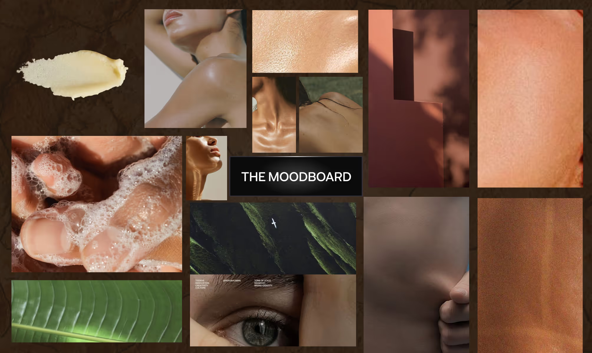
VISUAL IDENTITY
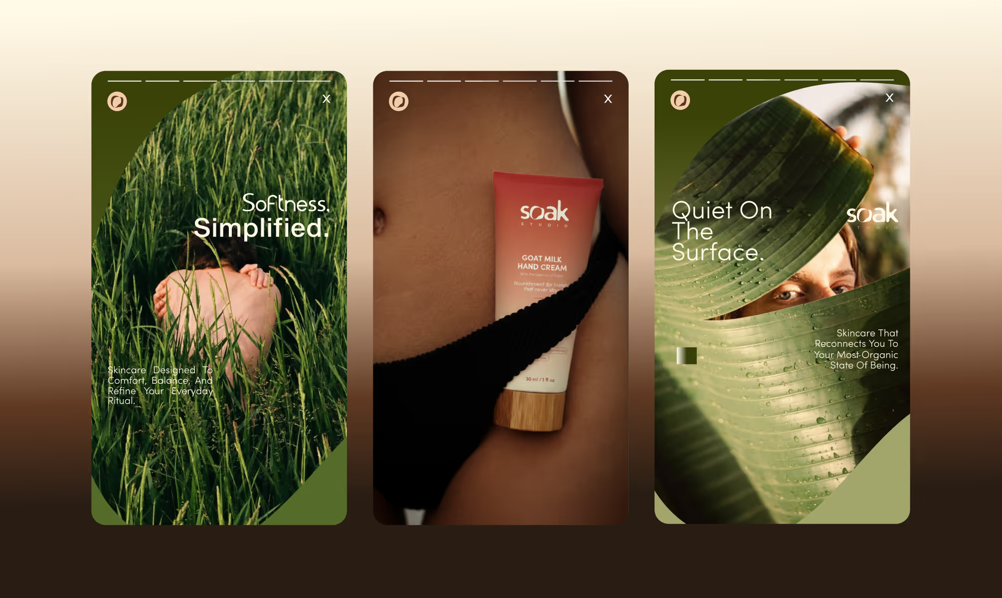
The visual identity for Soak Studio is defined by one principle: grounded fluidity. The wordmark sits low and wide, set in a custom fluid interpretation of a geometric sans-serif, with generous letter spacing that signals unhurried ritual. The circular mark extracted from the "O" serves as a standalone brand icon, adaptable across product caps, social avatars, and packaging embossing.
The color system is architecturally structured. Warm earth tones ground the core brand, while a modular palette of browns, greens, and oranges; each deployed as gradients across product packaging, creates intuitive category navigation for the consumer. The arch-topped label format references apothecary tradition without nostalgia, and rounded pill-shaped attribute tags distill key benefits into scannable, tactile touchpoints.
Sweet Sans Pro anchors the typographic hierarchy across headlines, packaging titles, and product communication. Pelara introduces elevated, refined moments within callouts and secondary copy, injecting character without compromising clarity. The photography direction reinforces the system: real skin, natural texture, warm unfiltered light, rejecting aspirational fantasy in favor of somatic honesty.
OUTCOME
The visual identity for Soak Studio is defined by one principle: grounded fluidity. The wordmark sits low and wide, set in a custom fluid interpretation of a geometric sans-serif, with generous letter spacing that signals unhurried ritual. The circular mark extracted from the "O" serves as a standalone brand icon, adaptable across product caps, social avatars, and packaging embossing.
The color system is architecturally structured. Warm earth tones ground the core brand, while a modular palette of browns, greens, and oranges; each deployed as gradients across product packaging, creates intuitive category navigation for the consumer. The arch-topped label format references apothecary tradition without nostalgia, and rounded pill-shaped attribute tags distill key benefits into scannable, tactile touchpoints.
Sweet Sans Pro anchors the typographic hierarchy across headlines, packaging titles, and product communication. Pelara introduces elevated, refined moments within callouts and secondary copy, injecting character without compromising clarity. The photography direction reinforces the system: real skin, natural texture, warm unfiltered light, rejecting aspirational fantasy in favor of somatic honesty.
Latest Work
Every project is a chance to try something new. Look at something with a fresh perspective. Do something for the first time.
EVOVE
India’s first biohacker-grade skincare brand redefining anti-aging through cellular health maintenance.
Branding
Packaging
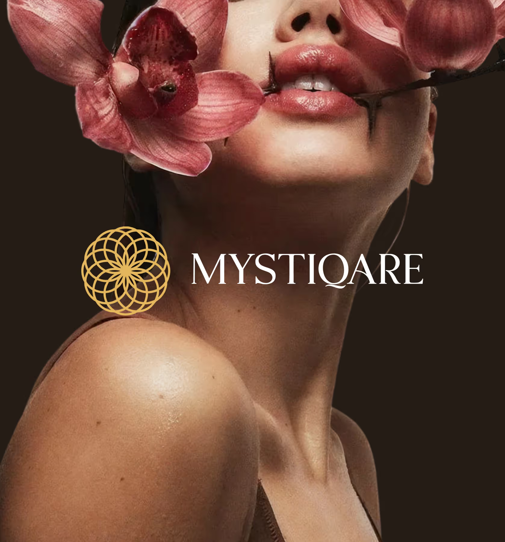
MYSTIQARE
A global yet rooted brand unifying three global distinct ritual-led lines for Indian skin.
Branding
Packaging