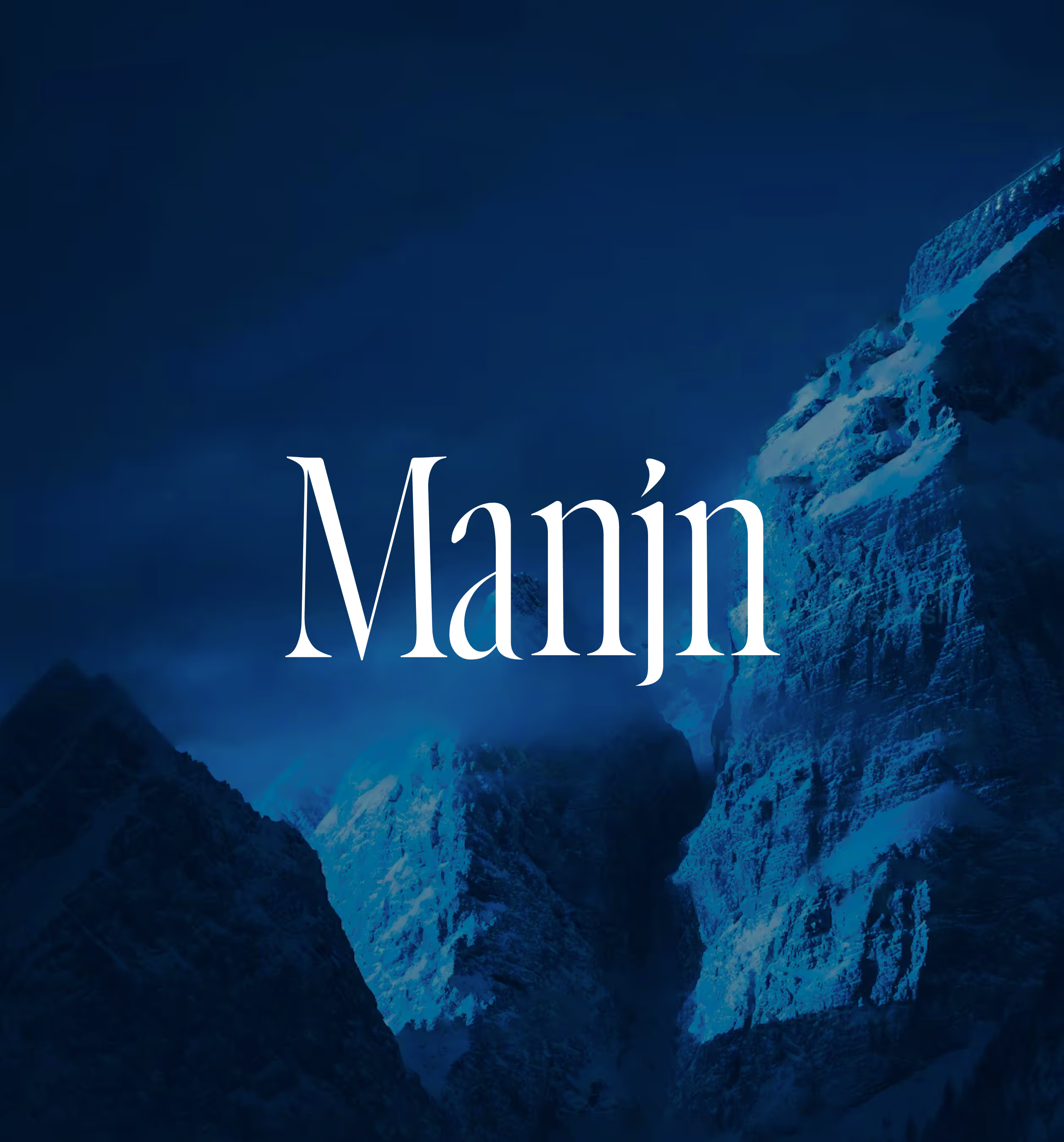
MANJN
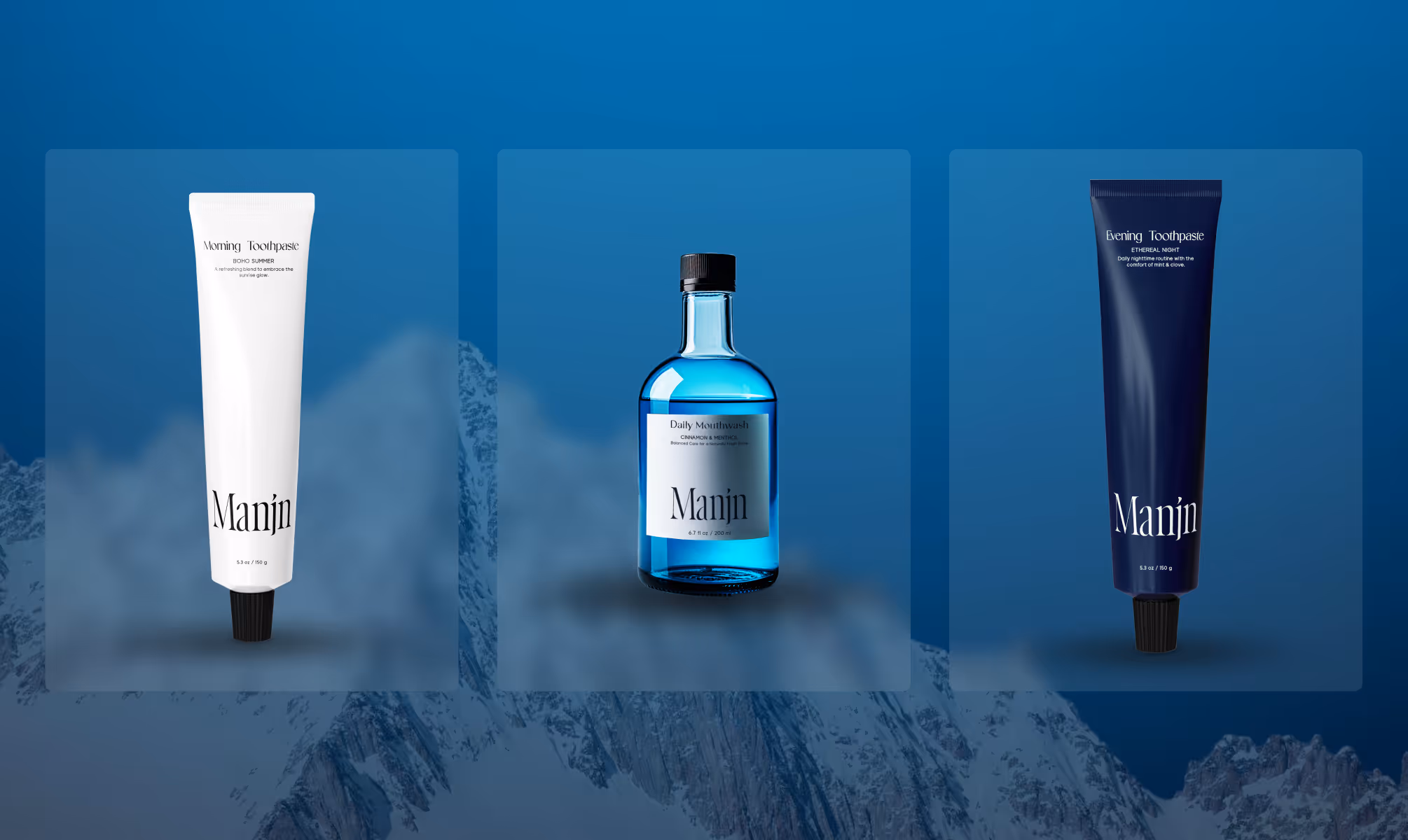
Manjn is a premium Indian oral care brand that translates ancient Indic oral care wisdom into a precise three-product daily regimen: Morning Toothpaste, Evening Toothpaste, and Daily Mouthwash, formulated with mineral-botanical intelligence and positioned for global audiences.
CLIENT
Umendra Exports Private Limited
SERVICES
Branding
Packaging
Website
YEAR
2025-26
THE OBJECTIVE
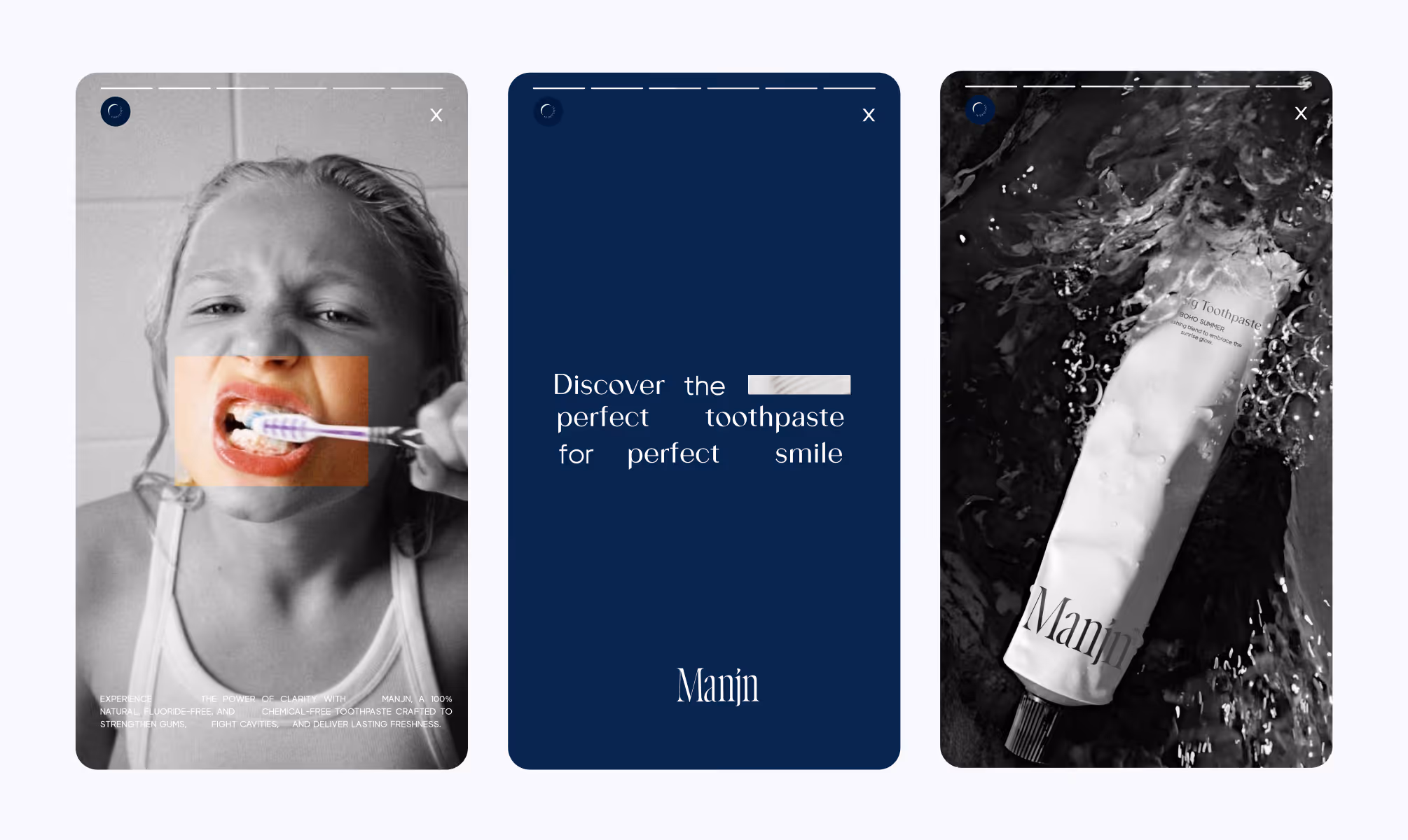
We created a creative and experiential e-commerce for Manjn that tells the story of its products' naturalness through a pure and complete visual language. Fluid animations guide users seamlessly, while our clean, minimal design keeps the products as the true protagonists of the experience.

THE APPROACH
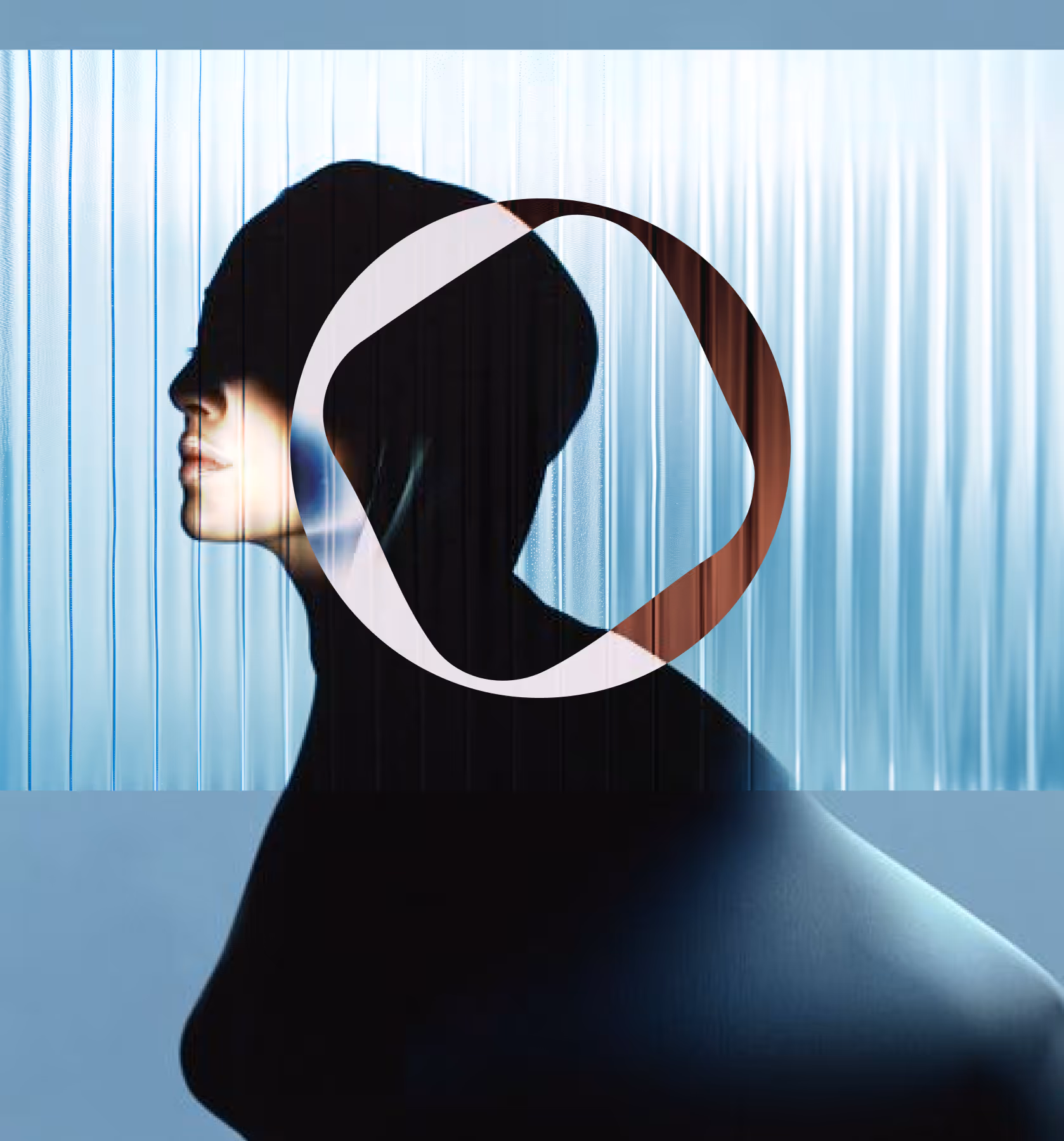
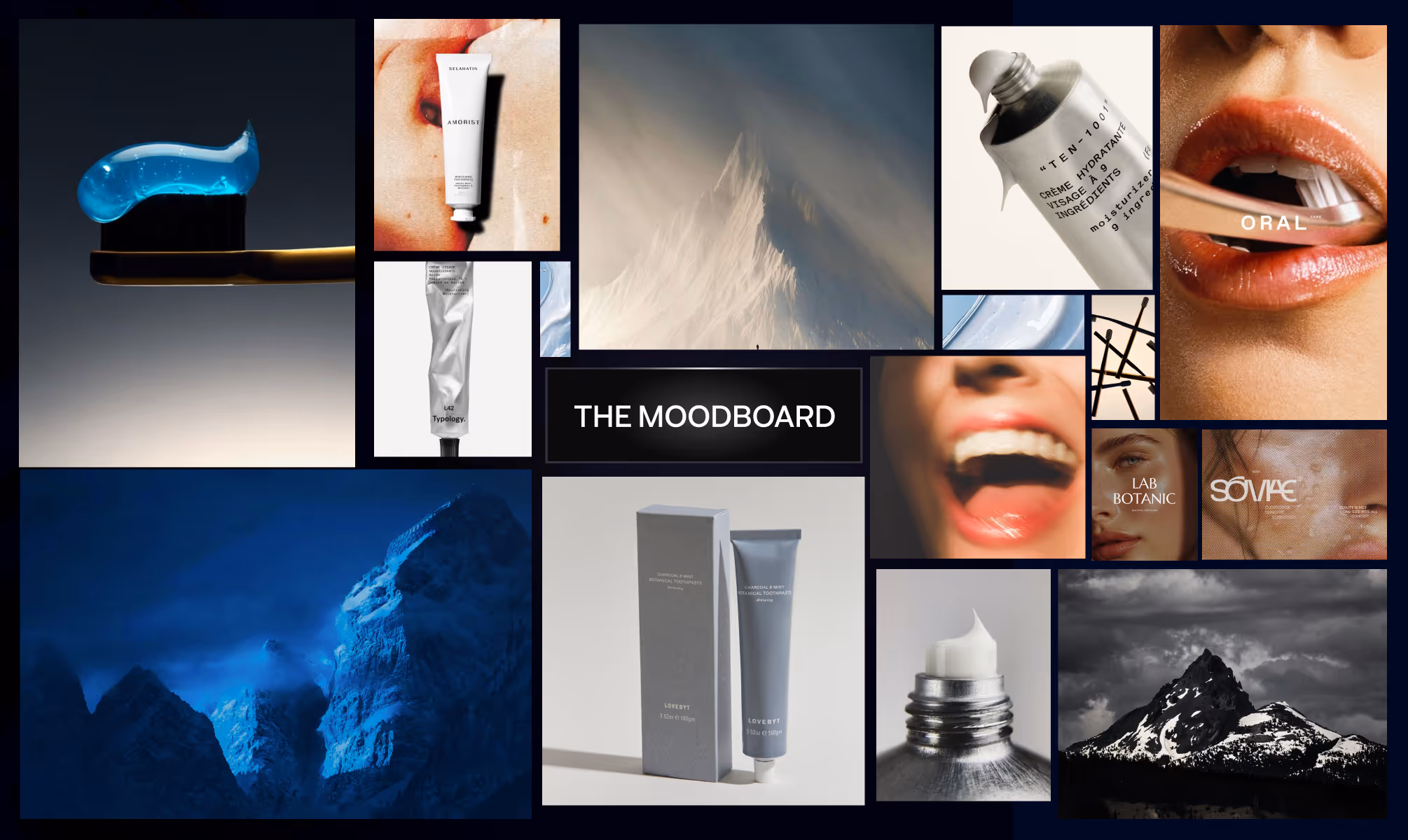
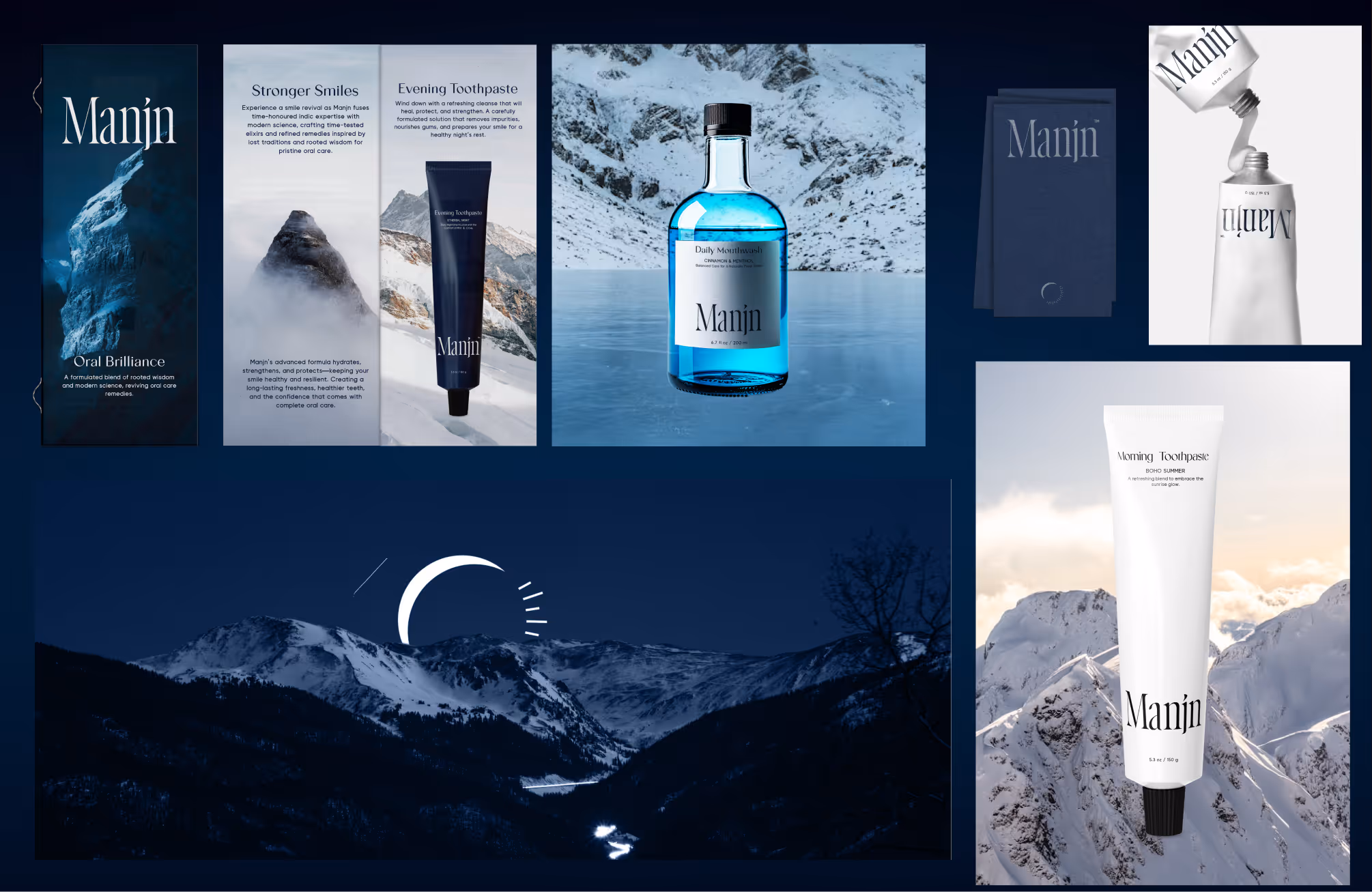
The central design tension was heritage without nostalgia. Manjn draws from the Indian tradition of dant manjan, a centuries-old oral care ritual, but the visual language refuses folklore. The brand is cold, precise, and glacial, rooted in an alpine aesthetic that makes the science feel elemental.
The wordmark uses Gracela as the primary typeface, a face with refined, high-contrast serifs that carry both editorial authority and cultural quietness. Visia Pro serves as the secondary typeface across Light, Regular, Semibold, and Bold weights, handling product communication, interface copy, and packaging hierarchy with Swiss-grade clarity.
The color palette is built on Midnight Navy (#011A3C), Warm Parchment (#F1EDE1), Ice White (#F7F9FD), and Charcoal Black (#070808), four tones that together evoke glacial clarity grounded in Indic warmth.
VISUAL IDENTITY
Manjn's visual identity lives at the intersection of the Indian mirror and the glacier's edge. The wordmark, set in Gracela, carries the quiet authority of a heritage brand without referencing one directly. Its high-contrast letterforms sit with natural confidence across packaging, website, and communications.
The color system is deliberately restrained. Midnight Navy dominates as the hero brand color, carrying depth and clinical precision simultaneously. Warm Parchment introduces the earthiness of Indic tradition. Ice White and Charcoal Black govern contrast and legibility across all touchpoints.
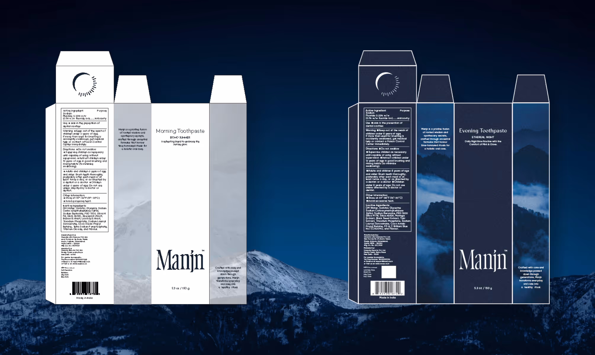
Packaging design uses a clean tubular format with minimal label architecture, letting the navy and parchment palette do the tonal work. Product differentiation between Morning, Evening, and Mouthwash is handled through copy hierarchy and contextual photography rather than disruptive color changes, keeping the family visually cohesive across all three SKUs.

OUTCOME
Manjn's visual identity lives at the intersection of the Indian mirror and the glacier's edge. The wordmark, set in Gracela, carries the quiet authority of a heritage brand without referencing one directly. Its high-contrast letterforms sit with natural confidence across packaging, website, and communications.
The color system is deliberately restrained. Midnight Navy dominates as the hero brand color, carrying depth and clinical precision simultaneously. Warm Parchment introduces the earthiness of Indic tradition. Ice White and Charcoal Black govern contrast and legibility across all touchpoints.
Packaging design uses a clean tubular format with minimal label architecture, letting the navy and parchment palette do the tonal work. Product differentiation between Morning, Evening, and Mouthwash is handled through copy hierarchy and contextual photography rather than disruptive color changes, keeping the family visually cohesive across all three SKUs.
Latest Work
Every project is a chance to try something new. Look at something with a fresh perspective. Do something for the first time.
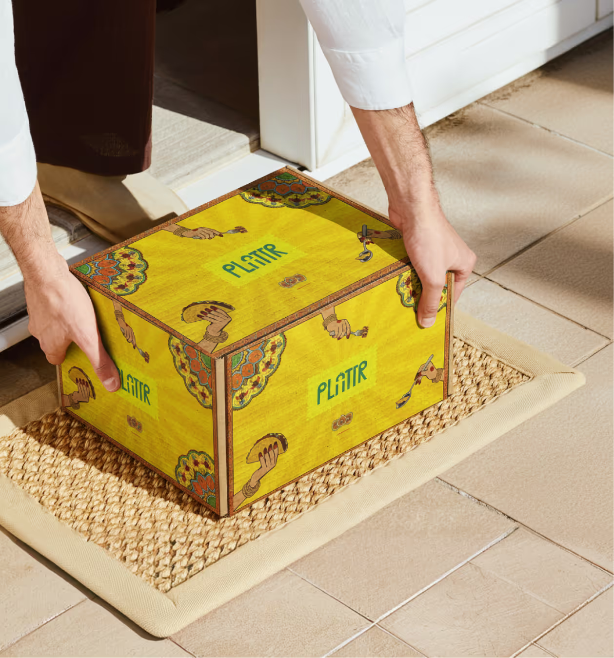
PLATTR
Plattr is a bulk catering platform built for corporate and household events.
Branding
Packaging
UI/UX
EVOVE
India’s first biohacker-grade skincare brand redefining anti-aging through cellular health maintenance.
Branding
Packaging