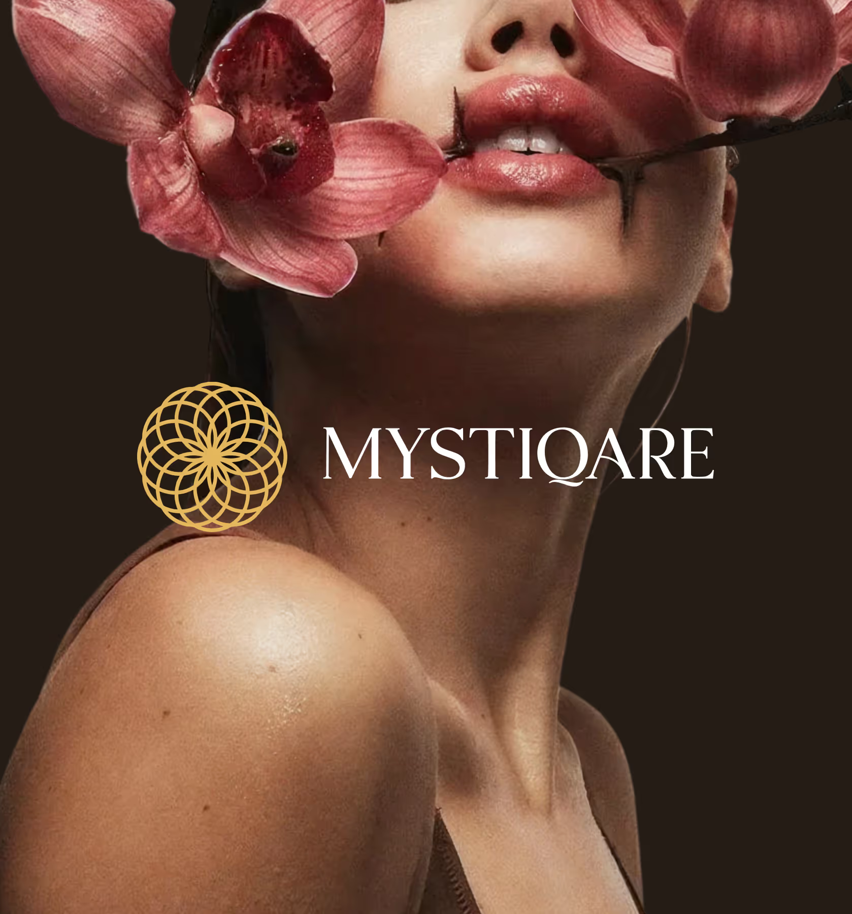
MYSTIQARE
Mystiqare is a global-grade skincare brand that studies the wisdom of international beauty rituals and re-engineers every formulation with climate intelligence and melanin respect, delivering world-class skincare precision built specifically for Indian skin.
CLIENT
MYSTIQARE
SERVICES
Branding
Packaging
YEAR
2025
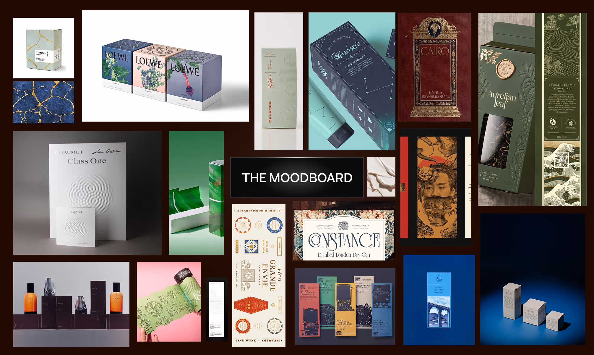
THE OBJECTIVE
We created a creative and experiential e-commerce for Manjn that tells the story of its products' naturalness through a pure and complete visual language. Fluid animations guide users seamlessly, while our clean, minimal design keeps the products as the true protagonists of the experience.
THE APPROACH
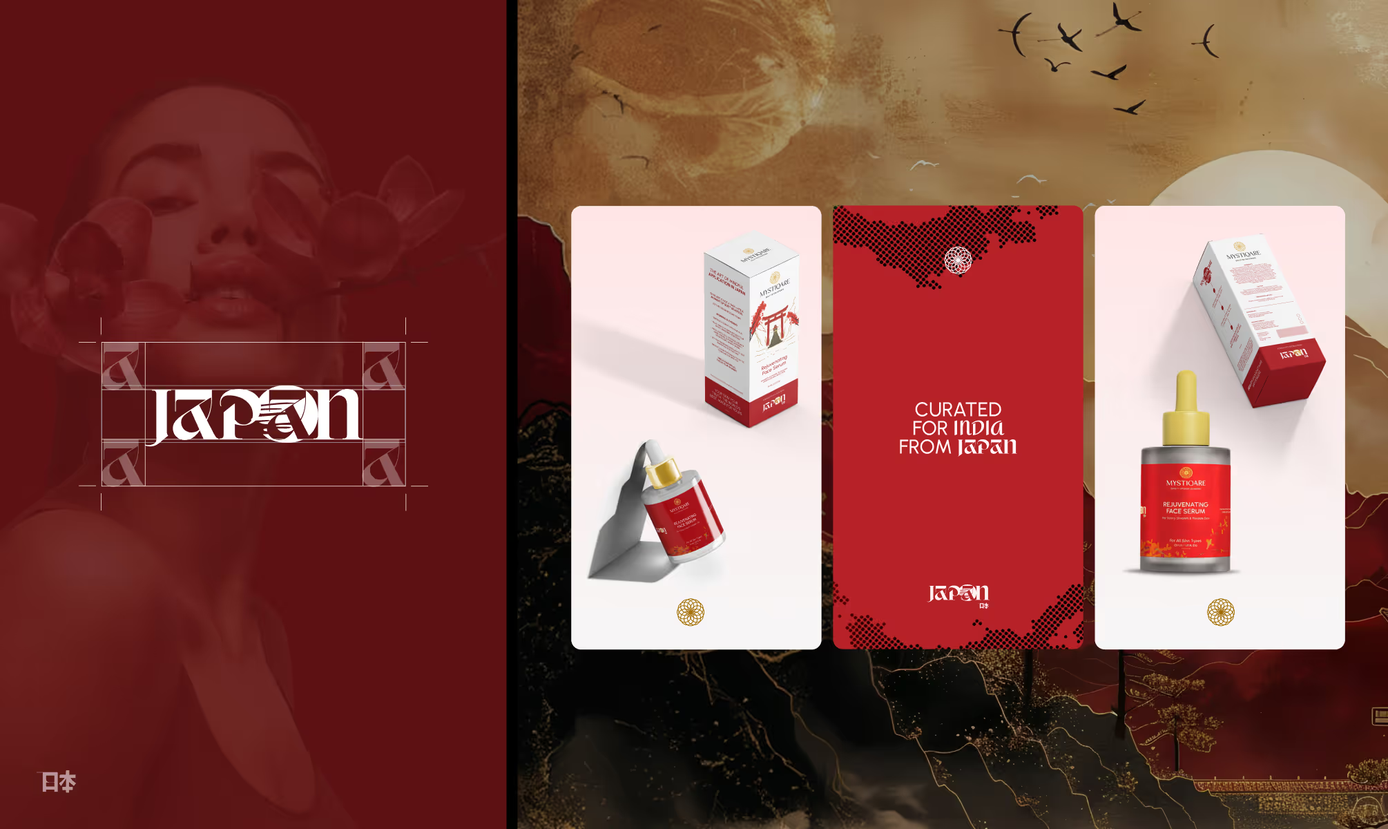
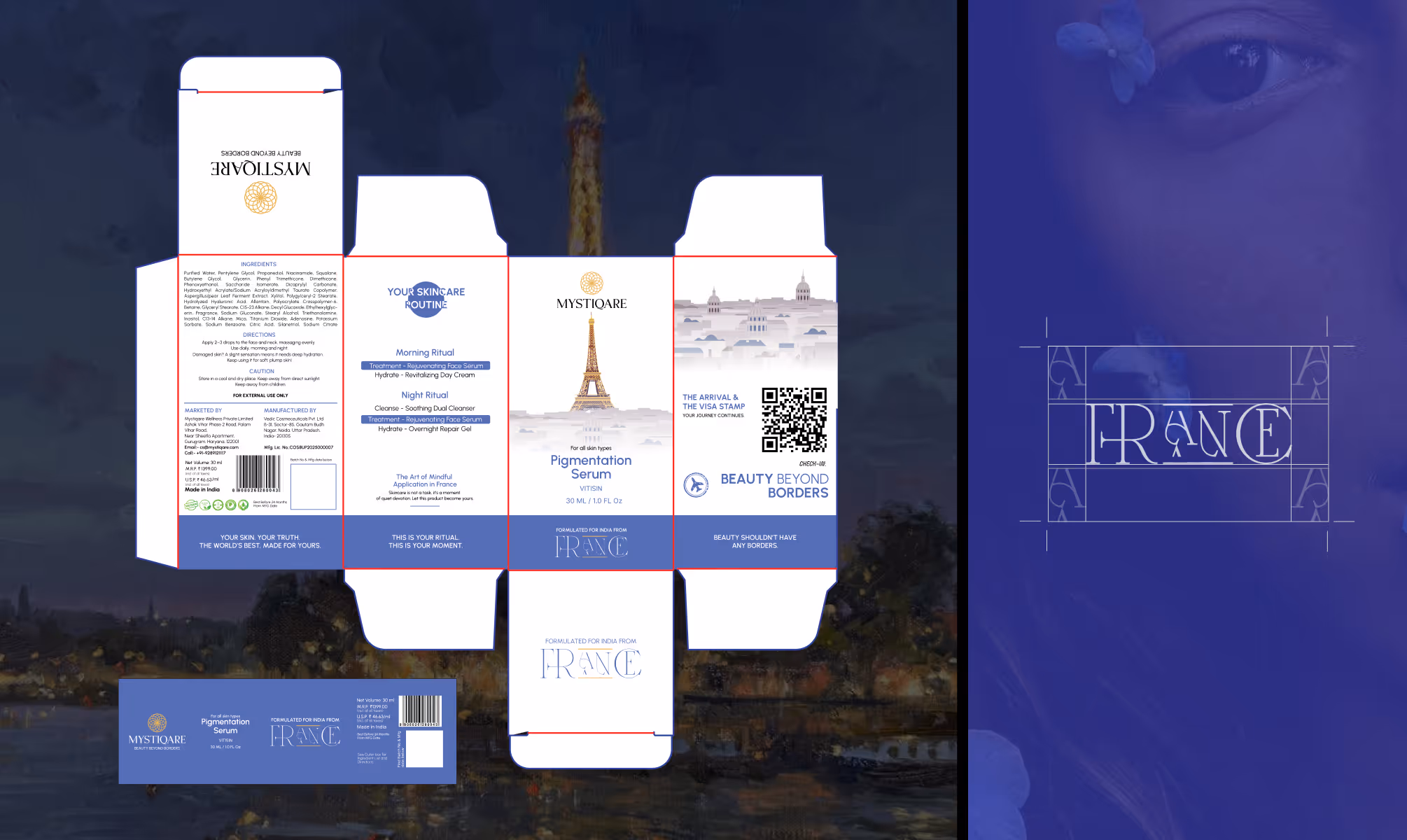
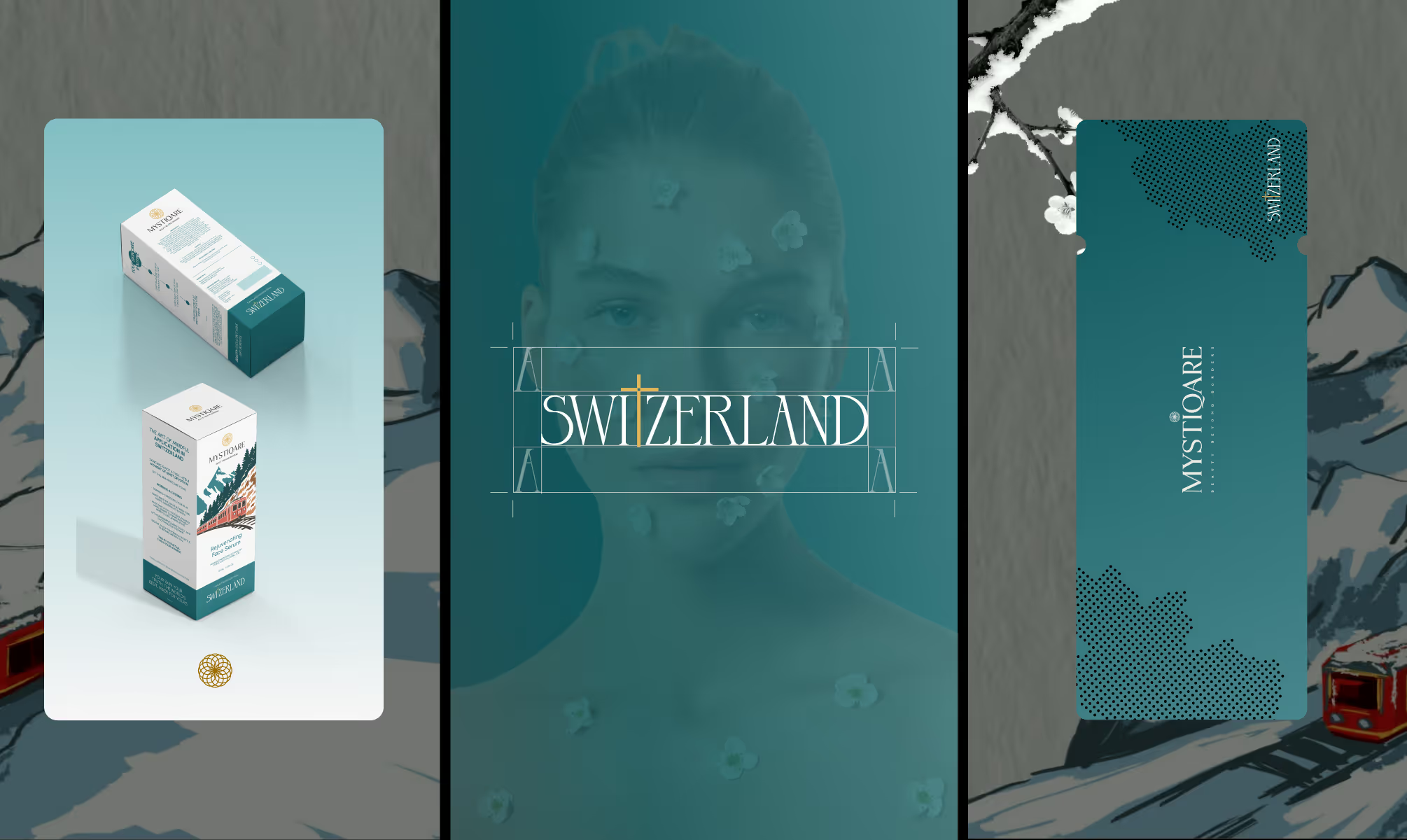
The central design challenge with Mystiqare was resolving a genuine brand tension: the formulations draw authority from global geographies, Japan, France, and Switzerland, yet the product exists entirely for Indian skin. A single unified identity would collapse that duality. Three disconnected brands would lose coherence. The solution was a master-sub brand architecture.
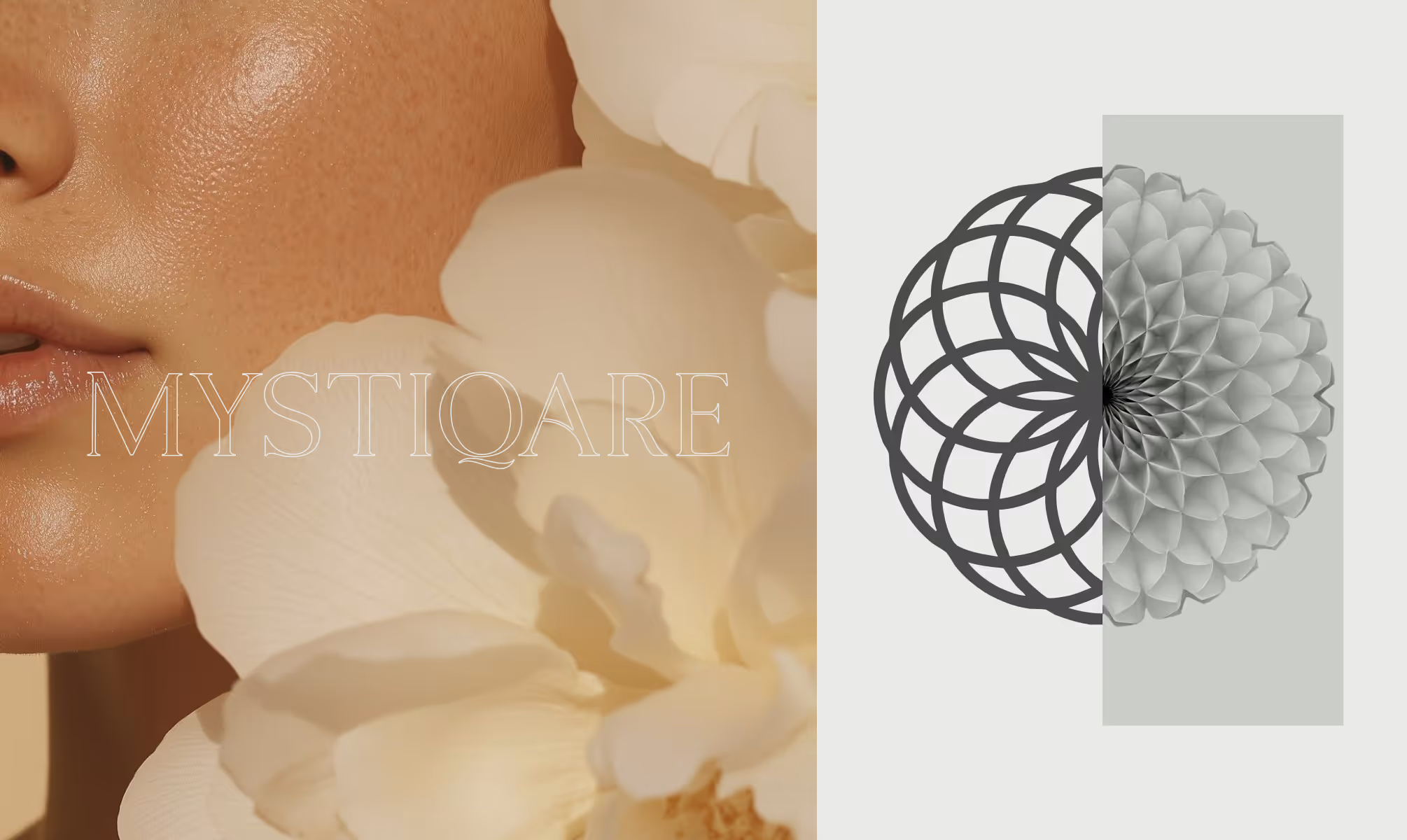
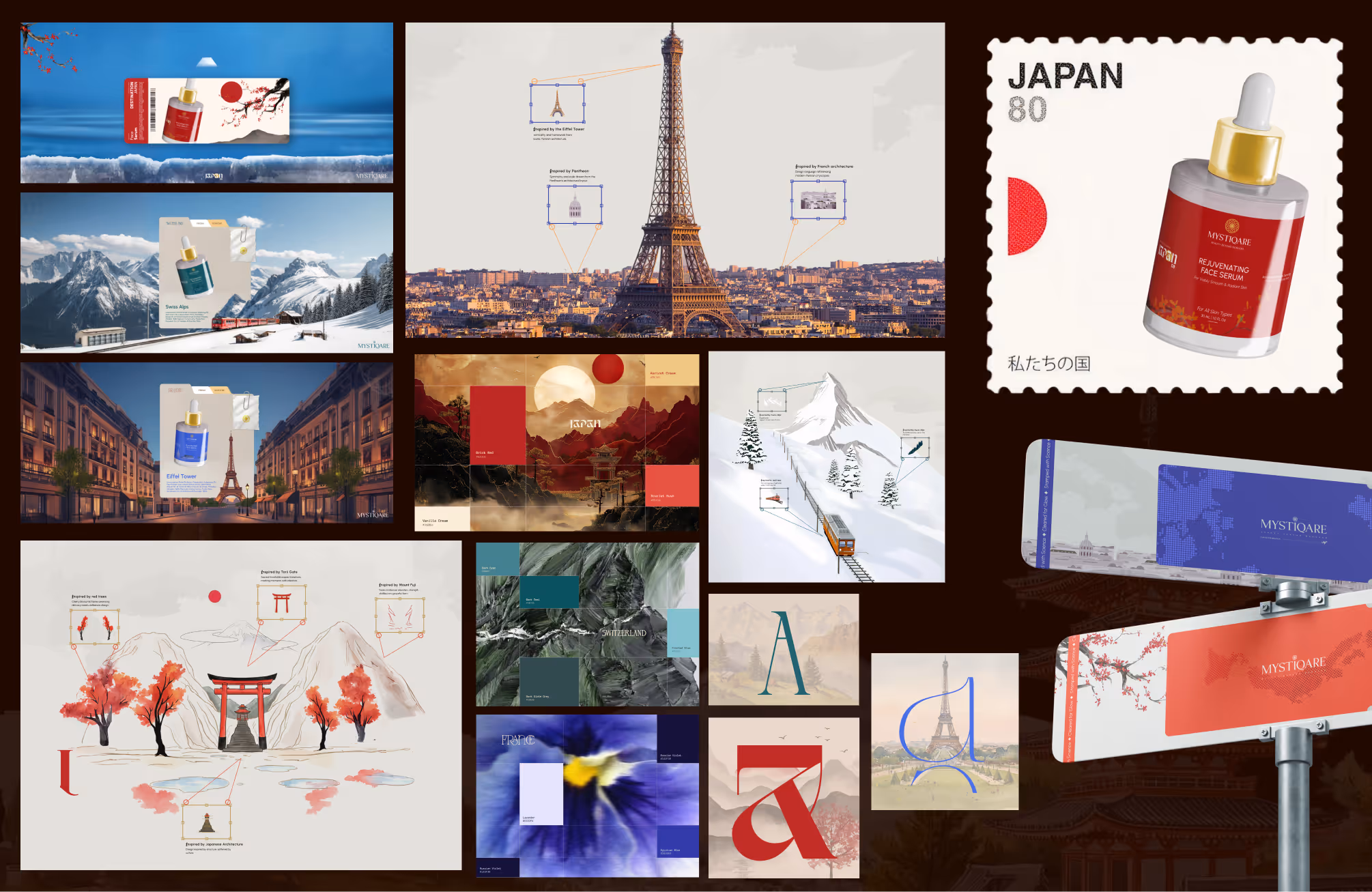
The master brand, Mystiqare, was built with a Vedic, Ayurvedic visual sensibility, establishing the Indian root. The primary wordmark uses letterforms that merge Japanese typographic precision with flowing curves, referencing kintsugi's philosophy of intentional beauty. The symbol mark operates on its own geometric rhythm, with exclusion zones designed as visual breathing room, referencing the Japanese principle of ma, the meaningful pause that gives form its power.
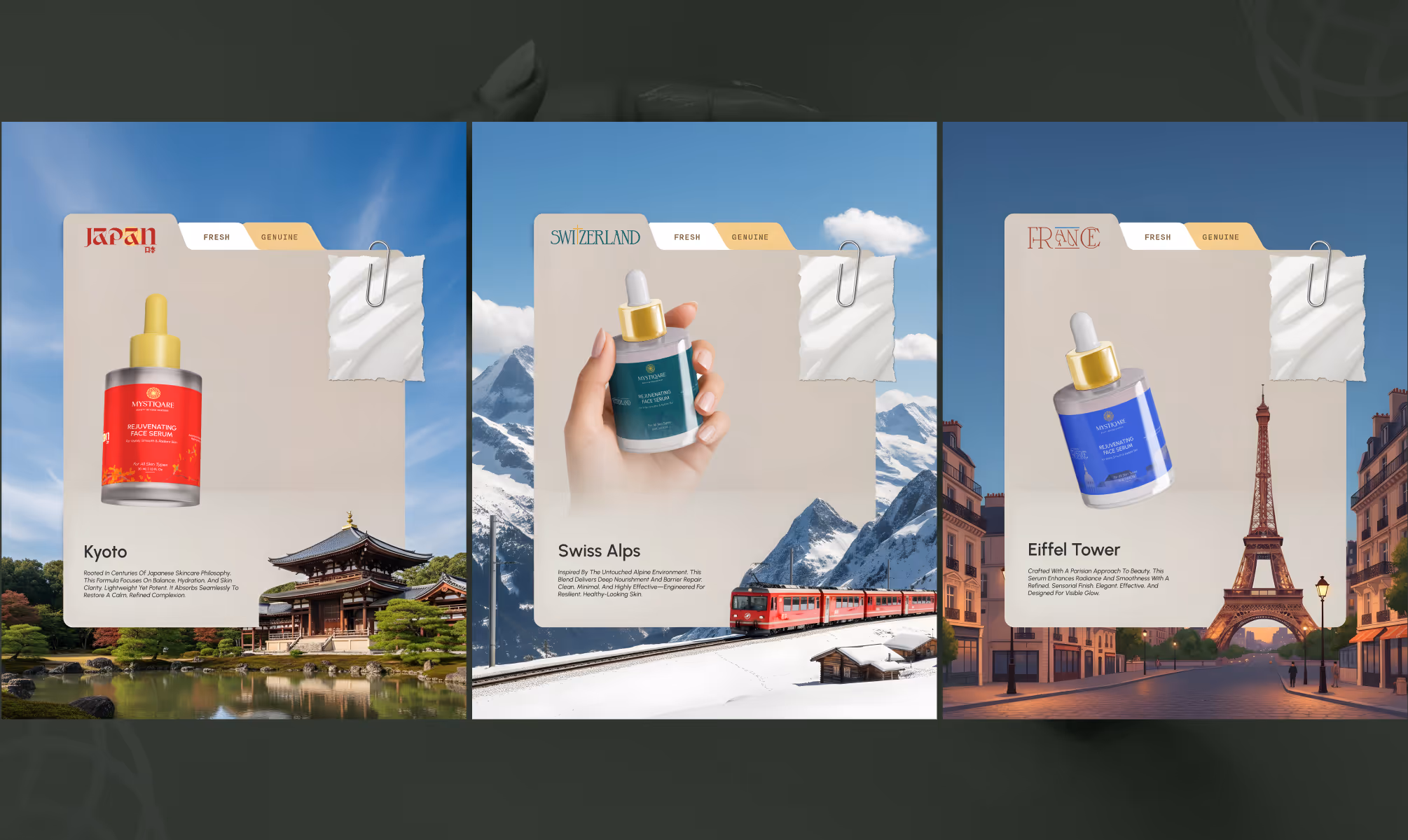
Each sub-brand then claims its own visual territory. Japan received an identity built on restraint, clean geometric layouts echoing shoji screen precision, red accent tones referencing torii gates, and a palette of Apricot Cream (#EBC985), Brick Red (#B21D25), Scarlet Rush (#DB4742), and Vanilla Cream (#F8EDD6). Delicate line illustrations of sakura branches and Mount Fuji appear as secondary graphic elements, never competing with clinical product information.
France was crafted through the lens of Art Deco geometry and Parisian typographic elegance. The sub-brand wordmark balances mathematical stroke precision with organic fluidity. The color palette draws from Parisian twilight, lavender fields, and champagne. Architectural silhouettes of the Eiffel Tower, the Pantheon, and Haussmann boulevards appear as minimal line work, whispering rather than declaring, consistent with French understatement.
Switzerland was engineered with Swiss International Style precision. The wordmark integrates the iconic cross as a structural typographic element, with letterforms built to watchmaker-level proportion. The palette operates in Dark Cyan (#47868C), Dark Teal (#0E575D), Frosted Blue (#87C6CD), and Dark Slate Grey (#324B4D). The exclusion zone was constructed with the exactitude of a technical blueprint, referencing the regulated spacing discipline of Helvetica and Swiss poster design.
Packaging design across all three sub-brands maintains the master-sub hierarchy. Each collection carries its own cultural color code paired with clean layouts and modern typography. SKU-level variation was governed by content placement and information hierarchy, with arch-format label structures, pill-shaped attribute tags, and a consistent "Formulated for India from [Geography]" lock-up anchoring every product to both its origin and its destination. The website was designed as a transitional, scroll-driven geographic journey, moving users through each territory with purposeful motion design.
VISUAL IDENTITY
Mystiqare's visual identity system operates across two levels simultaneously. At the master brand level, the identity is grounded, precise, and quietly Vedic. The primary wordmark uses a custom geometric construction that merges Japanese typographic influence with fluid organic terminals, a deliberate fusion that sets the brand's dual DNA from first glance. The symbol mark, a structured ring-based form, functions independently across digital, packaging, and brand communication touchpoints.
At the sub-brand level, each geography receives a fully realized visual world. Japan: ceremonial reds, cream warmth, sakura and Fuji line illustrations, shoji-referenced grid layouts. France: Art Deco letterforms, Parisian twilight tones, Eiffel lattice and Invalides dome silhouettes, understated luxury at every scale. Switzerland: cross-integrated typography, teal and slate precision palettes, Swiss grid discipline applied to every packaging surface.
The typographic system across all three sub-brands prioritizes legibility and cultural reference in equal measure, with modern sans-serif clarity functioning as the structural backbone while decorative elements carry geographic identity. Packaging copywriting deploys a recurring narrative device, "The Arrival and The Visa Stamp," creating a journey metaphor that ties all three collections into a single global story.
OUTCOME
Mystiqare's visual identity system operates across two levels simultaneously. At the master brand level, the identity is grounded, precise, and quietly Vedic. The primary wordmark uses a custom geometric construction that merges Japanese typographic influence with fluid organic terminals, a deliberate fusion that sets the brand's dual DNA from first glance. The symbol mark, a structured ring-based form, functions independently across digital, packaging, and brand communication touchpoints.
At the sub-brand level, each geography receives a fully realized visual world. Japan: ceremonial reds, cream warmth, sakura and Fuji line illustrations, shoji-referenced grid layouts. France: Art Deco letterforms, Parisian twilight tones, Eiffel lattice and Invalides dome silhouettes, understated luxury at every scale. Switzerland: cross-integrated typography, teal and slate precision palettes, Swiss grid discipline applied to every packaging surface.
The typographic system across all three sub-brands prioritizes legibility and cultural reference in equal measure, with modern sans-serif clarity functioning as the structural backbone while decorative elements carry geographic identity. Packaging copywriting deploys a recurring narrative device, "The Arrival and The Visa Stamp," creating a journey metaphor that ties all three collections into a single global story.
Latest Work
Every project is a chance to try something new. Look at something with a fresh perspective. Do something for the first time.
LOUPE
A trusted gemstone marketplace ensuring authenticity, secure transactions, eliminating fraud.
Branding
UI/UX
GSF
GSF India early-stage VC fund backing founders since 2012, funding disruptive startups.
Branding
Website