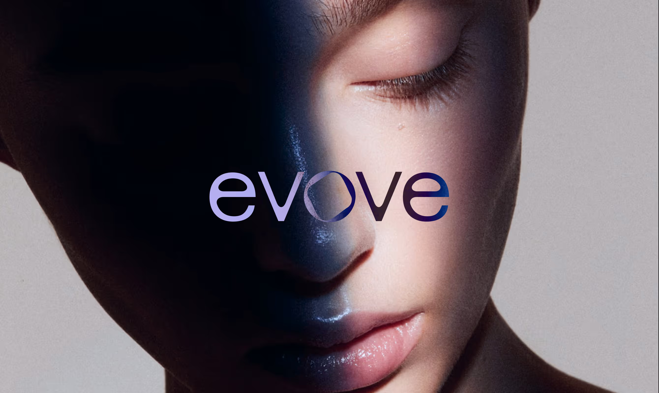
EVOVE
Evove is India's first biohacker-grade skincare brand that reframes anti-aging as cellular health maintenance. Built on probiotics, exosomes, and nanoactives, it delivers measurable, science-first results for consumers who demand proof over promises and precision over packaging.
CLIENT
EVOVE
SERVICES
Branding
Packaging
YEAR
2025
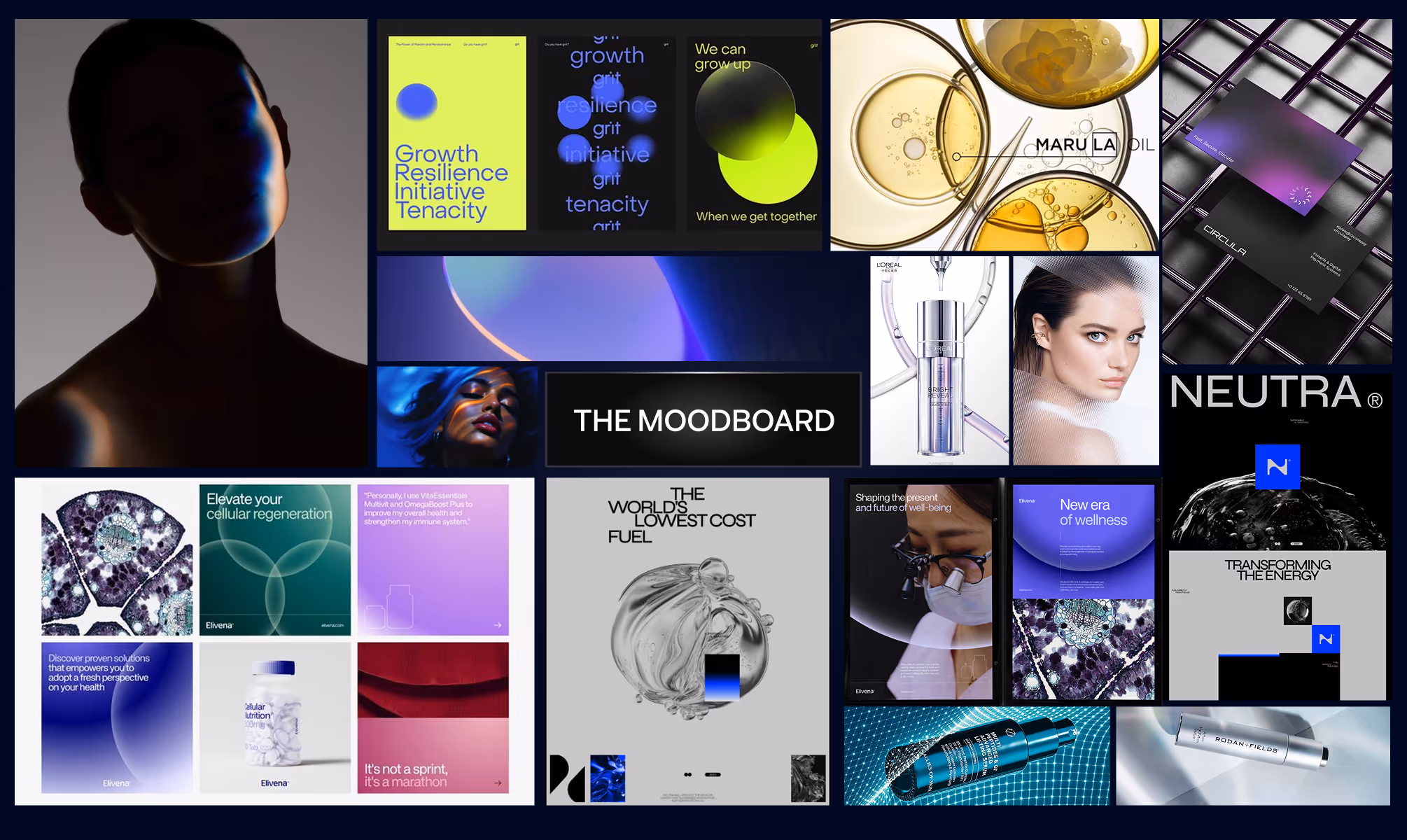
THE OBJECTIVE
We created a creative and experiential e-commerce for Manjn that tells the story of its products' naturalness through a pure and complete visual language. Fluid animations guide users seamlessly, while our clean, minimal design keeps the products as the true protagonists of the experience.
THE APPROACH
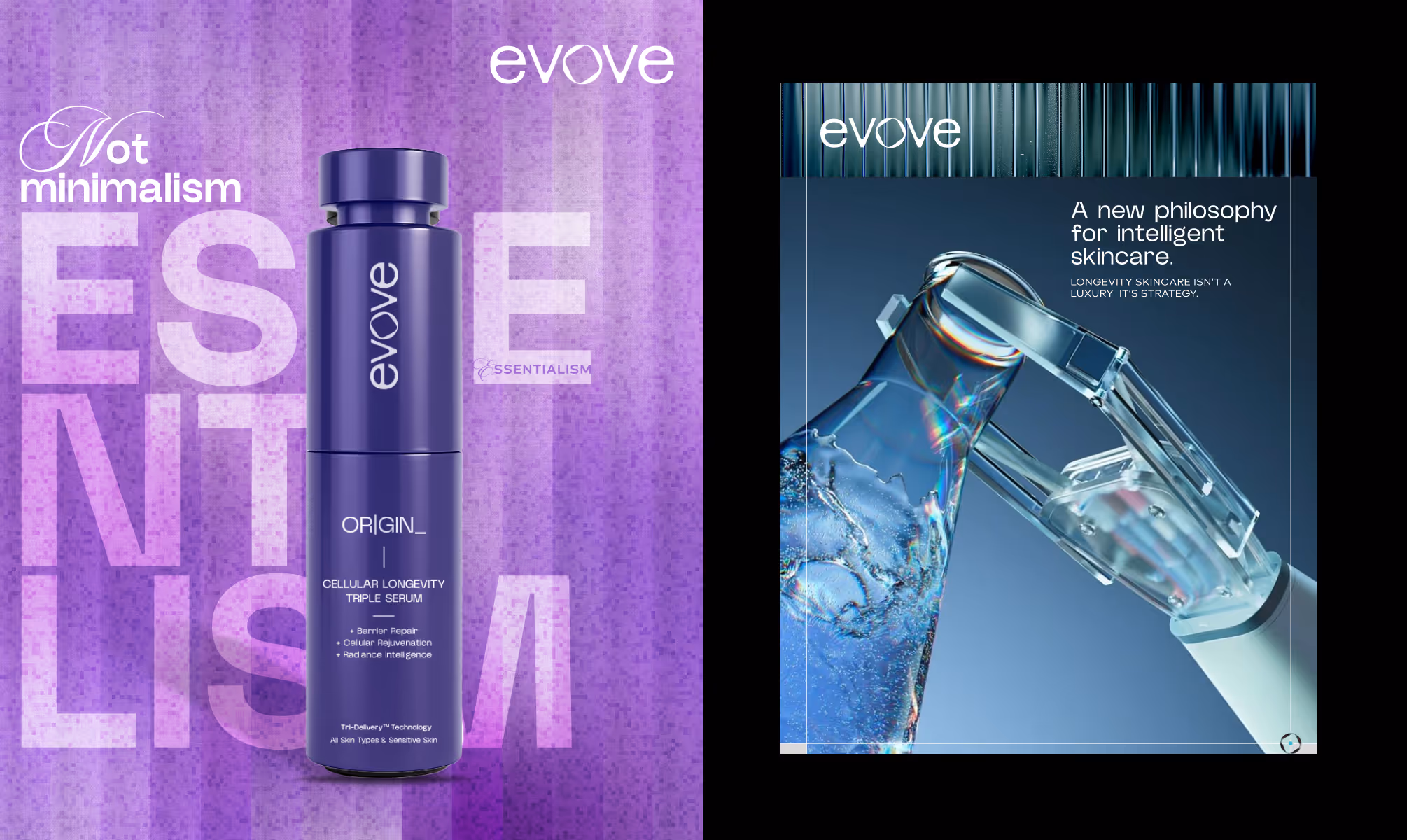
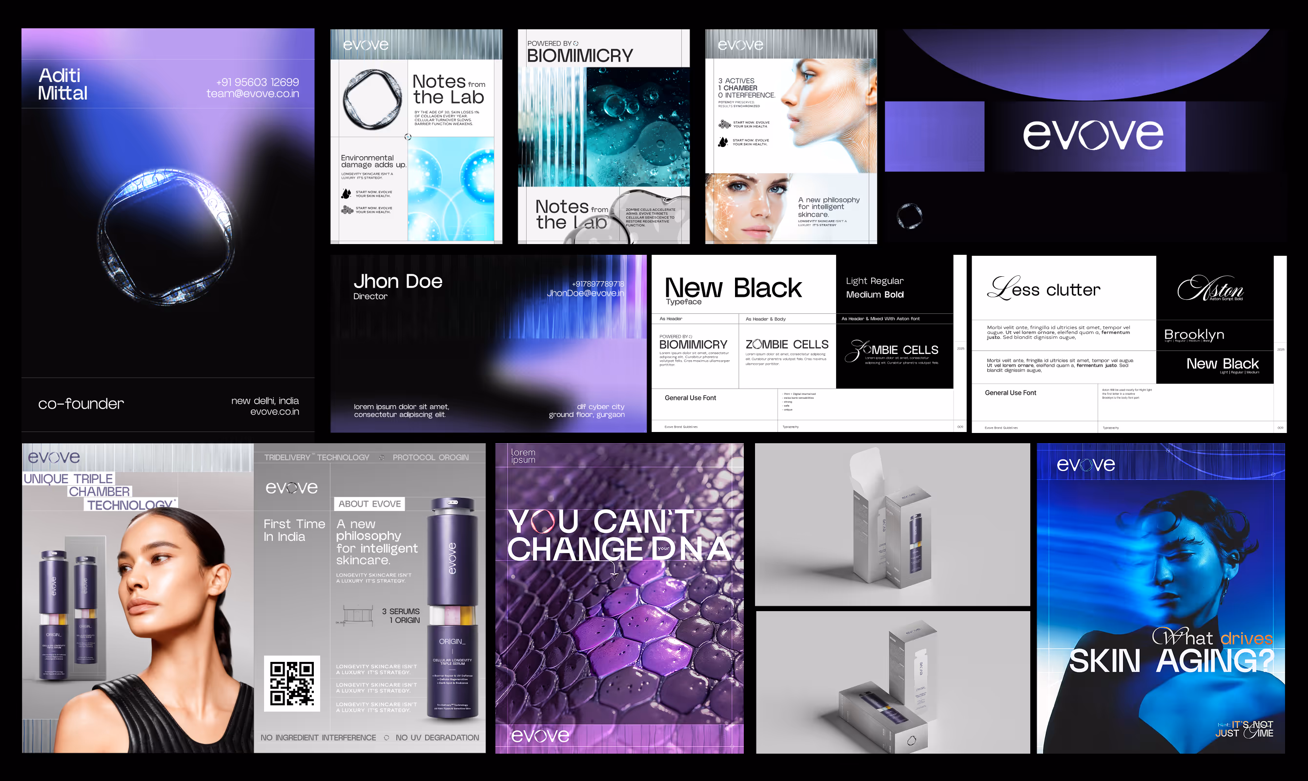
The core strategic decision was category rejection. Evove refuses to compete on conventional anti-aging terms, positioning skincare as a protocol, not a product, anchored by the brand line Decode Potentiality.
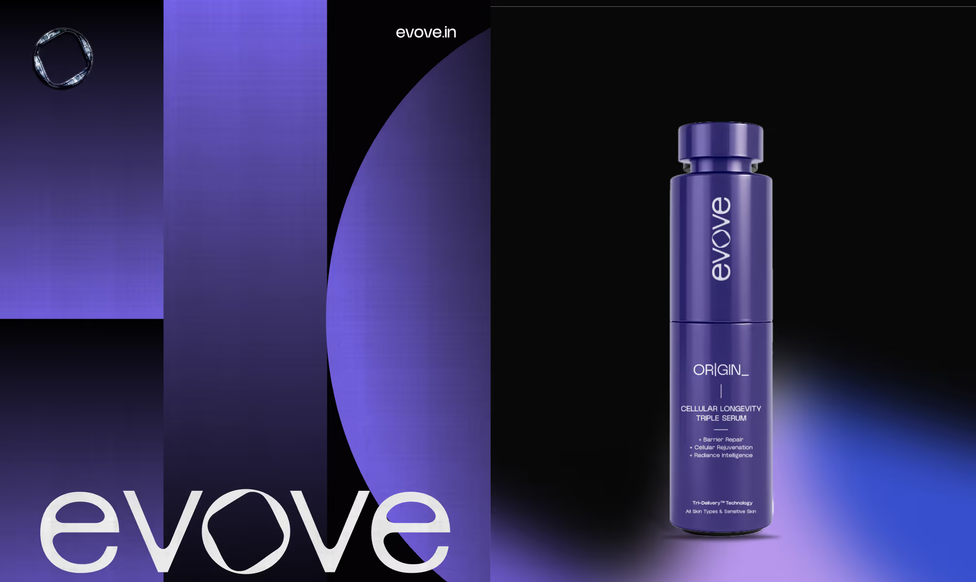
The wordmark uses custom rounded letterforms governed by simplicity, with the central O carrying a proprietary organic ring mark referencing both cellular biology and brand iconography. Exclusion zones are defined by typographic cap-height measurement, not arbitrary spacing.
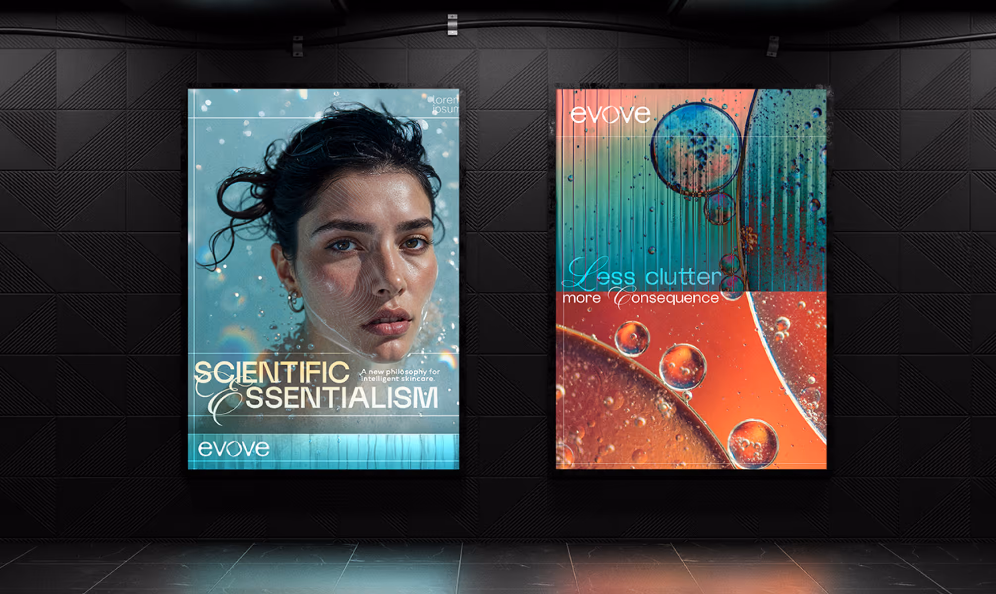
The color system is led by Crocus Purple (#312768 to #B6A9FF), with Cerulean Blue, Baby Purple, and Mint Green as supporting spectrums. Gradients function as background environments in marketing assets. Typography pairs New Black for headlines, Brooklyn for body copy, and Aston Script as a decorative accent for editorial moments.
VISUAL IDENTITY
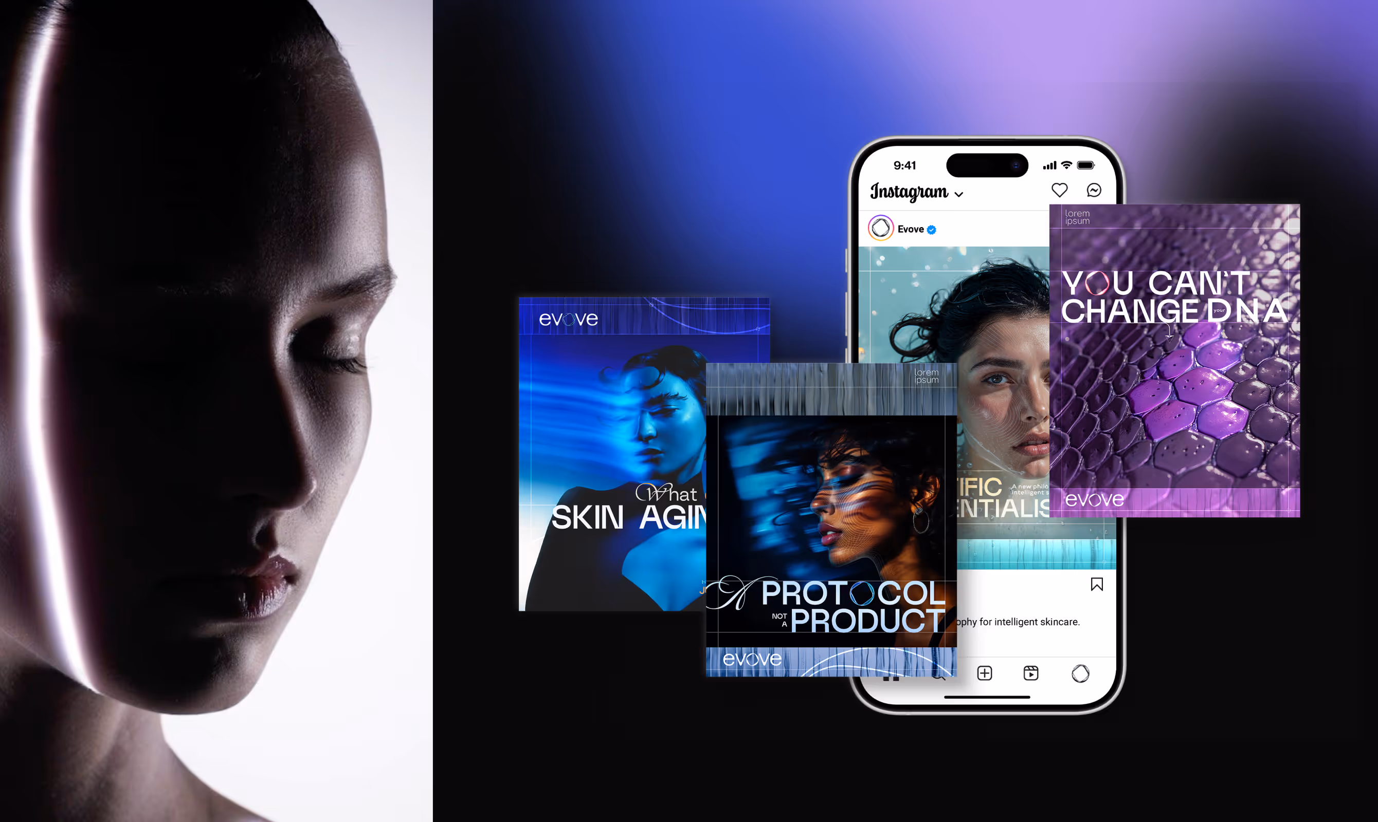
Evove's visual identity places biological precision and editorial confidence in the same space. The wordmark, built on custom open rounded letterforms, maintains legibility from product vial to neon signage. The brand icon, an organic faceted ring, functions as a standalone mark: rendered flat in core blue or black for 2D applications, and always in blue gradient style for 3D executions.
Crocus Purple dominates hero assets and packaging as the primary brand color, immediately ownable in a category of whites and botanicals. Gradient transitions from purple to periwinkle and blue to pink create luminous, biologically alive environments across social and editorial assets.
New Black commands headlines at scale. Brooklyn handles clinical body copy with precision. Aston Script introduces human warmth at key creative moments, ensuring the system reads as intelligent without becoming cold.
OUTCOME
Evove's visual identity places biological precision and editorial confidence in the same space. The wordmark, built on custom open rounded letterforms, maintains legibility from product vial to neon signage. The brand icon, an organic faceted ring, functions as a standalone mark: rendered flat in core blue or black for 2D applications, and always in blue gradient style for 3D executions.
Crocus Purple dominates hero assets and packaging as the primary brand color, immediately ownable in a category of whites and botanicals. Gradient transitions from purple to periwinkle and blue to pink create luminous, biologically alive environments across social and editorial assets.
New Black commands headlines at scale. Brooklyn handles clinical body copy with precision. Aston Script introduces human warmth at key creative moments, ensuring the system reads as intelligent without becoming cold.
Latest Work
Every project is a chance to try something new. Look at something with a fresh perspective. Do something for the first time.
MANJN
Manjn is an upcoming oral care brand from India for global audience.
Branding
Packaging
Website
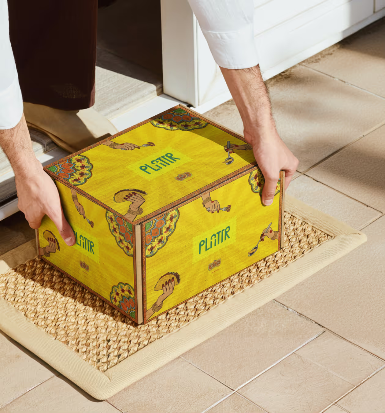
PLATTR
Plattr is a bulk catering platform built for corporate and household events.
Branding
Packaging
UI/UX