PLATTR
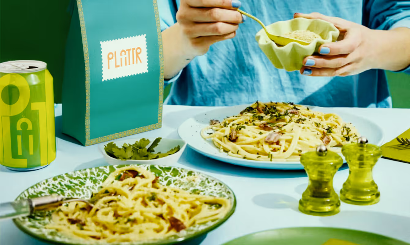
Plattr is a bulk catering platform built for corporate and household events, offering three service tiers: Meal Boxes, Party Orders, and full Catering. The brand combines Indian cinema's visual energy with quick-commerce UX familiarity into one bold, scalable system.
CLIENT
PLATTR
SERVICES
Branding
Packaging
UI/UX
YEAR
2025
THE OBJECTIVE
We created a creative and experiential e-commerce for Manjn that tells the story of its products' naturalness through a pure and complete visual language. Fluid animations guide users seamlessly, while our clean, minimal design keeps the products as the true protagonists of the experience.
THE APPROACH
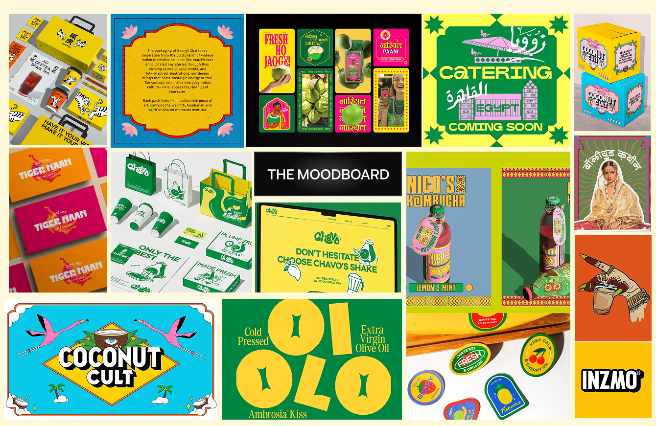
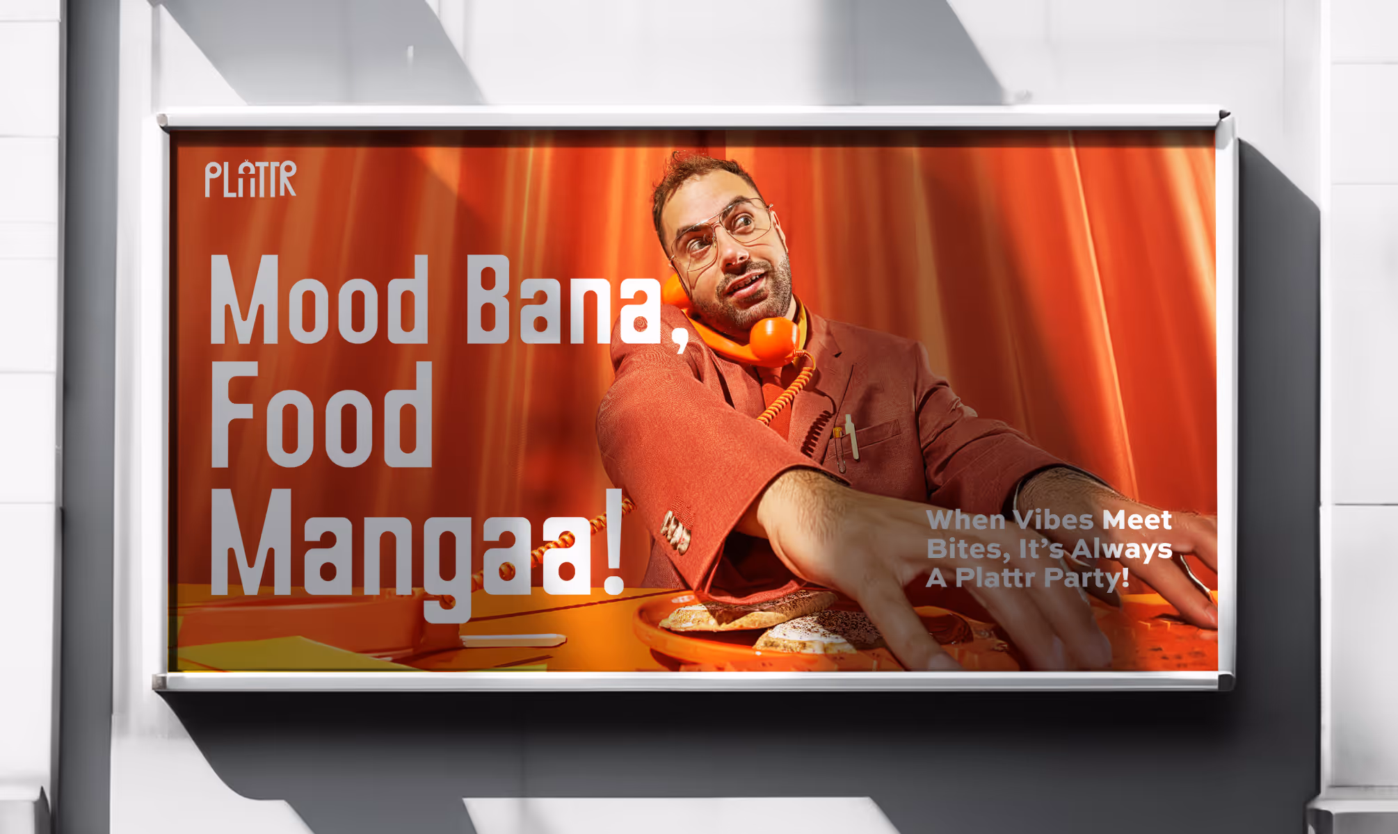
The core design challenge was making bulk catering feel exciting. The category is dominated by generic, utilitarian brands. Plattr's identity was built to fix that by drawing from the visual language of Indian cinema, spanning the 70s through the 90s, as the creative foundation.
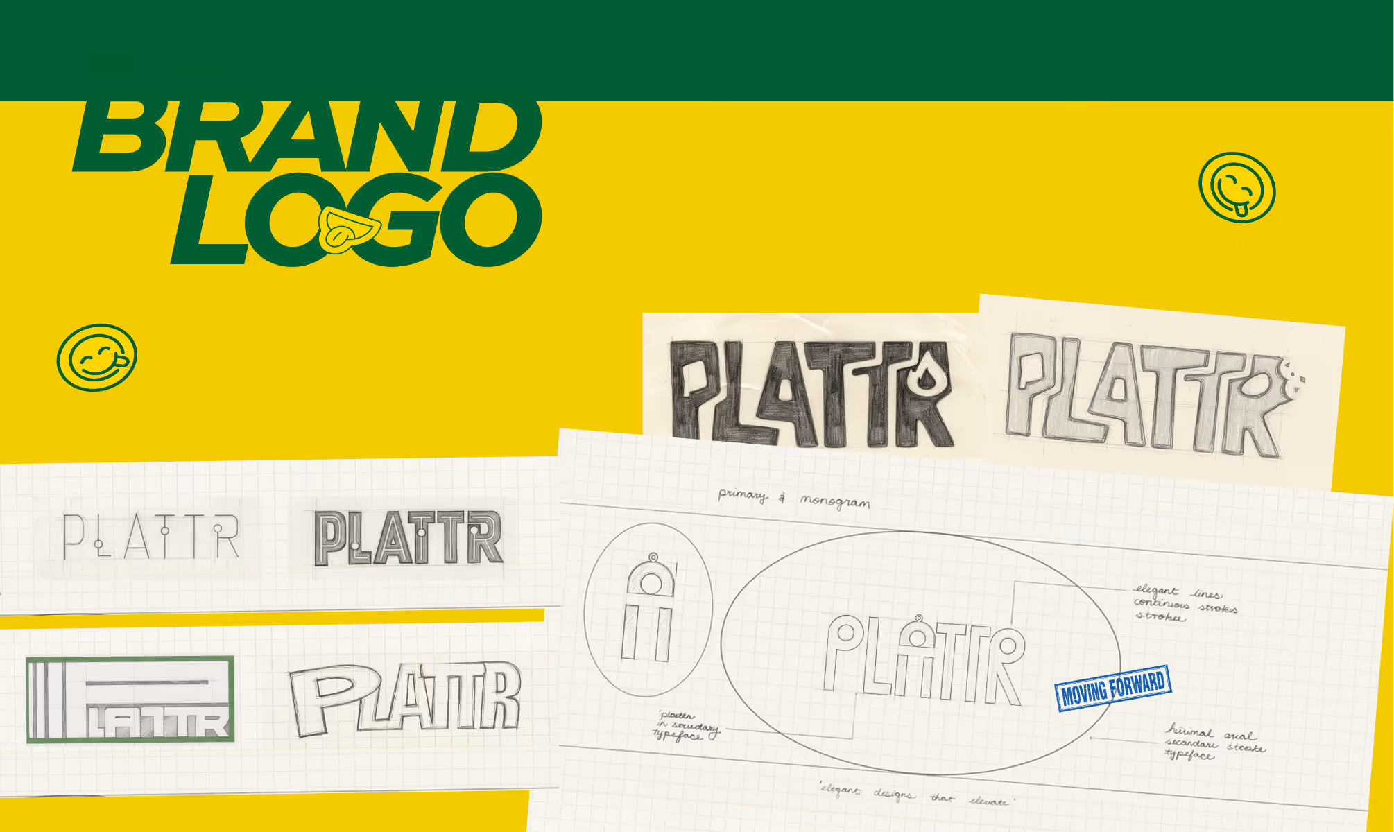
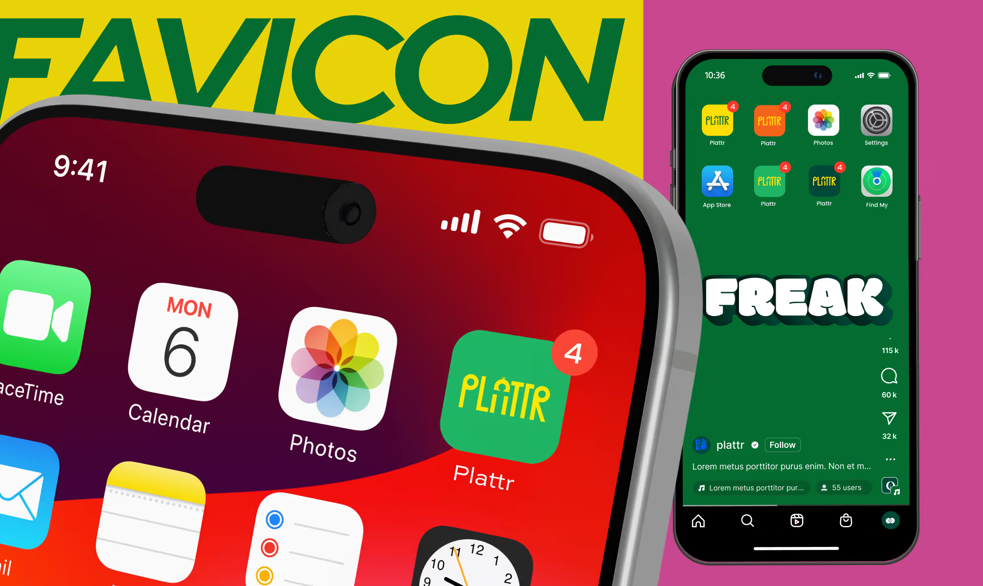
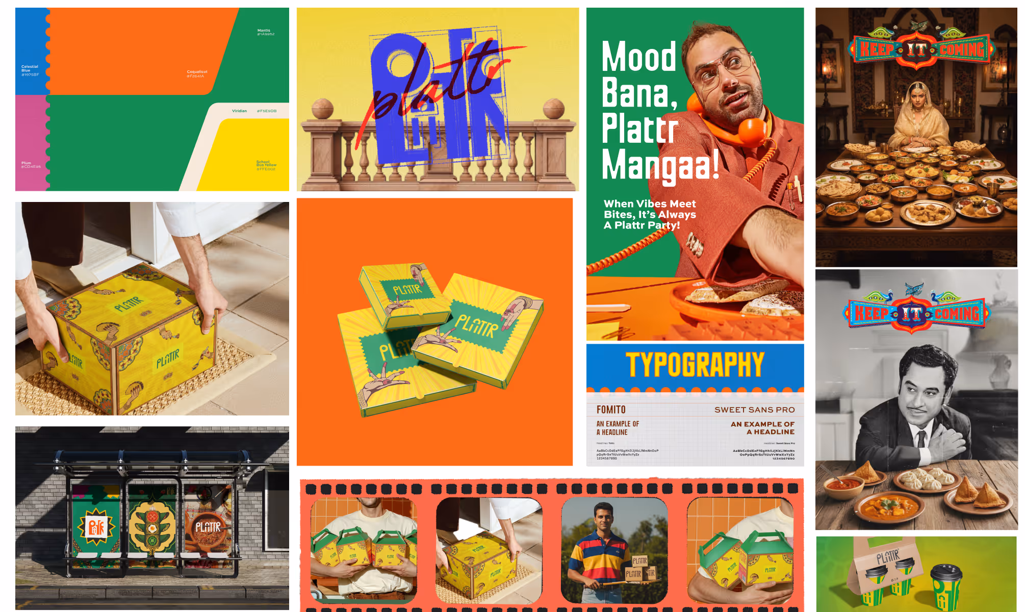
The logomark evolved from early hand-sketched explorations into a bold, custom wordmark with friendly, contemporary character. A secondary stamp logo was developed in parallel for tight packaging spaces, conveying approval and authenticity wherever the primary mark cannot be used.
The color system was named Colorology: Bright Gold (#FFE002), Shamrock (#1A9952), Stormy Teal (#0C655A), Blaze Orange (#F2641A), Dark Orange (#FA9332), True Cobalt (#343280), Sky Aqua (#5ED2FE), Dark Walnut (#6C2906), and Papaya Whip (#FFF1DB). The palette reads like a film poster, appetite-forward and impossible to ignore.
VISUAL IDENTITY
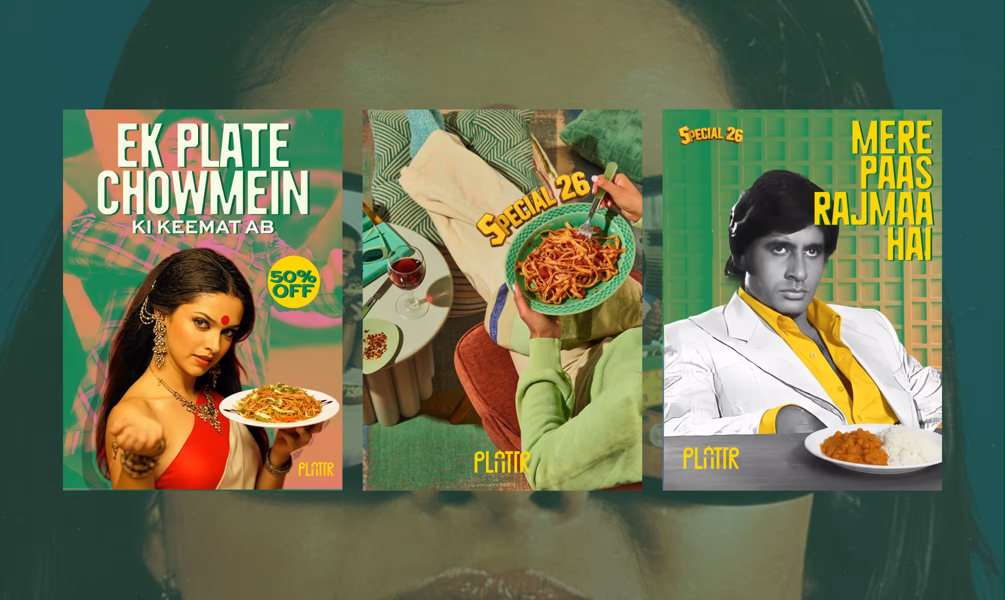
Plattr's visual identity is built entirely on the energy of Indian cinema. Every design decision, color, type, pattern, and packaging motif, references the visual grammar of Bollywood poster art and the bold graphic confidence of Indian commercial design across four decades.
The primary typeface is Fomito, a condensed display face set at 80px SemiBold with 2% tracking, used for all headlines. Sweet Sans Pro at Heavy weight handles secondary headlines and interface copy, maintaining legibility at every scale. Both typefaces are set in all caps, amplifying the cinematic register.
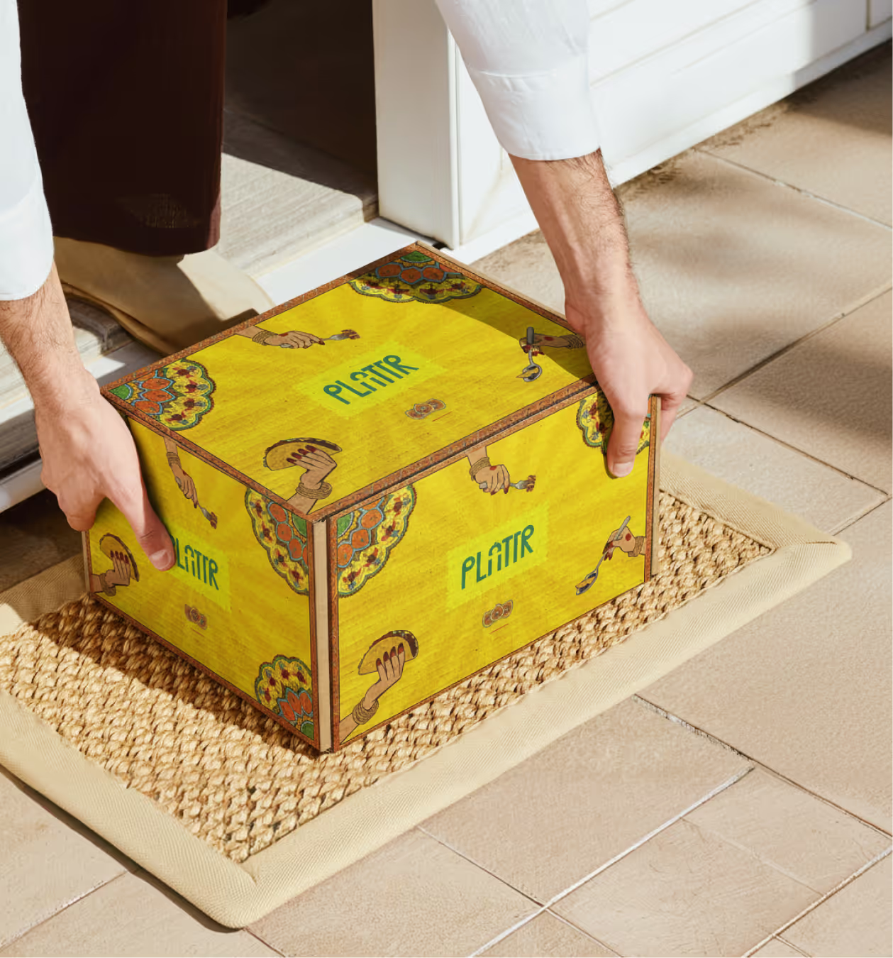
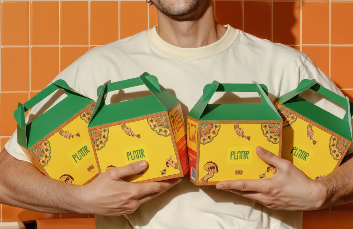
Packaging design is bright, bold, and unmistakably full of energy. Yellow catering boxes carry decorative mandala-inspired border motifs. Green cups carry oversized logotype. A film-strip graphic device and warning-label copy, "Opening this may cause sudden crowd formation," inject Plattr's personality into every physical touchpoint.
OUTCOME
Plattr's visual identity is built entirely on the energy of Indian cinema. Every design decision, color, type, pattern, and packaging motif, references the visual grammar of Bollywood poster art and the bold graphic confidence of Indian commercial design across four decades.
The primary typeface is Fomito, a condensed display face set at 80px SemiBold with 2% tracking, used for all headlines. Sweet Sans Pro at Heavy weight handles secondary headlines and interface copy, maintaining legibility at every scale. Both typefaces are set in all caps, amplifying the cinematic register.
Packaging design is bright, bold, and unmistakably full of energy. Yellow catering boxes carry decorative mandala-inspired border motifs. Green cups carry oversized logotype. A film-strip graphic device and warning-label copy, "Opening this may cause sudden crowd formation," inject Plattr's personality into every physical touchpoint.
Latest Work
Every project is a chance to try something new. Look at something with a fresh perspective. Do something for the first time.
MYSTIQARE
A global yet rooted brand unifying three global distinct ritual-led lines for Indian skin.
Branding
Packaging
THIRD ALIGN
Third Align connects enterprise companies with ideal buyers through high-value B2B conversations.
Branding
Website