The Shelf Test: What Packaging Must Do in 200 Milliseconds
May 11, 2026
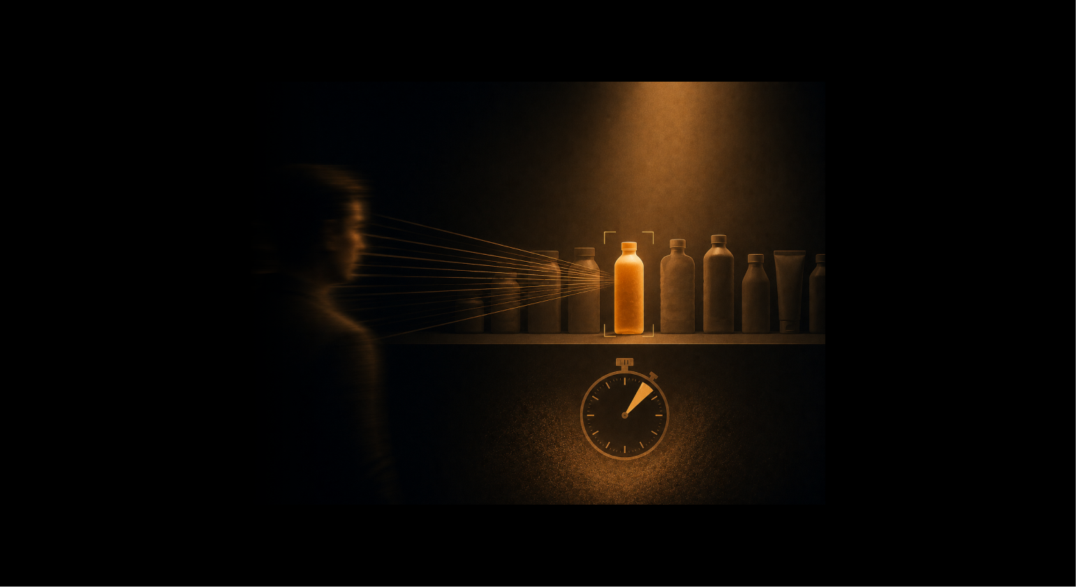


You are in a supermarket. Aisle 7, beverages. There are twenty-three products on the shelf in front of you.
You don't study them. You scan.
Your eye moves across the row at a pace that registers almost nothing consciously. You aren't reading labels. You aren't comparing claims. You are doing something far more primitive: your visual system is processing colour, shape, and contrast in parallel, without asking your brain for permission, in under 200 milliseconds. By the time any deliberate thought forms, the decision is already leaning one way.
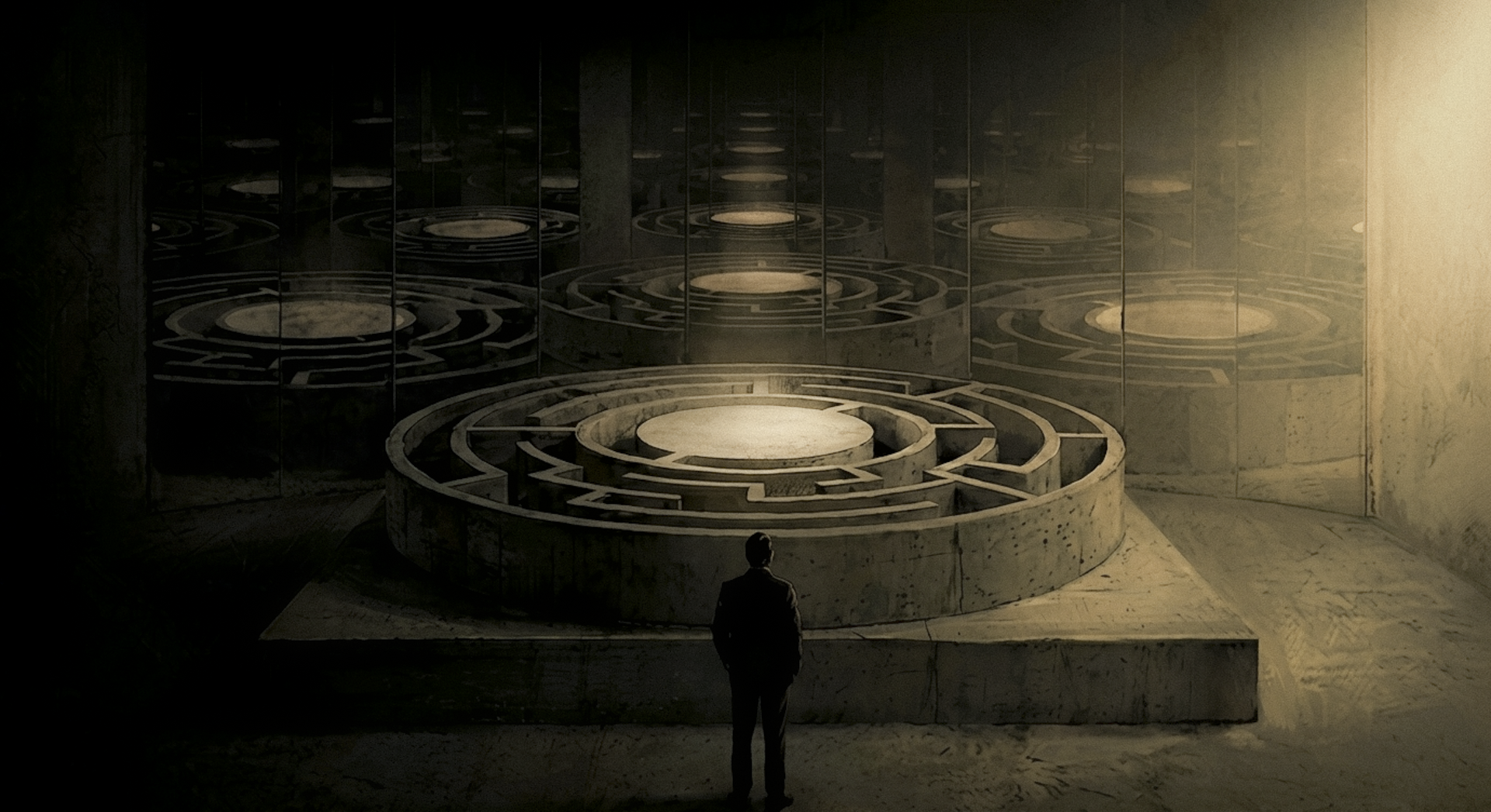
That is the moment packaging exists to win. And most packaging briefs never mention it.
This gap isn't unique to one category or one price point. It runs through the entire problem of brand identity for consumer brands in India and globally: the brief is written for a mood board review. The shelf doesn't care about mood boards.
In this piece:
1. Why Your Packaging Brief Is Written for the Wrong Moment
2. What Actually Happens in 200 Milliseconds
3. The Five Jobs Packaging Must Do at Shelf
4. What a 200ms-Tested Brief Looks Like
5. Frequently Asked Questions
6. The Brief Is a Brief for a Moment, Not a Mood Board
Why Your Packaging Brief Is Written for the Wrong Moment

Pull up any packaging brief written in the last decade and you will find the same language.
The brand should "feel artisanal." The packaging should be "premium without being intimidating." The design should "reference the heritage of the brand while speaking to a modern sensibility."
These aren't bad instincts. They are instructions for a conversation that never happens at point of sale.
Procter and Gamble understood this in 2005. A.G. Lafley, then CEO, introduced the concept of the "First Moment of Truth": the 3 to 7 seconds after a shopper first encounters a product on a store shelf. He didn't describe a mood. He described a window. P&G took it seriously enough to create a director-level role for it, appointing Dina Howell as Director of the First Moment of Truth. The most powerful consumer goods company in the world decided this moment deserved its own executive.
Most packaging briefs are written as if that person doesn't exist.
The Research Nobody Reads Before Writing a Brief
P&G's 3 to 7 seconds is the deliberation window. Think of it as the outer circle. More recent neuromarketing and eye-tracking research tightens that to something smaller: the initial visual registration, the moment before any deliberate scanning begins, happens in under 200 milliseconds. Two concentric circles. The outer one is where you make the case. The inner one is whether you get heard at all.
Packaging has to work in both. Almost nobody designs for the inner one.
Paco Underhill spent years tracking actual shoppers through actual aisles for his research firm Envirosell, accumulating thousands of hours of field observation. The finding at the centre of "Why We Buy" (Simon and Schuster, 1999) is now almost self-evident: the majority of purchase decisions are made in-store, not before entry. The aisle is the most important media channel a brand has. Not the ad campaign. Not the billboard. The shelf.
But even Underhill's framing is generous. It assumes the shopper is deliberating. In high-frequency FMCG categories, many of them aren't. They are pattern-matching on autopilot. Packaging as a brand surface rather than a container is an idea worth understanding in its own right. But the strategic case for why it matters starts with what happens in those first 200 milliseconds.
What Most Packaging Briefs Actually Say
"Should feel artisanal" gives a designer latitude to produce something that photographs beautifully on a mood board and disappears against a kirana shelf at 3 metres.
"Premium without being intimidating" can be fulfilled in a hundred different ways, none of which have been tested against the specific visual environment where the product will actually live.
Compare that to this: "Must arrest a moving eye at 3 metres against a white and blue shelf environment." That is a functional specification. It names the problem, the context, and the success condition.
That sentence is almost never what a packaging brief says.
If you’re thinking about packaging as a brand surface rather than a functional container, that strategic case is explored separately.
What Actually Happens in 200 Milliseconds
Before a single thought forms, your visual system is already at work.
Pre-Attentive Processing: What the Eye Catches Before You Think

Anne Treisman and Garry Gelade established this in a 1980 paper that now has over 13,000 citations: Feature Integration Theory. The model describes visual processing in two stages. In the first stage, before conscious attention is engaged, your brain processes colour, contrast, orientation, and size in parallel across the entire visual field. A target with a unique feature pops out automatically. It doesn't require attention to be found. A target that requires the combination of multiple features to be recognised demands serial, focused attention. And serial attention takes time nobody at shelf has.
Pop-out is survival. Serial search is death.
The practical implication is uncomfortable for most packaging designers. Colour is not an aesthetic preference. It is the most powerful pre-attentive signal a pack has. Shape and silhouette come second. The name, the copy, the claims, the ingredients list: these all require focused attention, which only fires after the pack has already arrested the eye.
Most briefs are written backwards. They obsess over what the brand says when the first job is whether it stops the scan.
System 1 at Shelf
Daniel Kahneman gave us the most useful language for understanding why this matters.
In "Thinking, Fast and Slow" (Farrar, Straus and Giroux, 2011), he describes System 1 as the fast, automatic, associative mind: emotionally loaded, pattern-matching, constantly building narratives from whatever visual information is available. System 2 is slow, deliberate, analytical. It only activates if System 1 doesn't close the case.
For most packaged goods in most purchase contexts, System 2 never activates.
This is the insight Tropicana ignored in 2009. The brand invested $35 million in a redesign by Arnell Group. The new packaging was cleaner, more contemporary, more sophisticated. It made perfect System 2 sense. And within two months of launch, sales dropped by 20%. Thirty million dollars in lost revenue. They reverted to the original design by February 23, 2009.
What happened?
The original Tropicana packaging had one of the most efficient System 1 signals in the beverage category: an orange with a straw stuck in it. Instantly recognisable. Instantly communicating freshness, purity, and brand identity. The redesign replaced it with a generic glass of orange juice. That glass wasn't a Tropicana signal. It was a category signal. It looked like every private-label OJ on the same shelf.
The straw-in-orange was a System 1 argument. The glass of juice was a System 2 argument.
System 2 lost.
Kahneman calls this WYSIATI: what you see is all there is. System 1 builds a complete narrative from the visual information immediately available. It doesn't wait for more. When shoppers saw the new Tropicana packaging, System 1 looked at a generic glass of juice and built a generic product narrative. Not Tropicana. Not premium. Not the one I usually buy.
The Five Jobs Packaging Must Do at Shelf
Here's the thing. The problem with most packaging briefs isn't that they're aesthetically uninformed. It's that they're structurally wrong.
They describe a feeling rather than a function.
The right structure is built around five jobs. These aren't a checklist. They are a sequential logic: each job is a gate the shopper's attention must pass through. Fail any gate and the sequence stops.
For brand identity to work at shelf for consumer brands in India, where visual noise is high and shopper dwell time is low, every single gate needs to be solved before you brief a designer on aesthetics.
Paper Boat is the most instructive Indian example of a brand that solved all five with one structural and visual decision system. Launched by Hector Beverages in 2013 and designed by Elephant Design in Pune, it didn't just create a product. It created a packaging system that worked every gate.
Job 1: Arrest. Stop the Scan.
This is a purely optical problem. The eye in motion registers discontinuity: a break in pattern, an unexpected colour, an unusual silhouette. The question your brief should ask is not 'does it look nice?' It is: does it interrupt a scan at 3 metres?
In India's general trade environment, kirana shelves stacked floor-to-ceiling with maximum visual noise, the arrest job is harder than it appears. Many briefs call for 'restraint' or 'minimalism' at precisely the moment the shelf demands contrast.
Minimalism on a white kirana shelf is invisibility.
Paper Boat's doypack format, designed with a boat-shaped cap and matte tactile surface, was a structural interruption. In a category of uniform tetra packs and PET bottles, it had a shape nobody had used before. Ashwini Deshpande, co-founder of Elephant Design, put the design logic clearly: 'There was never too much focus on what existing players were doing. The design process was always focused on creating a new category.'
You cannot win the arrest game by studying the competition. You win it by introducing a discontinuity the shelf has never seen.
Job 2: Categorise. Tell Me What It Is.
If the eye stops, the brain's first question is: what is this?
Category cues are not encoded in copy. They live in colour conventions, typography scale, structural norms, and spatial hierarchy. A shopper doesn't read '100% Natural Beverage' to categorise a drink. They read the colour temperature, the label proportions, the font weight.
Breaking category codes without deliberate reason creates cognitive friction. That friction doesn't produce curiosity. It produces abandonment. The brief must specify which category signals this pack preserves and which it deliberately violates, and why.
Job 3: Signal. Communicate Quality and Stance.
Once the brain knows what it is, it makes a rapid quality and values assessment. Premium or mass-market. Trustworthy or risky. Authentic or manufactured.
These signals don't come from copy. They come from typeface weight and style, colour palette sophistication, spatial discipline, and material finish. Virginia Postrel's central argument in "The Substance of Style" (HarperCollins, 2003) applies directly here: aesthetic choices carry functional information. They communicate quality, values, and trustworthiness before any rational evaluation begins.
A founder who says 'our packaging should feel premium' needs to hear this plainly: premium is a typography decision. A colour temperature decision. A spatial proportion decision. It is not a mood.
Paper Boat's matte white packaging with hand-drawn illustration style communicated natural, authentic, and made with care. Each of those signals was a design decision, not an adjective in a brief.
Job 4: Differentiate. Be Specifically This One.

Within category recognition, the pack must be legible as specifically this brand.
That requires at least one hard-to-imitate, ownable visual element. A structural choice nobody else has made. A colour not shared with any competitor. An illustration style uniquely recognisable.
This is the job Tropicana catastrophically failed. The orange with a straw was theirs. Nobody else owned it. The redesigned glass of juice was owned by everyone and no one. The moment that signal disappeared, brand identity collapsed into category noise.
Paper Boat's doypack format and boat-shaped cap are not replicable at low cost. That structural decision is a brand moat built at the brief stage. This differentiation logic, once established, also needs to be designed to scale across a growing SKU range, which is a different and harder brief than the launch pack alone.
Job 5: Invite. Make Me Want to Pick It Up.
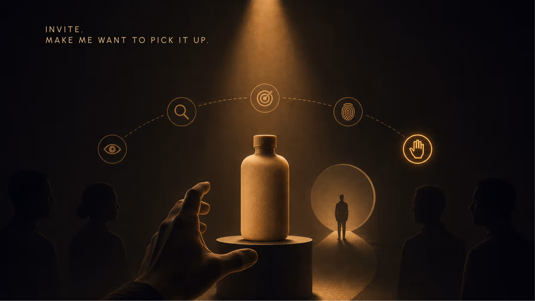
The final move. After arrest, categorisation, signalling, and differentiation, the last job is to create a desire to touch.
Picking up the pack is the inflection point. Paco Underhill's field research points to a consistent correlation: once a product is held, purchase likelihood increases significantly. The pack has moved from peripheral vision to physical contact. That is not the same moment.
Most briefs never ask: what happens when someone picks this up for the first time?
Paper Boat's matte, paper-textured pouch had its own tactile language. The compact doypack format fits a hand naturally. And the text written at the bottom of each pack rewarded the curious: short, warm, nostalgic. An invitation to stay a little longer with the brand.
The brief should ask: what is the first thing someone feels when they touch this? Most don't.
What a 200ms-Tested Brief Looks Like
The five-job framework doesn't replace aesthetic direction. It structures it. Aesthetic decisions must be downstream of functional specifications, or they remain decoration in a presentation room.
Here's what the rewrite looks like in practice.
From Feels Premium to Arrests at Three Metres
Old brief language: 'The packaging should feel warm, artisanal, and premium without being intimidating.'
New brief language: 'The packaging must arrest a moving eye at 3 metres in a modern trade environment where white and teal dominate the shelf. Once arrested, it must signal handmade quality within 200ms using typeface weight and material finish alone, with no copy visible.'
Old: 'Should stand out on shelf.'
New: 'Must introduce a structural or colour discontinuity not present in the category. Specify the exact context: general trade kirana, modern trade gondola, or D2C digital photography.'
Old: 'Should reference our heritage.'
New: 'Must carry one ownable visual element that cannot be replicated by a private-label manufacturer at low cost. Heritage informs what that element is, not replaces it.'
Five Brief Prompts That Force the Right Thinking
Before you brief a packaging designer, you should be able to answer these five questions. If you can't, the brief isn't ready.
1. What shelf environment does this pack need to arrest in? Name the specific format: general trade kirana, modern trade gondola, or D2C digital.
2. Which of the five jobs does your current packaging fail? Be honest. Most brands already know.
3. What is the single ownable visual element that makes this pack legally and commercially yours?
4. What does this pack signal about quality tier when no copy is visible? Cover the label. What remains?
5. What happens when someone picks it up for the first time? What do they feel, and what is the first thing they discover?
These are the questions a shelf test would answer. Ask them before the shelf test, not after. And if you want to understand how those answers translate into a complete process, the full packaging design journey from brief to shelf is worth working through step by step.
Frequently Asked Questions
How long does a consumer actually spend looking at a product before deciding to buy it?
There are two windows. Pre-attentive visual processing, driven by colour and shape, registers in under 200 milliseconds before conscious attention engages. P&G's First Moment of Truth sits in the 3 to 7 second window that follows. Packaging must work in both. In high-frequency FMCG categories, most decisions never leave the first window.
What is the most important element of packaging design for consumer brands in India?
Colour is the most powerful pre-attentive signal, as Treisman’s Feature Integration Theory establishes. But in India’s general trade environment, structural distinctiveness often outperforms colour alone. Paper Boat’s doypack format is the clearest Indian evidence. The brief should specify the shelf context: modern trade and kirana require different arrest strategies.
Why did Tropicana's packaging redesign fail if it looked better?
It failed because it destroyed System 1 recognisability. The new packaging was aesthetically cleaner but removed the orange-with-straw signal that served as Tropicana’s pre-attentive differentiator. What replaced it, a generic glass of juice, was shared by dozens of competitors. “Better” in a studio and “better in 200 milliseconds at shelf” are different problems. It lost $30 million in two months.
How do I brief a packaging designer to design for shelf performance, not just aesthetics?
Use the five-job framework as the structure of the brief. Each job, Arrest through Invite, becomes a section with a performance specification rather than an aesthetic mood. The five prompts in the preceding section provide the exact questions to answer. If the brief can be challenged on any of those questions, it isn't ready yet. Aesthetics follow from specifications.
The Brief Is a Brief for a Moment, Not a Mood Board
Go back to Aisle 7.
The consumer's eye is still moving. In 200 milliseconds, the pack either stops it or it doesn't. And every decision in the brief, every adjective, every colour swatch, every reference image, is either doing a job in those 200 milliseconds or it is decoration.
The honest version of a packaging brief is not a description of how the brand wants to feel. It is a specification for a moment that lasts less time than a blink.
Most packaging briefs are written for the client's approval.
The shopper never reads them.


Continue
Reading


The Craft Premium: Why Slowness Is the New Luxury Signal
Slowness only functions as premium when it reads as choice, not constraint. This is the knife edge. Bottega Veneta’s social media deletion worked because it was legible as a considered refusal. Not a technical failure. Not disorganisation. A position