The Rothko Principle: On Emotional Density in Visual Identity
May 7, 2026


There is a room at the Tate Modern in London that does something unusual to people.
It holds nine large canvases. Deep maroons. Blood reds. Near-blacks. Painted in the late 1950s by Mark Rothko for a commission he ultimately refused. The paintings are enormous, most taller than a person. And in a museum full of objects competing for your attention, people walk into this room and slow down.
Some stop entirely. Some sit.
A few cry.
The paintings contain no figures. No narrative. No symbol you can point to. Just colour, scale, and edges that blur so gradually you cannot find where one field ends and another begins.
Now consider the average visual identity design system. Dozens of touchpoints. Hundreds of design hours. A logo refined across twelve rounds of feedback. Typography sourced from a reputable foundry. A colour palette chosen to signal "trust" or "energy" or "approachability." Guidelines so thorough they include examples of misuse.
And somehow, at the end of all that, most brand identities leave no residue. You encounter them. You move on.
The difference is not craft.
The difference is density of intention.
Most visual identity design spreads thin across surfaces. Rothko compressed everything into the field itself.
In this piece
1. What Rothko Actually Did With Colour (And Why It Matters to Visual Identity Design)
2. The Density Gap: Where Most Brand Identities Lose Emotional Weight
3. Intention Per Square Inch: Designing Visual Identity Like a Colour Field
4. The Seagram Test: When Context Betrays Identity
5. From Palette to Principle: Building Emotional Density Into Brand Systems
6. Frequently Asked Questions
7. The Chapel Standard: What Visual Identity Design Could Feel Like
What Rothko Actually Did With Colour (And Why It Matters to Visual Identity Design)
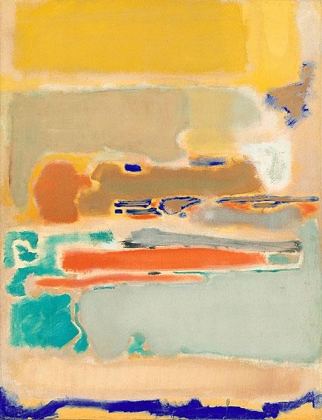
Mark Rothko spent two decades arriving at the paintings he became famous for.
He started as a figurative painter. Then came Surrealist figures with mythological undertones. Then pure abstraction. Each stage was a removal: of narrative, of character, of symbolic hierarchy. Until what remained was colour, scale, and the emotional state that required no story to communicate it.
He was unambiguous about why. In a conversation with Selden Rodman in 1956, Rothko said: "I am not an abstractionist... I'm interested only in expressing basic human emotions, tragedy, ecstasy, doom, and the fact that a lot of people break down and cry when confronted with my pictures shows that I communicate those basic human emotions."
That is not an artist describing colour relationships. That is an artist describing an emotional mission. The colour was never the point. It was the vehicle.
The crucial thing to understand is that Rothko's process was additive before it became visible. He built canvases in thin, translucent washes of pigment, layer over layer, so that the colours underneath continued to glow through the surface. The result was a depth that seemed to pulse. Not flat. Not static. Breathing.
Selma Kraft, writing in 1986, argued that from 1947 Rothko began probing colour as something deeper than appearance: "the source of an indefinitely open, expanding experience in which the boundaries between viewer and viewed are obliterated."
That last phrase is worth holding. The boundaries between viewer and viewed are obliterated.
Your brand identity is not designed to obliterate boundaries. I know. But the question worth asking is: does it even move them?
The Architecture of Feeling
Rothko painted large to be intimate. Not to be grandiose. The scale of his canvases, often seven or eight feet tall, was a deliberate decision to surround the viewer rather than be admired from a safe distance. He wanted you inside the painting, not standing outside looking at it.
This is a distinction that almost no visual identity design has absorbed.
Most brand identities are built to be admired from a distance. At arm's length, from across a room, in a thumbnail on a phone screen. The brand appears, it communicates its presence, and you acknowledge it.
Rothko designed to be inhabited.
The soft, feathered edges between his colour fields were not a stylistic signature. They were a consequence of the intention. Hard edges produce certainty: you can see where one thing ends and another begins. Blurred edges produce ambiguity, invitation, the sense that you might still move into what you are looking at. Rothko understood that emotional experiences do not have hard edges either.
Kandinsky, Albers, and the Lineage He Inherited
Rothko did not arrive at this alone.
Wassily Kandinsky, writing in 1911, had established the philosophical foundation in Concerning the Spiritual in Art: "Colour is the keyboard, the eyes are the hammers, the soul is the piano with many strings. The artist is the hand which plays, touching one key or another, to cause vibrations in the soul." For Kandinsky, colour was not decoration. It was direct communication between form and consciousness.
Josef Albers, whose Interaction of Color appeared in 1963, proved something more uncomfortable: colour is never what it appears to be in isolation. The same green looks like two entirely different colours when placed against yellow versus blue. "In visual perception," Albers wrote, "a color is almost never seen as it really is." Colour only exists in relationship.
Rothko synthesised both. Colour as spiritual language, and colour as relational system.
Most brand colour palettes manage to absorb neither insight.
The Density Gap: Where Most Brand Identities Lose Emotional Weight

Here is what a brand identity can do perfectly and still fail.
It can maintain correct Pantone values across forty touchpoints. It can apply the logo at the specified minimum size with the specified clear space. It can use the right typeface at the right weight in the right hierarchy. Every execution can be technically compliant with the brand guidelines.
And the brand can still feel like nothing.
This is the density gap. The distance between visual consistency and emotional coherence.
Arthur Danto, in his essay "Rothko's Material Beauty," was sceptical of the emotional claims made around Rothko's work. He argued that one of the canvases "shows what materiality comes to when it does not evoke something deeper than itself." He was wrong about Rothko. But he identified exactly the condition that most brand identities inhabit permanently.
Material beauty without emotional depth. Consistent without coherent.
Consistency Is Not Coherence
Visual consistency means the same assets applied correctly. Emotional coherence means every surface communicates the same feeling at the same depth.
These are not the same thing.
Consider Aesop. The skincare brand has stores across four continents, each individually designed to respond to its specific architectural context and neighbourhood. No two stores look identical. But every single one feels like Aesop: a particular quality of attention, restraint, and intelligence that no brand standards document could mandate. The coherence is emotional, not visual. The consistency is felt, not measured.
This is what Rothko was doing: not replicating the same gesture across multiple canvases, but ensuring every canvas carried the full weight of the same intention.
Brand guidelines optimise for visual consistency. Rothko optimised for emotional coherence. The difference is visible in the work.
The Tyranny of the Swatch
The most common place this breaks down is the colour palette.
A swatch on white is the least truthful way to understand colour. Albers proved this half a century ago, and the brand industry has largely not noticed.
Rothko never painted on white. He built colour on colour on colour, because he knew that the meaning of a colour is not contained within it. It is produced by its relationships: with the colours next to it, beneath it, around it, and with the light conditions of the space it inhabits.
When a brand colour palette is presented as a grid of Pantone swatches on a white page, what you are actually seeing is a set of colours stripped of every condition that will determine how they behave in the world. That warm amber looks considered in the PDF. Applied against a dark background on a phone screen at night, it vibrates uncomfortably. Applied to a matte business card stock under fluorescent office light, it reads cheap.
Colour strategy should show colour in relationship. How does the primary respond to the secondary? How do they behave across materials: matte, gloss, uncoated, digital? What happens at small scale versus large?
The swatch grid is a starting point, not an arrival.
Intention Per Square Inch: Designing Visual Identity Like a Colour Field
Rothko's mature practice involved a quality standard that no brand studio uses.
Intention per square inch.
Every brushstroke carried the full weight of the emotional mission. There was no background-versus-foreground hierarchy. The field surrounding the central form was not supporting the painting. It was the painting. In Rothko, there is no decorative space. Every inch is load-bearing.
What if that were the standard for visual identity design?
Not more elements. Not more touchpoints. More density per element. More weight per surface. The question is not "does this execution comply with the guidelines?" but "does this single surface carry the full emotional argument of the brand?"
What Rothko Eliminated (And What Brands Should)
Rothko's path to the colour fields was a long process of elimination.
Figurative painting in the 1930s. Mythological abstraction in the early 1940s. Biomorphic forms borrowed from Surrealism. And then, from 1949 onward, a radical reduction until nothing remained but colour, scale, and the viewer's response.
This is not minimalism. Minimalism is an aesthetic choice: remove elements because restraint is beautiful. What Rothko practised was compression: remove elements because everything remaining must be load-bearing. The distinction matters enormously.
A minimal visual identity can still be emotionally empty. A compressed one cannot. Every surviving element has passed a test: does this carry emotional weight, or is it decoration?
Rothko himself was explicit about what he was and was not doing. "I am not an abstractionist," he told Rodman. "I am not interested in the relationships of color or form or anything else." He was interested in expressing basic human emotions, and everything that could not serve that mission was removed.
The emotional brief, in other words, came first. The visual decisions followed.
The Emotional Brief vs. The Visual Brief
Most brand projects begin with a visual brief.
"We want something clean. Modern. Approachable. Premium but not cold."
These are aesthetic preferences. They are not emotional intentions.
Rothko did not start with a colour preference. He started with tragedy, ecstasy, doom: existential states. And he worked backwards to the form that could carry them.
Kandinsky called this inner necessity, the idea that form must emerge from genuine emotional need, not external stylistic convention. You do not choose red because red is energetic. You choose red because the specific quality of red, at this weight, at this scale, in this relationship, is the only form that can hold the particular emotion you are trying to express.
The distance between "approachable" and "ecstasy" is the distance between most brand briefs and Rothko's practice. One is a category instruction. The other is a human state.
This inversion is the Rothko Principle applied directly to visual identity design: start with the feeling, then find the form that can bear its weight.
The Seagram Test: When Context Betrays Identity

In 1958, Mark Rothko accepted the most lucrative commission ever offered to an abstract expressionist.
Philip Johnson had been tasked with furnishing the interiors of the Four Seasons restaurant in Mies van der Rohe's Seagram Building on Park Avenue. He offered Rothko $35,000 to create a series of murals. Rothko accepted. And then he did something unusual. He built a scaffold in his studio matching the restaurant's exact dimensions, so that he could paint specifically for that space.
He produced thirty canvases in dark maroons and blood reds, inspired in part by Michelangelo's vestibule in the Laurentian Library in Florence: those sealed, blind windows that create a sense of containment, almost suffocation. Rothko described the effect he wanted to produce. He wanted diners at the Four Seasons to feel trapped in a room where all the doors and windows were bricked up.
Then he ate there.
He arrived one evening in 1959 with his wife Mell. He looked at the space. He looked at the crowd: wealthy, conspicuous, indifferent. He realised that his paintings would become wallpaper. Background decoration for people performing their social status over expensive meals.
He withdrew the entire commission. Returned every cent. Kept every canvas.
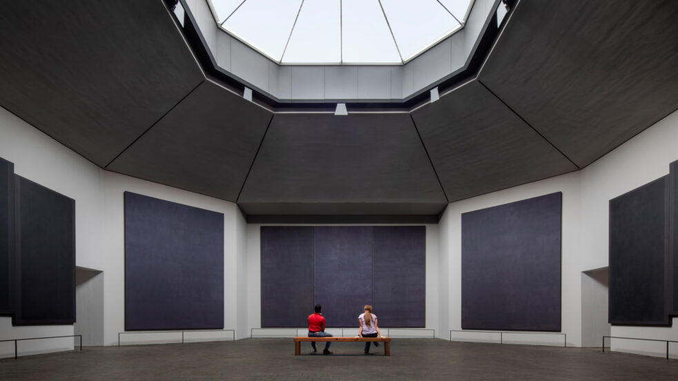
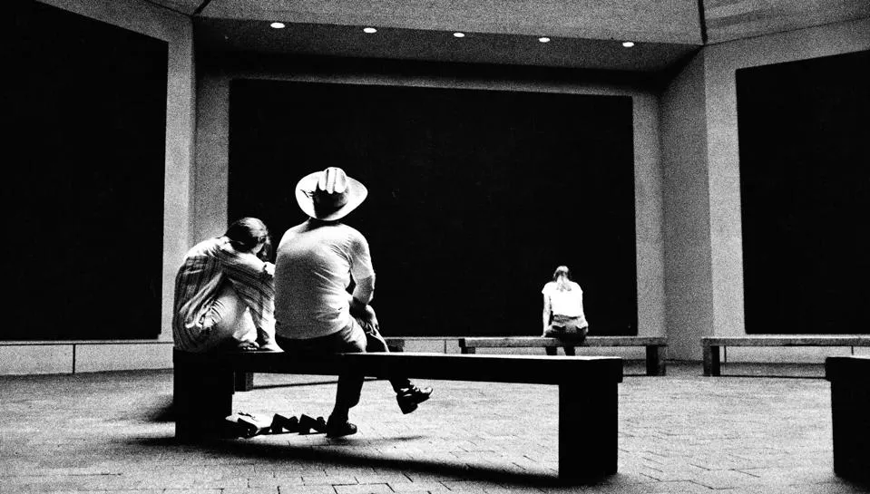
Nine of those paintings eventually went to the Tate Modern. That room on the fourth floor of Bankside, the one where people slow down and some of them cry, those are the Seagram Murals. The paintings that were too emotionally dense for the restaurant they were designed for.
Rothko understood something that most brand work never tests: context either supports an identity or it consumes it.
When Decoration Wins, Identity Loses
How many brand identities are built for emotional intensity and then deployed in contexts that drain them?
A warm, intimate brand identity applied to a cold, transactional checkout flow. A typographic system built for authority, reduced to 9 pixels in a cookie consent banner nobody reads. A colour palette chosen to communicate trust, rendered in a low-resolution JPEG by a vendor who grabbed it from the website.
Rothko walked away from the most prestigious commission of his career because the context would have betrayed the work.
The Seagram Test, applied to visual identity: if your identity can be used as background decoration in an environment that contradicts its emotional intention, it has not been designed with enough density. Context-agnostic identities are, by definition, emotionally weightless.
Design is not complete at the brand guidelines PDF. Design is complete when the context has been considered, contested, and, when necessary, refused.
From Palette to Principle: Building Emotional Density Into Brand Systems
Three shifts. Not a process. Not a framework in the listicle sense. Three places where visual identity design can move from surface to substance.
Shift 1: From Palette to Emotional Argument
Stop presenting colour as a palette. Start presenting it as an emotional argument.
A palette is a set of colours. An emotional argument is an answer to a specific question: what does this combination make someone feel? Not "trust" or "energy," those are category clichés deployed by half the brands in every vertical. What precise, human, nameable emotion?
Albers's principle is the test. Does the palette behave as an argument when colours are placed in relationship, or does it fall apart into independent swatches that happen to coexist? If the colours only hold together on white, the palette has been selected, not designed.
Shift 2: From Consistency to Compression
Stop optimising for visual consistency across touchpoints. Start optimising for emotional compression at each touchpoint.
Consistency asks: does this execution comply with the guidelines?
Compression asks: does this single business card carry the full emotional weight of the brand?
The way to feel the difference is to look at a single touchpoint in isolation and ask whether it communicates the brand's emotional argument without the support of any other surface. A Rothko canvas does not need to be seen next to another Rothko to feel like Rothko. You know it immediately. That immediacy is what compression produces.
Shift 3: From Touchpoints to Environment
Rothko's ultimate ambition was not to create paintings. He wanted to create places.
The Rothko Chapel in Houston is the fullest realisation of this. Fourteen large-scale paintings in a non-denominational octagonal space, commissioned by John and Dominique de Menil. Dark, near-void canvases in deep purple, maroon, and near-black. A skylight that changes with the weather. No explanatory text. No hierarchy of important-versus-decorative surfaces.
The chapel opened in February 1971, a year after Rothko's death. People travel from around the world to sit in silence in front of paintings in a room that is, itself, the emotional argument.
Aesop does something close to this in retail. Each store is individually designed to respond to its specific location and architectural conditions: local materials, neighbourhood references, a total sensory composition. The brand does not populate touchpoints. It builds environments.
The question, for any brand serious about emotional density, is whether you are designing a set of surfaces or a single environment that happens to manifest across multiple surfaces. The brand identity system that works like a Rothko chapel is not the one with the most consistent logo application. It is the one where every surface, independently, holds the full weight of what the brand is trying to make someone feel.
Frequently Asked Questions
What is emotional density in visual identity design?
Emotional density is the amount of intentional emotional weight carried by each design element. It is distinct from visual consistency, which is about applying the same assets correctly across touchpoints. A brand can have perfect visual consistency and near-zero emotional density. Density is about depth of feeling at each point of contact, not breadth of application.
How do you make a brand identity feel more emotionally resonant?
Start with an emotional brief, not a visual brief. Define the specific feeling you want to produce: not "trust" or "energy," but a more precise human state. Design colour in relationship, not isolation. Then test each touchpoint for emotional compression: does this single surface carry the brand's full emotional argument, or does it only work when surrounded by the rest of the system?
What can designers learn from Mark Rothko about brand design?
Rothko's practice teaches that emotional power comes from compression, not addition. Every element must be load-bearing: nothing decorative, nothing filler. Context matters as much as content. If the environment a brand identity lives in contradicts its emotional intention, the design fails regardless of execution quality. Rothko returned the Seagram commission rather than let the context win.
Why do most brand colour palettes feel generic?
Because they are chosen as isolated swatches against white, without considering how colours interact with each other, with real-world materials, and with changing light conditions. Albers proved that colour is relational: the same hue reads completely differently depending on what surrounds it. A palette developed without testing those relationships has been selected, not designed.
The Chapel Standard: What Visual Identity Design Could Feel Like
There is a room in Houston.
Fourteen paintings. An octagonal space. No windows letting in natural light, only a skylight that changes with the weather. No text telling you what to think. No hierarchy of important-versus-decorative surfaces. Just colour, scale, and the silence of a space built to hold a specific kind of human attention.
Rothko never saw it open. He died in February 1970, a year before the chapel was inaugurated.
His son Christopher wrote that "even as he feared the public, he desperately needed them to bring meaning to his paintings." The chapel was built for exactly that kind of meeting: between an intention held in paint and a viewer willing to sit with it long enough to feel what it is.
This is the standard. Not minimalism. Not restraint for its own sake.
Intentionality so thorough that no surface escapes the weight of the emotional argument.
Most brand identities are built for the Four Seasons. Surfaces designed to be glanced at by people who will not stop eating. Aesthetically considered, technically consistent, emotionally inert. They pass the guidelines check. They fail the Seagram Test.
The question Rothko spent his life trying to answer is whether a visual language can be made dense enough to stop someone. To slow them down. To make them feel something they did not plan to feel when they walked in.
He got there. The room at the Tate Modern proves it.
Whether a brand identity can get there is a separate question. But it starts by asking something different at the beginning of the process.
Not: what should it look like?
But: what should it feel like to stand inside it?


Continue
Reading


The Craft Premium: Why Slowness Is the New Luxury Signal
Slowness only functions as premium when it reads as choice, not constraint. This is the knife edge. Bottega Veneta’s social media deletion worked because it was legible as a considered refusal. Not a technical failure. Not disorganisation. A position