Packaging Is a Brand Surface, Not a Container
May 4, 2026


Pick up a bottle of Aesop hand wash. Not the website screenshot. Not the Instagram square. The actual amber bottle, in your hand, in a Mumbai hotel bathroom you are visiting for the first time. Notice what just happened. Your hand registered the weight before your eye finished the label. The glass cooled your palm. The pump moved with a small, expensive kind of resistance. You decided something about this brand before you read a single word.
That moment, repeated millions of times every day across kitchens and bathrooms and kirana counters, is what most consumer brand founders in India are designing around without realising it. For any product business, packaging is the most-touched piece of brand communication in a customer’s life. If you are building brand identity for consumer brands India operating in the real economy, the package is not a container with a logo on it. It is the brand. Everything else is a downstream projection.
And yet, ask any founder how their last big brand investment was budgeted, and the answer goes something like this. Logo first. Website second. Brand book third. Packaging somewhere in the back half, briefed in three weeks, with the printer breathing down the designer’s neck.
This is the most expensive design decision in the consumer business, and almost nobody is making it consciously.
Why Packaging Is the Most-Touched Brand Surface in Indian Consumer Life

Let me ask you to actually count.
In a typical week, how many times does your customer see your billboard? Maybe never. How many times do they glance at your Instagram ad? Three, four, six if your performance team is working hard. How many times do they sit on your website? If you are lucky, twice. How many times do they pick up your package?
If you are a daily-use brand, the answer is twenty. Thirty. Sometimes more.
This is not a marketing-funnel argument. It is a physics argument. The package wins on contact frequency by an order of magnitude, and it wins on dwell time by another order of magnitude on top of that. A digital ad lasts three seconds. A bottle of shampoo lives in your shower for six weeks.
The Frequency Argument: Counting the Touchpoints That Matter
Wally Olins, in On Brand (2003), built his framework around a single observation. A brand is everything the customer experiences. He did not mean the wordmark. He meant the system of touchpoints. The phone hold music. The receipt paper. The plastic bag. The till of the shop. Every surface the brand touches the customer through.
Marty Neumeier, writing the same year in The Brand Gap, took it further. A brand is not what you say it is. It is what they say it is. And what they say is shaped overwhelmingly by what they touch.
Packaging is the densest concentration of brand-customer contact in the entire consumer business.
Touch Beats Pixels: What the Hand Does That the Screen Cannot
A screen flattens.
Everything on a screen, no matter how brilliantly photographed, arrives through the same medium: backlit pixels through your retina. The brand has access to one channel of communication. Visual.
A package opens four channels at once. Sight, touch, sometimes smell, sometimes sound. The hand reads weight, paper finish, ink texture, edge profile, the resistance of a cap turning. None of that information transmits over a JPEG. This is why screen-only D2C brands, when they hit physical retail for the first time, are routinely confused by why their packs feel cheap. They were designed for a single channel and they are now being read on four.
Donald Norman, in Emotional Design (2004), called this the visceral level of design. Below the cognitive. Below the behavioural. The body responds first, in milliseconds, before the brain finishes catching up.
Pack lives in the visceral.
The Indian Consumer’s Pack Relationship: From Counter to Kitchen Shelf
There is a specifically Indian dimension to this argument that the textbooks miss.
Indian consumers do not just buy packs. They live with them.
A box of biscuits sits on the kitchen shelf for three weeks. A jar of pickle is on the dining table for four months. A shampoo bottle becomes part of the bathroom for the entire monsoon. The package is not a transaction wrapper. It is household visual furniture, contributing daily to the ambient sense of how the house feels.
Damodar Mall, who currently runs Reliance Retail’s Value Formats and previously helped build DMart and Big Bazaar, made this point repeatedly in Supermarketwala (Penguin, 2014). The Indian shopper has an unusually durable relationship with the packaged good after purchase. The pack is on display in the home long after the purchase moment.
Most Indian consumer brand identities are designed for the moment of purchase. They should be designed for the months after.
The Container Mindset: How Indian Consumer Brands Got Here
So why is most Indian consumer packaging so visibly forgettable?
Walk through any kirana store in any city in India. Fifty brands, eight categories, all variants of the same three or four design defaults. Cream plus serif plus gold foil for premium. Bright primary colours for mass. Founder photo and origin story for “founder-led”. The shelf reads like a single brand pretending to be fifty, and most of the founders looking at it know something is off but cannot name what.
What is happening is that almost nobody briefed the pack. They briefed a label.
The Manufacturing-Led Default
Indian FMCG grew up inside a manufacturing-led culture.
Plant capacity came first. Fill speed came first. SKU rationalisation came first. Bottle moulds were standardised before brand was a word in the conversation. The legacy of bulk filling lines, contract manufacturers, and shared converter capacity still shapes what packs can become before any designer touches the brief.
New D2C brands inherit this same vendor ecosystem. They go to the same printers. They use the same five doypack suppliers. The conversation begins with: what does our co-packer’s filling line allow, instead of: what is the strongest physical statement this brand can make.
The constraint is real. The mistake is treating the constraint as the brief.
Compliance, Cost, and the Death of the Brief
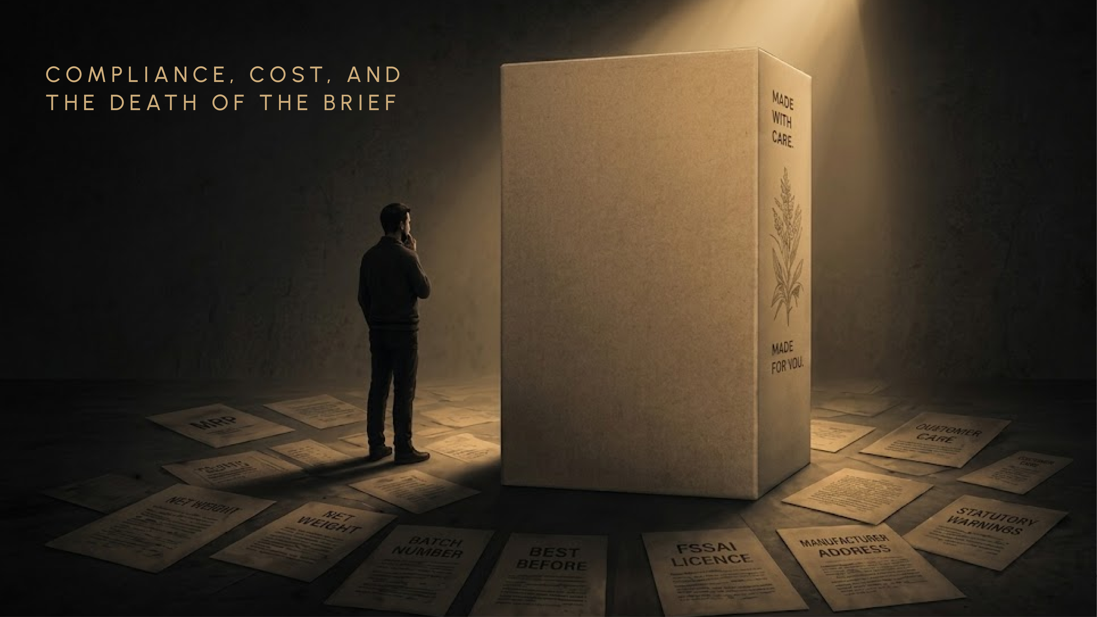
Then there is the regulatory layer.
MRP. Net weight. Batch number. Manufacturing date. Best before. FSSAI licence number. Manufacturer name and address. Customer care number. Statutory warnings. Ingredient list. Country of origin. Veg or non-veg dot. The Legal Metrology Rules of 2011 and FSSAI’s labelling regulations together claim a meaningful share of every Indian pack’s surface area before any brand decision is made.
Most founders treat this as a constraint to work around. They squeeze it into the back, in the smallest legible type, hoping nobody notices.
Pack-led brands treat compliance as the brief.
This is the single biggest difference I have watched separate the brands that build identity through pack from the ones that don’t. The compliance load is not your enemy. It is your second canvas. Apple treats the regulatory back-of-pack as a designed surface. So does Aesop. So does MUJI. The back is a place to demonstrate restraint, hierarchy, and the brand’s relationship with the customer’s intelligence.
If your back-of-pack looks like it was set by the legal team, the legal team is your art director.
When Packaging Is the Last Step in the Process, Not the First
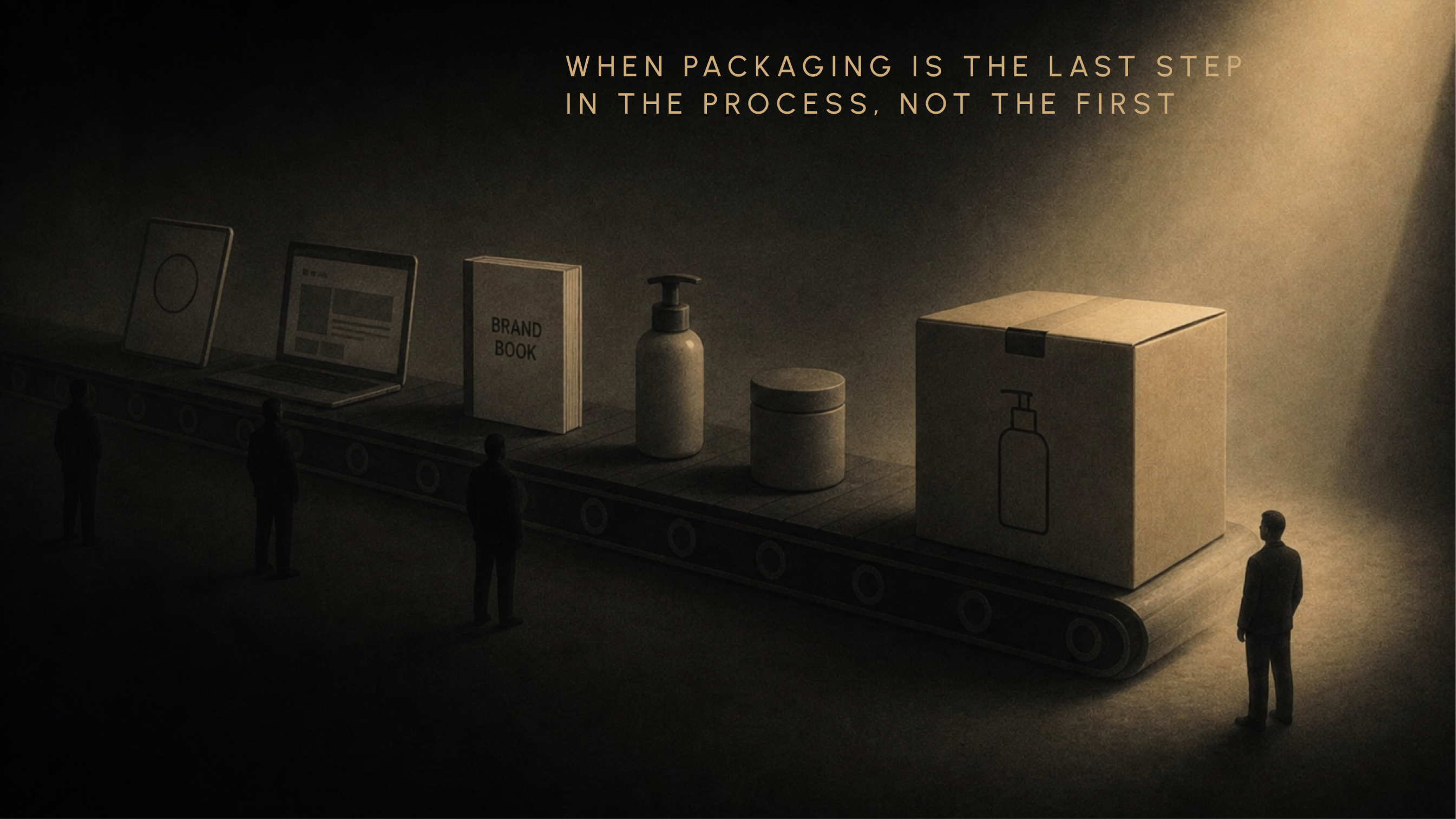
Here is the deeper structural problem.
In most consumer brand projects, packaging is briefed after the logo, the website, and the brand book are done. By the time the pack designer gets the brief, the strategic decisions have already been made for surfaces the customer will see far less often than they will see this one.
The pack should be the first design problem solved. Not the last. Every other surface defers to it.
Michael Bierut, the Pentagram partner, has written about this for years. Packaging is one of the most demanding design problems because the designer cannot hide behind size or scrolling. There is no second screen. Twelve square inches, every brand decision committed at once, no take-backs.
That kind of constraint is where the strongest brand identities are forged. We just keep handing it out last.
Packaging as Identity, Not Application: The Reframe Indian Consumer Brands Need
Here is the move I want you to make.
Stop thinking of the package as where your brand identity gets applied. Start thinking of the package as where your brand identity is.
Everything else is downstream.
The logo is a derivative of how the pack looks. The website is a derivative of how the pack feels. The Instagram grid is a derivative of how the pack performs in real life. For brand identity for consumer brands India, the pack is the source. Not the surface.
This is not theory. The brands that have built durable identity in Indian consumer goods built it pack-first. The ones that struggled built it logo-first.
Identity Lives in the Object, Not Just the Logo

A logo can be screenshotted, redrawn, copied in fifteen minutes by any junior designer in Cyber City.
A pack cannot.
The silhouette of the bottle. The exact weight of the glass. The opening ritual. The paper choice on the secondary box. The smell of the ink as it comes off the printer. None of that copies easily. This is why heritage brands invest disproportionately in pack physicality and treat the wordmark as almost incidental. Aesop’s amber bottle is the brand. The wordmark is the proof of what the bottle already said.
Walter Isaacson’s biography of Steve Jobs documents the same principle inside Apple. Jobs personally reviewed packaging. Apple operated a dedicated packaging design lab. The unboxing was a story arc with paper engineering, designed years before YouTube made unboxing a genre. Jonathan Ive talked about packaging as the first product experience. Not a wrapper for the product. The product itself, beginning at the pack.
Most Indian founders, when they say “brand identity”, point at the logo file.
The customer never sees the logo file. The customer touches the pack.
Three Indian Brands That Built Identity Through Pack
Three short stories, picked because each one made the pack decision before they made the brand decision, and each one created identity from the package outwards.
Paper Boat. Hector Beverages was founded in 2009 by Neeraj Kakkar, Neeraj Biyani, Suhas Misra, and James Nuttall. Paper Boat launched in August 2013. Before the brand had a positioning deck, before it had a tagline, before “Drinks and Memories” was a line anyone had said out loud, the founding team picked a Doypack flexible pouch as the format. The pear-shaped silhouette borrowed from astronaut food packaging gave Paper Boat a shape no Indian beverage had used at scale. Then they patented a conical cap. Then they picked an illustration style. The pack created the brand. The brand did not pick a pack.
Forest Essentials. Founded in 2000 by Mira Kulkarni in Delhi. Long before national distribution, long before the Estée Lauder stake in 2008, Kulkarni made the pack the entire argument. Gold-stamped jars. Hand-tied muslin. Brass caps. Heavy glass. The pack told the customer that Indian Ayurveda could be luxurious before they had ever tasted a single product. The Hyatt Regency order that became the early credibility moment was placed because of how the soaps looked and felt, not because of a brand book. The pack made the position credible. The brand caught up later.
Slurrp Farm. Wholsum Foods, founded by Meghana Narayan and Shauravi Malik. They walked into a category, kids’ food in India, where every pack on the shelf looked like a knock-off of Western imports or a mass-market biscuit brand. They built illustration-led pouches that looked like nothing else in the aisle. The pack invented the visual category for millet-based kids’ food in India. Without the pack, the category would have remained invisible.
In each case, the founders treated the pack not as an output of brand strategy. They treated it as the strategy itself.
Three Indian consumer brands that built brand identity through packaging — Paper Boat, Forest Essentials, Slurrp Farm pack-led identity comparison
What Packaging Carries That Logos, Websites, and Ads Cannot
So what specifically does the package transmit that other brand surfaces cannot? Three things, each one a channel of brand identity that a logo simply does not have access to.
Tactility. Sequence. Persistence.
Let me slow down on each.
Tactility: Weight, Paper, Ink, Surface
A heavy glass bottle says one thing. A flexible pouch says another. Uncoated stock signals something matte ink on glossy paper cannot. The Aesop amber bottle, the Issey Miyake frosted flask, the Apple white box. None of them communicate primarily through their wordmarks. They communicate through material.
This is what Bruno Munari was getting at in Design as Art (1966) when he wrote about the orange. The orange is a perfectly designed package. The skin protects, the segments portion, the smell signals freshness, the colour signals ripeness. No one designed it deliberately, but every consumer brand pack should be measured against it.
Hideyuki Oka’s How to Wrap Five Eggs (Weatherhill, 1967) is the foundational text on packaging as material philosophy. Oka documented the Japanese tradition of tsutsumi, wrapping, as an expression of respect, restraint, and material consciousness. A wrapped object in Japanese tradition is not just protected. It is honoured. The wrapping is the gesture.
Most Indian consumer brand packs are designed entirely on screen, signed off entirely on screen, and only encountered as physical objects when the first run comes off the line. By then it is too late to ask what the customer’s hand is going to feel.
Pack materials are an unsigned essay your customer reads with their hands.
Sequence: The Opening as a Designed Moment
Every package interaction has a sequence.
There is a pickup. A turn. A first look. An opening. A first reveal. A use. A closure. A re-opening. Eight designable moments, minimum, before the product is even gone.
Most Indian consumer brands ignore this sequence entirely.
Forest Essentials does not. The muslin tie on certain product lines is a designed delay, a small ritual you have to perform before you reach the product. Paper Boat’s conical cap is a designed pop, a small sound that became part of the brand recognition. Apple’s iPhone box, which Walter Isaacson documented, was paper-engineered to release at a specific speed when lifted, building a moment of theatre into the unboxing.
The sequence is not a UX problem. It is a brand authorship problem. Every moment in the sequence is a moment to say something about who you are.
If your pack opens with tape and a tear strip, you have outsourced eight authorship moments to the corrugator vendor.
Persistence: The Pack Lives in the Home for Weeks
A digital ad disappears in three seconds.
A pack sits on a shelf for a month, a season, sometimes longer.
This longer dwell time changes the entire design problem. Every choice, colour, hierarchy, font, illustration, has to survive familiarity, not just attention. The pack that grabs you in the first 200 milliseconds at the kirana counter has to also reward you on day forty-five, when you have made the same chai and reached for the same jar and seen the same label two hundred times.
The first test is, be visible. The second test is, be liveable.
This is one of the reasons the unboxing economy has become a meaningful brand surface in its own right. It extends pack persistence by a few extra hours, into content. It makes the pack work for longer, against more eyes. We have written separately about how unboxing as a brand surface changes the calculus, and the short version is this: persistence used to end at the kitchen shelf. Now it ends on someone’s Instagram story.
Munari again, writing about objects in domestic space: an object you live with has to age into pleasure, not into fatigue. That is the persistence test.
Most packs fail it.
If you are looking at your current pack and seeing more label than brand, that is the brief problem. We work with founder-led Indian consumer brands on exactly this gap. See how we approach pack-led brand identity in our consumer-brand work.
The Pack Brief: Brand Identity for Consumer Brands India in Three Dimensions
Here is where the essay becomes operational.
A pack brief is fundamentally different from a logo brief or a website brief. It operates in three physical dimensions, across multiple sensory channels, against multiple retail contexts, with regulatory load baked in. You cannot brief a pack the way you brief a homepage.
So what does a real pack brief look like? Let me give you the version we use.
Six Questions Every Pack Brief Should Answer
Pack brief framework — six questions every Indian consumer brand should answer before packaging design begins
Each question becomes a chapter of the brief. Most pack briefs in India answer two of these and skip the rest.
The Brief Before the Sketch: What Strategy Looks Like on Pack
Most pack briefs in India are written as Pinterest boards.
A real pack brief is written as positioning plus behaviour plus material.
If your positioning is “premium Ayurveda”, that is not a pack brief. That is a position. The pack brief is what that position becomes in glass thickness, paper choice, label hierarchy, opening ritual, restraint of claims, and quiet of typography. It is the operational translation of position into material.
Marty Neumeier in Zag (2006) made the case that the strategic brief, not the strategic deck, is where differentiation actually happens. David Aaker, in Building Strong Brands (1996), distinguished between core identity and extended identity. The pack is where the core identity has to become physically manifest. Everything else is extended.
Wally Olins put it most directly. The brief, not the design, is the strategic decision.
If you want to know whether your brand strategy is real, look at your pack brief. If it reads like a Pinterest board, the strategy is decoration.
Designing Across the Indian Retail Reality: Kirana, Modern Trade, Q-Commerce
India is not one retail context. There are at least three, each one with radically different physical and attention conditions, and each one demanding different things from the same pack.
A pack designed only for one will fail in the other two.
This is the operational reality that most agency presentations skip past, because it is uncomfortable.
The Kirana Wall: Where Pack Survives Clutter
The majority of Indian FMCG retail still moves through kirana stores. The exact share has shifted as Q-commerce has grown in metros, but for a national brand, the kirana wall is still where most of the volume happens.
The kirana shelf is not a shelf in the modern trade sense. It is a wall, stacked vertically, dimly lit, with the shopkeeper as the gatekeeper. The customer often does not pick the pack. The customer asks, and the shopkeeper picks.
Your pack has to be visible to the shopkeeper at angle, in low light, from across the counter, identifiable from the back of the customer’s memory when the customer has only said “the green one” or “the one with the dancing girl”.
Most premium D2C packs fail this test. They were designed for a phone screen. They show up on a kirana wall and disappear into the noise.
The Modern Trade Shelf: Where Pack Competes With Itself
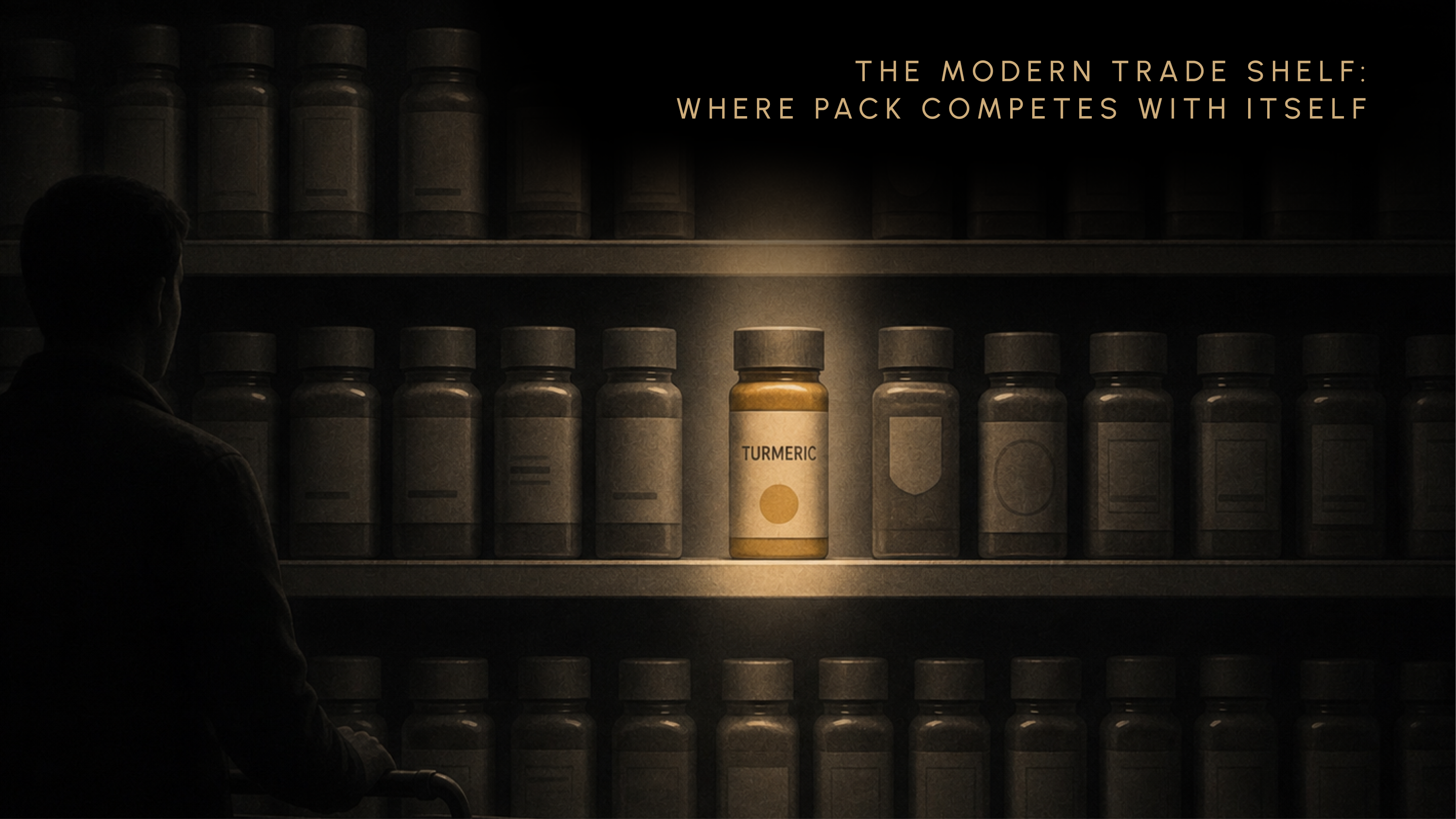
In a DMart, Reliance Smart, or Star Bazaar, the rules change.
Now the pack is lined up next to its eight closest competitors at eye level. The shopper can see all of them at once and is comparing in real time. The fight is no longer be visible. It is be different from the eight nearly identical packs beside you.
This is where ownable colour, silhouette, and pack-as-system thinking matter most. If your turmeric bottle looks like every other turmeric bottle on that shelf, your differentiation is reading time. The shopper has thirty seconds in front of that section before they move on.
Damodar Mall has documented in Supermarketwala how DMart specifically has trained its customers to scan a category quickly. The packs that win in DMart are the packs that have made one or two non-negotiable physical choices before they made any colour choice.
The Q-Commerce Tile: Where Pack Becomes a Thumbnail
Then there is the newest and harshest context.
Zepto, Blinkit, Instamart. The pack is now a 200-pixel thumbnail in a grid of similar thumbnails. The customer is on a phone, in a hurry, often ordering on instinct. Every word smaller than the brand name is invisible. Every illustration finer than a postage stamp disappears.
Hierarchy at the thumbnail scale is now an identity decision, not a cosmetic one.
Pack designers have started talking about tile-first design, which is a new way of saying what we have always known: design for the smallest, hardest reproduction first, and let the larger reproductions take care of themselves. Most Indian consumer brand packs are designed at A4. They look gorgeous at A4. They die at 200 pixels.
This is the test we have written separately about, the 200-millisecond shelf test, and it now applies twice. Once at the kirana shelf, and once again in your customer’s palm.
A pack that survives all three contexts is a pack that has been briefed properly. A pack that wins in only one is a portfolio piece, not a brand asset.
Eight Recurring Failures in Indian Consumer Brand Packaging
You can spot all eight of these in any large supermarket in any Indian city, on any given afternoon. I am not going to name brands. I am going to name patterns.
If you find your pack in three or more of these, the brief failed. Not the designer.
1. Logo bloat. Front-of-pack dominated by an oversized logo that drowns hierarchy. The brand is shouting because the brief did not give it anything else to say.
2. Premium clone syndrome. Premium positioning expressed through the same cream-plus-serif-plus-gold-foil template, identical across categories. Skincare, snacks, ghee, chai, all wearing the same costume. The category visual is doing the heavy lifting because the brand does not have its own.
3. Founder photo and story dump. Pack used as a press release. Twenty lines of origin story competing with the product name. The founder is on the pack because the founder did not yet trust the brand to communicate without them.
4. Stock illustration trap. Generic produce illustrations, generic founder cartoons, generic geometric patterns, all sourced from the same five vendor libraries. You can tell because three brands in three categories will use the same orange-with-a-leaf graphic.
5. Multi-claim chaos. Five product claims competing for the same eye position. 100% natural. No preservatives. Vegan. High protein. Family pack. None of them register because all of them register at once.
6. The thumbnail killer. A pack readable beautifully at A4, dead at 200 pixels on Q-commerce. The pack was designed in InDesign at full size, never tested at thumbnail. Nobody asked the question.
7. No system across the SKU range. Each variant designed in isolation. Three flavours, three different design languages. No recognisable family at the shelf. The brand is fragmented before it has even been encountered.
8. The compliance dump. Back-of-pack treated as a legal graveyard. Eight-point type, no hierarchy, no visual relationship to the front. The brand stops being a brand the moment you turn the pack over.
These are not designer failures. They are brief failures. Every one of them traces back to a pack that was briefed as a label, not as a brand surface.
Six Principles for Pack-Led Brand Identity in Indian Consumer Brands
Here is how to think about it. Six principles, not rules. Principles are how to think. Rules are what to do, and the moment you write a rule someone breaks it correctly.
1. Brief the pack first. Before the logo. Before the site. Before the deck. The pack is the highest-frequency brand surface, so it should be the first design problem solved. Every other surface defers to it.
2. Design the silhouette, not the front-of-pack. Ownability lives in shape and proportion before colour and type. The Coca-Cola bottle silhouette is recognisable in a black-and-white shadow. That is the bar.
3. Restraint scales. Decoration does not. Every additional element on a pack is a tax on legibility, on production cost, on SKU range extension, on retail context performance. The pack you do not load up is the pack you can scale.
4. Build a system, not a hero pack. A single beautiful pack that does not extend across a range is a portfolio piece. It is not a brand. The system is what survives the third flavour, the fifth size, the next category extension. We have written separately about scalable packaging architecture for a growing SKU range, and the short version is this: design the system you will need three years from now, not the pack you need this quarter.
5. Treat compliance as a designed surface. Back-of-pack is the second canvas, not the bin. Apple, Aesop, MUJI all treat the regulatory surface as a brand surface. So can you. The compliance load is the brief, not a constraint to work around.
6. Test at three sizes and three lights. A4 mockup. Kirana shelf. Q-com thumbnail. If your pack does not survive all three, the brief is broken. Test before print, not after print, because the test after print is called a recall.
These six are not exhaustive. They are diagnostic. If your current pack fails on three of them, you do not have a packaging problem. You have a brief problem.
Frequently Asked Questions
How important is packaging for brand identity for consumer brands in India?
For any product business, packaging is the highest-frequency, longest-dwell brand surface a customer ever encounters. In the Indian retail context, where the same pack must survive kirana clutter, modern trade competition, and Q-commerce thumbnails, the package carries identity weight no logo or website can match. It is not a touchpoint. It is the touchpoint.
What is the difference between packaging design and brand identity?
Packaging design is often treated as a sub-craft of brand identity, executed downstream of the logo and the brand book. For consumer brands, this is backwards. The pack is the identity’s primary physical expression. Apple, Aesop, and Paper Boat all built identity from the package outwards. The logo is downstream proof of what the pack has already said.
How much should an Indian consumer brand spend on packaging design?
The honest answer avoids fee ranges and frames it differently. Pack should command at least the same investment as logo and website combined for any consumer brand, because it is held and seen far more often than either. If your packaging line item is smaller than your homepage line item, the budget is misallocated.
Why do most Indian FMCG brands look so similar?
Three reasons. First, the manufacturing-led legacy that prioritised plant capacity over brand expression. Second, a vendor ecosystem of converters and printers that defaults to a narrow set of finishes and formats. Third, the premium clone pattern, where category-typical templates substitute for differentiation. Any brand that breaks the visual default in a category buys a free first-mover advantage in shelf attention.
A Pack Is a Promise You Hand Someone
Go back to the bottle.
The amber glass in the Mumbai bathroom. The cool weight in the palm. The pump that moved with that small expensive resistance. That moment, before any word arrived, when you decided something about the brand.
That is the only piece of brand communication a customer ever puts in their hand and takes home with them.
Not the logo. Not the ad. Not the website. Not the founder’s LinkedIn post about the company’s mission. The pack. The thing in the kitchen, in the bathroom, in the kirana counter, in the customer’s actual physical life for weeks at a time.
If brand identity for consumer brands India is anything, it is this surface. Build it like you mean it.
Or do not bother building any of the rest.


Continue
Reading


Why 'Premium' Fails as a Brand Positioning Strategy
'Premium' shows up in almost every brand brief we've reviewed. It solves nothing. This piece breaks down why premium is a destination rather than a brand positioning strategy, and what the brands that actually command premium pricing did differently.
