Typography Design Is a Positioning Call for Visual Identity Projects. Here's Why
May 21, 2026


Here is how it usually goes.
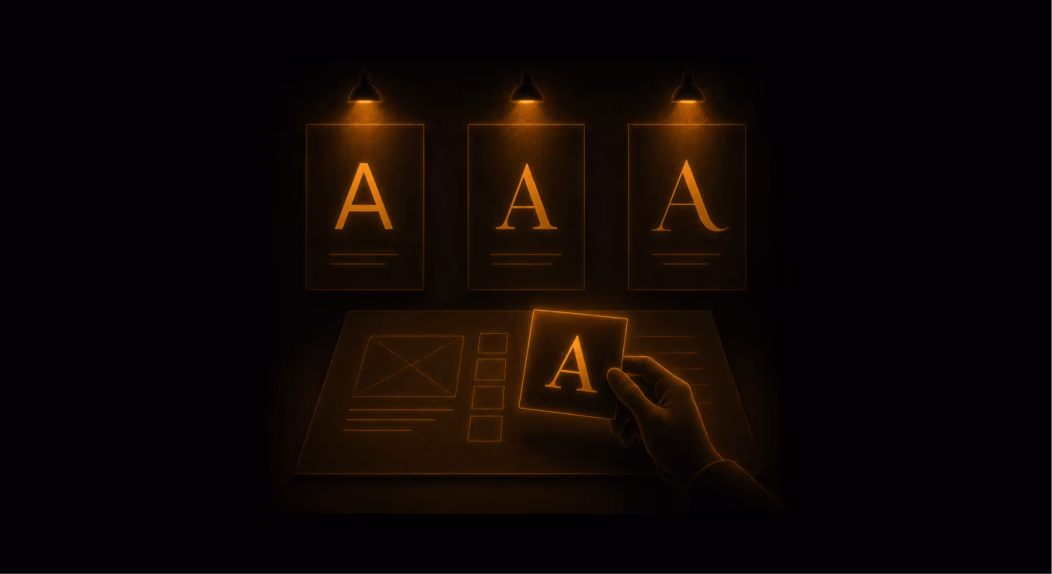
A founder opens a Figma file. The brief is done, the naming is locked, the colour palette is settled. The last remaining question in the visual identity design process, or so it seems, is the typeface. Three options sit on the mood board. One looks clean and modern. One has a bit of warmth. One feels premium, somehow, though nobody in the room can say why.
Thirty seconds later, the decision is made. The "premium" one wins.
This is a scene that happens thousands of times a day across every design studio and startup sprint in the world. And in almost every instance, what just occurred was not a stylistic decision. It was a positioning decision made without any positioning rationale.
Robert Bringhurst, whose The Elements of Typographic Style remains the closest thing the field has to a canonical text, put it plainly: "The type fonts we use, and the way we use them, are like the clothes we wear, subject to taste and tradition." He was describing a constraint, not a freedom. A typeface does not arrive neutral. It arrives carrying class, era, ambition, and disposition, all encoded in its letterforms before your first word is read.
This piece is a framework for choosing type the way a strategist would: not by feel, but by signal.
Table of Contents
1. Why Typography Is a Decision, Not a Step
2. The Four Signals Every Typeface Sends
3. How to Evaluate a Typeface Strategically
4. Three Brands Where Typography Was a Positioning Decision
5. Frequently Asked Questions
6. The Brief You Should Write Before You Open a Type Catalogue
Why Typography Is a Step in the Visual Identity Design Process That Most Brands Get Wrong
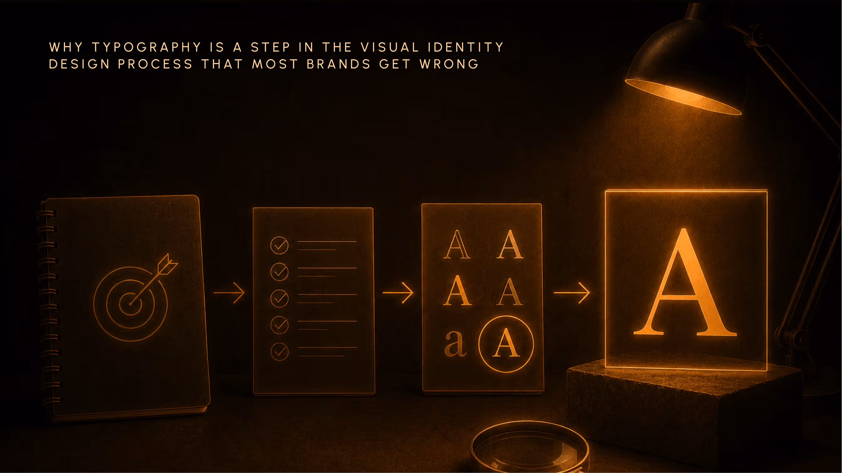
Most brands treat typeface selection as the final decorative act. Strategy is done. Copy direction is done. The brief has been written and approved. Now the designer opens a catalogue and finds something that "fits the vibe."
This is backwards.
A typeface is a claim. It says: this brand belongs here, speaks like this, costs this much, and treats its customer this way. Those signals do not disappear because the team chose the font while distracted. They persist. They either reinforce the brand's positioning, or they work silently against it.
The same logic that governs tagline selection, pricing strategy, or channel choice governs type selection. It should be evaluated against strategy, not taste.
What a Typeface Communicates Before Anyone Reads It
The serif-versus-sans-serif conversation is a starting point, not an insight. Yes, serif fonts have historically signalled authority and tradition. Yes, sans-serifs carry associations with modernism and progress. But these are category-level signals. What actually matters is the specific typeface within a category, and the cultural history embedded in its design.
Bringhurst frames typography as a discipline requiring "a deep understanding of language, culture, and history." Not an eye for aesthetics. Not an instinct for what looks right. Culture and history, understood and applied deliberately.
The reader's eye registers these signals before the brain processes the words. Think of it as the typographic equivalent of a voice. You can say the same sentence in a cold, clipped register or in a warm, unhurried one. The words are identical. The meaning is not.
The Contradiction Test: When Type Undermines Brand Strategy
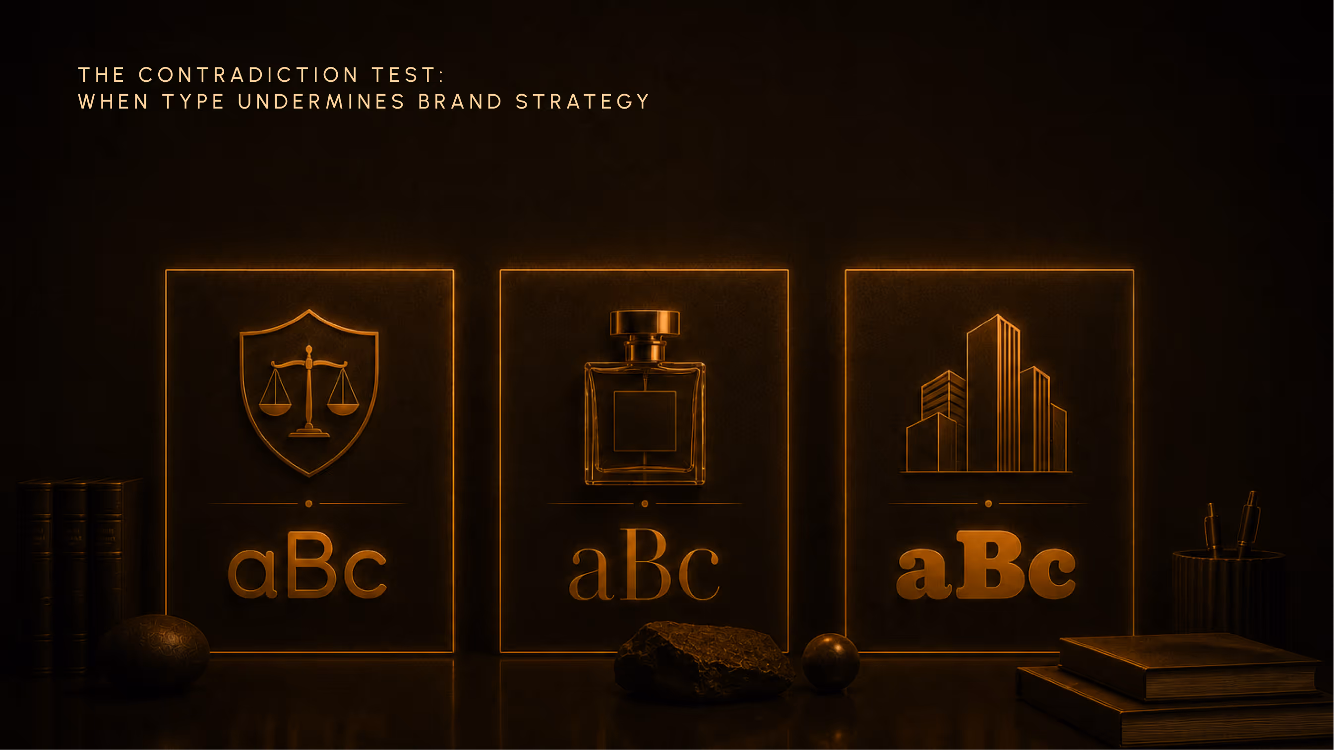
Type mismatches are not subtle to the people experiencing them. They may not be consciously identified. But they generate a friction, a sense that something does not add up, that erodes trust without the viewer knowing why.
A law firm using a rounded, playful sans-serif. A luxury fragrance brand using a generic system font. A challenger brand using the same corporate Helvetica as the bank down the street. Each one signals either "we did not think about this," or actively contradicts the positioning the brand is trying to claim.
Paula Scher of Pentagram has argued that when the spirit of the type conflicts with the meaning of the word, cognitive dissonance follows. The word carries one message; the letterform carrying it says something else.
The contradiction is felt before it is named. And by the time the audience has moved on, they have already decided.
The Four Signals Every Typeface Sends in the Visual Identity Design Process
Every typeface answers four questions simultaneously, whether or not you intended to answer them. The framework below is not a taxonomy of typeface styles. It is a set of lenses: four lines of questioning you run before making a decision.
Signal 1: Class (Who This Brand Considers Its Peer Set)
A typeface signals where a brand believes it belongs in the cultural hierarchy. Not where it currently is. Where it believes it belongs.
High-contrast serifs like Bodoni and Didot position alongside heritage fashion houses. Vogue has used Didot for decades: refined, assured, an authority that does not raise its voice. Geometric sans-serifs like Futura and Circular position alongside tech-modernism. Transitional serifs like Baskerville and Times New Roman position alongside intellectual institutions, universities, broadsheets, the established record.
The useful question is not "which category does this typeface belong to?" It is: if this brand were a person, what room would this typeface walk them into?
Massimo Vignelli, in The Vignelli Canon, reduced his entire working palette to roughly a dozen typefaces: Garamond, Bodoni, Century Expanded, Helvetica, Futura, Baskerville. His reasoning was not aesthetic minimalism. It was a class argument. He believed that most new typefaces were “designed for commercial reasons, just to make money,” and that the enduring ones had earned their standing through cultural use. Choosing from the canon was, for Vignelli, a philosophical stance as much as a design decision.
(Most founders would file that under stubbornness. It’s worth asking whether they’re wrong.)
Signal 2: Era (When This Brand Thinks It Belongs)
Every typeface carries a period. Most brands choose type without knowing which period they are importing.
Helvetica, designed by Max Miedinger and Eduard Hoffmann at the Haas foundry in 1957, is not a neutral typeface. It was the visual embodiment of the International Typographic Style's philosophy: strip away decoration, deliver information efficiently. It was born as postwar Swiss rationalism made visible. When a brand chooses Helvetica today, they are borrowing that ideology, whether they know it or not.
Futura, released in 1927, carries the early modernist optimism of the Bauhaus era. Garamond, with roots in the 16th century, carries the Enlightenment's relationship with the printed word. Cooper Black, designed by Oswald Cooper in the early 1920s, carries warm early-American commercial energy: heavy, rounded, built for storefronts.
Using a typeface without knowing its period is like wearing an era's costume to an event without knowing the era. The period leaks through.
For most brands, the goal is either timeless or deliberately contemporary. Both are valid positions. Accidental retro is not.
(This one catches more brands than you’d expect.)
Signal 3: Ambition (How Large This Brand Wants to Feel)
Some typefaces expand. Others compress. Weight, contrast, x-height, and optical width combine to create a sense of scale before any copy is applied.
Spotify commissioned a custom typeface, Circular, precisely because they needed type that performed with equal authority at ten pixels on a mobile screen and a hundred pixels on a billboard. That decision, reported to have cost somewhere north of two hundred thousand dollars, was not a design indulgence. It was a business argument: a brand operating at this scale cannot afford to borrow a typeface designed for someone else's ambitions.
IBM made the same argument when they commissioned IBM Plex in 2017. After decades of Helvetica, IBM built a complete custom type family: sans, serif, mono, covering over 110 languages. The message was not aesthetic. It was: our scale demands type that belongs entirely to us.
A brand claiming global ambitions while using a narrow, low-contrast face reads tentative. A boutique brand using an oversized, loud display type reads compensatory. The scale the type implies should match the scale the brand is actually reaching for.
Signal 4: Disposition (How This Brand Wants to Be Approached)
Disposition is the interpersonal signal. It answers: how does this brand want its customer to feel in its presence?
This is perhaps the most misunderstood signal because it is the most emotionally legible, and therefore the one founders most often try to manage by feel. The problem is that disposition is also the easiest signal to misalign. An enterprise SaaS brand choosing a rounded, playful sans-serif signals a different relational contract than its pricing and product imply. A challenger food brand choosing corporate Helvetica is whispering "take me seriously" so loudly that no one believes it.
Disposition should match the brand's actual relationship with its customer. Not the relationship the founder wishes they had. The one the brand has earned, or is genuinely building toward.
How to Evaluate a Typeface in Your Visual Identity Design Process
The four-signal model is only useful if it produces a decision process, not just a framework to admire. Below is the four-step evaluation we apply at Izart before any typeface is shortlisted for a client.
Step 1: Name the Position Before You Open a Type Catalogue
This one step eliminates most of the ambiguity.
Before looking at a single specimen, write four sentences: the class your brand is claiming, the era it wants to inhabit, the scale it intends to operate at, and the disposition it wants to project toward its customer.
If your team cannot answer these questions without opening a mood board, the strategy work is not done. Type selection is downstream. It cannot fill a strategic gap. A typeface selected before these four questions are answered is a guess dressed up as a decision.
The brand's personality must be fully developed before typography choices can be meaningfully made. The personality informs the type, not the other way around.
Step 2: Run the Four-Signal Audit on Your Shortlist
Take three candidate typefaces. For each one, answer the four signal questions: what class is this communicating, what era is it importing, what ambition does its scale imply, and what disposition does it project?
If any answer contradicts the position named in Step 1, that typeface is disqualified.
This is not about finding the objectively best typeface. It is about finding the typeface that tells the right story for this brand at this moment. Two equally well-crafted typefaces can arrive at completely different answers to all four questions. The better typeface, for this purpose, is the one whose answers align.
Step 3: Read the Category Context
A typeface that passes the four-signal audit must then be evaluated against the competitive landscape.
Is it doing what every competitor is doing? That is not automatically a mistake. Category codes exist for reasons. A legal firm using a serious serif is playing to expectations that work in their favour. But conformity should be a conscious choice, not a default.
The more useful question: where does conformity serve us and where does differentiation create a competitive advantage?
When COLLINS rebranded Mailchimp in 2018, they chose Cooper Light in a market flooded with Helvetica and Open Sans. Every other email marketing tool looked clean, professional, and completely interchangeable. Mailchimp chose warmth. The type positioned them outside the category they were technically part of, which was exactly the point. This kind of deliberate break from category norms is directly related to a broader principle explored in our piece on colour as a positioning decision, where the same logic applies to palette.
Step 4: Test for Contradiction Across the System
Type does not live in a specimen. It lives alongside colour, imagery, copy tone, price point, and channel.
A typeface decision that holds beautifully as a standalone specimen can still produce friction when it meets the rest of the system. The only way to test this is to place the shortlisted type in context: in the hero image, on the packaging, in the email template, in the small print on the contract.
If anything feels incongruent, and requires creative justification to explain why it still "works," the type is probably wrong.
Creative justification is a warning sign. The right typeface does not need defending. It just fits.
In short, the four-step type evaluation:
1. Name the position (class, era, ambition, disposition) before opening a catalogue.
2. Shortlist three typefaces. Run each through the four-signal audit. Disqualify any that contradict your stated position.
3. Read the category. Decide consciously whether to conform or differentiate.
4. Test in context. If the type requires creative justification to defend, it is probably wrong.
Three Brands Where Typography Was a Positioning Decision
These are not case studies in good type choices versus bad ones. They are evidence that typefaces carry positioning weight whether or not the brand intends them to.
Mailchimp: When a Typeface Is a Market Position
The 2018 COLLINS rebrand chose Cooper Light, a rounded American serif with roots in Oswald Cooper's 1920s display work, in a market that had standardised on sans-serif rationalism.
This was not an aesthetic choice. It was an argument: Mailchimp is not a corporate SaaS tool. It is a creative partner for growing brands. The disposition signal, approachable, warm, slightly weird, matched the brand's actual relational contract with its users.
When Cooper Light's technical limitations became apparent, Mailchimp did not default to a safer option. They commissioned a custom typeface, Means, from Commercial Type in 2020. Designer Greg Gazdowicz described the brief in terms that every brand strategist should write down: "Smart but not stuffy. Goofy but definitely aced its SATs." That is not a description of letterforms. That is a positioning brief expressed through type.
The decision was made twice. Both times from position, not preference.
Celine (2018): The Accent as Ideology
When Hedi Slimane took over as creative director of Céline in 2018, one of his first acts was to remove the accent from the 'e.' The brand became CELINE.
One character. An entire brand philosophy overturned.
The accent in Céline was not punctuation. It was a marker of French provenance, of a specific relationship to womenswear authority, of the quiet intellectual luxury Phoebe Philo had built over a decade. Slimane's removal of it signalled a repositioning: from editorial authority to international commercial legibility.
You may or may not agree with that shift. That is a separate argument. The point is that the typographic decision was immediately legible as a brand philosophy. A critic quoted in Hypebeast's coverage of the simultaneous fashion house rebrands that year noted that Burberry, in its own type changes, had "ceased to be grounded in any typographic styling that is recognizably British or from a heritage of English type forms." The same logic applied to Celine. The type had been carrying a cultural heritage. Removing one character made visible the decision to sever it.
Gap (2010): Type Without a Position
In October 2010, Gap replaced its iconic blue-box serif wordmark with a Helvetica-based minimalist mark. The backlash was immediate and complete. Within six days, Gap reversed the decision.
The failure is commonly narrated as a story about nostalgic attachment. Customers loved the old logo. They resisted change.
That is not what happened.
Helvetica is not a bad typeface. The problem was not the choice of Helvetica. The problem was that the type changed without any corresponding shift in brand positioning, product strategy, or cultural narrative. Helvetica imported a class signal, corporate modernism, Swiss rationalism, international efficiency, that contradicted Gap's actual identity: accessible American casualwear, heritage denim, the clothes that belong to everyone.
The type said one thing. The brand meant another. The contradiction was felt before anyone articulated it.
Gap's failure was not a design failure. It was a consequence of treating type as decoration that can be refreshed in isolation from strategy. The brand "failed to provide a convincing reason for the change." That is not a presentation problem. That is the absence of a positioning rationale. Which made the entire decision arbitrary.
The same question that governs any design decision, which we explore in more depth in our piece on what makes a design decision strategic, applies here: what is this choice in service of? Without an answer, every option is equally arbitrary.
Frequently Asked Questions About Typography in the Visual Identity Design Process
How do I choose the right typeface for my brand's visual identity?
Start by answering four questions in writing: what class is your brand claiming, what era does it want to inhabit, what scale of ambition does it intend to project, and what disposition does it want to broadcast toward its customer? Only after these are articulated should you open a type catalogue. Then shortlist three options, run each through the four-signal audit, and choose the one whose answers align with your stated position.
What is the difference between a primary typeface and a secondary typeface?
Your primary typeface carries the brand's personality: it appears in headlines, key brand moments, and anywhere the brand is speaking at full volume. Your secondary typeface handles hierarchy, body copy, and utility. The two should be complementary but distinct in optical purpose. Many strong brand systems use a single typeface family with multiple weights rather than two separate families, keeping the system clean and avoiding personality conflicts between the two.
Should a startup invest in a custom typeface?
Rarely, at the early stage. Custom type is warranted when you are operating at sufficient scale that a borrowed typeface carries too much cultural baggage, or when category norms make differentiation genuinely necessary across a wide range of contexts. For most early-stage brands, a strategically chosen existing typeface delivers far more value per pound spent. Get the selection right first. Commission custom type when you have outgrown the options available.
Can changing a typeface change brand perception?
Yes, in both directions. Mailchimp's Cooper Light positioned them outside the norms of their category, which was the point. Gap's Helvetica introduced a class signal that contradicted everything the brand stood for, which is why it failed in six days. The distinction: a type change that reinforces an existing or intended position builds equity. A type change used as a substitute for a positioning decision creates confusion. The same typeface can do either, depending on whether the strategic work came first.
The Brief You Should Write Before You Open a Type Catalogue
Go back to the scene at the start.
The founder, the mood board, the three options. One looks clean and modern. One has warmth. One feels premium, somehow.
What if the question in the room were not "which one feels right?" but "which one is telling the truth about this brand?"
The reframe changes everything. The warm one might be telling the truth. Or it might be projecting a disposition the brand has not earned. The premium one might be signalling a class the brand aspires to. Or it might be importing a century of associations that sit uneasily next to the product's actual price point. The clean modern one might be right. Or it might be the default choice, the option that means nothing because it has been chosen by everyone.
Bringhurst said the type fonts we use are like the clothes we wear. Clothes carry class, era, ambition, and disposition. A person in the wrong clothes is not just aesthetically mismatched. They are communicating something false, and the people around them feel it, even if they cannot name it.
The same logic extends to every visual decision: how layout encodes brand hierarchy, how colour makes cultural arguments, how the system either holds together or quietly contradicts itself (more on this in our piece on how layout encodes brand hierarchy).
Write the four-sentence brief before you open the catalogue. Name what you are claiming. Name the era you are inhabiting. Name the scale you are reaching for. Name the disposition you want to project.
The right typeface, once you have answered those four questions, will not feel like a choice. It will feel like the only honest answer.