Semiotics for Founders: Brand Identity vs Brand Strategy
May 18, 2026


Phil Knight looked at the sketch and said, "Well, I don't love it, but maybe it will grow on me."
It did. The sketch cost him $35. It went on to become one of the most recognised visual signs in human history. At the time, he had no idea what he was looking at.
Most founders don't either.
You're in the room. Three logo concepts on the table or on screen. Your designer is watching you. And the sentence that forms is the same one that forms in a thousand boardrooms every year: "I don't love it."
The problem isn't your taste. The problem is that you're looking at a sign system without any framework for reading what it's signing.
The question of brand identity vs brand strategy feels like a scope question, a sequencing question. It isn't. It's an ontology question. It's about what something fundamentally is.
Until you understand what brand identity actually is, you'll keep making decisions based on whether a sign pleases you rather than whether it's doing its job.
Contents
1. What It Means for Something to Mean Something
2. Brand Identity vs Brand Strategy: A Semiotic Reading
3. The Hidden Vocabulary of Every Visual Decision
4. Peirce's Three Sign Types and Why They Matter to Founders
5. When Signs Break: Brand Decisions That Failed Their Strategy
6. What This Changes About How You Work With Brand Identity
7. Frequently Asked Questions
What It Means for Something to Mean Something

Semiotics is the study of signs. Not signs in the road-signage sense, though those count. Signs in the fundamental sense: anything that stands for something other than itself.
Ferdinand de Saussure, the Swiss linguist who founded modern semiotics, described every sign as having two components. The signifier: the perceivable form, the thing you see or hear or read. And the signified: the concept that form carries.
The signifier is the word "tree." The signified is your mental concept of a tree.
Here's the thing Saussure considered most important, and the insight most brand conversations ignore entirely. The relationship between signifier and signified is arbitrary.
There is nothing tree-like about the word "tree." In French it's "arbre." In Hindi it's "ped." The signifier is a cultural agreement, nothing more. Meaning is not embedded in forms. It's constructed around them.
This is where brand identity vs brand strategy splits into two entirely different questions. One asks what the form looks like. The other asks what the form should mean.
The Sign Behind Everything You See
Apply this directly to a logo.
A logo is a signifier. The shape of the mark, the weight of the line, the choice of typeface: these are the perceivable forms. What they signify is not determined by the designer and not determined by you. It is constructed through strategy, culture, and sustained use.
Your logo, on day one, signifies almost nothing. It is a mark without a meaning attached. Phil Knight didn't love the Swoosh on June 18, 1971, when it was trademarked. He accepted it because there was a production deadline to meet. The mark arrived in the world with no cultural weight behind it.
What it means now was built.
The Second Layer: Where Brands Live
Roland Barthes, writing in 1957, went one step further than Saussure. In Mythologies, specifically in the essay "Myth Today," he described how signs operate on two levels simultaneously.
At the first order: a rose is a flower. The signifier "rose" produces the signified "flower." That's denotation. That's the dictionary.
At the second order: a rose means romance. It means desire. It means love in a particular cultural register that has nothing to do with botanical facts. That's connotation. That's culture.
Brands don't live at the first order. They live entirely in the second.
A Hermès handbag denotes leather, metal hardware, and careful stitching. What it connotes is scarcity, taste, a particular kind of arrival into a particular kind of life. None of that meaning lives in the materials. It was constructed by a brand system operating over decades.
In "The Rhetoric of the Image," written in 1964 and later collected in Image-Music-Text, Barthes examined a Panzani pasta advertisement and identified how the image's colour palette and composition were generating "Italianicity" as a connotation, a cultural meaning layered entirely over the literal image. He called this connoted message the true subject of advertising.
It is also the true subject of brand identity. Every visual decision you make is an argument about what your brand should connote. The question is whether you know that before you make it. We've explored how this mechanism operates specifically in the context of trust in our earlier piece on how brands encode meaning before they ever speak.
Brand Identity vs Brand Strategy: A Semiotic Reading
Let me state the argument plainly.
Brand identity is the signifier layer. It is the visible, perceivable surface of your brand's sign system: logo, colour palette, typeface, spatial logic, photographic register, texture and material language. These are the forms through which meaning is delivered.
Brand strategy is the signified layer. It is the specification of what those forms are supposed to mean: in which cultural territory, to which audience, against which competitive codes, with what values and relationship at its centre.
Strategy is the signified. Identity is the signifier. Neither can do its job without the other.
Brand Identity as the Signifier Layer
Here is what brand identity actually names: the visible, perceivable surface of a sign system.
Every element of a visual identity is a signifier. The logo is a signifier. The typeface is a signifier. The colour palette is a signifier. The spacing between letters, the photographic style, the texture of materials: all signifiers.
Wally Olins defined brand as "organised perception." The key word is organised. What is being organised is not the visuals themselves but the meaning they produce in the perceiver's mind. Perception is the signified. Visuals are the organising instrument.
Marty Neumeier put it differently: "A brand is a person's gut feeling about a product, company, or organization." That gut feeling is the signified arriving in the receiver. The visual identity's entire job is to cause that feeling in the right person at the right time.
Form without meaning is noise. A beautifully crafted visual identity that doesn't know what it's signing is the most expensive kind of noise in business.
Brand Strategy as the Signified Layer
Brand strategy specifies what you want to mean.
Not how you want to look. Not which aesthetic you prefer. What you want to mean: in which cultural territory you're operating, for which audience you're building significance, against which other signs in the category you're defining yourself.
The strategic brief is, in semiotic terms, a specification of meaning before the sign is built. Without this, the designer has nothing to anchor to. They make a sign, and they make it well, and it carries some meaning, but no one has decided what meaning it should carry.
That is not a design problem. It is a strategy problem wearing a design mask.
The Category Error That Costs Founders Most
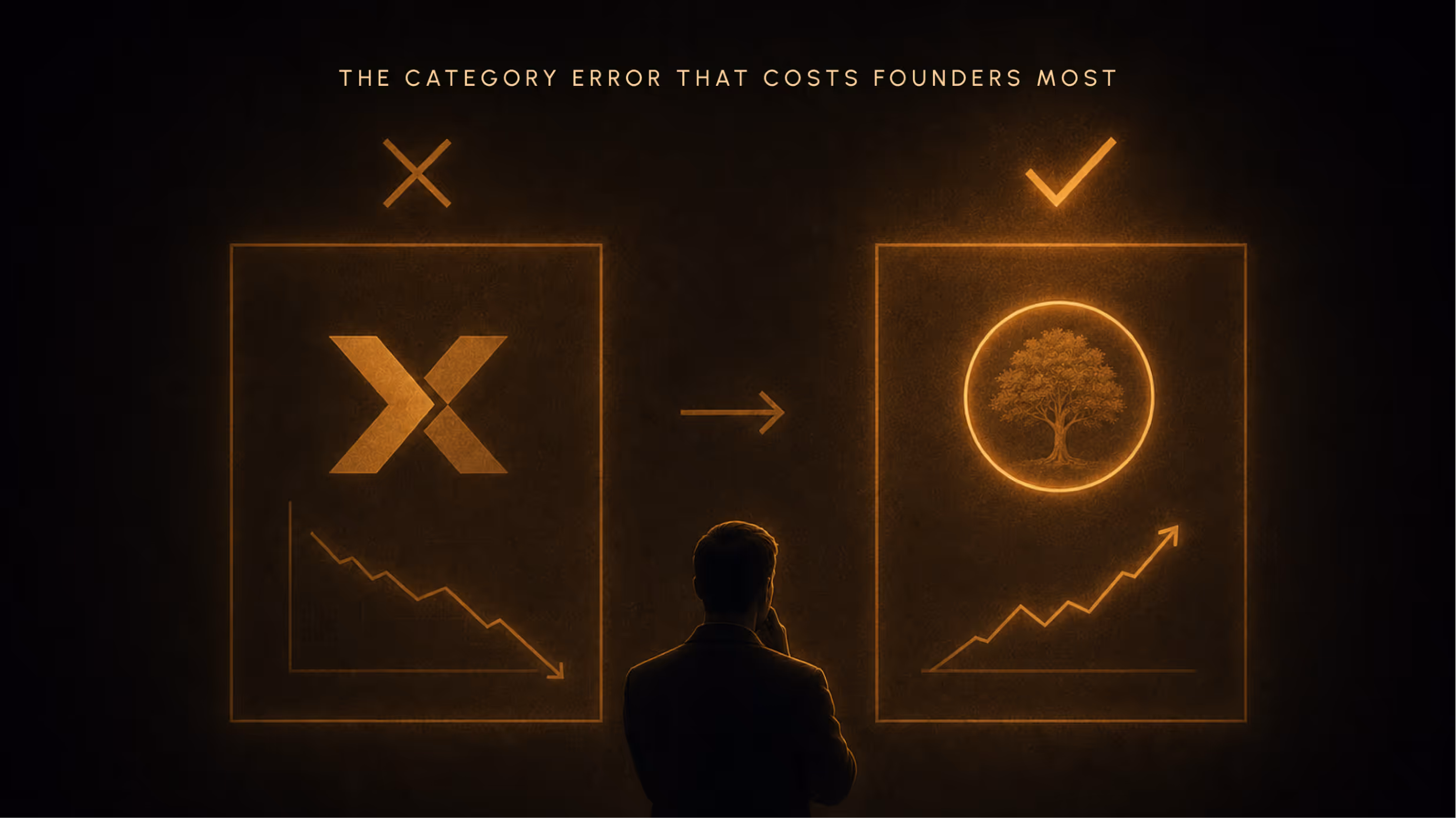
The most expensive mistake in founder-level brand work is confusing the sign for the meaning.
"Improve the logo" is almost always the wrong brief, because the logo is rarely the problem. The problem is that the signified is unclear. Strategy is absent, or underdeveloped, or was never translated into a specification for the identity.
This is why rebrands fail. Not because the new mark is bad design. But because a new signifier was built without a new, clearly specified signified to carry.
You can't fix a meaning problem by changing the form. You fix it by deciding what you want to mean, then building the form that carries that meaning consistently.
The Hidden Vocabulary of Every Visual Decision

Every element of a brand's visual identity is a sign. And every sign operates within cultural codes that determine what it means to the people reading it.
These codes are not absolute. They shift across cultures, subcultures, categories, and time periods. But they are real, and they are legible, and founders who don't understand them make visual decisions that sign the wrong thing.
Typeface as Cultural Signal
Serif typefaces carry the cultural codes of heritage, authority, print culture, and established institutions. The New York Times uses a serif because it is signing gravitas and institutional permanence. Rolex uses one because it is signing tradition and precision. Vogue uses one because it is signing a particular idea of considered elegance.
Sans-serif typefaces carry different codes: modernity, accessibility, technology, democratic design. Google's typeface signs approachability and clarity. Airbnb's signs belonging and simplicity. Most DTC brands default to sans-serif because they want to sign "contemporary and direct."
None of this is absolute. Virgil Abloh understood that perfectly. His use of Helvetica on Off-White, surrounded by quotation marks, turned a sans-serif into a sign for institutional critique. He was using the code in order to disrupt it. That only works if you know the code exists.
The code is always contextual. But it always exists. Simon Garfield traces the cultural biography of specific typefaces in Just My Type (Profile Books, 2010), including a treatment of Helvetica worth reading before you select any sans-serif as a "neutral" choice.
Colour as Code, Not Preference
In 1942, German-occupied Paris had supply shortages across nearly every category. One of the least consequential, in historical terms, was a shortage of cardboard boxes for a 105-year-old French leather goods house called Hermes.
Their usual cream and mustard packaging was unavailable. The only supply their provider could offer was a vivid orange that, by the house's own account, was "the colour nobody wanted."
Emile-Maurice Hermes added a brown ribbon and the house logo to it and sent the products out.
That colour, by the time Dana Thomas wrote about it in Deluxe (Penguin Press, 2007), had become Hermes' signature "almost overnight." By the 1990s, the orange box had won international packaging design awards.
Today, a plain orange box with no logo on it can be recognised globally as a Hermes product. The colour signs luxury, exclusivity, and heritage entirely through the consistency of its use over eight decades, not through any inherent property. Orange does not naturally mean luxury. It was made to mean it.
The sign acquired its meaning through disciplined, sustained, exclusive deployment. Nothing else.
This is what colour decisions actually are: not preferences, but investments in a cultural code. Our piece on why colour is never just a preference goes deeper into how this operates across categories, including where cultural codes conflict between markets.
Shape, Space, and What Silence Signs
Symmetry signs stability and institutional authority. Asymmetry signs movement, tension, and modernity. The rectangle signs hierarchy and containment. The circle signs wholeness and continuity.
These are conventions, not laws. But they operate with real cultural weight.
And what a sign doesn't show is as meaningful as what it shows. Lindon Leader's FedEx logo, designed at Landor Associates in 1994, hides an arrow in the negative space between the capital E and the lowercase x. The mark won over 40 design awards not because it's decorative but because it's indexical: it points, it moves, it signs speed and direction without stating them.
Premium brand communication is defined as much by what it withholds as by what it declares. White space is a sign of restraint. Of confidence. Of a brand that trusts its audience to bring interpretation to the space it leaves open.
Jan Tschichold argued, in Die Neue Typographie (1928), that asymmetric layout was itself a semiotic act: a rejection of classical hierarchy in favour of democratic, modern design. Every layout decision carries an argument, whether the designer intends it or not.
Peirce's Three Sign Types and Why They Matter to Founders
Charles Sanders Peirce, the American philosopher who developed semiotics independently from Saussure, went further than the signifier-signified pairing. In his Collected Papers (Harvard University Press, 1931-1958), he categorised signs by the nature of the relationship between the signifier and what it refers to.
His taxonomy: three types. Icon, index, symbol.
This is, arguably, the most practically useful framework in all of semiotics for anyone making brand identity decisions.
The Icon: When Signs Resemble What They Represent
Iconic signs resemble what they represent. The photograph of a building resembles the building. The image of a leaf on a sustainable brand's logo resembles a leaf and, by resemblance, signs naturalness.
Founders instinctively gravitate toward iconic signs. They are legible. They're immediate. They tell people what the brand is about without requiring any prior cultural knowledge.
The risk is category saturation. If every sustainable consumer brand puts a leaf in its logo, the leaf has stopped being a distinctive sign and has become a category expectation. It's the minimum viable signal rather than a differentiating one. You're not signing your brand. You're signing your category.
Iconic signs are not inherently inferior. But they are the most literal register of signing, and the most susceptible to dilution. When you see a leaf on a product, do you think of the brand, or do you think "oh, sustainable"?
The Index: When Signs Point by Association
Indexical signs don't resemble what they mean. They point to it through a real, earned connection.
Smoke indexes fire. A thermometer indexes temperature. The connection is factual, not resemblance-based.
In branding: the Nike Swoosh had no inherent meaning in 1971. Carolyn Davidson, a graphic design student at Portland State University, drew it in around 17.5 hours and invoiced Phil Knight $35. The mark was trademarked on June 18, 1971. When Knight first saw it, his response was: "Well, I don't love it, but it will grow on me."
He was right. It grew on fifty years of consistent association with the world's greatest athletes. The mark points to athletic excellence not because it resembles excellence but because it has been placed alongside it, again and again, until the association became a factual connection in the cultural mind.
The sign's meaning was earned.
This is what strategic brand deployment actually produces over time. You begin with an arbitrary mark. You place it, consistently and exclusively, in association with the meanings you have decided to own. Over years, it acquires indexical force. The sign points to those meanings because it was there when they were present.
The Symbol: The Most Powerful and Most Fragile Register
Symbolic signs are fully arbitrary. The meaning has no resemblance-based or factual connection to the form. It exists entirely through cultural convention and collective agreement.
The Chanel double-C interlace doesn't resemble luxury. It doesn't point to it through any earned factual association the way the Swoosh does. It signifies it because culture has agreed, through decades of shared exposure, that it does. The agreement is the meaning.
The power of symbolic signs is density. Once established, a symbol carries extraordinary amounts of meaning in a minimal form. The Chanel double-C carries a whole world of associations in two overlapping letterforms.
The fragility is equally real: disrupt the symbol, and you disrupt the agreement.
Which is exactly what happened in October 2010.
When Signs Break: Brand Identity Decisions That Failed Their Strategy
Three cases. Two failures and a masterclass. Each one makes a specific argument about what happens when brand identity is disconnected from brand strategy at the level of signs.
Gap (2010): Six Days and the Breaking of a Sign Contract
On October 6, 2010, Gap silently replaced its 20-year-old blue-box logo with a Helvetica wordmark and a small gradient square. No announcement. No strategic narrative. The backlash was immediate: 14,000 parody versions circulating within days, a full reversal announced October 12 at a reported cost of approximately $100 million. The new logo's lifespan: six days.
The standard narrative frames this as a design failure. The semiotic reading is more precise.
The old blue-box logo was a symbolic sign. Its meaning was entirely cultural, entirely constructed through two decades of consistent use. It wasn't intrinsically good design. But it had accumulated cultural weight: it signed "reliable, familiar, the Gap you know."
The new mark wasn't bad design. It was technically competent. But it was a sign that signed nothing. It had no cultural weight to carry. No strategy had specified what meaning this new signifier was supposed to produce.
Customers didn't reject a font. They rejected a broken promise. The symbolic sign contract was violated without any strategic preparation for what would replace it.
Apple (1997-1999): Re-signing Without Rebranding
When Steve Jobs returned to Apple in 1997, what followed is widely described as a rebrand. Semiotically, it was something more specific: a re-signing operation.
The rainbow logo had been in use since 1977. At launch, it was a functional sign: the six stripes were a literal advertisement for the Apple II's colour display capability. In 1977, in a market where most personal computers displayed in monochrome, that was a differentiating argument. The logo was signing "we do colour."
By 1997, that signified had become a liability. The rainbow signed "dated, consumer toy, slightly chaotic." In a landscape where Apple needed to sign "design authority," the rainbow was actively working against the strategy.
Jobs changed the sign. But the shape didn't change. The bitten apple silhouette that Rob Janoff designed in 1977 remains the Apple logo today. What changed was everything the sign was signing.
The monochrome logo launched with the iMac G3 in 1998. Same form. Entirely different signified: from "accessible and colourful" to "elegant, serious, premium."
You change what a sign means by changing the strategy that specifies its meaning. Not by changing the form. Jobs understood, with rare precision, that the sign and the strategy needed to align, and that aligning them required strategic clarity first.
Hermes Orange: The Accidental Sign and What It Teaches
Return to that wartime Paris supply shortage.
In 1942, the orange colour signified nothing for Hermes. It was pure contingency: the only cardboard available. No strategy preceded the choice. No meaning was assigned to it. Emile-Maurice Hermes added a brown ribbon and the house logo, and the products went out.
What followed is the most instructive semiotic case in luxury brand history.
The colour was used consistently. It was used exclusively. Every box that left Hermes was orange. Over years, over decades, the colour acquired cultural meaning through nothing other than that consistency and that exclusivity.
The lesson is not that accidents can become assets, though they can. The lesson is what the accident required in order to become an asset: eight decades of disciplined, unwavering, exclusive deployment.
Signs acquire meaning through sustained, consistent, contextually coherent use. The quality of the sign matters far less than the quality and consistency of its strategic deployment. We take that argument further in our piece on the semiotics of luxury, where this same logic plays out across the whole architecture of meaning-making at the top of the market.
What This Changes About How You Work With Brand Identity
Understanding brand identity through a semiotic lens produces three specific shifts in how founders behave. Not techniques. Cognitive reframes that change the questions you ask.
From "Do I Like It?" to "What Is This Signing?"
Aesthetic judgment is not useless. A sign that is poorly crafted will undermine itself. But aesthetic judgment is incomplete as a framework for evaluating brand identity.
"Do I like it?" asks whether the signifier pleases you. That tells you something about your taste, which is not nothing. But it tells you nothing about whether the sign is doing its strategic job.
"What is this signing?" is the question that matters. It asks: what meaning will the intended audience construct from this sign? In what cultural context will it be read? Against which category codes does it position itself? Is the signified it produces the one the strategy specified?
When founders learn to ask that second question, conversations with designers change. You're no longer a stylistic critic. You're a strategic collaborator checking alignment between the sign and the strategy that was supposed to specify its meaning.
Writing the Brief as a Specification of Meaning
If brand strategy is the signified and brand identity is the signifier, then the brief you give a designer is the specification of meaning before the form is built.
A brief that provides mood boards and competitor references is telling the designer what kind of signifier you want. But it leaves the signified undefined. The designer builds a form. It might even be beautiful. But it's beautiful form without specified meaning.
A well-written brief specifies the cultural territory the brand occupies, the audience relationship the signs need to produce, the values the identity must carry, and the category codes that need to be acknowledged, reinforced, or deliberately violated.
That specification is what separates strategic brand work from decorative brand work.
Reading Category Codes Before Breaking Them
The most disruptive brand identity decisions work because they first understood the semiotic codes of their category and then broke them deliberately.
Liquid Death, founded in 2019 by Mike Cessario, sells mountain water in tallboy cans. The category codes for water are health, purity, restraint, calm. Liquid Death applied the visual signifiers of heavy metal culture: aggressive typography, skulls, countercultural aesthetics. The juxtaposition is legible precisely because both codes are clearly understood. You can see exactly what is being violated and why.
You can only break a code if you know it exists. Founders who skip strategy and reach directly for "different" end up with visual difference that reads as noise, not disruption. The sign doesn't land because it has no strategic logic underneath it.
Disruption is a semiotic argument, not a design instinct.
If you want to audit what your brand is currently signing and build the strategy that specifies what it should, our brand strategy and visual identity work starts here.
Frequently Asked Questions
What is the difference between brand identity and brand strategy?
Brand strategy defines what you want to mean: your positioning, values, audience relationship, and the cultural territory you're occupying. Brand identity is the visual and verbal sign system through which that meaning is carried. Strategy is the signified. Identity is the signifier. One specifies meaning; the other delivers it. Strategy must precede identity, or the identity has nothing to carry.
Can a logo carry brand meaning on its own, without strategy?
A logo on its own is a signifier without an assigned signified. It will acquire meaning over time through use, but that meaning will be culturally determined, not strategically directed. The Nike Swoosh meant nothing in 1971. What it means now was built through fifty years of consistent, deliberate strategic deployment.
What is semiotics, and why does it matter for branding?
Semiotics is the study of signs: how perceivable forms carry meaning. It matters for branding because every brand decision is a sign decision. You are always saying something, whether or not you’ve decided what to say. Those who understand the mechanics of sign-making ask better questions, write better briefs, and build stronger brands.
How do I know if my visual identity is signing the right thing?
Three tests.
- Ask a stranger from your target audience what the brand communicates before telling them what it does. The gap between their reading and your intention is your semiotic misalignment.
- Map your visual codes against your category: are you signing in line with the conventions, or deliberately against them?
- Check consistency across all touchpoints. Signs acquire meaning through repetition. A sign applied inconsistently produces an incoherent system.
The Question Behind the Question
The founder is still in the room.
Three logo concepts on the screen. The designer watching. And the question forming.
Here's what changes when you understand what you're actually looking at. You're not looking at three aesthetic proposals. You're looking at three sign systems, each of which will carry meaning into the world on behalf of your brand. The question isn't whether you love them. The question is: what is each of these signing, to whom, in what cultural context, against which competitive codes, and does any of it align with what you've decided this brand should mean?
That is a different question. It's also a harder one, because it requires that you've done the strategy work first. You can't interrogate a sign's meaning if you haven't specified the meaning it's supposed to carry.
But it's the right question.
Brand identity isn't decoration. It's a sign system with real consequences. Every mark, every colour, every typeface is an argument about meaning being sent into the world. The only question left is whether you're deciding what it says, or whether you've left that decision to chance.
Phil Knight wasn't sure about the Swoosh. He accepted it under deadline pressure. But what he did over the following decades, consistently, with discipline and strategic precision, was build a meaning for that mark that nothing about the original $35 sketch could have anticipated.
The sign was never the thing.
The meaning was always the thing.