Visual Identity Design: White Space as a Business Decision
June 24, 2026


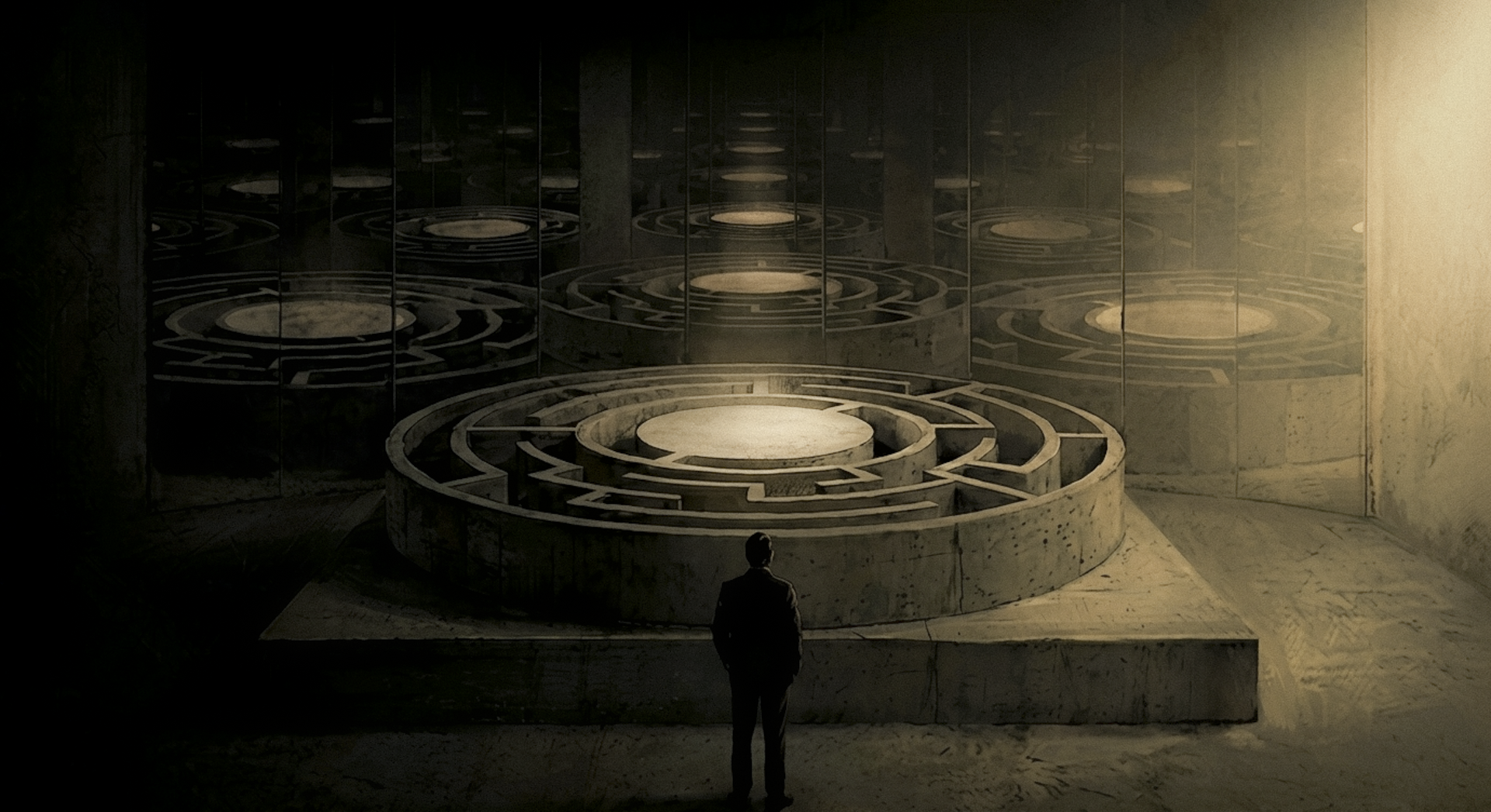
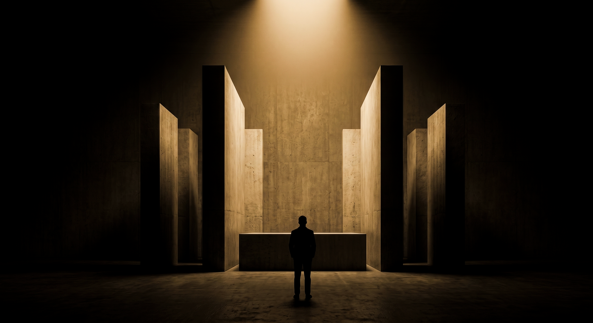
You are in a presentation room. A visual identity design deck is open on the screen. The designer walks you through the layouts: a homepage hero, a business card, a label. There is space on each one, generous space, room for the eye to move.
You look at the hero. You look at the business card. And then you say it.
“Can we put something there?”
I have heard this sentence, or some version of it, in nearly every client review I have sat in. And it is one of the most expensive things a founder can say.
Table of Contents
1. The Compulsion to Fill
2. What White Space Actually Communicates in Visual Identity Design
3. Three Brands That Made Restraint a Business Model
4. The Question Your Visual Identity Design Agency Should Be Asking
5. Frequently Asked Questions
The Compulsion to Fill
Where the Anxiety Comes From
The instinct to fill space is not irrational. Founders are trained to maximise. More features. More content. More return per unit of investment. The brief for a product launch is about coverage: every benefit listed, every use case represented, every selling point visible. This thinking works in a pitch deck. It is catastrophic on a brand surface.
When you bring that instinct to a visual identity, the layout becomes a secondary brief. The logo must be bigger. The tagline must be visible. The secondary offer must appear somewhere. The result is a design that says everything, which is another way of saying it says nothing at all.
Adolf Loos understood this a century before startup culture existed. In his 1910 Vienna lecture “Ornament and Crime,” he argued that the compulsion to decorate is not generosity. It is a symptom. His conclusion: “The evolution of culture is synonymous with the removal of ornament from utilitarian objects.” He was talking about architecture. He was also talking about every brand surface that has ever tried to justify its existence by filling it.
What Filling Space Signals to the Viewer
Crowded design is the visual equivalent of over-explaining.
A brand that needs to fill every inch of its packaging does not believe any single thing it says is strong enough to stand alone.
This is what visual noise actually communicates: not abundance, not value, not effort. Insecurity. Purchase intent testing by SmashBrand, a CPG packaging research firm, confirms what most designers already know: crowded labels signal low value and lack of focus, while restrained designs with generous space and clean typography signal confidence and sophistication. That is not a creative preference. That is a documented commercial outcome.
Here is a test you can run right now. Pick any product category and look at the premium version’s packaging alongside the budget version. The most consistent visual difference will be white space. The premium has more of it. Always.
What your design communicates without saying a word
Where the anxiety comes from makes sense. What founders do with it does not.
What White Space Actually Communicates in Visual Identity Design
The Eye Reads Before the Mind Does
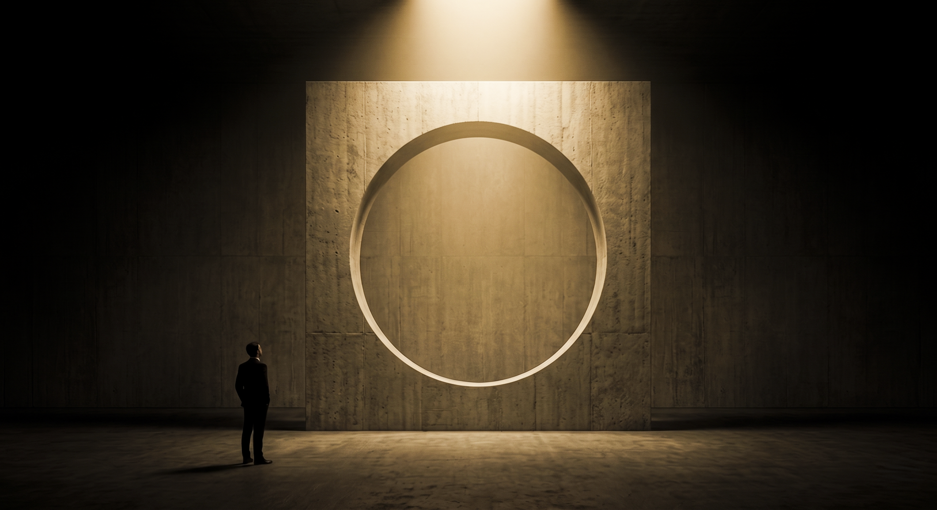
White space is not absence. It is argument.
When a design gives an element room, it is making a claim: this matters enough to stand alone. When a design crowds that element with neighbours, it is making a different claim: we are not sure which thing matters most, so we have included everything. Visual hierarchy is not a design preference. It is how human perception actually works.
Robert Bringhurst, whose “The Elements of Typographic Style” remains the closest thing typography has to a canonical text, treats white space as an active structural element, not a background. It directs the eye. It creates rhythm. It establishes what has weight and what is secondary. A headline surrounded by generous margins commands attention not because it looks beautiful, but because isolation signals importance to the eye before the mind has registered the words. This is not convention. It is the logic of perception.
Bringhurst’s argument applies equally to how typeface selection signals class or undermines it, which is a longer conversation worth reading in our piece on typography as brand signal.
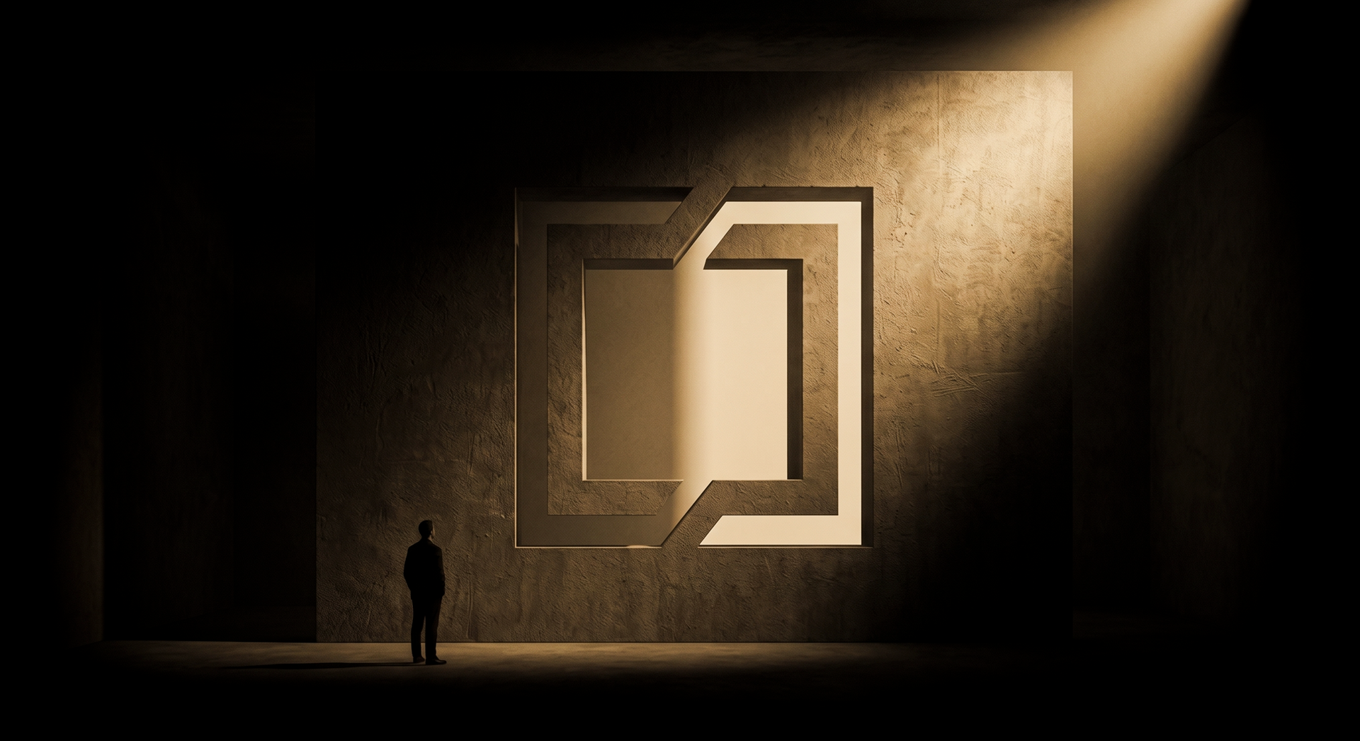
The Business Logic of Ma
In Japan, the concept of Ma (間) describes the active quality of negative space: not emptiness, but what gives the surrounding elements their resonance. The kanji combines the characters for “gate” and “sun,” evoking light passing through a doorway. In music, Ma is the pause between notes. Not silence. The pause that makes the notes matter.
When a brand leaves space in its visual identity, it is not leaving room empty. It is giving the present elements room to resonate.
The distinction between Western minimalism, which treats restraint as aesthetic, and Ma, which treats it as structure, is the key conceptual move. Our piece on Japanese design philosophy explores this framework in depth, because it shifts the conversation from “how much white space do we use” to “what are we giving permission to matter.”
The Japanese brands that built commercial empires on this principle, from MUJI to Uniqlo to Nintendo, achieved dominance not by adding features but by eliminating them. The white space was not a style choice. It was a strategic position.
Three Brands That Made Restraint a Business Model
Not every brand that uses white space does so strategically. But the ones that have built lasting commercial positions from it share a common thread: the space is not decoration. It is the argument.
Maison Margiela: Absence Equals Presence
Martin Margiela founded the house in 1988 with a single decision: no logo. A blank white label, held by four visible stitches, sewn to be cut off so the garment would carry no branding at all. Patrick Scallon, Margiela’s right-hand man, characterised the brand’s marketing philosophy as “absence equals presence” and “the cult of impersonality.” The Maison itself has described white as “neutral, the binary opposite of black, or a blank canvas.”
The label that was designed to be removed became one of the most recognisable signatures in fashion. Restraint did not make Margiela invisible. It made Margiela legible only to the right audience.
That is a brand architecture decision. The white space was not a placeholder. It was the product.
MUJI: White Space as a $4.4 Billion Product Philosophy
Mujirushi Ryohin translates as “no-brand quality goods.” MUJI built a business worth over four billion dollars annually from a philosophy of elimination: no logos, restrained packaging, white space as primary brand language. Average store sales have climbed consistently year on year, even as competitors who copied the aesthetic without the underlying philosophy have failed to replicate the commercial performance. Harvard Business School has examined MUJI’s competitive moat specifically to understand how philosophical depth creates an advantage that surface-level imitation cannot reproduce.
The argument here is not that white space looks premium. It is that restraint, when it derives from a coherent philosophy, builds a moat.
Apple: The Confidence to Let One Thing Breathe
Apple’s first marketing brochure, printed in 1977, opened with a line that has aged poorly as a cliche and has not aged at all as a strategic position: “Simplicity is the ultimate sophistication.”
Forty-seven years later, the most-watched product launch pages in the world are a white background, a single object, and the patience to let one thing breathe. Jony Ive, who joined the company in 1997 and pushed white as the dominant product direction across iMacs, earphones, and packaging, described his approach directly: “Simplicity isn’t just a visual style. It’s not just minimalism or the absence of clutter. It involves digging through the depth of the complexity.”
The signal was not minimalism. The signal was confidence.
Three categories. Three eras. The same editorial position: we have something worth looking at, and we trust that it will hold your attention.
We apply the same framework at Izart Studio. The visual identity design work is here.
The Question Your Visual Identity Design Agency Should Be Asking
The White Space Question as a Proxy for Brand Confidence
A capable visual identity design agency does not start by asking what to add. It starts by asking what is important enough to deserve the space, and then removing everything that competes with it.
This is editorial work. The grid itself, a structure we cover in our piece on how layout encodes hierarchy and trust, is what makes these decisions legible across an entire identity system. White space and grid are not separate concerns. They are the same argument expressed at different scales.
Dieter Rams captured the principle in his 10 Principles of Good Design, developed at Braun: “Good design is as little design as possible.” His work was the direct influence on Jony Ive’s approach at Apple. The lineage runs in one direction. More is not a design argument. It is the absence of one.
The white space question is a proxy for brand confidence. Look at any brand and ask where they left room. Premium brands leave it in the headline, on the label, on the landing page hero. They are saying: this one thing is worth your full attention. Brands that fill everything are saying: we are not sure which thing matters most.
Every request to fill the space is a request to reduce the signal.
Premium brands curate attention. They do not compete for it. The discipline of knowing what to remove is harder than knowing what to include. Most briefs do not ask for it.
The best ones do.
Frequently Asked Questions
What is white space in design, and why does it matter?
White space is any area in a layout containing no visual element: no text, no image, no shape. It functions as an active design element rather than a background, establishing hierarchy, directing the eye, and signalling brand confidence. What it communicates is not emptiness but editorial clarity: the brand knows what it wants you to see first.
Does white space make a design look unfinished?
Unfinished looks unintentional. White space looks deliberate when the elements present are strong enough to hold attention on their own. The test is simple: does what remains communicate clearly without support? If it does, the space is working. If it feels like something is missing, the problem is usually the remaining elements, not the space around them.
How does white space affect brand perception and premium positioning?
Consistently, white space is the most visible visual difference between premium and budget versions of the same product category. CPG packaging research confirms it: restrained designs signal confidence and sophistication, while crowded labels signal low value. The space communicates something the brand cannot say directly: we believe what we have is worth your full attention.
How does a visual identity design agency decide how much white space to use?
A visual identity design agency works from hierarchy, not preference. What is the single most important thing this surface must communicate? Everything that competes with that is a candidate for removal. White space is not a starting point. It is what remains after the editing process. The amount of space is a function of how confidently you can answer that question.
Leave the Room
The founder in that presentation room is pointing at the part of the design doing the most work. The negative space is not where nothing has been placed. It is where every competing element has been evaluated, weighed, and decided against.
Filling it is not making the design better. It is undoing the decision the designer had the confidence to make.
White space is not a design preference. It is a position. And like every position worth holding, it requires the belief that what you have chosen to say is worth the silence around it.
The brands that built lasting visual identities did not fill the room. They trusted the room.


Continue
Reading

The Craft Premium: Why Slowness Is the New Luxury Signal
Slowness only functions as premium when it reads as choice, not constraint. This is the knife edge. Bottega Veneta’s social media deletion worked because it was legible as a considered refusal. Not a technical failure. Not disorganisation. A position