What Brutalism Teaches a Brand Identity Design Studio
May 4, 2026


The first time you stand in front of the Barbican, you understand immediately that it is not trying to charm you.
It rises from the City of London in great stacked terraces of textured grey concrete, its surfaces still bearing the imprints of the wooden formwork that shaped them.
No glass curtain walls. No decorative cladding. No attempt to soften the mass or redirect your attention toward something more forgiving. The building offers you its material, exactly as it is.
Most people, on that first encounter, hate it.
But that reaction is exactly the point of the architecture.
The architects who built the Barbican, and the movement it came from, made a deliberate proposition. We will show you what this building is made of. We will not hide the structure behind a prettier surface. If you don’t like what you see, that tells us something about you, not about the building.
Now the question we’re trying to answer with this piece is simple.
What can a brand identity design studio learn from a movement that was nearly demolished, endlessly reviled, and ultimately proved right?
Contents
1. Beton Brut: The Ethic Underneath the Aesthetic
2. The Ornament Crime: What Most Brands Do Instead
3. When Brands Go Brut: Three Cases in Honest Brand Identity
4. The Brutalism Paradox: Why Honesty Divides Before It Bonds
5. What Brand Honesty Actually Requires: Five Structural Qualities
6. Frequently Asked Questions
7. The Building That Stays
Beton Brut: The Ethic Underneath the Aesthetic
Start with the name, because most people get it wrong.
“Brutalism” does not come from the English word “brutal.” It comes from the French phrase beton brut, meaning raw concrete. Le Corbusier used the term to describe his decision, while building the Unité d’habitation in Marseille in 1952, to leave the concrete exactly as it came out of its formwork: scarred, marked, unfinished.
As he wrote: “I had decided: leave everything ‘brut.’ I called it ‘beton brut.’”
In 1953, Alison Smithson described an unbuilt house design in Architectural Design as intended to be “exposed entirely, without interior finishes wherever practicable.”. Because it was honest. Because the structure of the building would be legible from its surface.
Architectural critic Reyner Banham formalised this argument in his 1955 essay “The New Brutalism,” published in Architectural Review, and expanded it eleven years later in The New Brutalism: Ethic or Aesthetic? Banham framed the movement as “both an attitude toward design and a descriptive label” that “eludes precise description, while remaining a living force.” Architect John Voelcker, one of the movement’s participants, put it more bluntly: Brutalism “cannot be understood through stylistic analysis.” The Smithsons themselves described it as “an ethic, not an aesthetic.”
That distinction matters enormously. A style can be adopted by anyone. An ethic has to be lived.
“Exposed Entirely”: What It Actually Means to Show Your Material
Peter Smithson described the movement’s core commitment as “the seeing of materials for what they were: the woodness of the wood; the sandiness of sand.” Not the disguise of one material as another. Not the application of a finish that conceals origin. The thing is what it is. Show it.
The brand parallel lands here, and it lands hard.
Most brands operate like a building wrapped in decorative cladding. The structure is there, somewhere, but the surface is designed to project something else. Something smoother, more aspirational, more universally appealing than the underlying reality. Brutalism asked: what if you just showed the structure?
The most trusted brands do exactly that. And the evidence for this is not theoretical.
The Ornament Crime: What Most Brands Do Instead
In 1910, a Viennese architect named Adolf Loos delivered a lecture that would later be published as “Ornament and Crime.” His central argument: the application of ornament to a functional object is not beautiful, it is dishonest. It disguises the nature of the thing it covers. “The evolution of culture,” Loos wrote, “is synonymous with the removal of ornament from utilitarian objects.”
He was not purely a precursor to Brutalism, but he planted the intellectual seed: that decoration applied over truth is a moral failure, not just a stylistic one.
What Brand Cladding Looks Like in Practice
A brand identity design studio encounters it constantly. Three patterns that show up in briefs with uncomfortable frequency.
One brief opened with “world-class” in the first paragraph and a product that had never been tested against its own category.
• The premium aesthetic applied over a mid-market product. The visual language screams luxury. The product does not. The gap between the identity and the substance creates a specific kind of consumer resentment: the feeling of having been misled.
• Sustainability language in the visual identity that is not in the supply chain. Words like “responsible,” “considered,” “earth-forward” woven through the brand deck. The factory is the same one it always was. This is brand cladding: a surface claim applied over an unchanged structure.
• A purpose statement that contradicts the revenue model. The brand narrative talks about community and empowerment. The business model extracts margin from the same people the narrative claims to serve. Again, cladding.
None of these are purely design problems. They are character problems that design has been asked to solve. And design cannot solve them. You cannot ornament your way to trust.
The architects who built Brutalist buildings understood this. The buildings that tried to be something they were not, that applied decorative facades over cheap construction, aged badly. Not just aesthetically. Socially. People could feel the lie in the material.
Brands are no different.
When Brands Go Brut: Three Cases in Honest Brand Identity
For a brand identity design studio, these three cases are the architectural record of what honest identity looks like at full scale. Three different categories. Three different eras. One structural commitment: here is what we are made of, presented raw, without apology.

Volkswagen “Think Small” (1959): The Ad That Admitted Everything
In 1959, Bill Bernbach at Doyle Dane Bernbach was handed a brief that seemed designed to humiliate him. Sell a small, ugly, German car to post-war Americans who were in love with chrome, fins, and the mythology of Detroit.
Every other agency had tried to make the Volkswagen Beetle look more American. DDB took the opposite approach.
Art director Helmut Krone and copywriter Julian Koenig placed a tiny image of the Beetle in the upper-left corner of a mostly white page. Below it, two words: Think Small. The copy acknowledged every objection: the car was odd-looking, foreign, economical rather than glamorous. It didn’t argue against these facts. It built an identity from them.
The “Lemon” ad, which followed in 1960, showed a Beetle with a barely visible cosmetic flaw on the glovebox and announced that VW had rejected the car. The headline read: “Lemon.” The copy explained that VW’s quality control was so exacting they refused cars for imperfections other manufacturers wouldn’t notice.
The brand didn’t reframe its weakness. It built its identity out of its actual material.
Advertising Age named it the greatest advertising campaign of the twentieth century. Krone himself was so certain the campaign would fail that he deliberately left the country when it was published.
He was wrong. The public recognised something in it they rarely saw: a brand that wasn’t trying to be something it wasn’t.
Oatly: Packaging as Raw Concrete
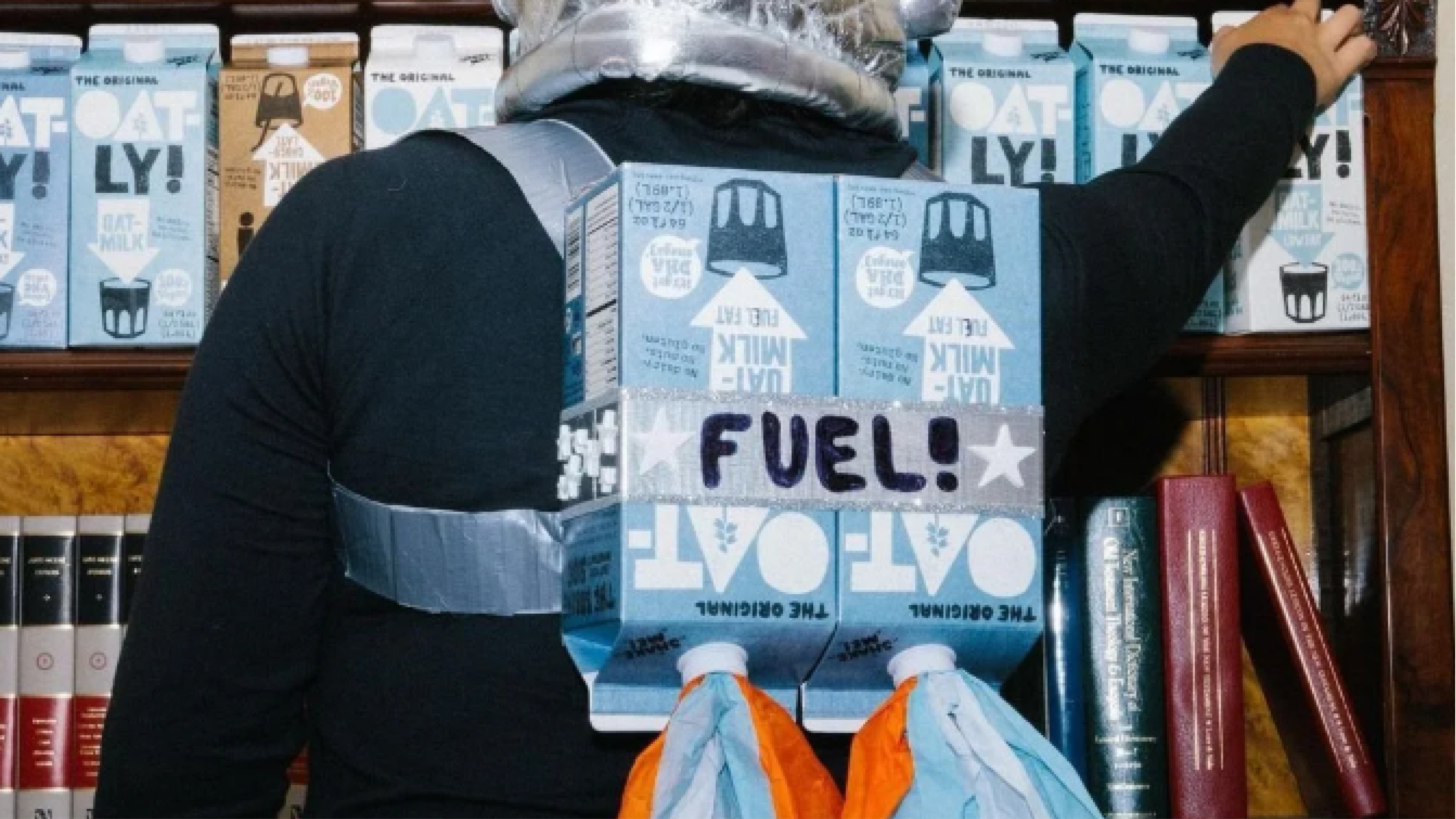
When CEO Toni Petersson and creative director John Schoolcraft rebranded Oatly in 2012, they made a decision that broke every rule of food packaging.
They turned the carton into the primary media channel. Not by making it clean and beautiful, but by making it talk. Rambling, self-aware, conversational copy filled every surface. One side literally reads: “Before we wrote this sentence, there was a lot of empty space on the side of this package and we didn’t know what to do with it really.” Verbose when packaging wisdom demanded concision. Strange when it should have been clear. The typography was hand-drawn, imperfect, irreducibly human.
The Swedish dairy industry sued them over the tagline “It’s like milk, but made for humans.” Oatly published the lawsuit.
This is Brutalism. The structural honesty is so visible, so present on the surface, that it provokes institutional resistance. A building that shows its actual construction is a political act as much as an architectural one.
The result: a 700% demand increase following the rebrand. A $10 billion IPO valuation in 2021. A brand that competitors could imitate in surface, and did at enormous scale across dozens of challenger brands, but could not replicate in structure.
Patagonia: The Brand That Exposed Its Own Business Model
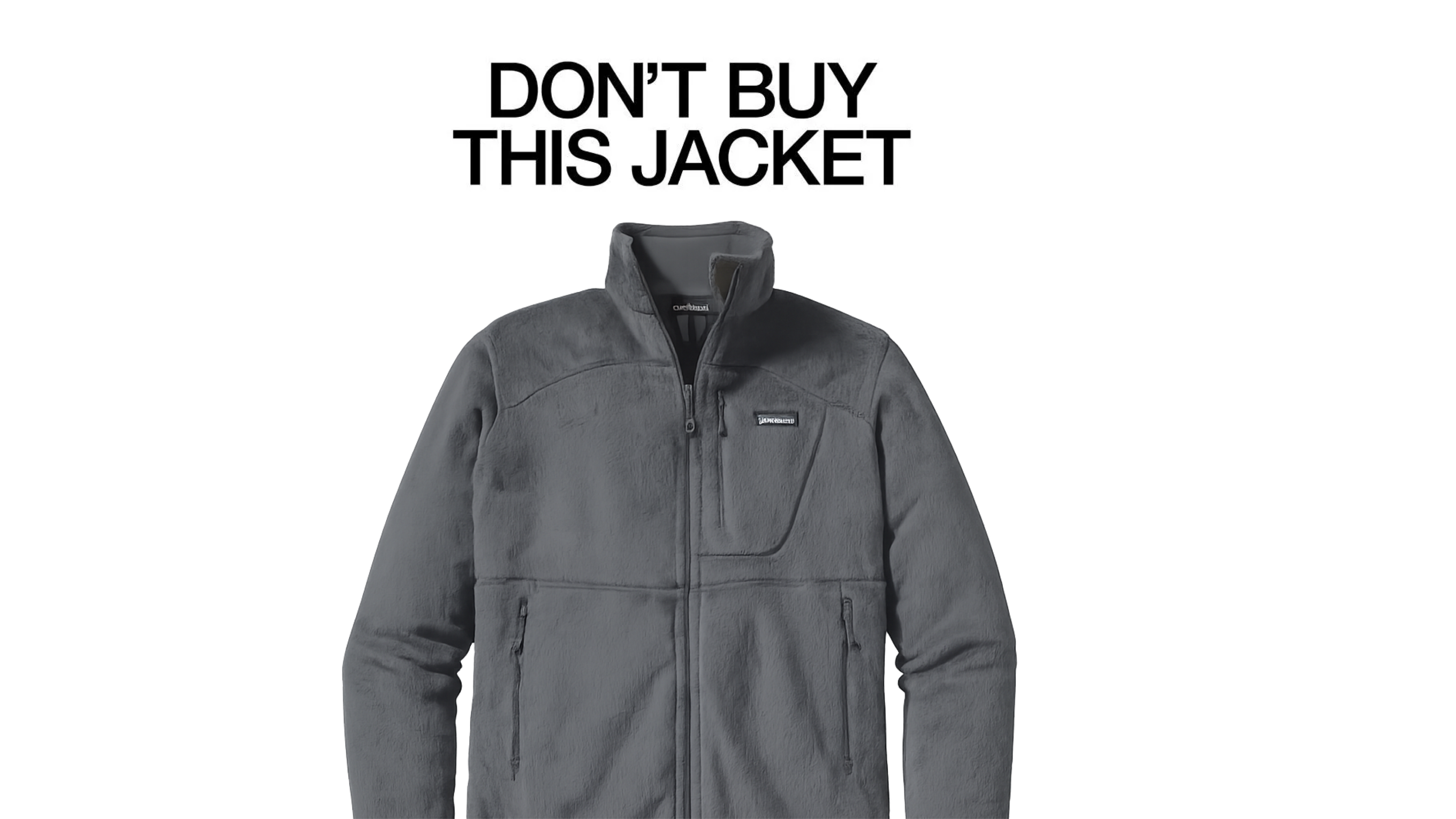
On Black Friday 2011, Patagonia ran a full-page advertisement in the New York Times. The headline: “Don’t Buy This Jacket.”
The ad itemised the environmental cost of manufacturing a single Patagonia fleece: the water used, the CO2 produced, the waste generated. Then it told its customers to reconsider the purchase. To repair what they had. To buy only what they needed.
Sales grew approximately 30% in the year that followed.
This is not a communications strategy. It is an architectural position. The brand is built on material that runs all the way through: interactive supply chain transparency tools, the Worn Wear repair programme (over 500,000 pieces repaired since its 2013 launch), and in 2022, founder Yvon Chouinard’s transfer of the entire company’s ownership to a climate nonprofit trust.
The honesty is not in the advertisement. It is in the structure of the business. The ad was just the surface making the structure visible.
That’s beton brut.
If you’re working out what your brand is actually made of, our brand identity work at Izart starts exactly here. See how we work.
The Brutalism Paradox: Why Honesty Divides Before It Bonds
The Barbican Was Hated. It Is Now the Most Sought-After Address in London.
Brutalism was not well-received.
The Barbican was derided, repeatedly. Robin Hood Gardens, the Smithsons’ council housing project in Poplar, East London, was partially demolished between 2017 and 2019, despite sustained campaigns by architects, critics, and residents. The Deutsches Architekturmuseum and the Wüstenrot Foundation launched the #SOSBrutalism campaign in 2022 specifically to document and protect Brutalist buildings around the world that were under threat. The public’s relationship with these buildings was, and in many places remains, hostile.
And yet.
The Barbican is Grade II listed and consistently ranked among the most desirable residential addresses in London. The V&A Museum preserved a section of Robin Hood Gardens. Brutalist buildings that survived demolition campaigns have found constituencies of people who love them with an intensity that glass-and-steel towers rarely generate.
The people who love the Barbican don’t merely like it. They feel it belongs to them. They feel they have found something real in a city full of surfaces.
Loyalty Is Not the Same as Popularity
This is the brand lesson that most founder conversations miss.
Patagonia does not want every outdoor apparel customer. Its honesty self-selects for people who will repair their jacket rather than replace it, who will choose the Worn Wear programme over a new product. These are not Patagonia’s most transactionally valuable customers. They are its most structurally loyal ones.
Oatly didn’t win the whole plant-based milk market. It created a movement. Competitors could imitate the hand-drawn typography and the conversational copy. They could not replicate the structural honesty that made the original identity irreplaceable.
Material honesty defines your constituency. It is a positioning instrument as much as it is an ethical one.
A brand identity design studio that serves a founder who wants everyone to like their brand is being asked to build cladding. The refusal to be universally palatable is not a design risk. It is the mechanism through which deep brand loyalty becomes possible.
(This distinction between brands that create genuine culture and brands that merely mirror it back runs through much of what we explore in our work on why brands that create culture behave structurally differently from those that simply reflect it.)
What Brand Honesty Actually Requires: Five Structural Qualities
Here is the thing that most conversations about “authentic branding” get wrong. They treat honesty as a tone-of-voice decision. A way of writing copy. A vibe.
Brutalism shows us it is an architectural property. Either it goes all the way through, or it doesn’t go anywhere meaningful.
These five qualities are the diagnostic. Not a checklist. A set of structural tests.
1. The Honesty Goes Structural, Not Surface
The test: would your brand’s identity change if it stopped saying it was honest?
For Patagonia, it wouldn’t. The identity lives in the supply chain, the ownership structure, the repair programme. If Patagonia stopped running “Don’t Buy This Jacket” campaigns tomorrow, the brand would still be structurally what it claims to be.
Everlane built its entire identity on “Radical Transparency,” publishing detailed cost breakdowns for every product. When criticism emerged in 2020 around labour practices and internal culture, the gap between the stated position and the structural reality became a brand crisis precisely because the promise had been so explicit. Transparency as a communications strategy can be performed. Honesty as a structural quality cannot.
2. A Stranger Can Read It From the Outside
Consider the customer who encounters your brand with no prior knowledge. What the price, the packaging, and the first line of copy tell them is the only evidence they have.
In Brutalism, the construction logic is legible from the exterior. You can see how the building was made, what it prioritises, who it serves. There is no gap between what the surface presents and what the structure delivers.
An honest brand identity has the same quality. A first-time customer, encountering your brand without reading your About page, should be able to read your actual values. Not your aspirational values. Your operational ones.
What does your pricing say about who you think your customer is? What does your return policy say about how much you trust them? What does your packaging say about what you think matters? These surfaces tell a story. The question is whether that story is consistent with your structural reality, or whether it is cladding over a different one.
3. It Does Not Perform Honesty. It Is Honest.
Oatly published the lawsuit. They didn’t run a campaign about how they were being sued. They didn’t write a blog post about their commitment to transparency. They published the actual lawsuit and built a campaign from the material reality of their situation.
That is the difference. Radical honesty as a marketing strategy is the cladding version of honesty. It uses the word without committing to the structure.
4. It Is Willing to Lose the Wrong Audience
The Barbican was not designed to please everyone. The Smithsons understood that a building built from honest material would find its constituency, and that constituency would be smaller, and more committed, than a building that tried to be universally palatable.
Oatly’s positioning line, “It’s like milk, but made for humans,” was designed to lose the dairy industry’s allies while gaining exactly the audience the brand needed. This willingness to define and exclude is not a design risk. It is the strategic function of honest identity.
The most honest question a brand strategy session can ask: who are we willing to lose?
5. It Survives Pressure Without Changing Its Material
Concrete weathers. It doesn’t pretend to be something else.
Brands face pressure to soften, to smooth, to qualify, to explain themselves away. The identity that holds under that pressure was built from honest material. The identity that shifts was built from cladding.
Oatly’s post-IPO period offered an instructive test. The Blackstone Group investment in 2020 drew significant criticism from environmental groups, precisely because Oatly’s identity had staked such a clear position on sustainability. The brand’s response was characteristically honest: they acknowledged the tension rather than concealing it. Whether you found the decision right or wrong, the structural approach to the criticism kept the brand’s identity legible.
The brand that changes its material under pressure was never built from honest material to begin with. The brands that hold were usually built from material the category never thought to look at. That’s the argument in our piece on studying artists, not competitors.
Frequently Asked Questions
What does brand honesty mean in the context of visual identity?
Brand honesty means your brand’s surface accurately reflects its structural reality: not just aspirations, but operations. It is less about tone of voice and more about whether a stranger can read your actual values from your brand’s exterior without consulting your About page. The Brutalist test applies: is the construction logic legible from the outside?
How is Brutalist architecture relevant to brand identity design?
Brutalism’s core proposition was that a building should show exactly what it is made of: no decorative cladding, no surface to conceal the underlying structure. A brand identity design studio working with honest material applies the same principle. The most durable identities are built from their actual material. The identity and the business are the same substance.
Can a brand be honest without being provocative or off-putting?
Yes. The provocation in Oatly’s identity is a style choice. The honesty in Patagonia’s is a structural one. A brand can be quiet and honest. Aesop has built a global brand on a deliberate refusal to overclaim efficacy, making none of the clinical promises the skincare industry manufactures. Honesty does not require loudness. It requires consistency between surface and structure.
What is the difference between authentic branding and transparent branding?
Transparency is a communications strategy: share what you might otherwise conceal. Authenticity is a structural property: your communications are consistent with your operations. The difference is that transparency can be performed as cladding. Authenticity, in the structural sense, cannot be performed at all. Either the identity is built from the business’s actual material, or it is built from aspiration.
The Building That Stays
Come back to the Barbican.
It is still there. Weathered, water-stained in places, still bearing the marks of its own making. Still exactly what it was on the day it was completed. It never stopped being itself under pressure of public opinion or architectural fashion.
It waited.
And now the people who understand what it offered, and what it cost its architects to offer it that honestly, love it with a fierceness that no glass tower has ever generated.
The brands that earn the deepest loyalty are doing the same thing. Not trying to be beautiful in the conventional sense. Not applying a surface designed to attract the broadest possible audience. Built from genuine material, exposed without apology, willing to wait for the right constituency to recognise what was offered.
Most brands chase palatability.
The building that lasts is not the one that tried to please everyone. It is the one that was irreducibly itself.


Continue
Reading


Why 'Premium' Fails as a Brand Positioning Strategy
'Premium' shows up in almost every brand brief we've reviewed. It solves nothing. This piece breaks down why premium is a destination rather than a brand positioning strategy, and what the brands that actually command premium pricing did differently.
