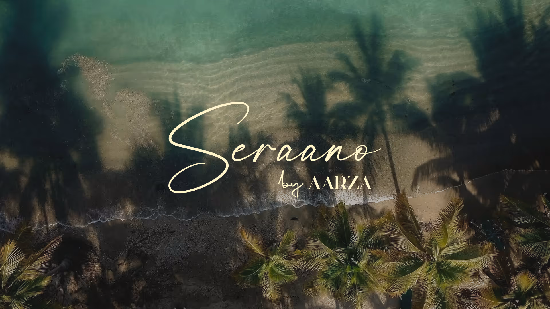
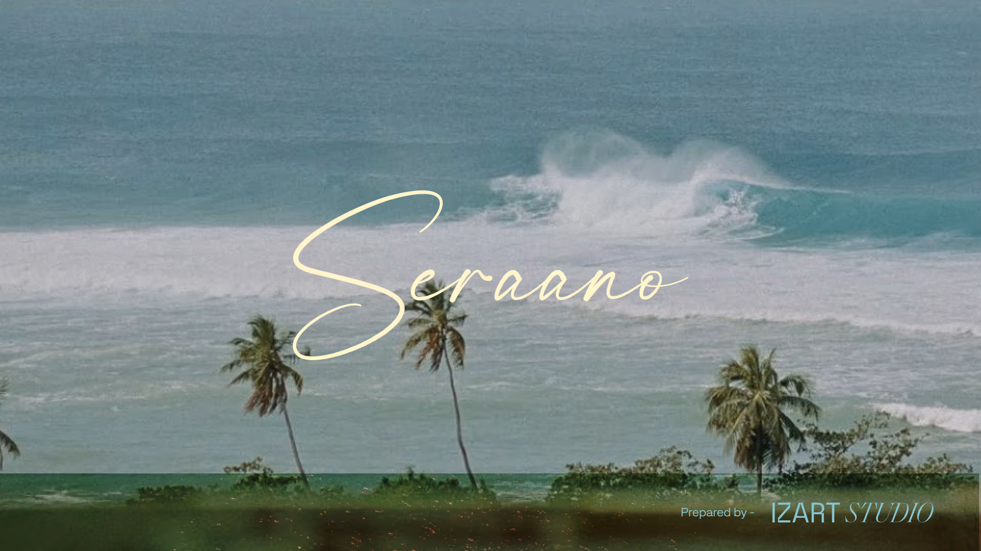
SERAANO
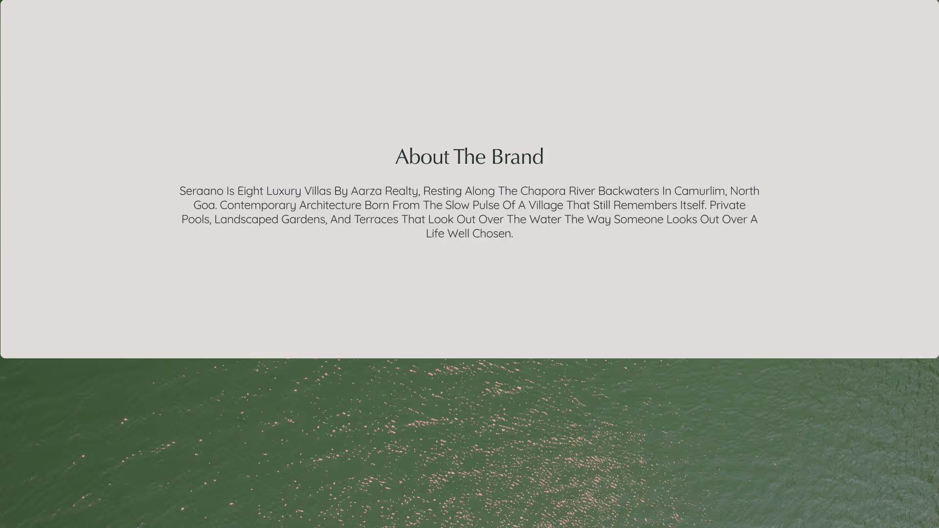
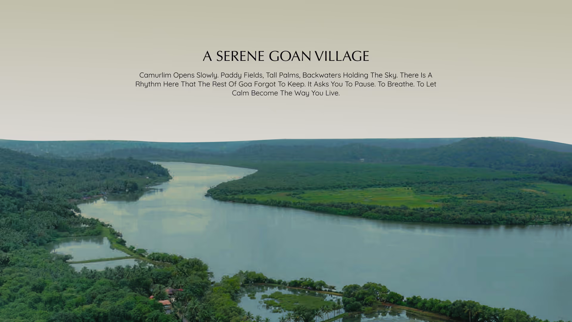
Seraano is a luxury villa community by Aarza Realty, resting along the Chapora River backwaters in Camurlim, North Goa. Eight residences shaped by the land they stand on. Contemporary architecture that listens to the village before it speaks for itself.
CLIENT
Aarza Ecko Buildwell LLP
SERVICES
Branding
Website
YEAR
2026
THE OBJECTIVE
We created a creative and experiential e-commerce for Manjn that tells the story of its products' naturalness through a pure and complete visual language. Fluid animations guide users seamlessly, while our clean, minimal design keeps the products as the true protagonists of the experience.

THE APPROACH
The central design tension was luxury without volume. Goa's real estate market speaks loud. Bright renders, bold promises, names borrowed from European postcards. Seraano needed to do the opposite. To feel like a place you return to in your mind long before you return in person.
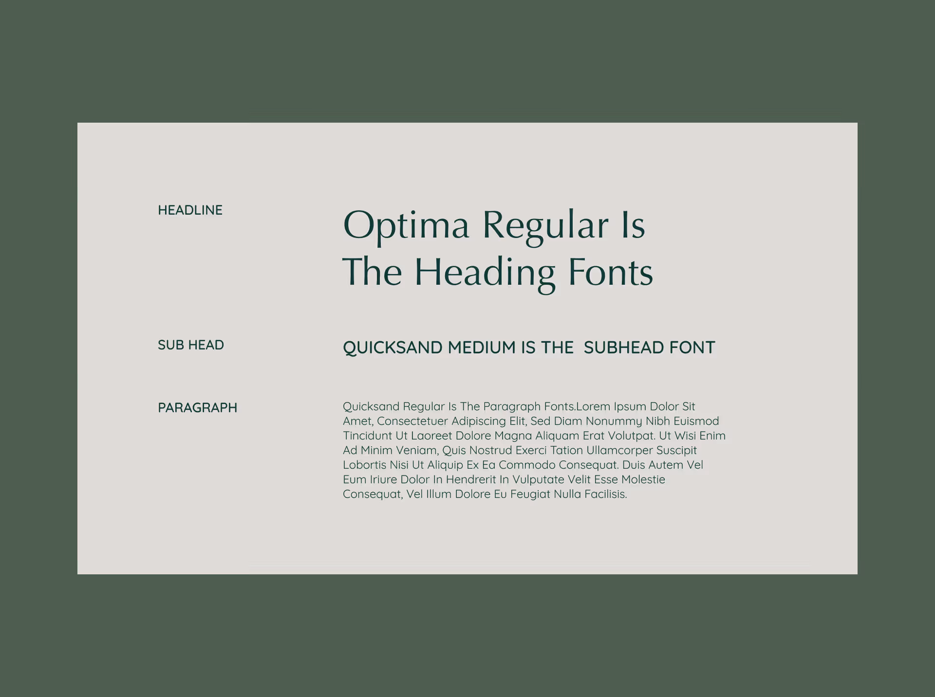
The wordmark uses a custom script, hand-drawn with the unhurried rhythm of water. It sits in gold against deep green and olive, a pairing that feels inherited rather than designed. Optima serves as the heading typeface, carrying editorial weight with classical restraint. Quicksand handles body copy and interface text, bringing warmth and legibility without softening the brand's posture.
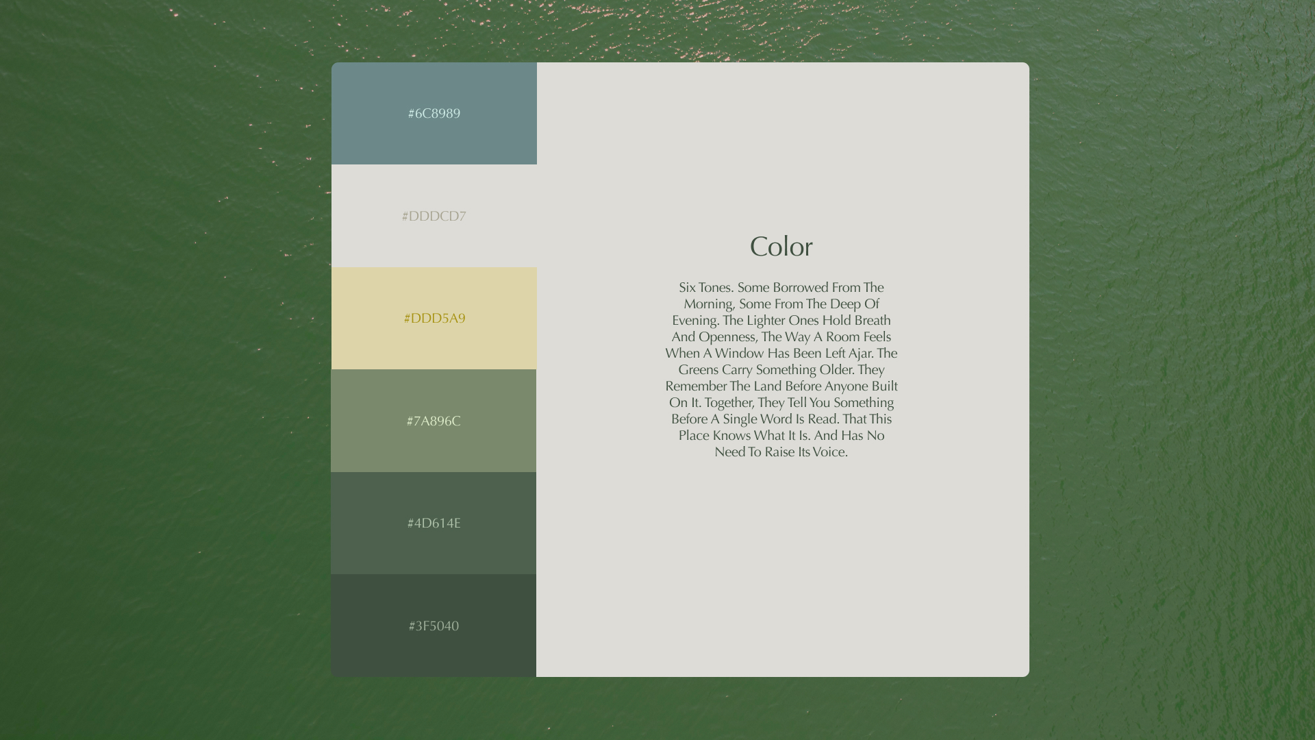
The colour system is built on six tones: Dusty Teal, Warm Stone, Muted Gold, Sage, Forest, and Deep Green. Together they move from open sky to dense canopy, mirroring the way light shifts across the Chapora through the day.
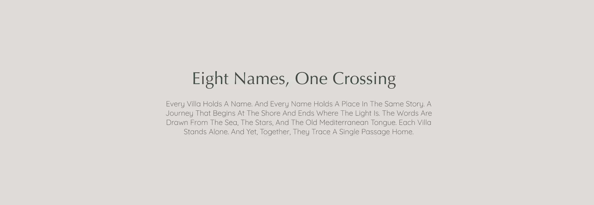
The naming system encodes a maritime voyage across all eight villas. Isla, Mira, Nava, Olea, Corva, Vela, Ciera, Liora. Each name drawn from the sea, the stars, and the old Mediterranean tongue. Each one a waypoint in a single crossing from shore to light. The story is there for those who look close enough. For everyone else, the names simply sound like they belong.
VISUAL IDENTITY
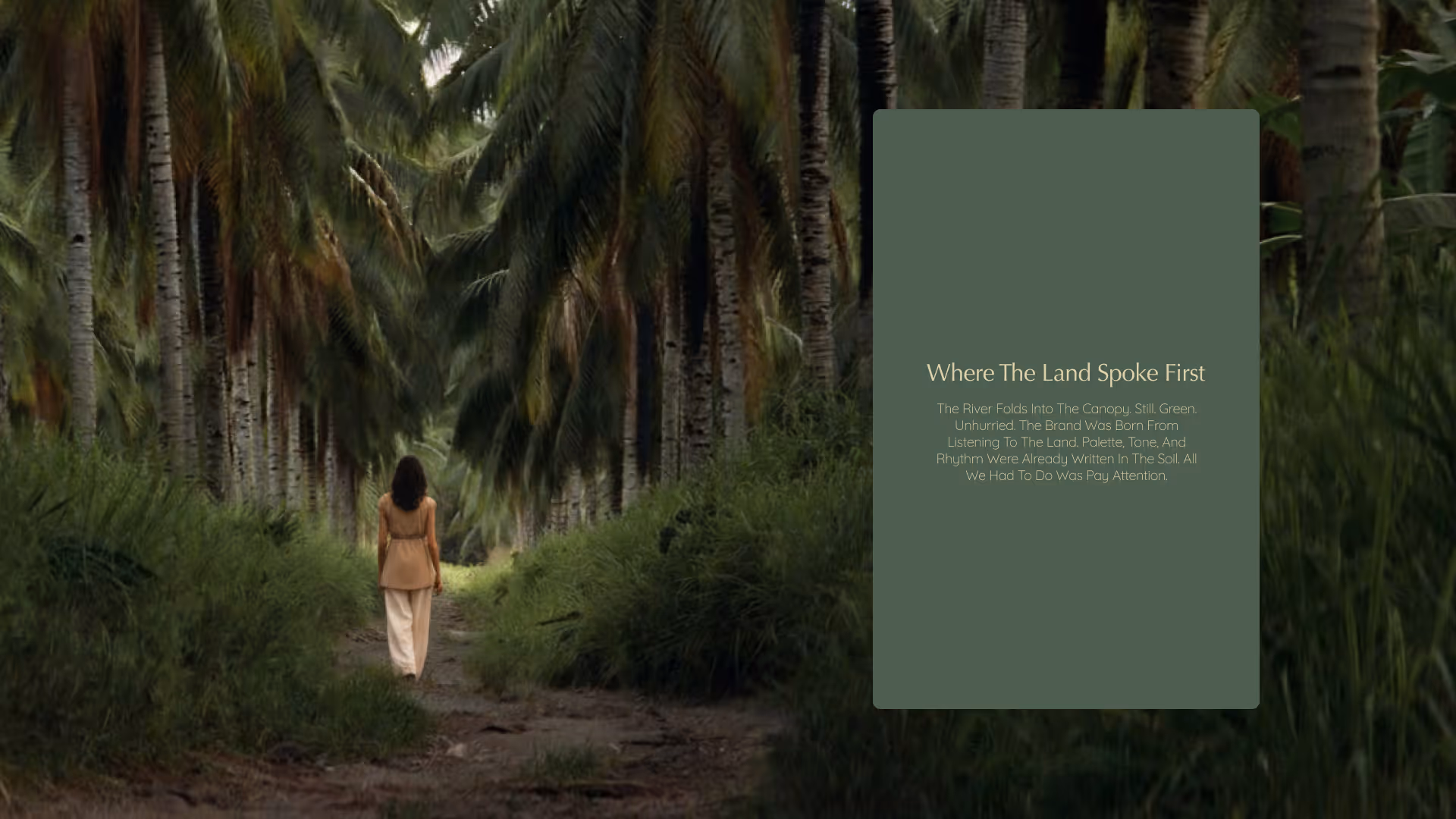
Seraano's visual identity begins where the river bends and the trees grow thick. The brand was designed to feel like the land remembered it, as if it had always been here, waiting to be named.
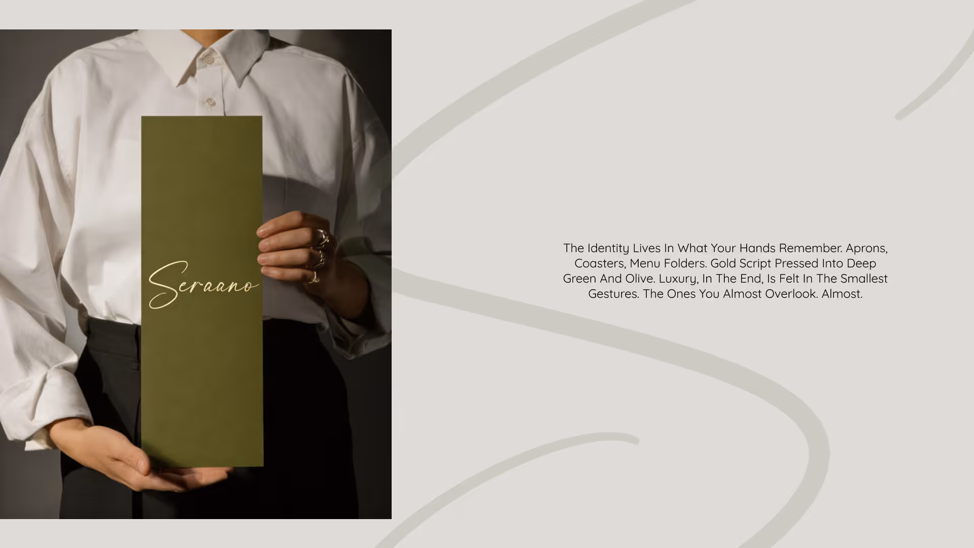
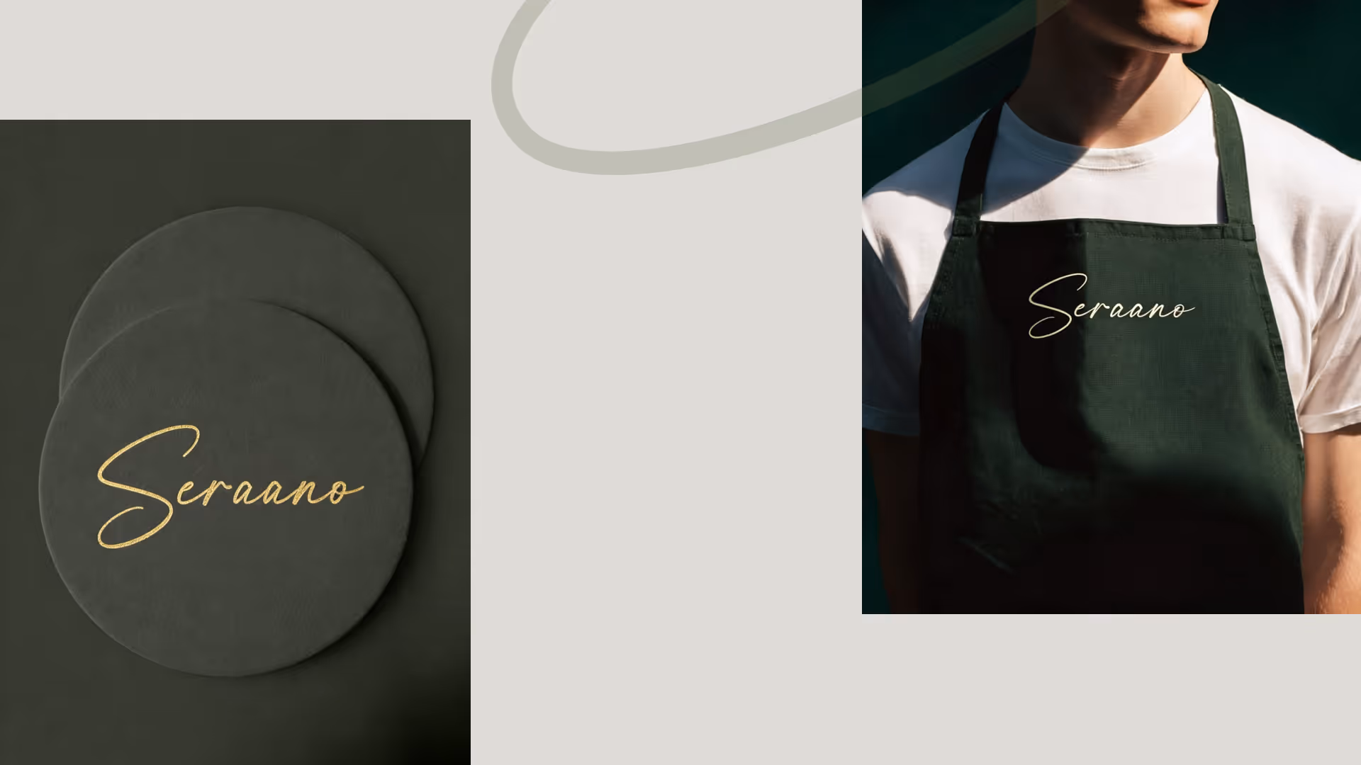
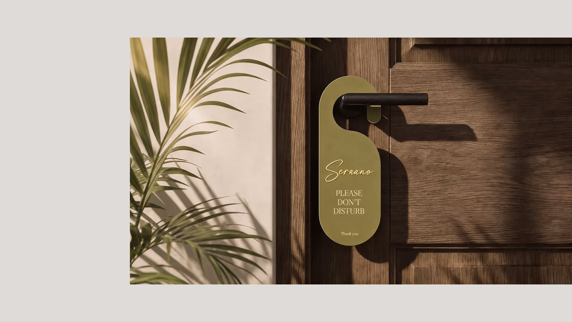
The gold script wordmark anchors the system. It appears on dark green coasters, olive menu folders, linen aprons, and door hangers. Every application was chosen for proximity to the body, to the hand, to the threshold. Luxury, in the end, is felt in the smallest gestures. The ones you almost overlook. Almost.
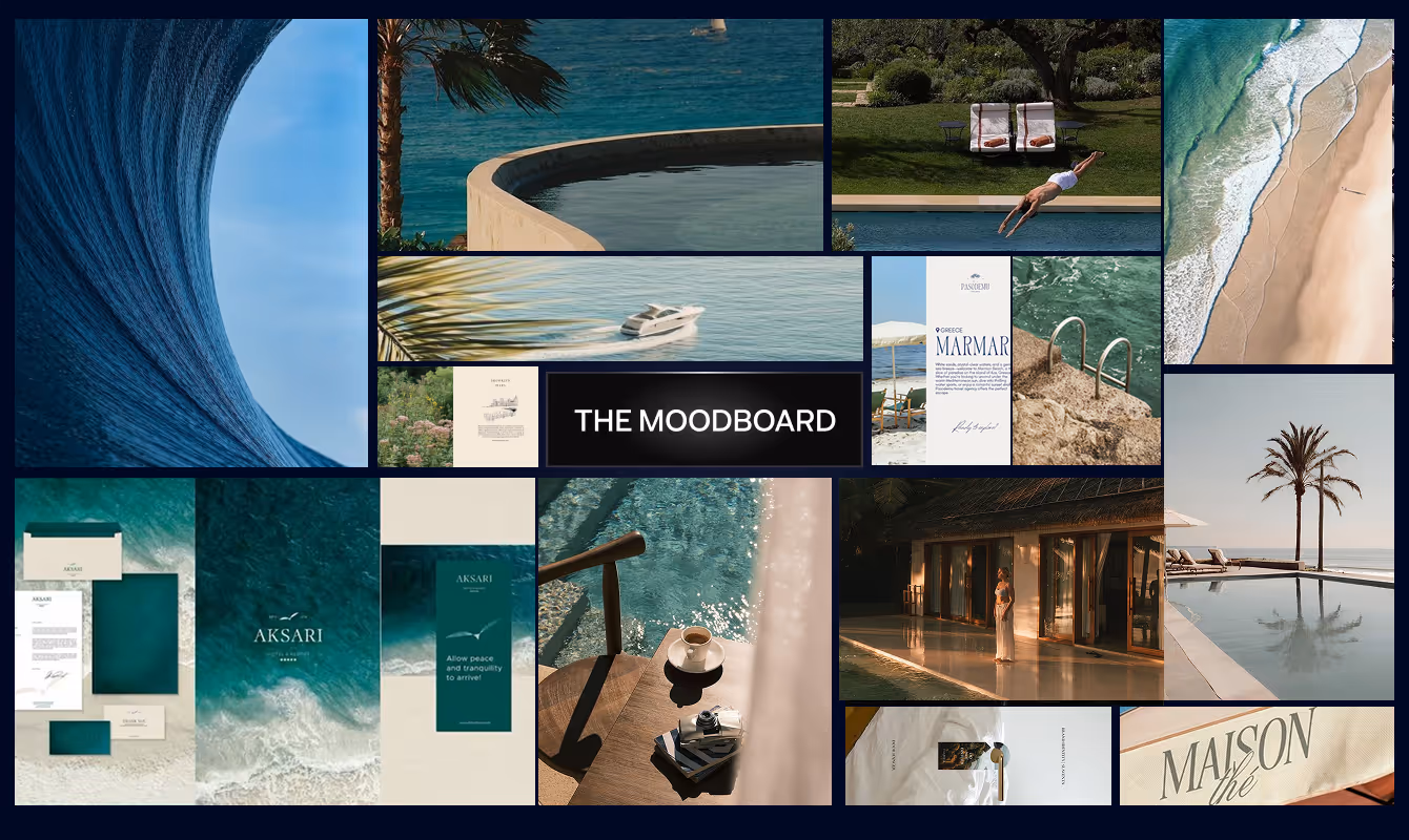
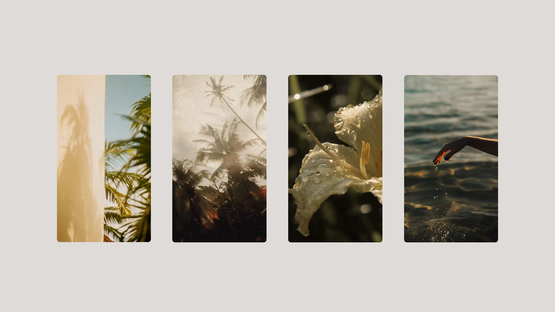
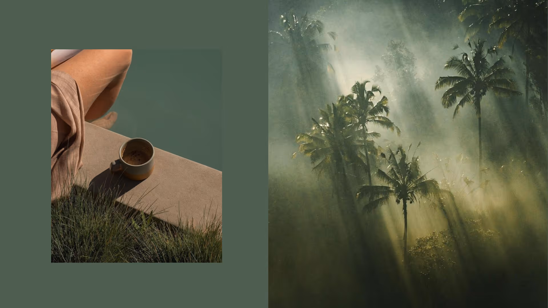
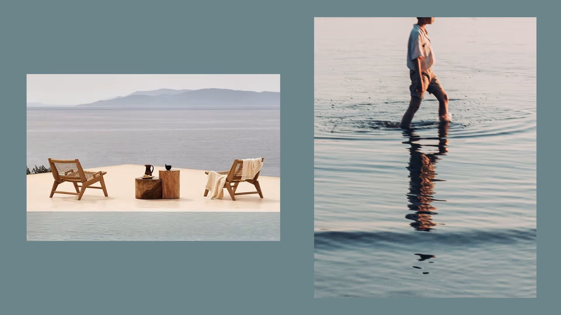
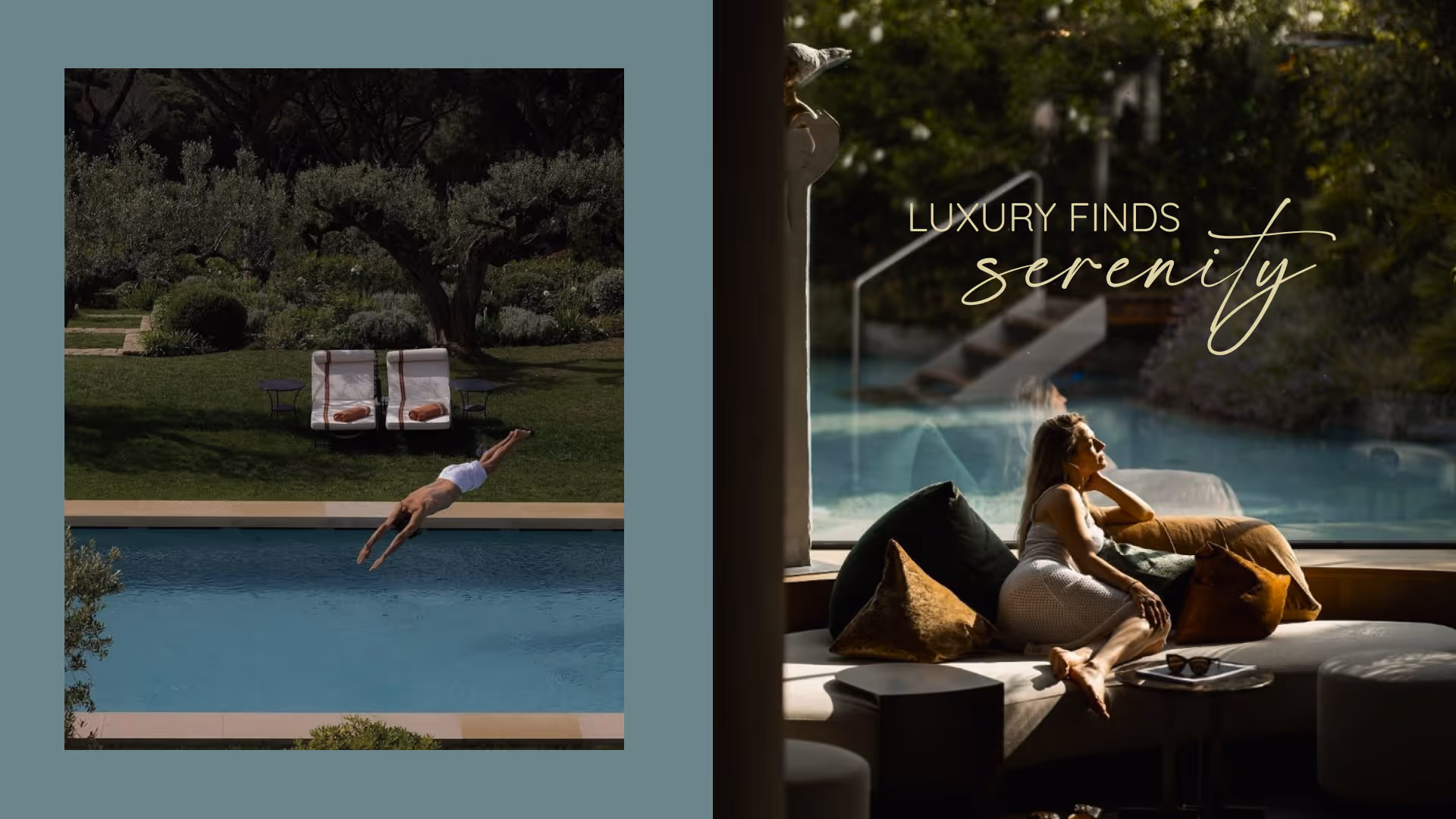
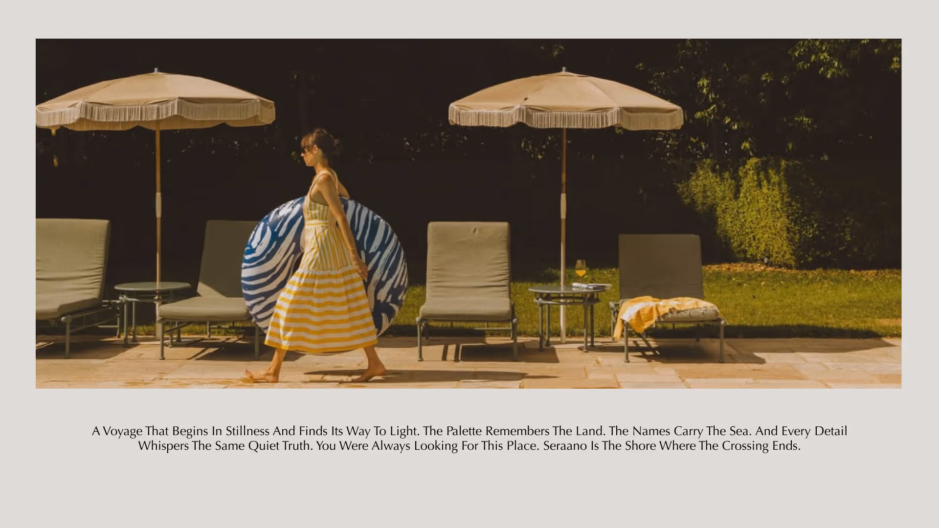
The moodboard draws from tactile, sensory imagery: water on skin, dew on petal, palm shadow on warm plaster, light breaking through monsoon canopy. The photography direction avoids the glossy perfection of luxury real estate marketing. Instead, it reaches for the feeling of a morning you want to stay inside of.
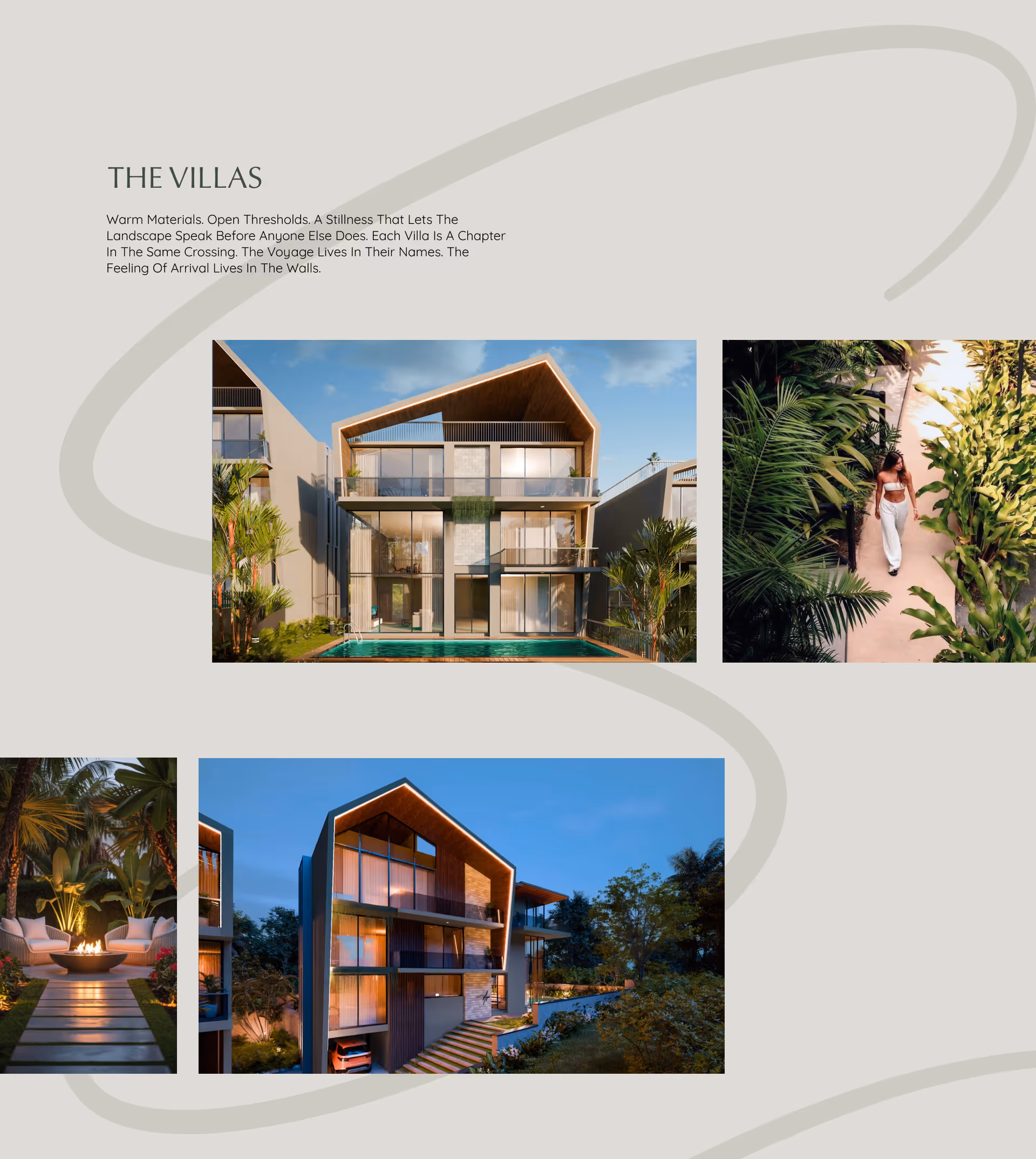
The villa renders sit within the brand system with the same restraint. Warm materials, open thresholds, pitched rooflines that echo the land's slope. The architecture was already doing the right things. The brand's role was to frame it, to let the buildings breathe inside a visual language that shares their temperament.
OUTCOME
Seraano's visual identity begins where the river bends and the trees grow thick. The brand was designed to feel like the land remembered it, as if it had always been here, waiting to be named.
The gold script wordmark anchors the system. It appears on dark green coasters, olive menu folders, linen aprons, and door hangers. Every application was chosen for proximity to the body, to the hand, to the threshold. Luxury, in the end, is felt in the smallest gestures. The ones you almost overlook. Almost.
The moodboard draws from tactile, sensory imagery: water on skin, dew on petal, palm shadow on warm plaster, light breaking through monsoon canopy. The photography direction avoids the glossy perfection of luxury real estate marketing. Instead, it reaches for the feeling of a morning you want to stay inside of.
The villa renders sit within the brand system with the same restraint. Warm materials, open thresholds, pitched rooflines that echo the land's slope. The architecture was already doing the right things. The brand's role was to frame it, to let the buildings breathe inside a visual language that shares their temperament.
Latest Work
Every project is a chance to try something new. Look at something with a fresh perspective. Do something for the first time.
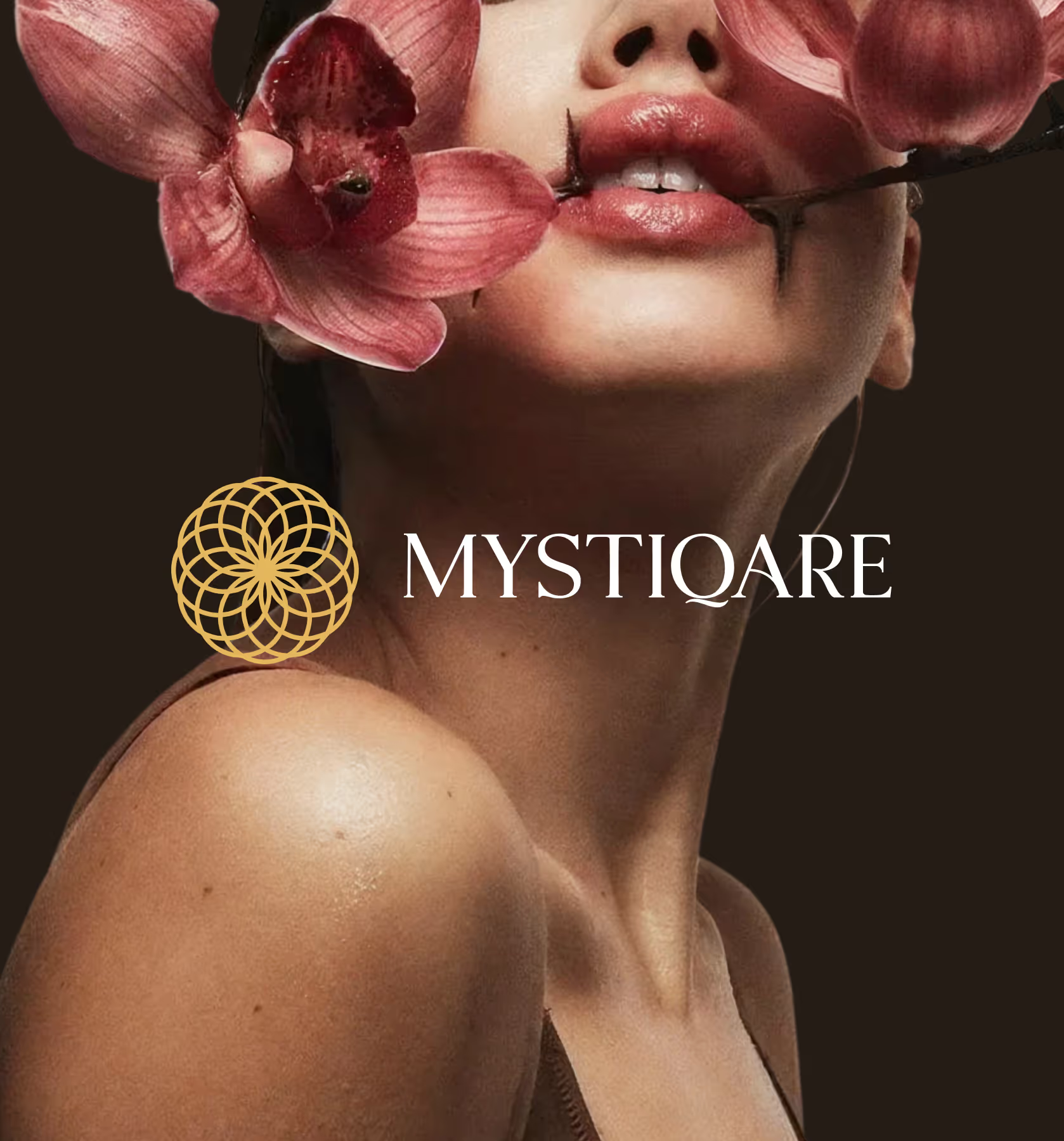
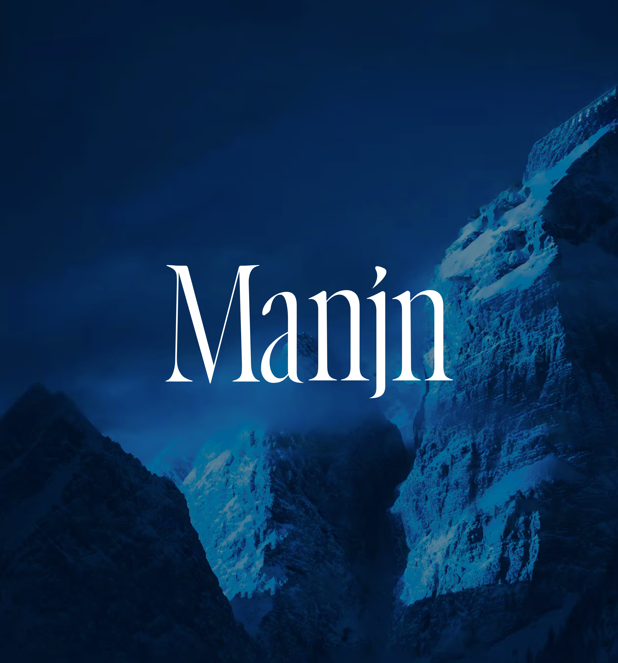
MANJN
Manjn is an upcoming oral care brand from India for global audience.
Branding
Packaging
Website
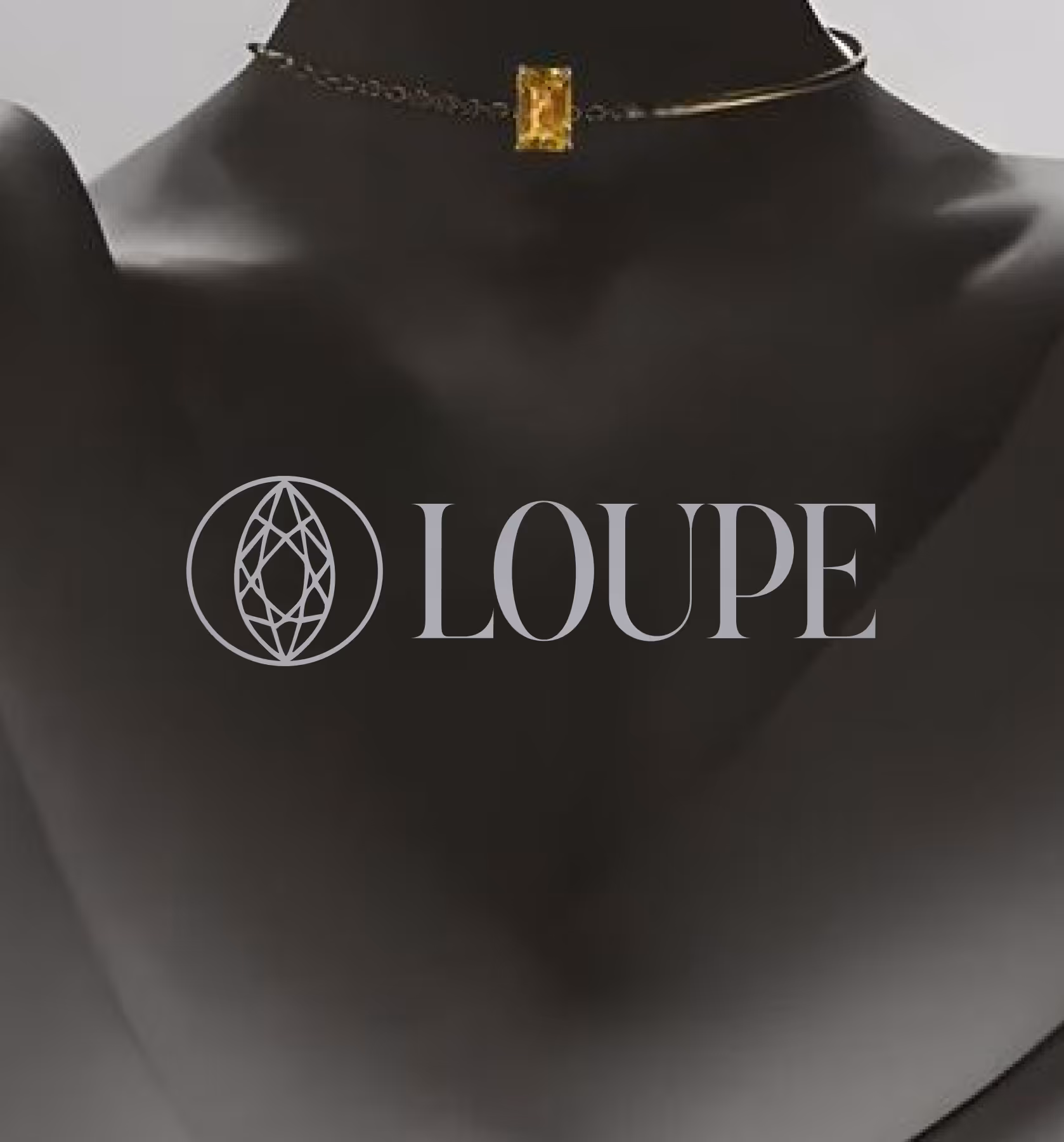
LOUPE
A trusted gemstone marketplace ensuring authenticity, secure transactions, eliminating fraud.
Branding
UI/UX