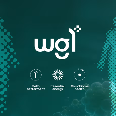
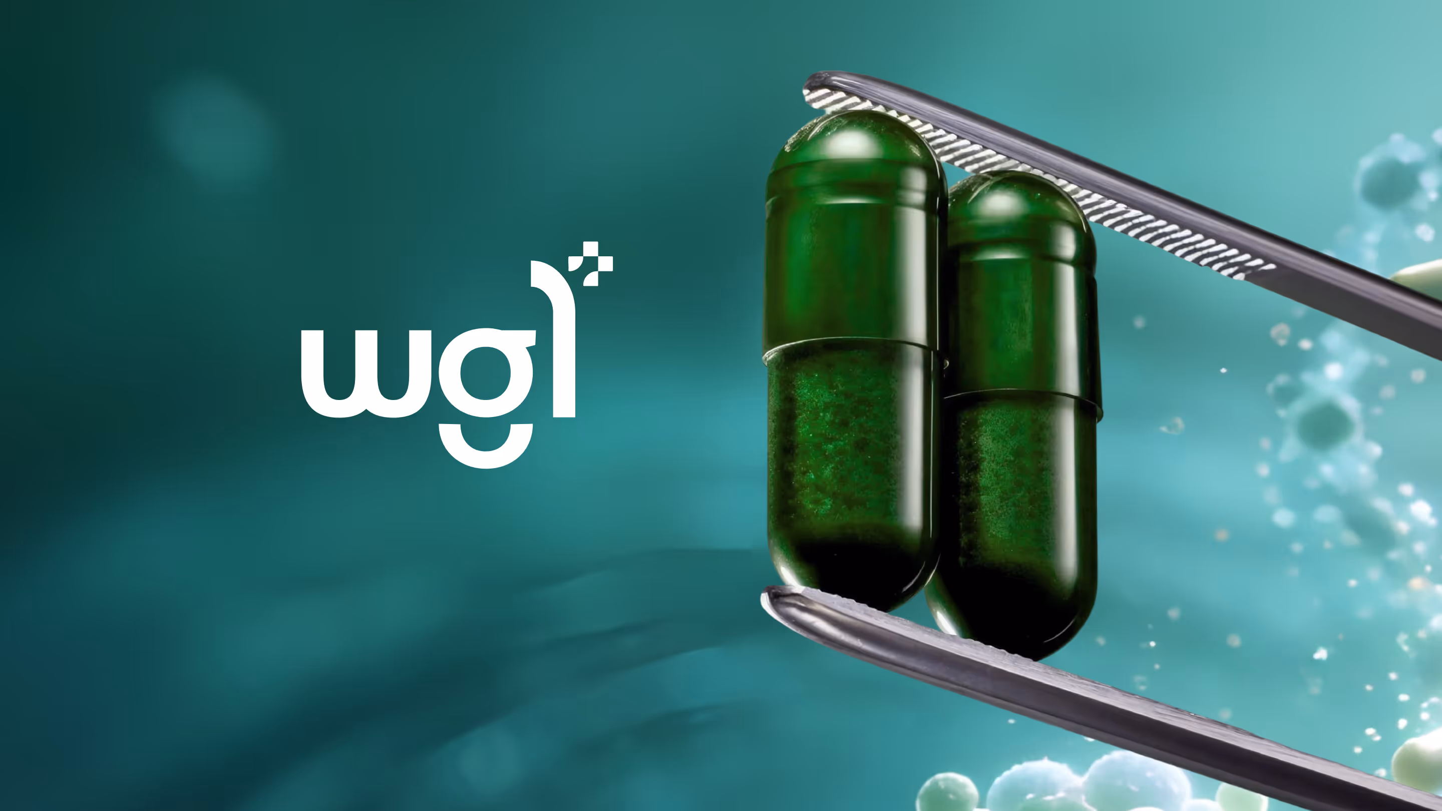
WG1
WG1 is a nutraceutical brand built around a single principle: health lives in what you repeat, in the ordinary days, in the things you do without thinking. The project distills foundational nutrition into a calm, dependable daily ritual, designed for people whose lives are too inconsistent for complexity but too aware to ignore the basics.
CLIENT
WG1
SERVICES
Brand Strategy
Visual Identity
Packaging
YEAR
2025
THE OBJECTIVE
We created a creative and experiential e-commerce for Manjn that tells the story of its products' naturalness through a pure and complete visual language. Fluid animations guide users seamlessly, while our clean, minimal design keeps the products as the true protagonists of the experience.

THE APPROACH
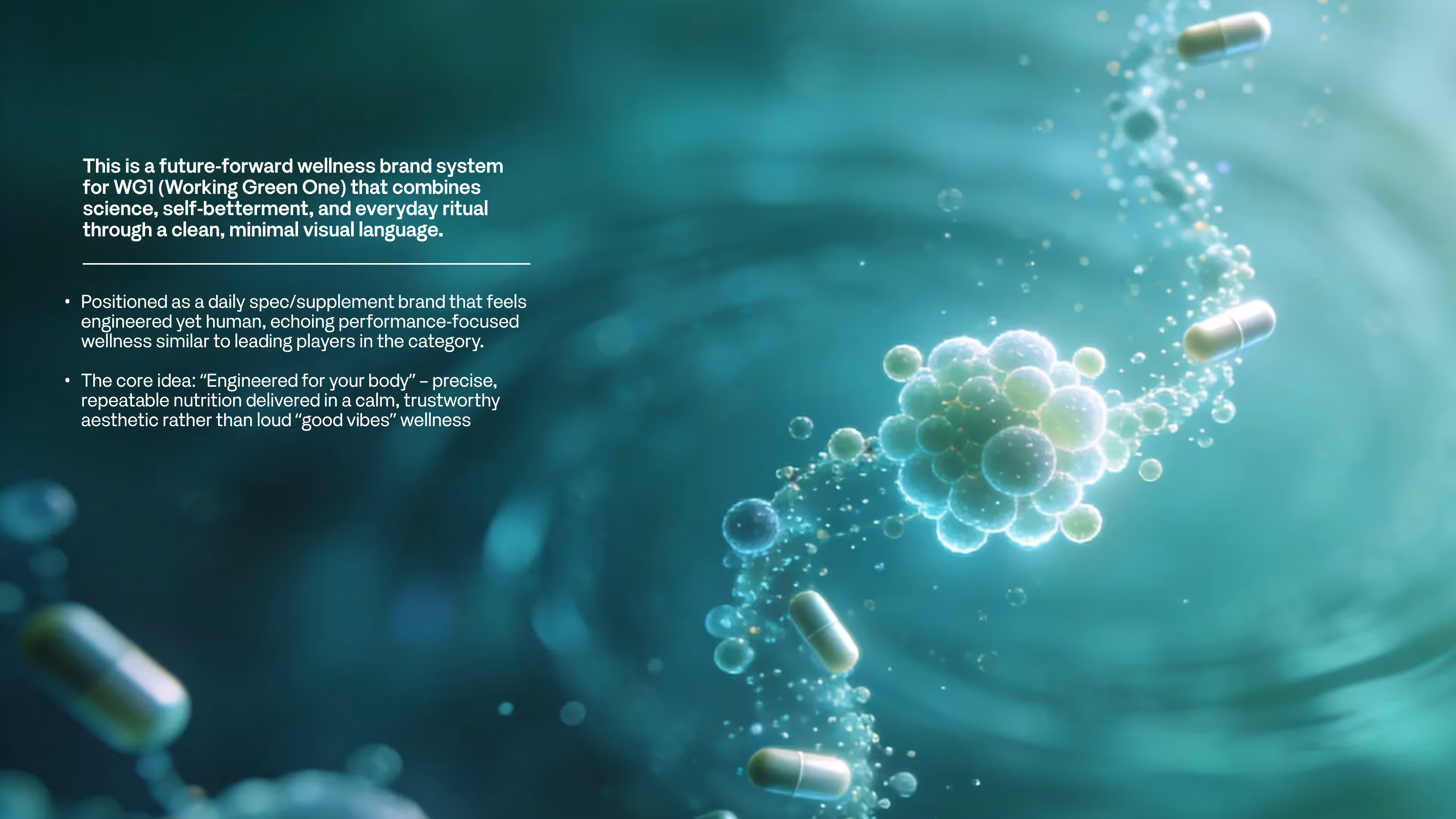
The central design tension was presence without performance. WG1 draws from clinical nutrition science, but the brand language refuses the vocabulary of supplements. There are no bold claims, no explosive colour palettes, no before-and-after promises. The tone is steady, grounded, and deliberate.
The visual system leans into restraint. Typography, colour, and layout were calibrated to feel closer to a wellness journal than a pharmacy shelf. The wordmark carries quiet authority, set in a typeface that balances precision with warmth. It reads the same way the product works: consistently, without demanding attention.
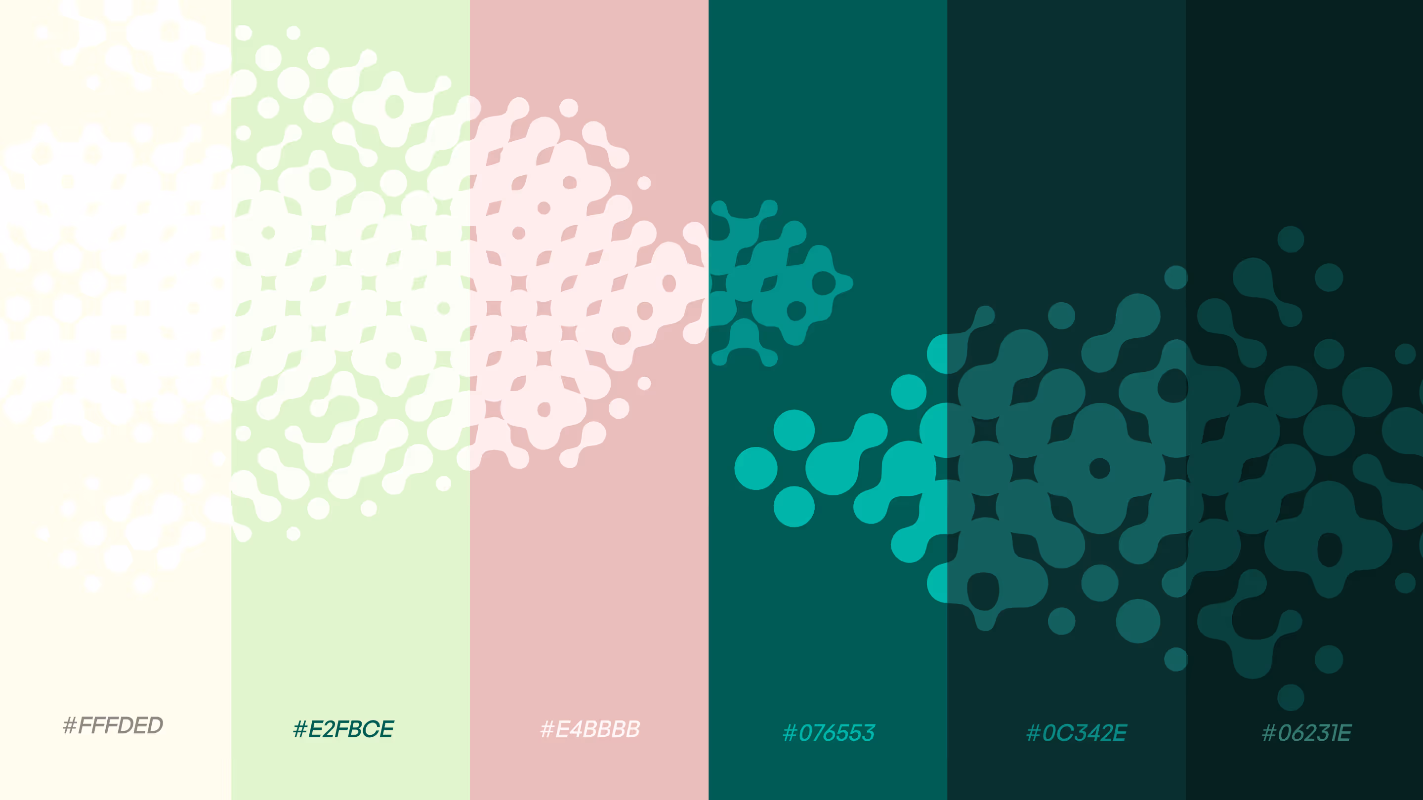
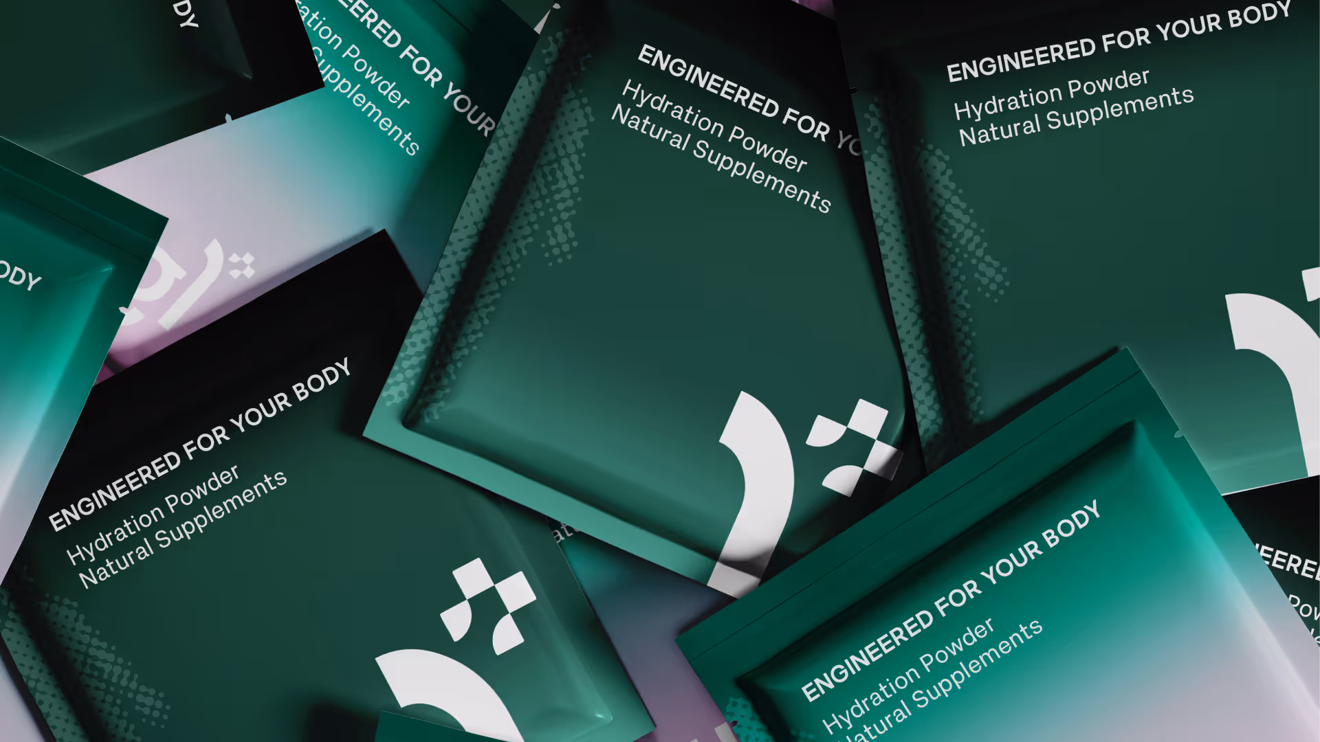
The colour palette was built to sit apart from the category. Where competitors reach for neon greens and electric blues, WG1 holds a muted, earthen register. Tones that feel closer to morning light than to a lab coat. The palette signals trust through calm rather than through clinical aggression.
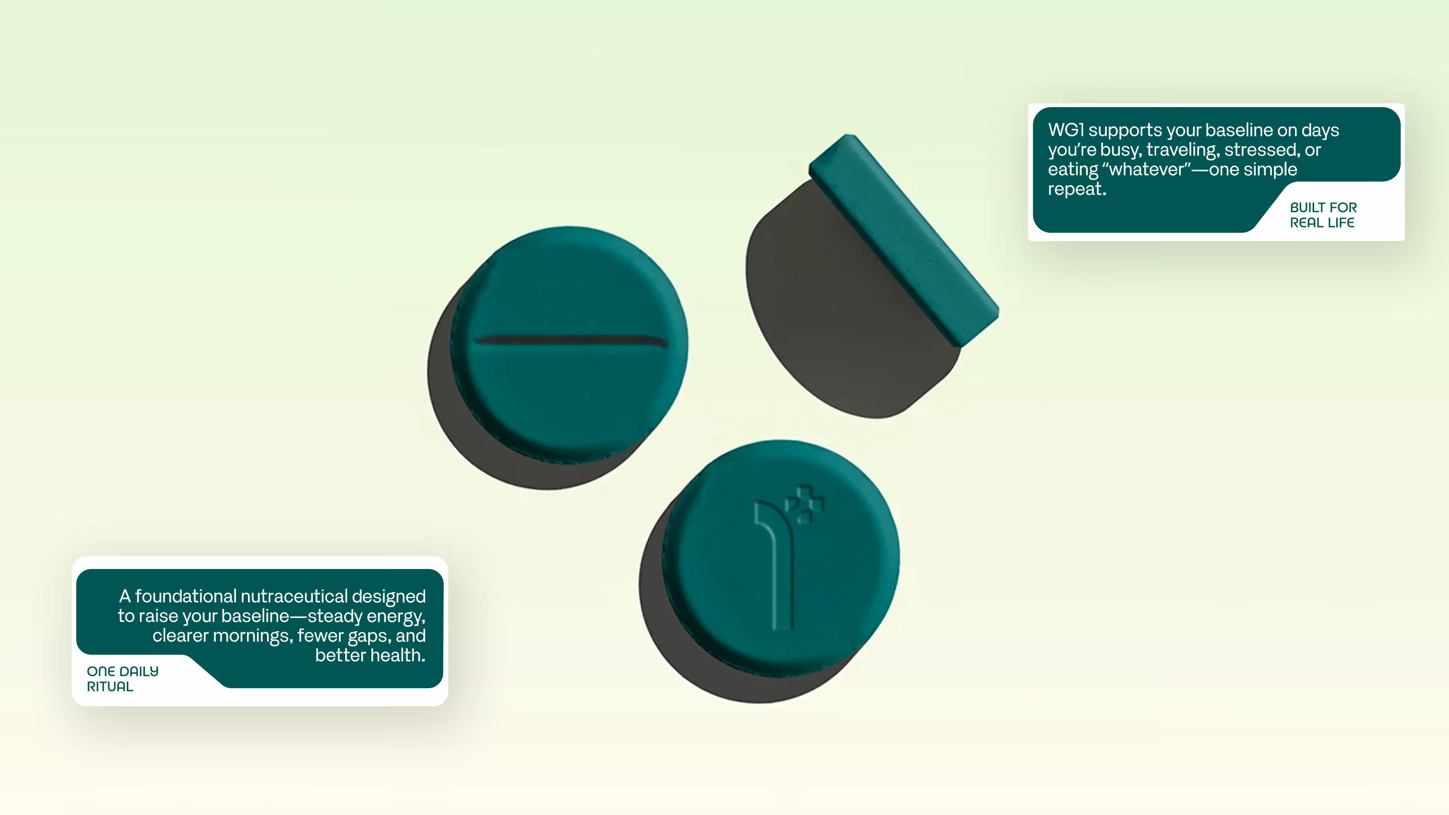
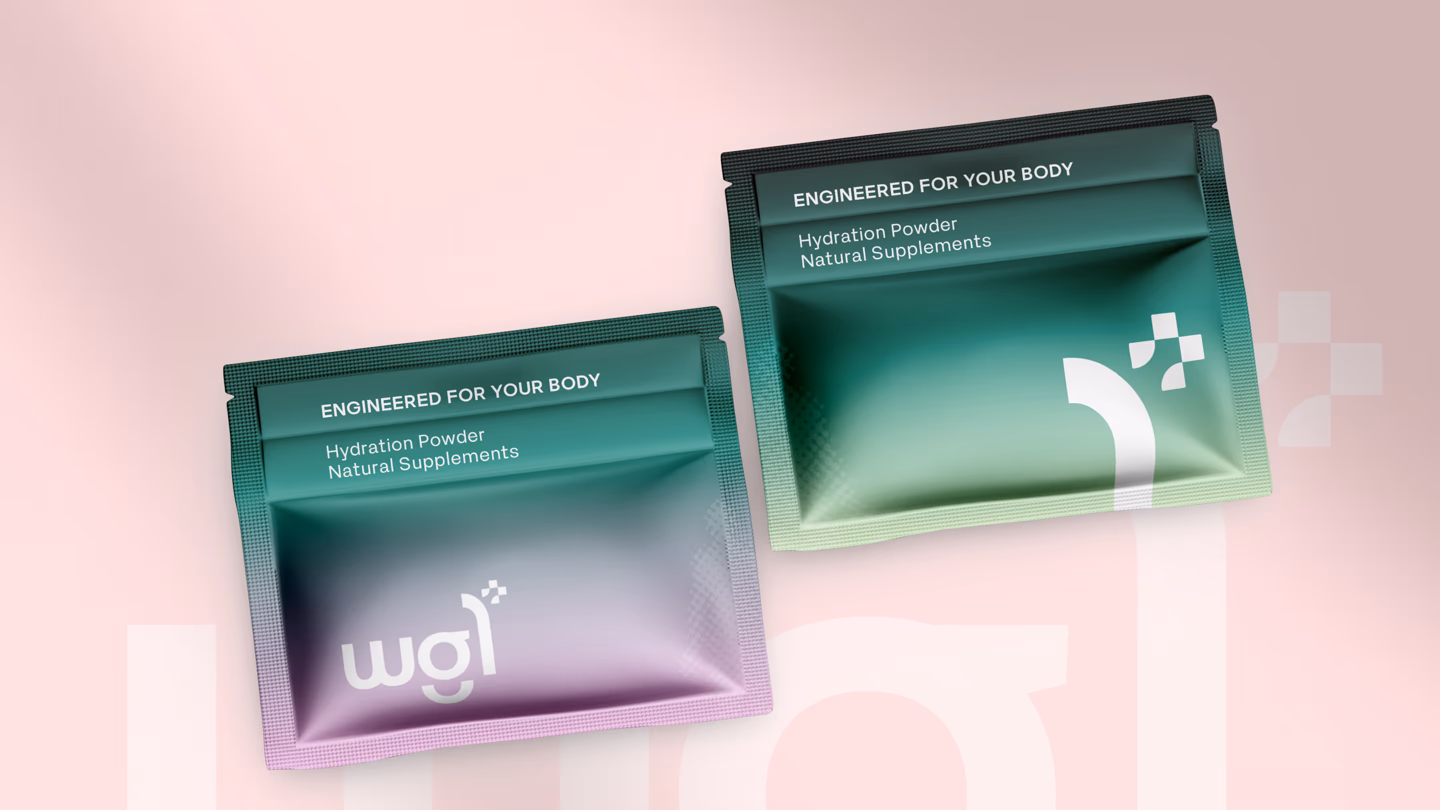
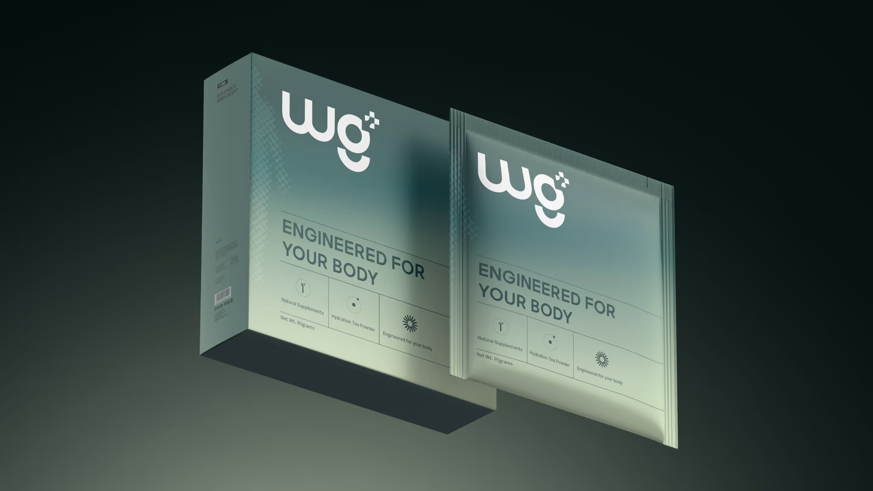
Packaging architecture follows the same philosophy. Clean label hierarchy, generous whitespace, and a structural format that communicates daily use rather than special occasion. The product sits on a counter, in a drawer, beside a glass of water. The design honours that context. It belongs in a routine, and it looks like it knows that.
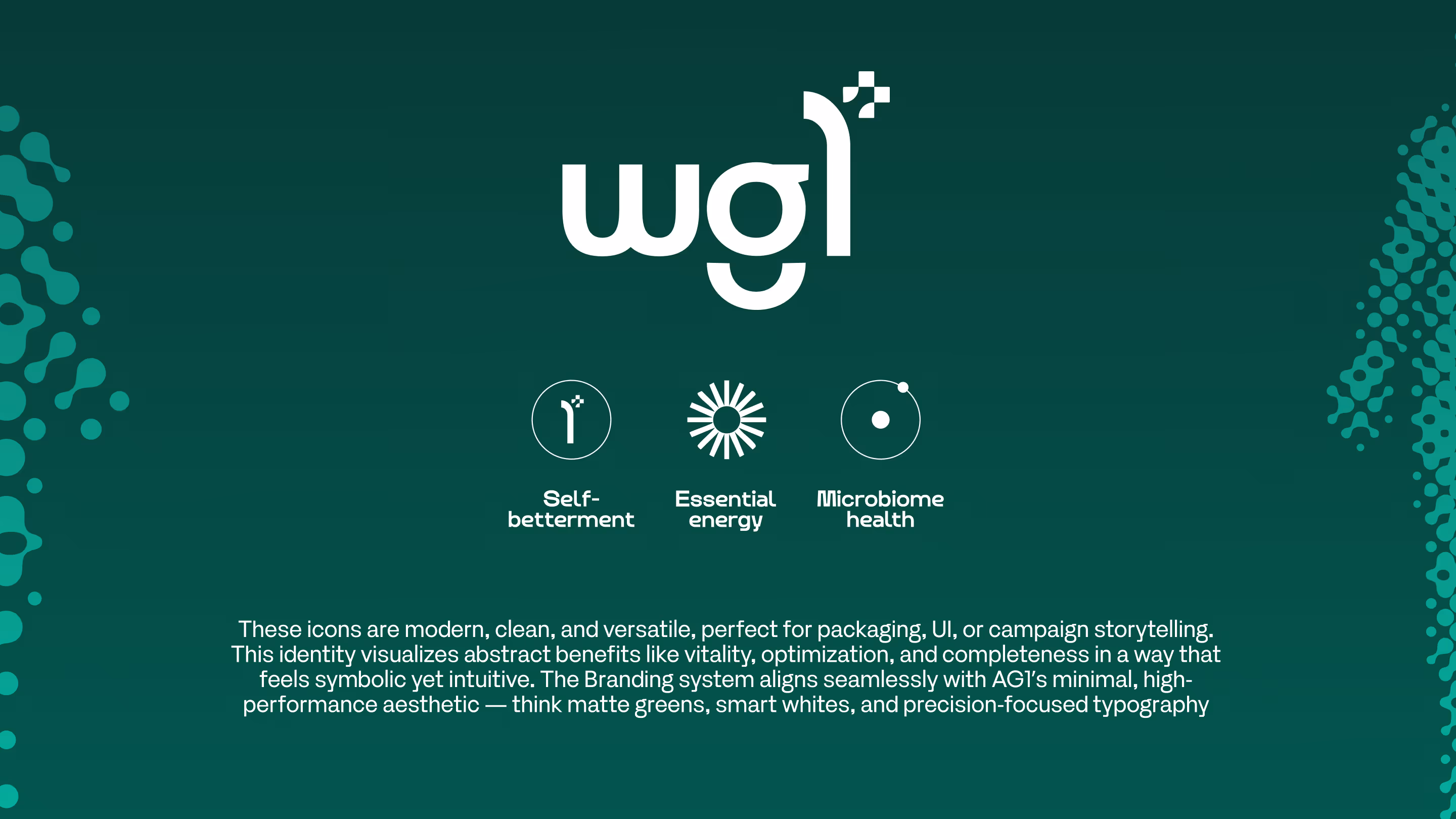
VISUAL IDENTITY
WG1's identity is built to disappear into your day and stay there. The wordmark is minimal, typographic, and confident enough to carry the brand across packaging, digital, and communications without raising its voice.
The packaging system treats every SKU as part of a single family. Differentiation is handled through subtle copy shifts and tonal variation rather than disruptive colour breaks. The result is a shelf presence that reads as one coherent thought instead of a catalogue of competing promises.
Photography and art direction follow the same restraint. Soft natural light, still compositions, and an absence of urgency. The visuals show the product in context: beside a bed, on a kitchen counter, in the rhythm of a morning. They sell consistency, because that is what the product actually delivers.
OUTCOME
WG1's identity is built to disappear into your day and stay there. The wordmark is minimal, typographic, and confident enough to carry the brand across packaging, digital, and communications without raising its voice.
The packaging system treats every SKU as part of a single family. Differentiation is handled through subtle copy shifts and tonal variation rather than disruptive colour breaks. The result is a shelf presence that reads as one coherent thought instead of a catalogue of competing promises.
Photography and art direction follow the same restraint. Soft natural light, still compositions, and an absence of urgency. The visuals show the product in context: beside a bed, on a kitchen counter, in the rhythm of a morning. They sell consistency, because that is what the product actually delivers.
Latest Work
Every project is a chance to try something new. Look at something with a fresh perspective. Do something for the first time.
SERAANO
Seraano is a luxury villa community by Aarza Realty, resting along the Chapora River backwaters in Camurlim, North Goa. Eight residences shaped by the land they stand on. Contemporary architecture that listens to the village before it speaks for itself.
Branding
Website
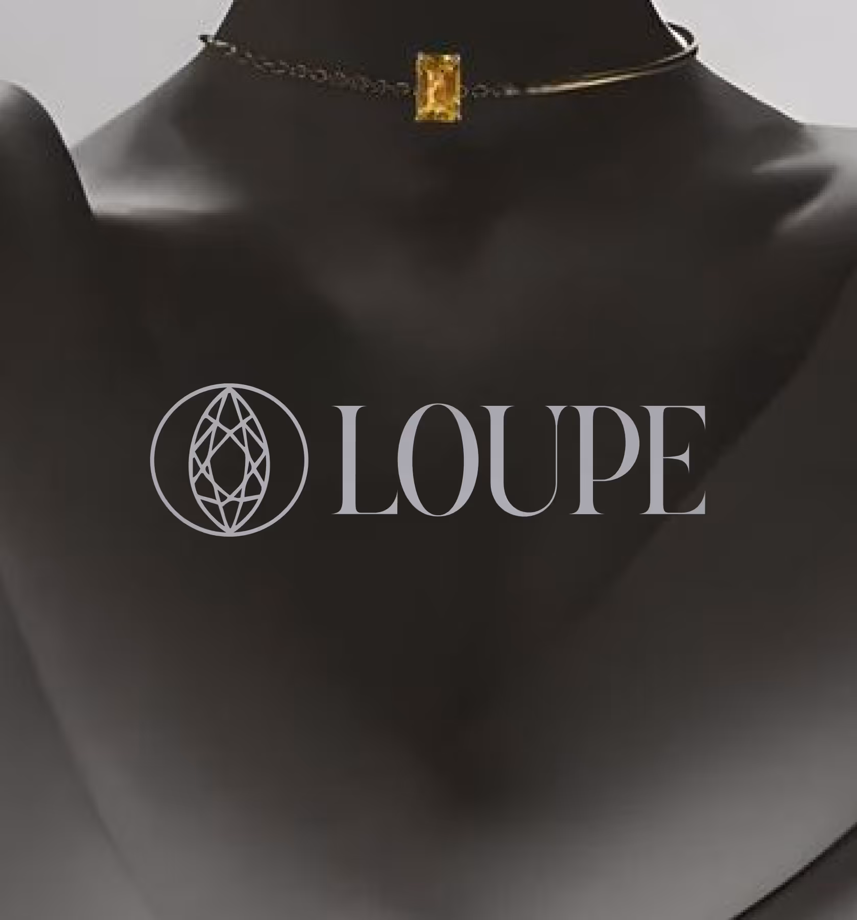
LOUPE
A trusted gemstone marketplace ensuring authenticity, secure transactions, eliminating fraud.
Branding
UI/UX