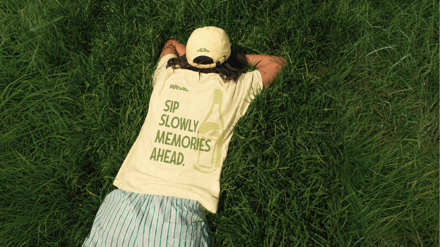
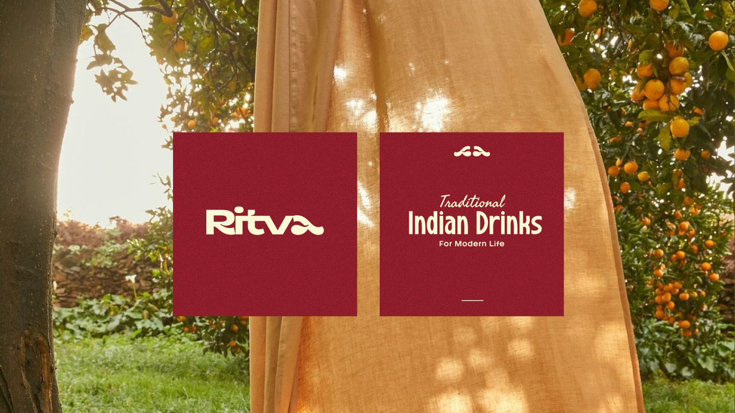
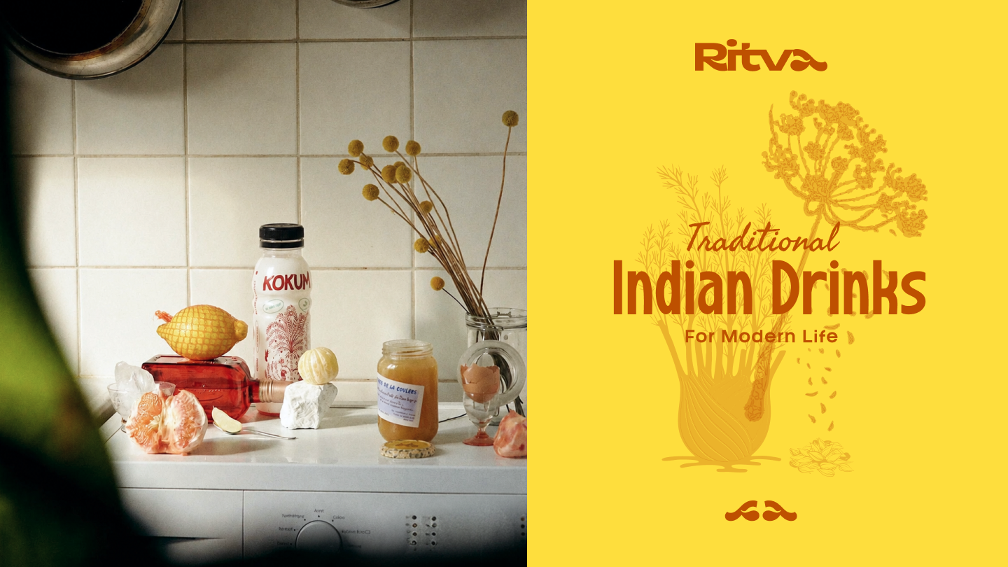
Ritva
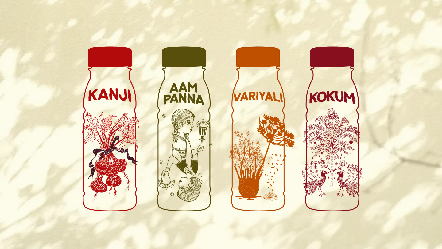
Ritva is a D2C traditional Indian beverage brand built on a straightforward belief: the drinks people grew up with deserve a place in modern retail. The Phase 1 launch covers four drinks from the Indian subcontinent's regional pantry, Kokum, Aam Panna, Kanji, and Variyali, each produced with real ingredients, zero added preservatives, and consistent taste across every batch. Izart Studio delivered the complete brand identity for Ritva, covering naming logic, logomark, visual system, packaging design, and brand communication.
CLIENT
Ritva
SERVICES
Brand Strategy
Visual Identity
Packaging
YEAR
2026

THE OBJECTIVE
We created a creative and experiential e-commerce for Manjn that tells the story of its products' naturalness through a pure and complete visual language. Fluid animations guide users seamlessly, while our clean, minimal design keeps the products as the true protagonists of the experience.
THE APPROACH
The core tension with Ritva was one of registers. Traditional Indian drinks carry deep cultural memory and are tied to seasons, families, and regional kitchens. Bringing them into a retail format risks making them feel clinical or nostalgic in the wrong direction: either too medicinal to be desirable or too folksy to be trusted at shelf. The brand needed to sit firmly in the space between the two.
The strategy was to anchor Ritva's identity in texture over statement. Rather than leading with health claims or heritage storytelling, the visual language draws from the physical qualities of the drinks themselves: their deep natural colours, their regional specificity, and the quiet rituals around consuming them. The photography approach reinforces this, pairing product with lived Indian domestic moments across generations, a grandmother, a family game, an afternoon gathering, rather than aspirational lifestyle imagery.
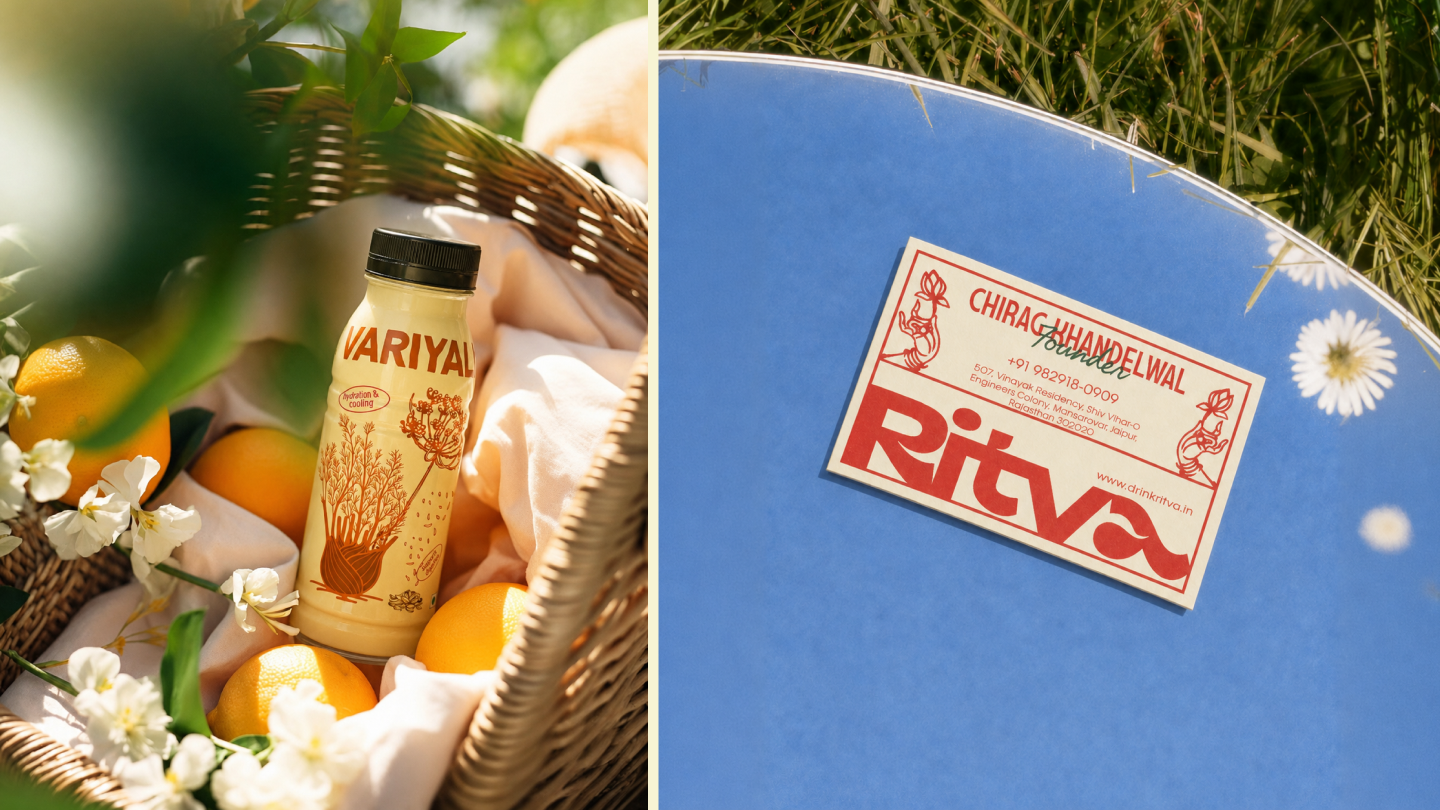
The logomark is a fluid abstract form derived from the brand's typographic tail, functioning independently as a brand symbol deployable across caps, bottle caps, and apparel without requiring the full wordmark. This gives Ritva two functional layers of identity at different scales.
.png)
VISUAL IDENTITY
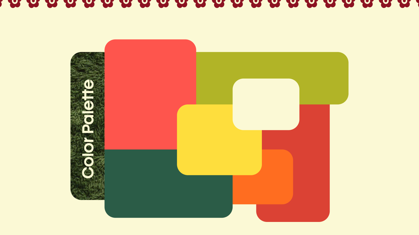
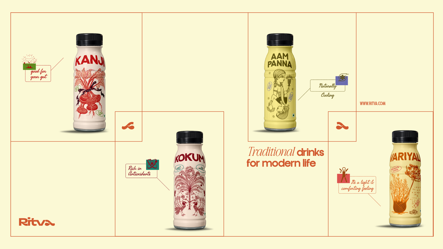
Ritva's visual identity is built around a palette sourced directly from the colour range of the drinks themselves. The eight-colour system spans Coral Red (#FF554D), Deep Crimson (#DC4335), Saffron Orange (#FF6D20), Forest Green (#2C5B47), Olive Chartreuse (#B1B427), Warm Yellow (#FEDE3E), Off-White Cream (#FCF8D5), and Near-Black (#090909). Each colour carries functional associations with the product range, making the palette a navigation tool as much as a brand expression. The system reads as grounded and ingredient-honest rather than artificially bright.
The primary typeface is Pingled, a bold condensed display face used for headlines and product names, set in deep crimson with a gradient treatment that adds depth without decoration. Francy serves as the secondary face, a clean geometric sans that handles body copy, label text, and interface elements with quiet legibility. Together, the two typefaces create a rhythm of weight and restraint that reflects the brand's dual nature: rooted and considered.
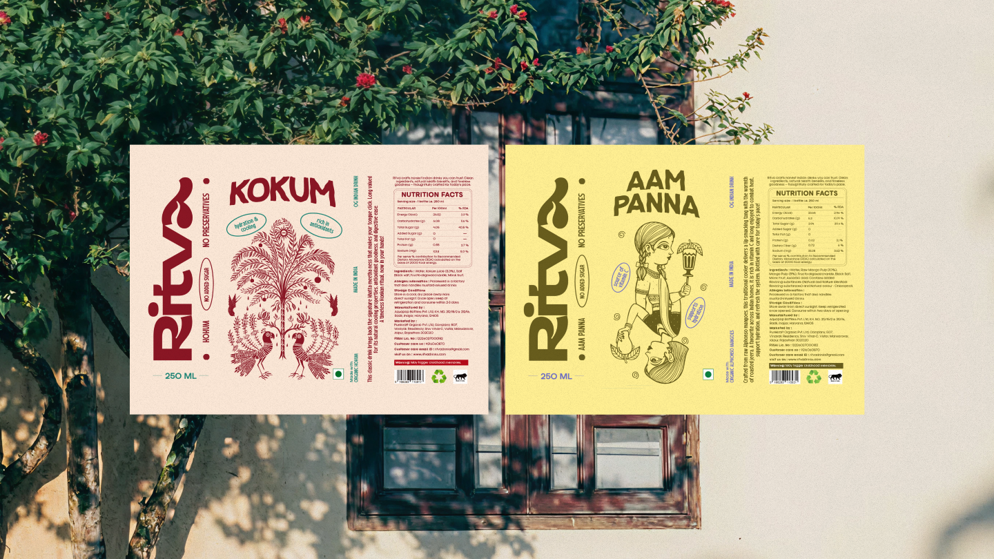
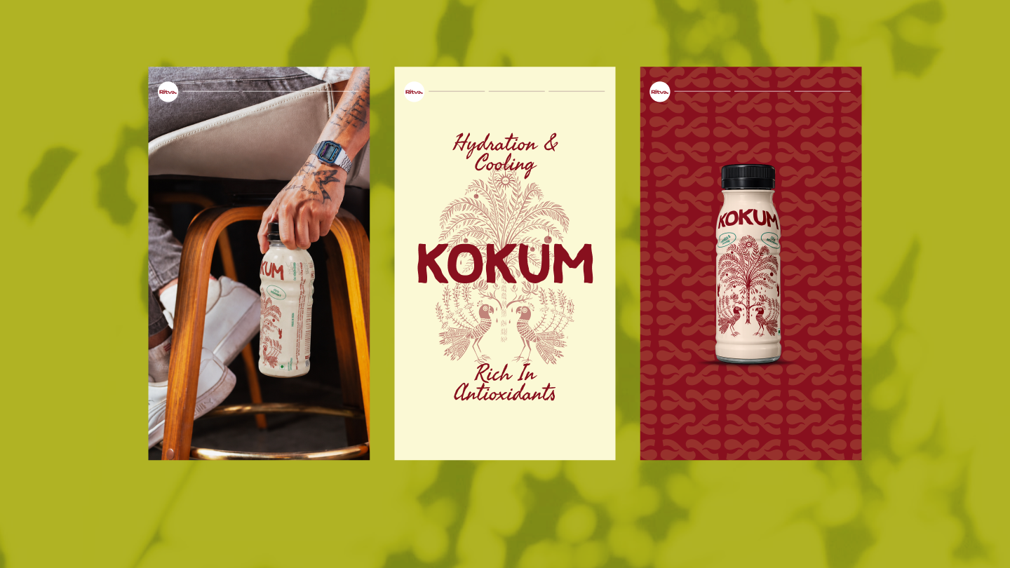
The packaging design for the Kokum bottle demonstrates the system's depth most clearly. An intricate folk-art illustration rendered in tonal red-on-cream covers the label body, drawing from Indian craft traditions without being derivative. Bold uppercase product naming anchors the top of the label, and a provenance badge at the base grounds the product in its ingredient origin. The result reads as premium at shelf while remaining approachable to a first-time buyer.
The logomark, an abstract fluid form in either Coral Red on Cream or reversed, scales from bottle cap to billboard. It appears on branded caps, apparel, and social assets as a recognisable shorthand for the brand without carrying the full wordmark.

OUTCOME
Ritva's visual identity is built around a palette sourced directly from the colour range of the drinks themselves. The eight-colour system spans Coral Red (#FF554D), Deep Crimson (#DC4335), Saffron Orange (#FF6D20), Forest Green (#2C5B47), Olive Chartreuse (#B1B427), Warm Yellow (#FEDE3E), Off-White Cream (#FCF8D5), and Near-Black (#090909). Each colour carries functional associations with the product range, making the palette a navigation tool as much as a brand expression. The system reads as grounded and ingredient-honest rather than artificially bright.
The primary typeface is Pingled, a bold condensed display face used for headlines and product names, set in deep crimson with a gradient treatment that adds depth without decoration. Francy serves as the secondary face, a clean geometric sans that handles body copy, label text, and interface elements with quiet legibility. Together, the two typefaces create a rhythm of weight and restraint that reflects the brand's dual nature: rooted and considered.
The packaging design for the Kokum bottle demonstrates the system's depth most clearly. An intricate folk-art illustration rendered in tonal red-on-cream covers the label body, drawing from Indian craft traditions without being derivative. Bold uppercase product naming anchors the top of the label, and a provenance badge at the base grounds the product in its ingredient origin. The result reads as premium at shelf while remaining approachable to a first-time buyer.
The logomark, an abstract fluid form in either Coral Red on Cream or reversed, scales from bottle cap to billboard. It appears on branded caps, apparel, and social assets as a recognisable shorthand for the brand without carrying the full wordmark.
Latest Work
Every project is a chance to try something new. Look at something with a fresh perspective. Do something for the first time.
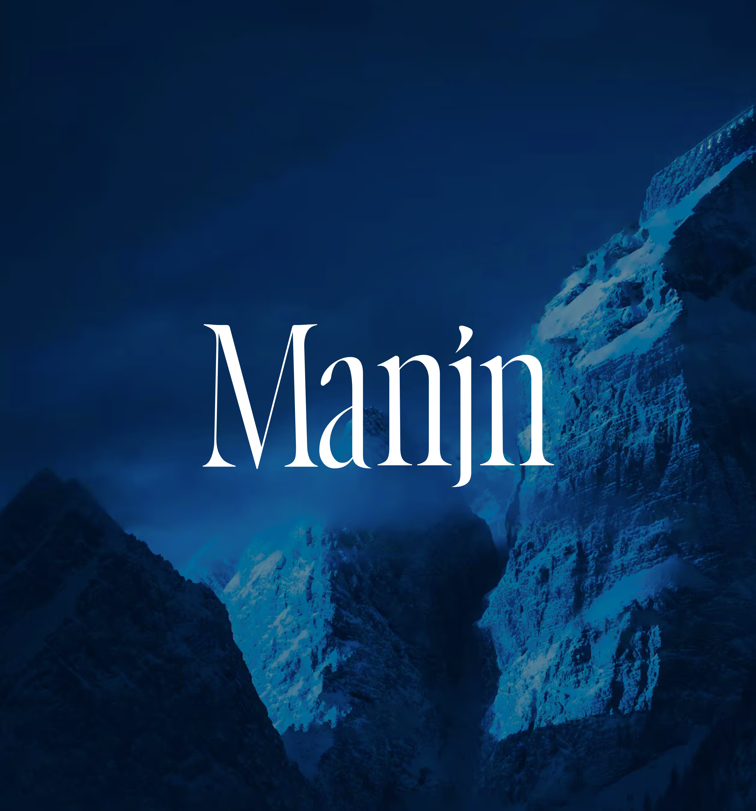
MANJN
Manjn is an upcoming oral care brand from India for global audience.
Branding
Packaging
Website
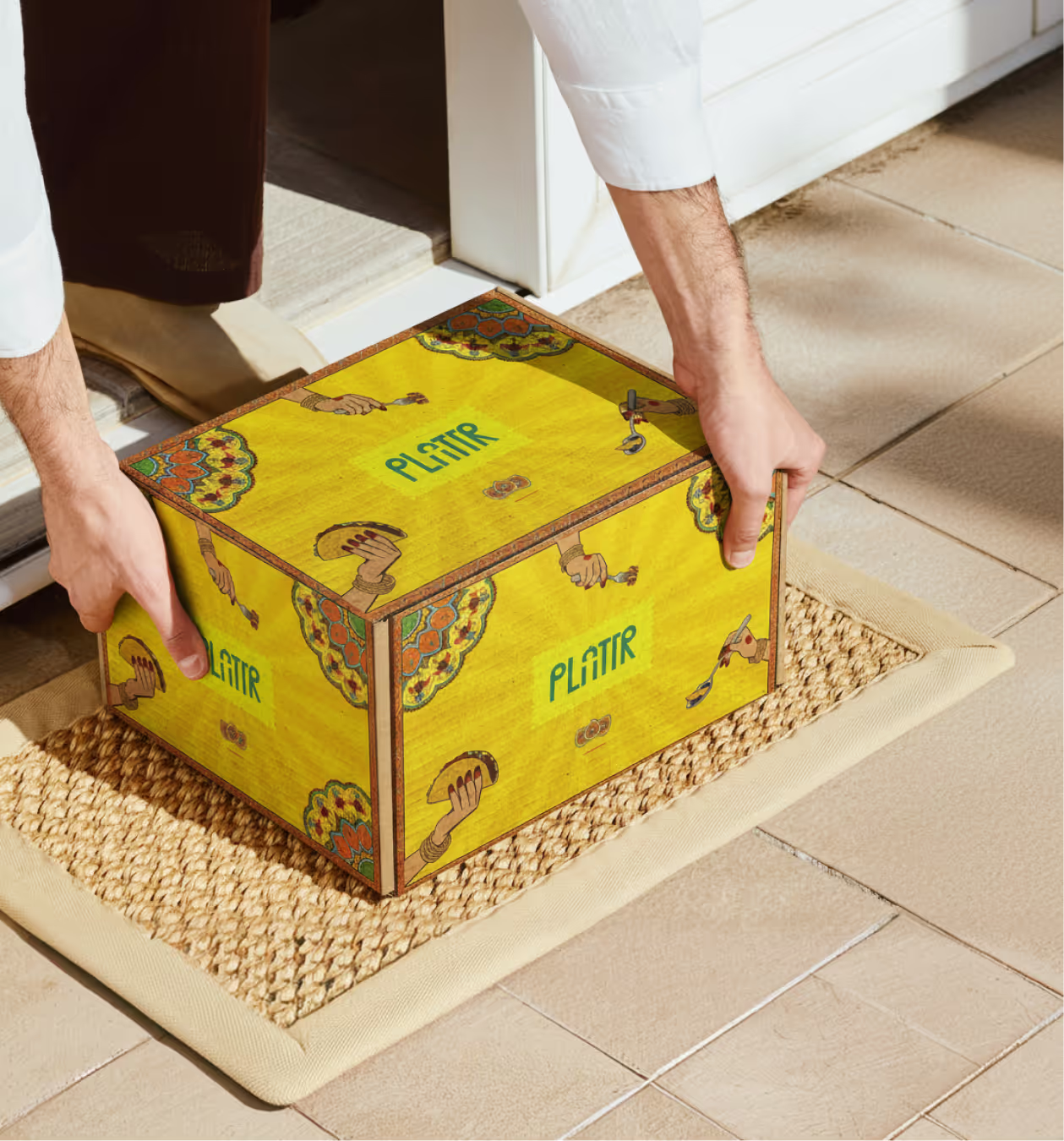
PLATTR
Plattr is a bulk catering platform built for corporate and household events.
Branding
Packaging
UI/UX