The Architecture of a Brand System
June 2, 2026


Someone points at a slide.
On screen: a logo in two sizes, three hex codes, two font names. Clean. Well-spaced. The kind of thing a good designer puts together in a week.
"That's our brand system."
Everyone nods. The meeting moves on.
Here's the thing: to answer what a brand system really is, you have to start by questioning what just happened in that room. Because what got pointed at was not a brand system. It was a style reference. A collection of design decisions, neatly formatted. Useful. But not a system.
The difference matters more than most people realise. It changes how you write a brief. How you evaluate creative work. How you protect meaning over time against the quiet erosion of well-meaning people making reasonable individual decisions that collectively unravel something nobody intended to unravel.
A brand system is not a logo with a colour palette. It is a semiotic architecture: a set of interlocking decisions about meaning, hierarchy, and communication that should survive every individual design choice made inside it.
That distinction is what this piece is about.
Table of Contents
1. The Definition Everyone Uses (And Why It's Incomplete)
2. Identity vs. System: The Distinction That Changes Everything
3. The Semiotic Foundation: How Brand Systems Generate Meaning
4. The Architecture Analogy: Why "System" Is Not a Metaphor
5. What a Brand System Is Actually Made Of
6. Three Systems That Prove the Argument
7. What a Brand System Changes About How You Work
8. Frequently Asked Questions
The Definition Everyone Uses (And Why It's Incomplete)
The Style Guide as Artefact
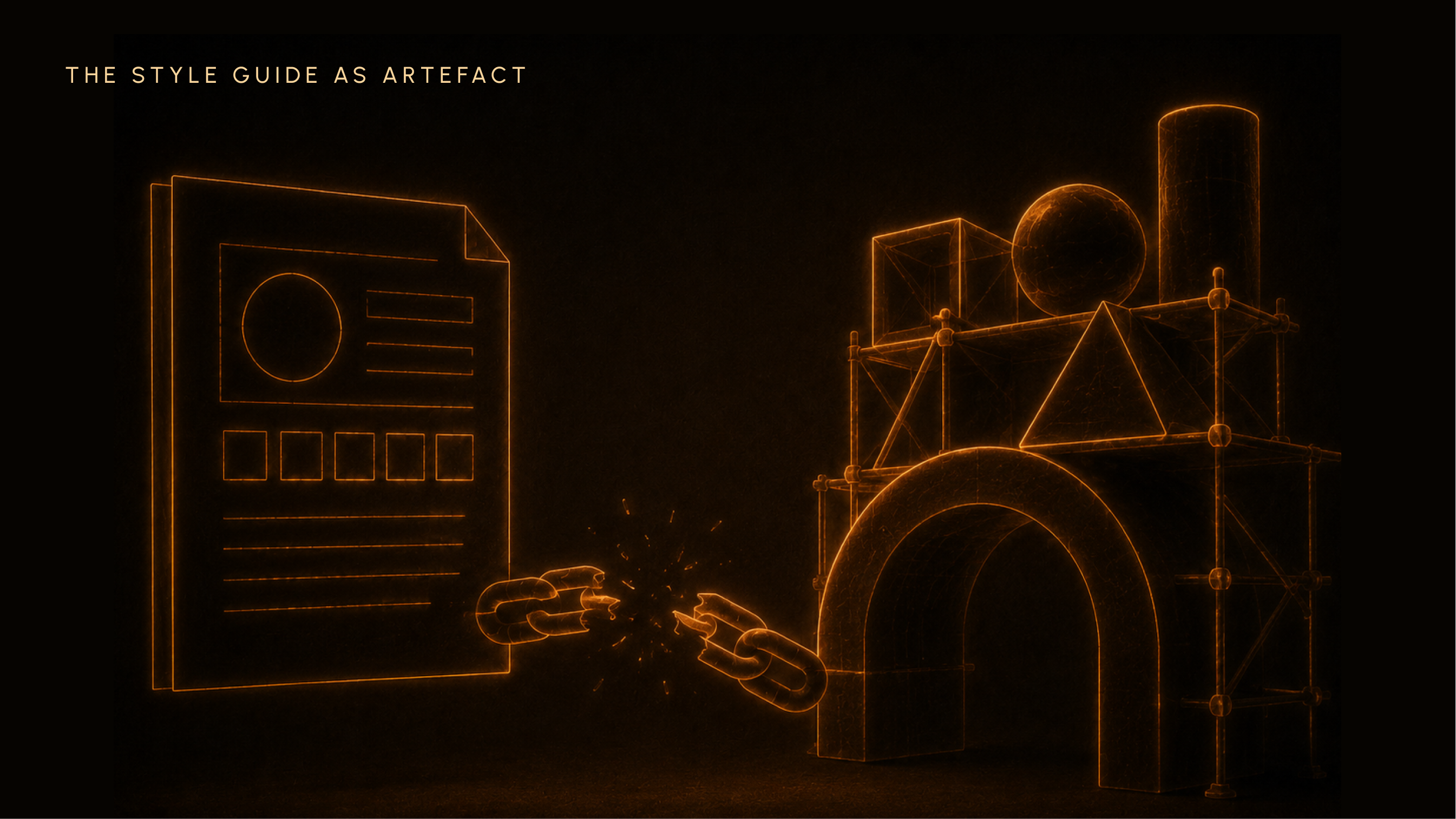
Most brands, when they talk about a brand system, mean a document. Often a PDF. Sometimes a Notion page. Usually it contains: the primary logo and its variants, the approved colour palette with hex and Pantone codes, the typeface hierarchy, maybe some photography guidelines, possibly a section on tone of voice that lists three to five adjectives and stops there.
This document is genuinely useful. It records decisions. It creates consistency at the surface level. It gives a new designer somewhere to start.
But it is descriptive, not generative.
A style guide records what has already been decided. It does not explain why those decisions were made. It cannot tell you what to do when a new situation arises that the PDF never anticipated. And it offers no guidance on which rules are load-bearing, which are flexible, and which are simply conventions that can shift as the brand evolves.
This is the failure mode: a brand that follows its guidelines faithfully while the meaning slowly drains out of the work. The colours are correct. The logo is placed correctly. The font is right. And somehow the work feels empty, or inconsistent, or simply uninspiring. The system is being followed. But the system was never actually built.
Both are useful. Only one tells you how the building holds together.
Richard Danne and Bruce Blackburn understood this better than almost anyone. Their 1975 identity programme for NASA, which became one of the most celebrated design systems in history, was not just a logo. It was an 80-plus-page standards manual governing everything: logotype specifications, the precise red of PMS 179, Helvetica as the authorised typeface, grid systems for publications, markings for vehicles, rules for every application from stationery to the Space Shuttle. As Danne described it: "a coordinated, comprehensive design programme, not just another ornamental badge."
That manual is as close as any document has come to being a genuine system. And it was still retired in 1992, when institutional leadership changed and nobody inside NASA understood the logic well enough to defend it. More on that later.
The Logo Is Not the Brand

Marty Neumeier wrote it plainly in The Brand Gap (2003): "A brand is not a logo. A brand is not a corporate identity system. It's a person's gut feeling about a product, service, or company."
That was a useful correction for its time. But it does not go far enough.
A logo is a sign. Not a metaphor for a sign: an actual sign, in the technical sense. It stands for something beyond itself. And that standing-for is not inherent in the logo. It is produced by everything around the logo: the pricing, the distribution, the people the company hires, the language it uses, the products it builds, the things it declines to do. The logo means something because a system around it keeps sending consistent signals.
Take the same logomark and put it on two companies with different systems, and you have two completely different brands. This is not a theoretical point. It is the practical reality that every brand manager who has survived a rebrand or a brand acquisition already knows.
The logo does not carry the meaning. The system does. The logo is where the meaning shows up.
Identity vs. System: The Distinction That Changes Everything
Brand Identity: The Output
Brand identity is the set of visual and verbal signals an organisation uses to present itself. It is the surface of the brand. Everything a consumer can see, read, or hear: the name, the logo, the colour, the typography, the tone of voice, the photography direction.
This is the deliverable most branding engagements produce. And it matters.
David Aaker's Brand Identity Planning Model, first articulated in Building Strong Brands (1996), is still the most rigorous academic framework for this work. Aaker organises identity around four perspectives: the brand as product, as organisation, as person, and as symbol. His central distinction between core identity, the associations most likely to remain constant over time, and extended identity, the elements that provide texture and expression, establishes that even identity itself is layered. It is not flat. Some of it holds still. Some of it moves.
Wally Olins, in The Brand Handbook (2008), added the structural dimension: identity is always a structural decision before it is an aesthetic one. His three expressions of corporate identity, monolithic, endorsed, and branded, are not style choices. They are organisation-level decisions about how meaning circulates across products, divisions, and touchpoints. You make the structural decision first. Then you make the aesthetic one.
Brand System: The Architecture Behind the Output
A brand system is the decision framework that produces identity consistently across situations the guidelines never anticipated.
It answers questions no style guide can answer. What do you do when a new touchpoint does not fit the grid? Which rules are immovable and which are flexible by context? How do you evaluate whether a creative decision is on-brand when reasonable people disagree?
Francisco Conejo and Ben Wooliscroft, writing in the Journal of Macromarketing in 2015, proposed that brands should be re-understood as "semiotic marketing systems": complex, multidimensional constructs with varying degrees of meaning, independence, co-creation and scope. Their argument: brands need to "contemplate their meaning infrastructures" given the symbolic density of contemporary markets. The AMA's trademark-based definition, they wrote, is nearly 80 years old and increasingly unfit for what brands actually are.
That phrase, meaning infrastructure, is the cleanest definition of what a brand system actually maintains.
It has hierarchy. It distinguishes between core architecture, the load-bearing structure, and flexible expression, the elements that can move without the building falling. It has logic that survives individual design choices. It answers the question "is this on-brand?" not by checking a colour code but by checking whether a decision is consistent with a meaning claim made at a higher level of the system.
That is what a style guide cannot do. Not because style guides are poorly made, but because they are the wrong tool for that job.
The Semiotic Foundation: How Brand Systems Generate Meaning
The Sign and the System
Let me make this practical.
Semiotics is the study of signs and how they make meaning. A sign is any element that stands for something beyond itself. Ferdinand de Saussure, in Course in General Linguistics (1916), broke the sign into two parts: the signifier, the sound-image or visual form, and the signified, the concept it points to. The key insight: the connection between them is arbitrary. There is nothing in the word "tree" that is inherently tree-like. The connection exists only through convention, through the shared agreement of a community who keep using it the same way.
This is exactly true of logos.
A bitten apple does not inherently mean anything. Apple, the company, made it mean something. They did it by maintaining a system of signals: the design language, the pricing, the retail experience, the packaging, the product logic, the language they used to describe what they were doing, and crucially, the things they chose not to do. The logo means something because the system kept that meaning alive.
Charles Sanders Peirce added a useful taxonomy in his Collected Papers. Peirce described three types of signs: icons, which resemble what they represent; indexes, which point to what they represent through a causal or proximity relationship; and symbols, which connect to what they represent purely through convention. Most logos are symbols in Peirce's sense. Their meaning is entirely dependent on convention. On the system reinforcing the connection over time.
Take away the system, and the symbol becomes empty. This is not hyperbole. Acquire a brand and stop maintaining the system, and watch how quickly the logo starts to feel like nothing.
Barthes and the Second Level: When a Logo Becomes a Myth
Roland Barthes, in Mythologies (1957), showed that cultural objects operate on two semiotic levels.
The first level is denotation: what something literally is. An orange box is a box that is orange.
The second level is connotation, or what Barthes called myth: what something has come to mean through cultural repetition and context. An orange box from Hermès is not a container. It is a compressed symbol of hand-crafted French luxury, of scarcity as a design choice, of a particular relationship between maker and owner that was built across 180 years of consistent signalling.
The denotation is simple. The connotation is the entire brand.
A brand system, at its most powerful, elevates a sign from the first level to the second. The logo stops meaning "a company" and starts meaning something culturally larger. Apple's bitten apple. Hermès orange. The Nike swoosh. The system did that. And the system is the only thing that can maintain it.
This is why it matters to know what a brand system actually is, and why a colour palette is not the same thing as a colour system. A colour palette is a list of approved colours. A colour system is an understanding of what each colour means, in what context, at what hierarchy, and why, traced back to a meaning claim the whole organisation has committed to. (That distinction between colour as decoration and colour as a meaning-carrying signal is territory worth exploring in its own right, particularly for brands operating across multiple categories.)
The Architecture Analogy: Why "System" Is Not a Metaphor
There is a reason this essay uses architecture as its central frame. It is not a metaphor. It is a precise analogy.
A building has load-bearing elements. Remove them and the structure collapses. It also has expressive elements: the colour of the walls, the handles on the doors, the tiles in the lobby. Change those and the building adapts. Change the load-bearing elements without understanding what they are holding and you get collapse.
A brand system works exactly the same way.
Load-Bearing vs. Expressive: The Hierarchy That Determines Everything
The load-bearing elements of a brand system are the meaning claim, the positioning logic, and the signal hierarchy.
The meaning claim is what the brand stands for at its core: not the tagline, but the reason behind it. The cultural space it occupies. The promise it has made and kept long enough that people believe it.
The positioning logic is the brand's relationship to adjacent territory: what it is not, what it refuses to do, what it costs relationally to be what it is.
The signal hierarchy is a map of which elements lead, which support, and which are ambient: which decisions carry the meaning and which decorate it.
These cannot be changed without rebranding. They are structural. David Aaker's core identity is the academic version of this: the associations most likely to remain constant over time, the elements that make the brand "sustainable, unique and valuable."
Expressive elements, campaign aesthetics, seasonal colour shifts, tone adjustments, photography direction, these can flex. They flex because the load-bearing structure holds them up.
Wally Olins described the monolithic brand as one where "everything within the organisation by way of promotion or product supports everything else." That is a description of a system with its hierarchy declared. Every element knows its role. The load-bearing decisions are understood. The expressive surface can move because the structure beneath it is stable.
The Problem of Undeclared Hierarchy
Most brand work fails not because the visual identity is weak but because nobody ever declared which elements were load-bearing.
So when creative decisions are made, a new campaign, a new hire, a new product line, each person applies their own intuition about what matters most. One designer prioritises colour. Another prioritises typography. A copywriter reframes the tone. A product lead makes a naming decision that implies a different positioning.
None of these are reckless choices. All of them are reasonable. And collectively they fragment the signals.
The brand does not lose its logo. It loses its meaning.
This is the undeclared hierarchy problem. And it is the most common cause of the slow, undramatic brand decay that clients bring to agencies three years after a well-executed rebrand. The work was done. The meaning was not governed.
The NASA Worm case is the most documented example of this in design history. Danne and Blackburn's 1975 system was structurally rigorous: 80-plus pages of specifications that declared hierarchy at every level. It failed not because the system was wrong but because its logic was never institutionally embedded. When leadership changed, when people inside NASA who disliked the worm gained influence, there was no structural argument to defend it. The logic of the system was in the document. The document was not in the people.
When NASA administrator Dan Goldin retired the worm in 1992 and reinstated the meatball, he was not making a bad design decision. He was making a decision in the absence of a system. That is the real story.
What a Brand System Is Actually Made Of
A brand system is not a flat list of assets. It is a hierarchy of decisions, organised into four layers. Each lower layer exists to express the one above it. A design decision at the third layer should always be traceable to a decision at the first.
Layer One: Meaning
The meaning layer is the foundation. It contains the positioning, the purpose, and the narrative arc. Not the tagline, which is the expression of the meaning; the actual meaning, the claim about what cultural space this brand occupies and why it has the right to be there.
This is what Aaker called brand essence: "the internal magnet that keeps the core identity elements connected." Without it, a brand has a style but not a position. It can look consistent without meaning anything in particular. Many start-ups with expensive visual identities are living exactly this situation.
Every decision at layers two, three, and four should be traceable to an answer here.
Layer Two: Messaging
The messaging layer governs how the brand speaks. Not the adjectives in the tone of voice section, warm, bold, confident, but a set of specific decisions: where on the formal-informal axis the brand sits in a given context, how it handles authority versus accessibility, what its vocabulary bank includes and excludes, what its copy logic is.
This layer is consistently underdeveloped. Most brands have a tone of voice section that stops at adjectives. The result: copy that sounds like it could belong to any brand in the category.
Hermès does not have a messaging layer in a document. The messaging system is delivered through culture, through the three-day onboarding programme called "Inside the Orange Box" that every new employee completes before any role-specific training begins. Three days tracing the company's origins, its product categories, its relationship between craft and commerce. The messaging is absorbed. It does not need to be referenced because it is not external to the people who create the work. It is in them.
Layer Three: Visual Mechanics
This is what most people mean when they say brand system. Logo specifications, colour palette, typography hierarchy, grid systems, iconography.
It is important. It is also the third layer, not the first. Its decisions are valuable precisely because they implement a logic established above them.
The NASA Graphics Standards Manual is the purest example of visual mechanics elevated to system discipline. PMS 179. Helvetica. Logotype spacing specified to fractions of a point. Grid rules for every publication format. Vehicle marking specifications for vans, planes, and the Space Shuttle. This is what it looks like when the visual mechanics layer is taken seriously.
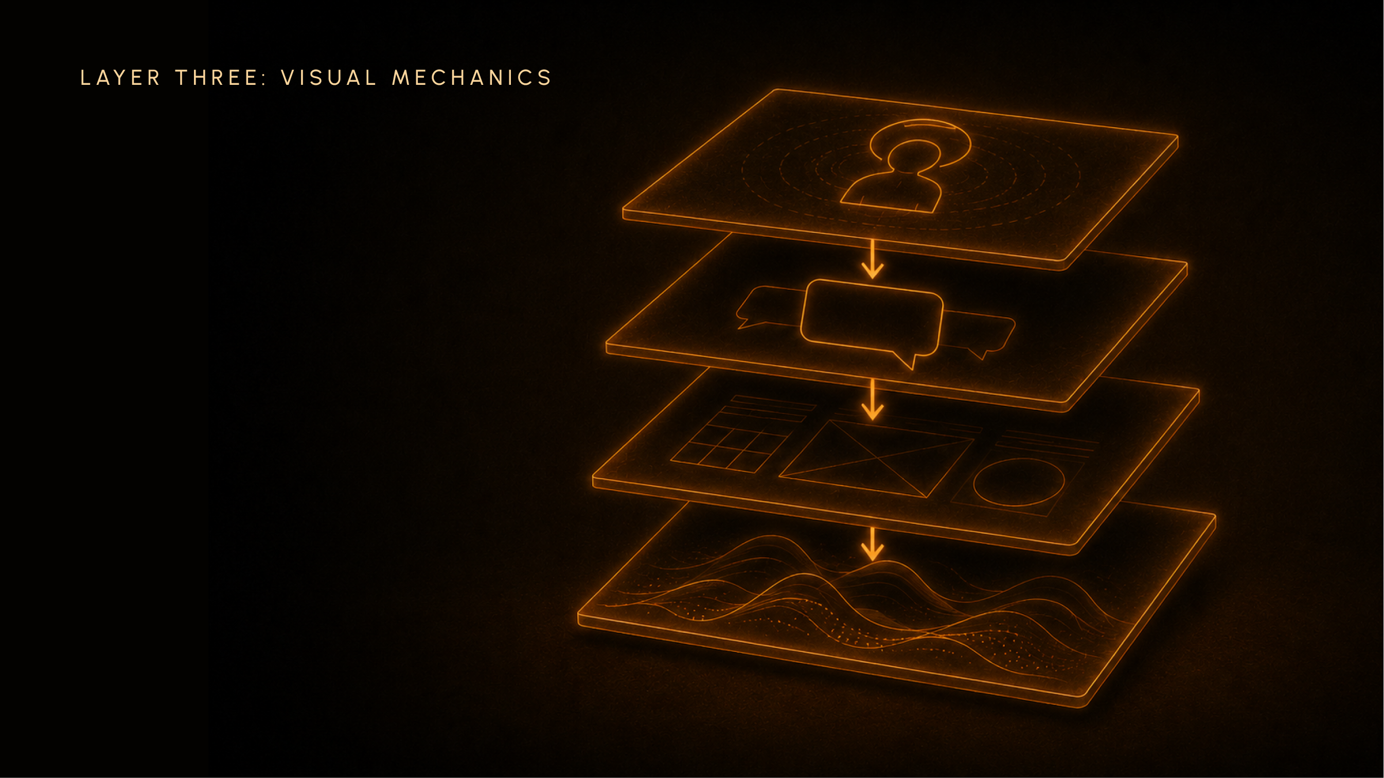
Layer Four: Visual Vibe
Photography direction, visual density, texture, energy, the feeling of the work at its surface.
This is the most flexible layer. And the one most agencies treat as the whole system.
The visual vibe can shift with campaign, season, and cultural moment without the system fracturing, as long as the three layers above it remain stable. This is not a weakness. This is the source of brand evolution: the capacity to hold the structure while flexing the surface.
Apple's Snow White project, the design language developed with Hartmut Esslinger and frog design in the early 1980s, established exactly this. Lines two millimetres wide and deep, spaced ten millimetres apart, suggesting precision. Specified corner radii. Case proportions calibrated to reduce perceived size at the front. This was a vibe layer governed by system logic: a set of decisions that made diverse products feel related without requiring them to be identical. The project proved that a design strategy is, at its core, "a frame of reference that defines, on a conceptual and concrete level, how a brand speaks to its customers through shapes, language and visuals."
The visual vibe layer matters enormously. It is just not, by itself, a brand system.
Three Systems That Prove the Argument
NASA: When the System Was Right and the Institution Was Wrong
Richard Danne's 1975 identity programme for NASA did not fail because the design was bad. Every measure of design rigour, coherence, scalability, systematic application, the worm identity passed all of them.
It failed because the system was documented but not understood.
When Dan Goldin became NASA's administrator in 1992, the worm had already accumulated institutional enemies: engineers who felt it disrespected their heritage, administrators who associated it with a period of failure. The design community mourned its retirement. The people inside NASA who drove the decision did not.
The lesson is not about internal politics. It is about system thinking. A brand system must be understood, not just archived. The logic behind the decisions, why the worm was designed as a symbol of unity and technical precision, why the standards manual was 80 pages long, why every application mattered, that logic was never embedded in the institution. It lived in the document.
When the document had no defenders, the system had no future.
Apple: The Snow White Principle
In the early 1980s, Apple's products were growing in number without growing in coherence. The company looked, from the outside, like a collection of interesting objects that happened to share a name.
Steve Jobs commissioned a competition to fix this. The Snow White project, led by Hartmut Esslinger at frog design, produced a design language: not a single product, but a set of principles that every product could implement. Specific proportions. Specific surface treatments. A visual logic that created family resemblance without mandating uniformity.
This was not a style guide. It was a system infrastructure: a set of decisions about how the brand would speak through form, encoded deeply enough that it could survive individual product teams making independent choices.
When Jobs returned to Apple in 1997 and drew the four-quadrant grid, pro and consumer, desktop and portable, and told the company to build exactly four products, he was making the same move at a strategic level. He was declaring the load-bearing structure. Everything else was expressive. The grid was the architecture.
"He didn't just redesign the marketing; he redesigned the entire company around a core brand principle: focus." The brand is the set of rules that governs every decision. Jobs understood this with an unusual clarity.
Hermès: The System That Doesn’t Need a Document
The Hermès brand is not managed by a style guide. It is managed by a system so deeply embedded in the organisation's behaviour that it operates without needing to be consulted.
Consider what the system actually is.
The orange box is not a colour choice. It is a delivery mechanism for a meaning claim: that what is inside was made by a person, with craft, for someone who understands what that costs. That meaning is reinforced by the pricing architecture, which does not discount. By the distribution strategy, which keeps the Birkin and Kelly bags exclusively in stores, requiring a physical interaction, a relationship, a process that mirrors the making. By the three-day "Inside the Orange Box" employee onboarding, which traces the company's origins before it teaches anyone their job.
Every element reinforces the others. The brand has no weak points because the system has no weak points. Scarcity, craft, distribution, training, pricing: they all point in the same direction.
No campaign can contradict this system because the campaign is the last thing Hermès relies on to carry meaning. The meaning arrived before the campaign began. The system delivers it.
It is worth noting what Hermès almost never does: it does not explain itself. No campaign exists to justify the price. No communication exists to defend the scarcity. The system is so coherent that explanation would be redundant. That relationship between a brand’s silence and its meaning is its own study, and one that luxury brands handle in a way that other categories struggle to replicate.
This is what a brand system looks like at its most advanced: not a document you reference, but a logic you embody.
What a Brand System Changes About How You Work
Briefing from System Logic, Not Aesthetic Preference
A brief generated from system logic starts with meaning, not mood board.
It answers: what layer of the system does this piece of work live on? What are the load-bearing constraints it cannot violate? What does "on-brand" mean specifically in this context? And it provides answers to those questions in the language of hierarchy, not taste.
Without system thinking, briefs default to aesthetic language. Premium. Warm. Bold. Sophisticated. These words mean something different to every designer in the room. They are not briefs. They are starting points for a guessing game.
When Conejo and Wooliscroft argued that brands need to "contemplate their meaning infrastructures," they were describing, in academic language, exactly what a system-logic brief does. It makes the meaning infrastructure legible. It gives everyone in the room the same map.
Evaluating Work Against Architecture, Not Taste
The most common creative review is a taste review.
"I like this." "This doesn't feel right." "Something's off but I can't tell you what."
System thinking transforms this into a structural review. This decision lives on the visual vibe layer and is consistent with the meaning layer above it, so it is a valid choice even if the reviewer's personal preference runs elsewhere. That work has changed the messaging layer in a way that contradicts the meaning claim, and that is why it feels wrong.
This is how mature creative organisations work. It protects good work from being overridden by personal preference. It protects brand managers from defending weak work as "brave." And it makes the review conversation about architecture rather than aesthetics, which is a conversation that can actually resolve.
Steve Jobs' design reviews at Apple were not aesthetic reviews. He was not asking whether he liked what he saw. He was asking whether the work served the system. That question has an answer. "Does it feel right?" does not.
Maintenance as System Governance
Brand maintenance is not a policing exercise. The question is not "does this look right?" The question is: has a load-bearing decision been changed without a corresponding change in the system logic above it?
If someone has introduced a new colour without asking whether it changes the meaning of the colour system: that is a load-bearing decision being made at the expressive layer. If a campaign has adopted a tone that is warmer and more accessible than the brand has ever been: that is either a system evolution that should be declared and embedded, or a drift that will create incoherence over time.
The distinction is: was this intentional? Was the hierarchy consulted? Does the system still hold?
The best brand managers think like architects. They are not asking whether the walls are the right colour. They are asking whether the load-bearing elements are still in place, and whether any expressive changes have been made with full understanding of what they are and are not touching.
NASA lost the worm not because its design was wrong, but because nobody was assigned to govern the system. When the institution needed a structural argument, there was none to make.
This is also a useful entry point into the broader question of brand architecture, which is where those structural decisions get made at the portfolio level.
Frequently Asked Questions
What is a brand system and how is it different from brand identity?
Brand identity is the set of visual and verbal signals a brand uses to present itself: the logo, colour, typography, tone of voice, photography direction. A brand system is the decision architecture that produces those signals consistently across situations the guidelines never anticipated. Identity is the output. A brand system is the logic that governs the output.
What are the core elements of a brand system?
A brand system is built in four layers, each expressing the one above it. The meaning layer holds positioning and purpose. The messaging layer governs how the brand speaks across contexts. The visual mechanics layer covers logo, colour, typography, and grid. The visual vibe layer covers photography direction, density, texture, and energy. A design decision at layer three should always be traceable to a decision at layer one.
Why do brand systems fail over time?
Three causes, usually in combination: undeclared hierarchy, where nobody has specified which decisions are load-bearing; lack of internal understanding, where a document exists but the logic behind it does not; and expressive drift, where surface-level decisions accumulate that subtly contradict the meaning layer. NASA's worm identity illustrates all three. The system was right. The institution did not understand it.
Do small brands or start-ups need a brand system?
Yes, proportionally. A start-up does not need an 80-page standards manual. It needs to answer the meaning and messaging questions before it resolves the visual ones. Many start-ups have expensive visual identities and no brand system. The result is a brand that looks polished and behaves incoherently: consistent enough to be recognisable, not clear enough to be trusted.
The Building Holds
Someone points at a slide.
The logo is still there. The hex codes. The fonts. The whole clean, well-spaced reference document.
But something has shifted in how you see it.
The logo is not the brand. It is one sign in a system of signs, and it means something only because all the other decisions around it are keeping that meaning alive. The colour is not a colour. It is a signal in a hierarchy of signals, each one pointing back to a meaning claim made somewhere above the design layer.
The style guide is not the system. It is the record of what the system produced.
And the most important thing about a brand system is not whether it is well-documented. It is whether the people responsible for the brand understand the logic well enough to defend it when someone, one day, points at a slide and says: let's change it.
The brands that last are the ones where someone understood that the building had to hold before the walls could be painted.