June 26, 2025
In today's crowded shelves and scrolls, your packaging is your pitch. If it doesn't say something meaningful fast, it gets ignored.
The landscape of packaging design has fundamentally shifted. What once served as a simple protective vessel has evolved into the most critical touchpoint in the customer journey. In an era where consumers encounter thousands of brand messages daily—whether browsing retail shelves or scrolling product feeds—your packaging design strategy must work exponentially harder to capture attention and drive purchase decisions.
Consider the modern shopping experience: shoppers spend an average of 13 seconds looking at products on shelf before deciding. Online, that window shrinks to milliseconds as users scroll past listings. Your packaging isn't just competing with direct competitors—it's competing with every visual stimulus demanding attention.
This reality has transformed packaging from functional necessity into strategic branding asset. The most successful brands understand that packaging design isn't an afterthought—it's a core component of brand strategy, requiring the same rigor as brand positioning, visual identity development, and brand storytelling. A creative branding studio that understands modern consumer behavior approaches packaging as the physical manifestation of a brand's entire narrative.
The best packaging design doesn't just protect and contain—it communicates, persuades, and creates emotional connections. It serves as three-dimensional brand identity that must function across retail environments, social media, unboxing experiences, and daily use. This multi-platform reality demands sophisticated understanding of how design systems work across different scales and interaction modes.
Old Rule: Make It Pretty. New Rule: Make It Say Something
Beautiful packaging used to be enough. Now, customers want story, purpose, and personality—on sight.
The evolution from aesthetic-focused to story-driven packaging represents a fundamental shift in consumer expectations. Traditional packaging design prioritized visual appeal—clean layouts, attractive colors, polished finishes. While these elements remain important, they're no longer sufficient to drive purchase decisions in a saturated marketplace where "pretty" has become commoditized.
Pretty Fades. Purpose Sticks.
Shiny design doesn't hold attention unless it reflects a clear, compelling brand story. Today's consumers seek authentic connections with brands. They want to understand not just what a product does, but why it exists, what values it represents, and how it aligns with their beliefs and lifestyle choices.
This shift has profound implications for branding agencies and creative direction strategies. Successful packaging design now requires deep understanding of brand narrative, target audience psychology, and cultural context. The visual identity must serve the story, not overshadow it. Colors, typography, imagery, and structural elements must work together to communicate specific messages about brand purpose and personality.
Consider the difference between generic premium positioning and authentic storytelling. A product might use gold foil and minimalist typography to signal luxury, but without compelling reason for that premium, it feels hollow. Conversely, a brand using unexpected colors, honest language, and distinctive elements to reflect its unique mission creates genuine differentiation.
No More "Designed for Dribbble"
You're not designing for awards—you're designing for buyers with half a second of attention. The design community has long celebrated packaging that photographs beautifully and garners social media engagement. While visual appeal remains important, the new rules of packaging design prioritize performance over portfolio aesthetics.
This doesn't mean abandoning creativity or visual excellence. Rather, it means ensuring every creative decision serves strategic purpose. Does this color choice communicate intended brand personality? Does this typography guide the consumer's eye to important information? Does this structural innovation enhance user experience or just create Instagram moments?
Strategic branding approaches packaging as part of a larger brand ecosystem, ensuring consistency with other touchpoints while optimizing for physical and digital retail environments. The goal isn't creating the most beautiful package—it's creating the most effective one.
Minimalism Isn't the Default Anymore
Generic D2C minimalism is everywhere. What cuts through now is clarity, emotion, and edge.
The minimalist aesthetic that dominated direct-to-consumer brands throughout the 2010s has reached saturation point. What once felt fresh now reads as generic and forgettable. The sea of white backgrounds, sans-serif typography, and muted colors has created homogeneous landscape where individual brands struggle to achieve recognition.
Clean ≠ Clear
Overly stripped-back design often hides brand identity instead of revealing it. True clarity in packaging design comes from strategic reduction—removing elements that don't serve the core message while amplifying those that do. This is fundamentally different from minimalism for its own sake.
Effective brand development recognizes that clarity requires hierarchy, not absence. The most successful packaging designs use visual complexity strategically, creating layers of information that serve different consumer needs. From distance, the package communicates category and key benefit. Up close, it reveals brand story and product details.
Personality Is the New Premium
Quirks, textures, honest language—these details spark recognition and loyalty. Modern consumers crave authenticity and human connection in brand relationships. Packaging that reveals genuine brand personality creates stronger emotional bonds than generic premium aesthetics.
This trend requires brands to understand their authentic voice and visual identity at deeper levels. Texture, finish, and tactile elements play increasingly important roles in creating memorable brand experiences. The unboxing experience has become crucial brand touchpoint, requiring thoughtful consideration of materials, construction, and reveal sequences.
Story Over SKU: Why Your Narrative Belongs on the Box
The most memorable packaging tells customers what you believe, how you're different, and why it matters—without needing a brochure.
The evolution from product-centric to story-centric packaging reflects broader changes in consumer behavior. Today's shoppers don't just buy products—they buy into brands, stories, and values. Packaging design must communicate these intangible benefits as clearly as functional attributes.
Lead with Your "Why," Not Just Your Product
Whether it's impact, origin, or attitude—your story is your value prop. The most effective packaging design leads with brand purpose rather than product features. This approach recognizes that emotional connections drive purchase decisions more powerfully than rational benefits alone.
This shift requires brands to articulate their unique value proposition clearly and translate it into visual and verbal language that works at package scale. A sustainability-focused brand might lead with environmental impact rather than specifications. A heritage brand might emphasize tradition over modern features. A disruptive brand might highlight innovation over category conventions.
Successful brand storytelling through packaging creates "narrative shortcuts"—visual and verbal cues that instantly communicate brand positioning and personality. These shortcuts help consumers quickly understand what the brand represents and whether it aligns with their values.
Package Copy Is Prime Real Estate
It's where you win trust, create a wink, or hook someone into exploring more. The language used on packaging carries enormous weight in shaping brand perception and purchase decisions. Unlike advertising copy, packaging copy is encountered at the moment of decision-making, when consumer attention is at its peak.
Effective packaging copy serves multiple functions: it educates about benefits, reinforces brand personality, creates emotional connection, and differentiates from competitors. The best package copy feels conversational rather than corporate, human rather than manufactured.
The most memorable package copy creates "aha moments"—instances where consumers feel understood, surprised, or delighted by the brand's communication. These moments build brand affinity and increase likelihood of trial and repeat purchase.
The Real-World Test: Shelf Power vs Pixel Power
Packaging should thrive in retail and online. If it only works in renders, it's not working.
The modern packaging design challenge requires optimization for multiple environments. A package must perform equally well on crowded retail shelf, in Amazon search results, in Instagram stories, and in customers' hands. This multi-platform reality demands sophisticated understanding of how design elements function across different scales and contexts.
Consider How It Lives in a Cart, on a Shelf, or in a Reel
Ask: Will this stop someone? Will it spark curiosity? Will it make someone feel something? The most effective packaging design strategy accounts for the complete ecosystem of consumer touchpoints. A design that looks striking in isolation may disappear when surrounded by competitors.
This requires testing design concepts in realistic environments from earliest development stages. How does the package look when grouped with similar products? How does it photograph under various lighting? How does it appear at thumbnail size in online listings?
The best branding studios use real-time testing methodologies to validate design concepts before final production. This might include shelf simulation, digital mockups across platforms, or even cold outreach to gather consumer feedback on design concepts.
Design for Distance and Detail
Bold from afar, layered up close—that's the sweet spot. Effective packaging design creates hierarchy of information that functions at multiple viewing distances. Primary brand identifier and key benefit must be visible from across a store aisle. Secondary information can be revealed as consumers move closer.
This layered approach requires sophisticated understanding of visual hierarchy and information architecture. The most successful packaging designs use "progressive revelation"—they reward closer inspection with additional layers of brand story or delightful details.
What We Prioritize When Designing Packaging That Sells
Our packaging principles are rooted in behavior, not trends.
After working with hundreds of brands across categories, we've identified principles that separate packaging that performs from packaging that merely looks good. These rules reflect deep understanding of consumer psychology, retail dynamics, and brand building fundamentals.
Rule 1: Be Unmistakable
No generic layouts. No off-the-shelf vibes. It should only belong to your brand. The first rule of effective packaging design is creating immediate brand recognition. In a world where consumers encounter hundreds of brand messages daily, packaging must function as distinctive brand identifier that cuts through visual noise.
This doesn't necessarily mean loud design—it means design that reflects the brand's unique personality so clearly that it couldn't belong to anyone else. Creating unmistakable packaging requires deep understanding of competitive landscape and whitespace analysis. What approaches are oversaturated? What opportunities exist for genuine differentiation?
Rule 2: Build a Visual System, Not One-Off Designs
Product lines should feel like siblings—not strangers. Successful brands think systematically about packaging design, creating flexible frameworks that accommodate line extensions while maintaining consistent brand recognition.
This systems thinking approach reflects sophisticated brand architecture and design system development. Rather than designing individual packages in isolation, effective packaging strategy creates visual languages that scale across multiple products and contexts.
A well-designed packaging system establishes clear rules for typography hierarchy, color application, imagery treatment, and information layout. These rules provide consistency while allowing flexibility for different product needs.
Rule 3: Embed Brand Behavior in Every Element
Voice, copy, color logic, structure—it all reinforces the larger brand story. The most effective packaging design integrates brand behavior into every design decision. This means ensuring color choices reflect brand personality, typography communicates brand voice, and structural elements support brand positioning.
This holistic approach requires close collaboration between strategy and creative teams. Design decisions must be informed by deep understanding of brand positioning, target audience insights, and business objectives. Every element should serve both aesthetic and strategic purposes.
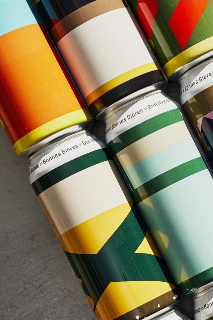
Mini Case: How Story-First Packaging Outperformed the "Design-First" Concept
A short story of a packaging redesign that ditched aesthetics-first thinking and won on-shelf and online with strategy-led storytelling.
One of our most illustrative packaging projects involved a specialty food brand that had invested heavily in premium packaging design but was struggling with trial and repeat purchase. The existing packaging was undeniably beautiful—minimalist typography, sophisticated colors, premium materials—but it was failing to communicate the brand's unique story.
The brand specialized in traditional fermentation techniques using ancient grains from regenerative farms. Their products delivered superior nutritional benefits while supporting sustainable agriculture. However, none of this compelling narrative was evident from their packaging, which looked virtually identical to dozens of other premium food brands.
Our discovery process revealed that health-conscious consumers were actively seeking products aligned with their values around sustainability and traditional food preparation. They wanted to understand ingredient sourcing, production methods, and environmental impact. The existing packaging provided none of this information.
Rather than pursuing another round of aesthetic refinement, we pivoted to story-first packaging strategy. We developed communication pillars around tradition, transparency, and regenerative impact. The new packaging design prioritized narrative elements: ingredient origin stories, fermentation timeline explanations, and farmer partnership highlights.
Visually, we moved away from minimalist approach toward more expressive design language reflecting the brand's artisanal heritage. We incorporated hand-drawn illustrations showing fermentation process, used earthy color palettes reflecting ingredient origins, and included tactile elements communicating craftsmanship.
Most importantly, we redesigned information hierarchy to lead with story rather than product features. The front panel communicated brand mission before listing nutritional benefits. Back panel told detailed stories about specific farms and fermentation techniques.
The results were dramatic and immediate. Trial rates increased by 60% within the first quarter. Customer surveys revealed significantly higher brand recall and understanding of unique value proposition. Repeat purchase rates improved by 35%, indicating stronger brand loyalty.
Perhaps most tellingly, the brand began receiving direct inquiries from consumers who had discovered them through packaging alone. People were taking photos of packages to share with friends, using them as conversation starters about sustainable food systems, and keeping empty containers as kitchen décor.
This case reinforced our conviction that packaging design must serve story first, aesthetics second. When those priorities are reversed, even beautiful design fails to create connections that drive long-term brand success.
Your Package Is Your Brand's Voice Made Tangible
The new rules of packaging demand clarity, guts, and story. If your packaging isn't talking to people, it's not doing its job.
The fundamental shift in packaging design reflects broader changes in how consumers relate to brands and make purchase decisions. In an attention-scarce environment where authenticity and purpose drive loyalty, packaging must function as three-dimensional manifestation of brand identity and values.
This evolution demands new approaches from branding studios and creative agencies. Success requires strategic thinking that goes far beyond aesthetic considerations. It requires deep understanding of consumer behavior, competitive dynamics, and cultural context. Most importantly, it requires courage to be authentic rather than safe, distinctive rather than conventional.
The brands that thrive in this new paradigm understand that packaging isn't just the container for their product—it's the container for their entire brand story. Every design decision, from material selection to copy tone, contributes to a larger narrative about what the brand believes, whom it serves, and why it matters.
This approach to packaging design as brand storytelling creates opportunities for genuine differentiation in crowded markets. While competitors chase generic premium aesthetics or copy successful design trends, brands with clear narratives and authentic expressions can create distinctive shelf presence and meaningful consumer connections.
The new rules of packaging design aren't really about design at all—they're about clarity, courage, and authentic communication. They're about understanding that in a world oversaturated with beautiful but meaningless options, the brands that dare to say something real will always stand out.
For brands struggling with packaging decisions, the path forward is clear: start with story, not style. Understand your unique narrative, identify your authentic voice, and then create packaging that makes that story impossible to ignore. The result won't just be more effective packaging—it will be more effective branding overall.
The package isn't just your brand's outfit—it's your brand's voice made tangible. Make sure it's saying something worth hearing.